BOHM
OVERVIEW
Developed as an original TCTS studio concept, this title-sequence study draws inspiration from physicist David Bohm’s idea that “matter is frozen light.”
Rather than treating matter as fixed form, Bohm described reality as a dynamic field of energy and vibration, where matter emerges from deeper underlying processes.
The project translates this proposition into a cinematic visual exploration, investigating how light, energy, and structure might evolve into a single coherent visual system.
Through a series of studies examining movement, transformation, and emergence, the work explores how abstract scientific ideas can be expressed through atmosphere, rhythm, and form, creating a visual language that exists between physics, philosophy, and cinematic design.
TITLE SEQUENCE CONCEPT
Studio design exploration
CONCEPT
The design approach focused on expressing energy as structure, light folding into geometry, motion becoming form.
Typography and composition were developed to feel suspended between solid and fluid states, mirroring Bohm’s view of an undivided universe.
Every frame was built around a simple question: what if matter behaved like illuminated rhythm?
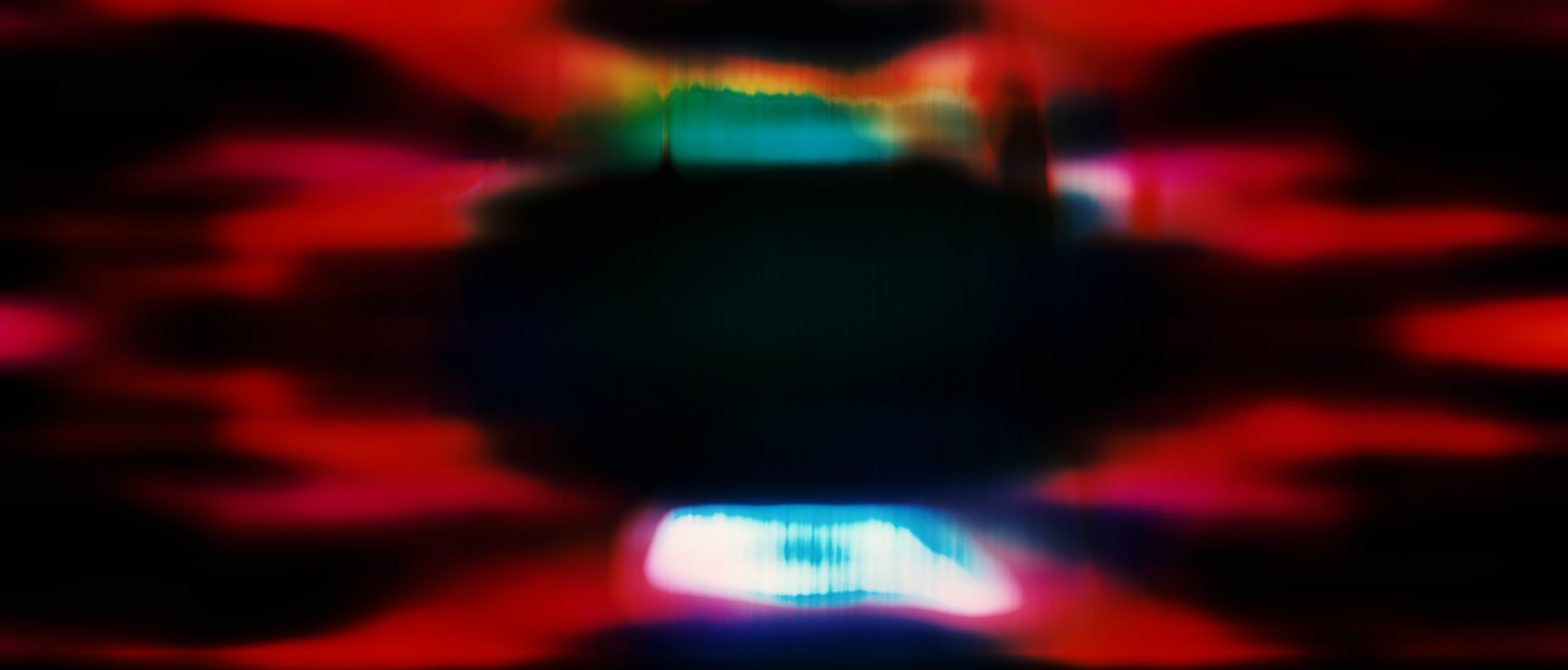
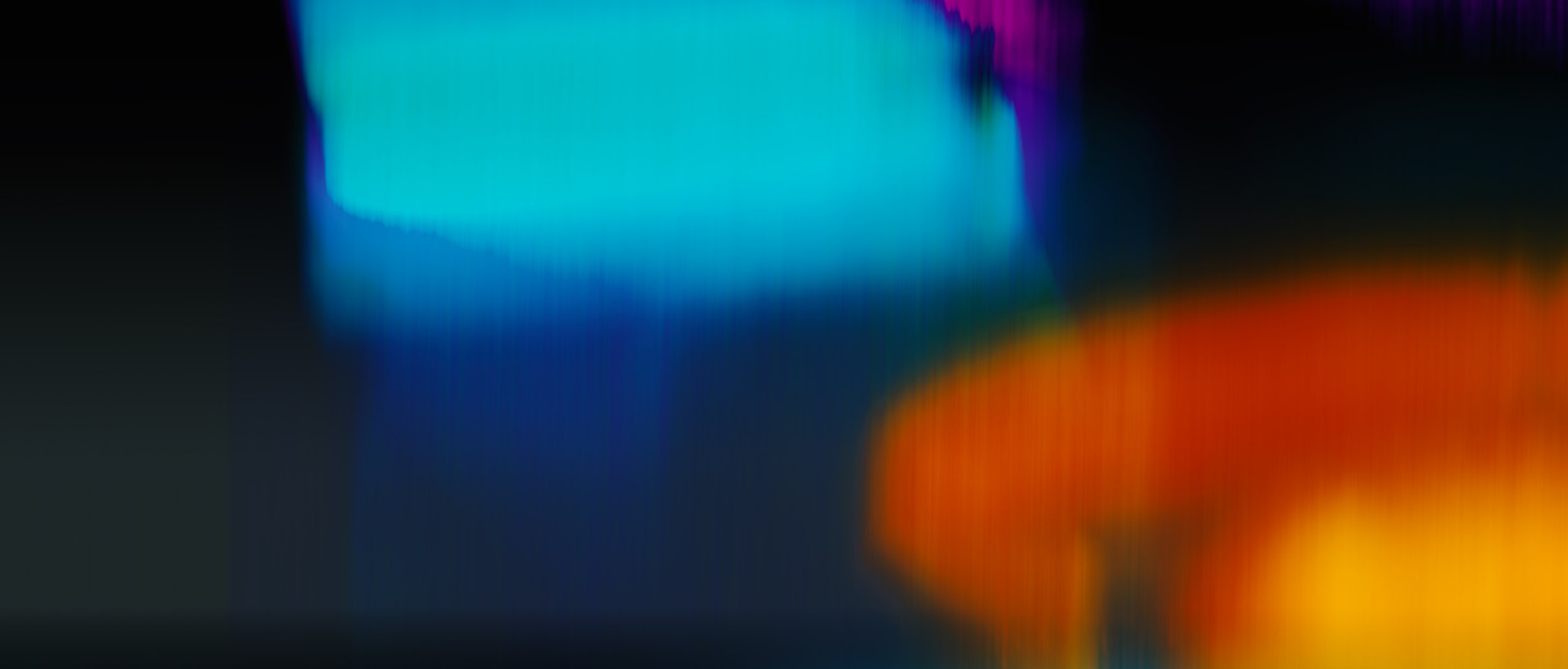
CONCEPT DEVELOPMENT
Tone BOARDS
Light becoming form; form becoming motion.
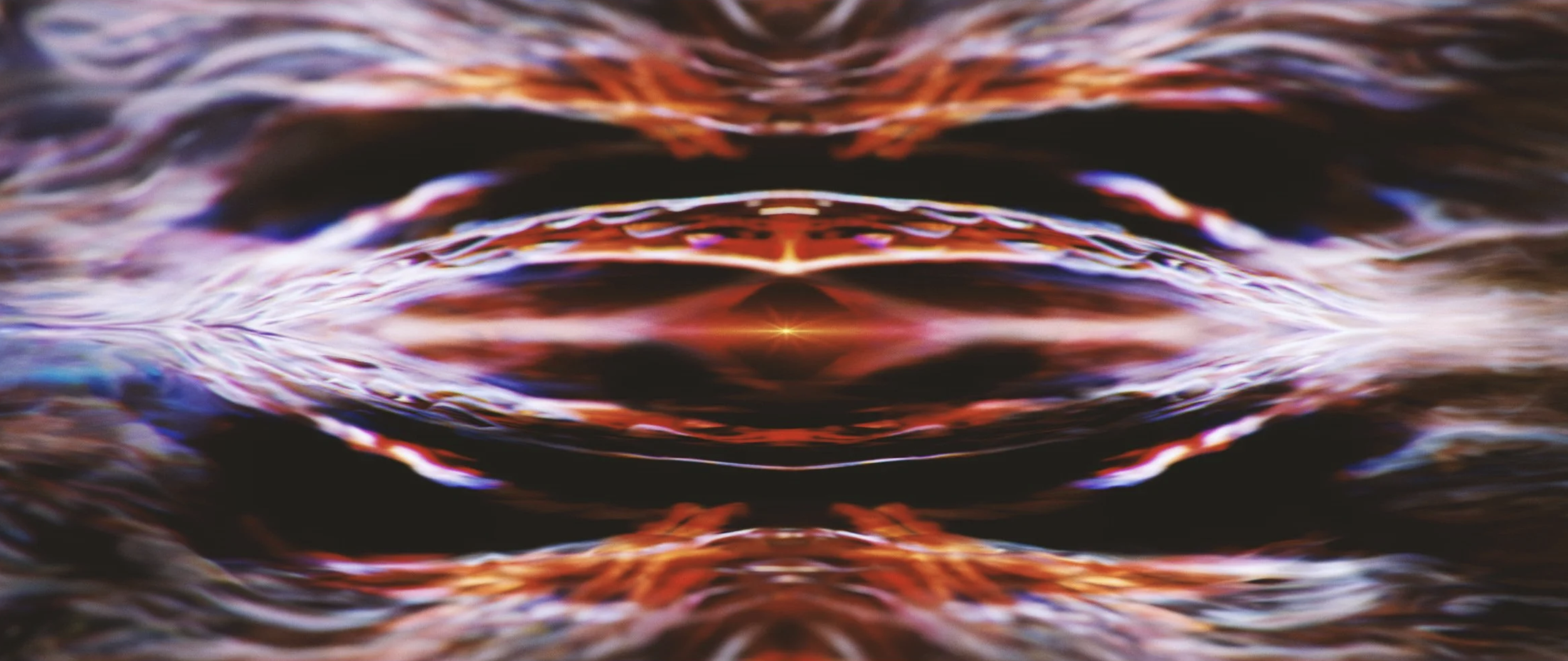
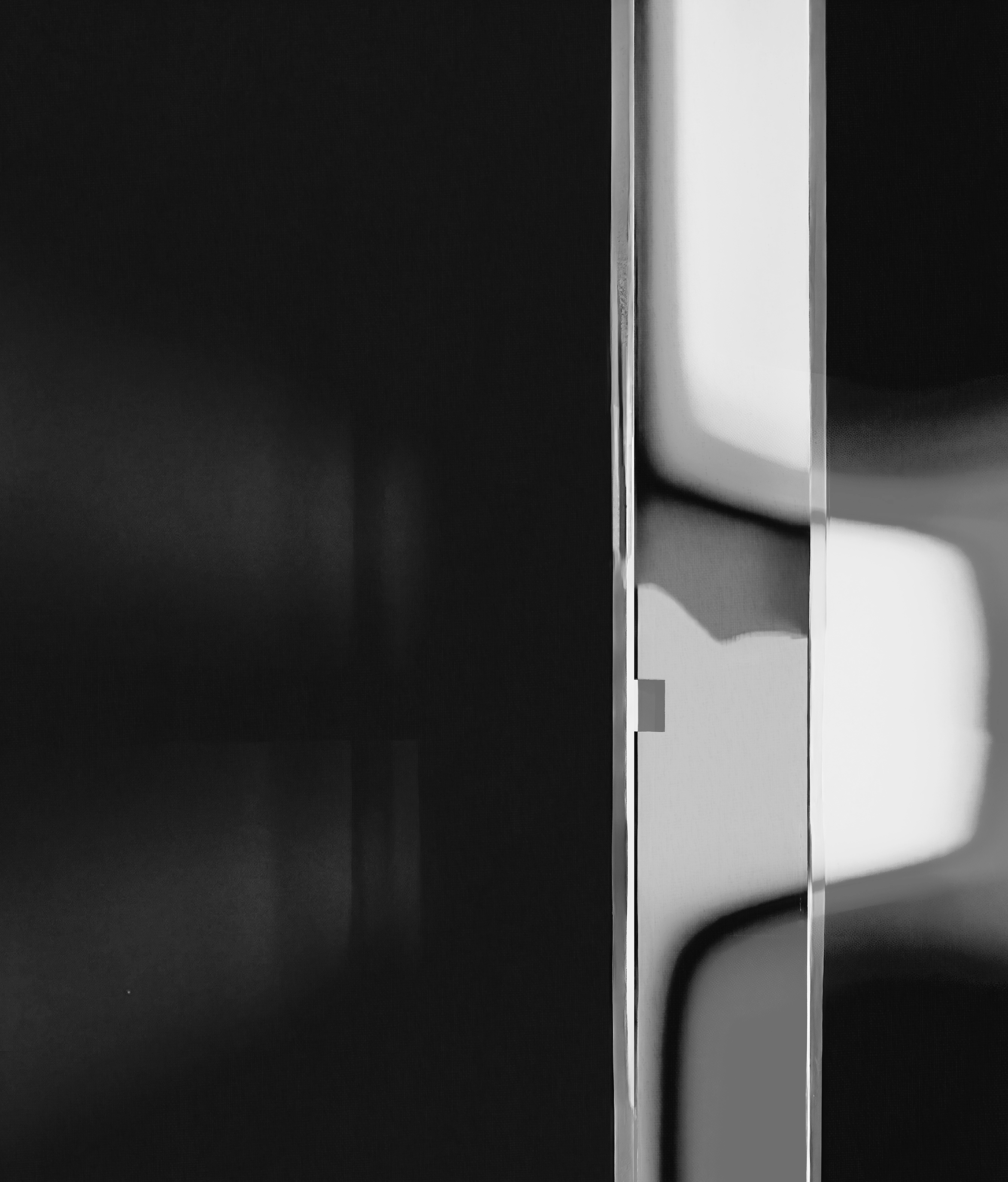
This study investigates the idea that matter is not static, but a temporal event shaped by movement and observation.
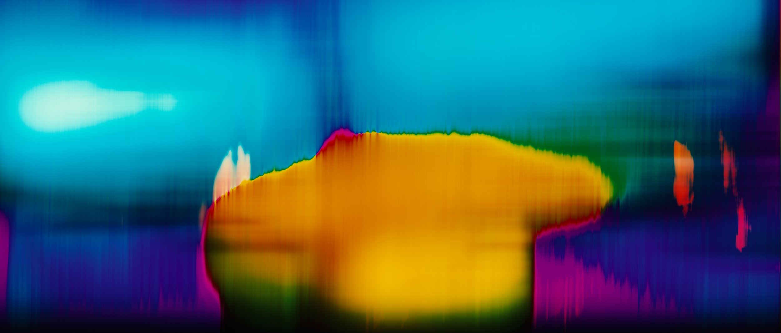
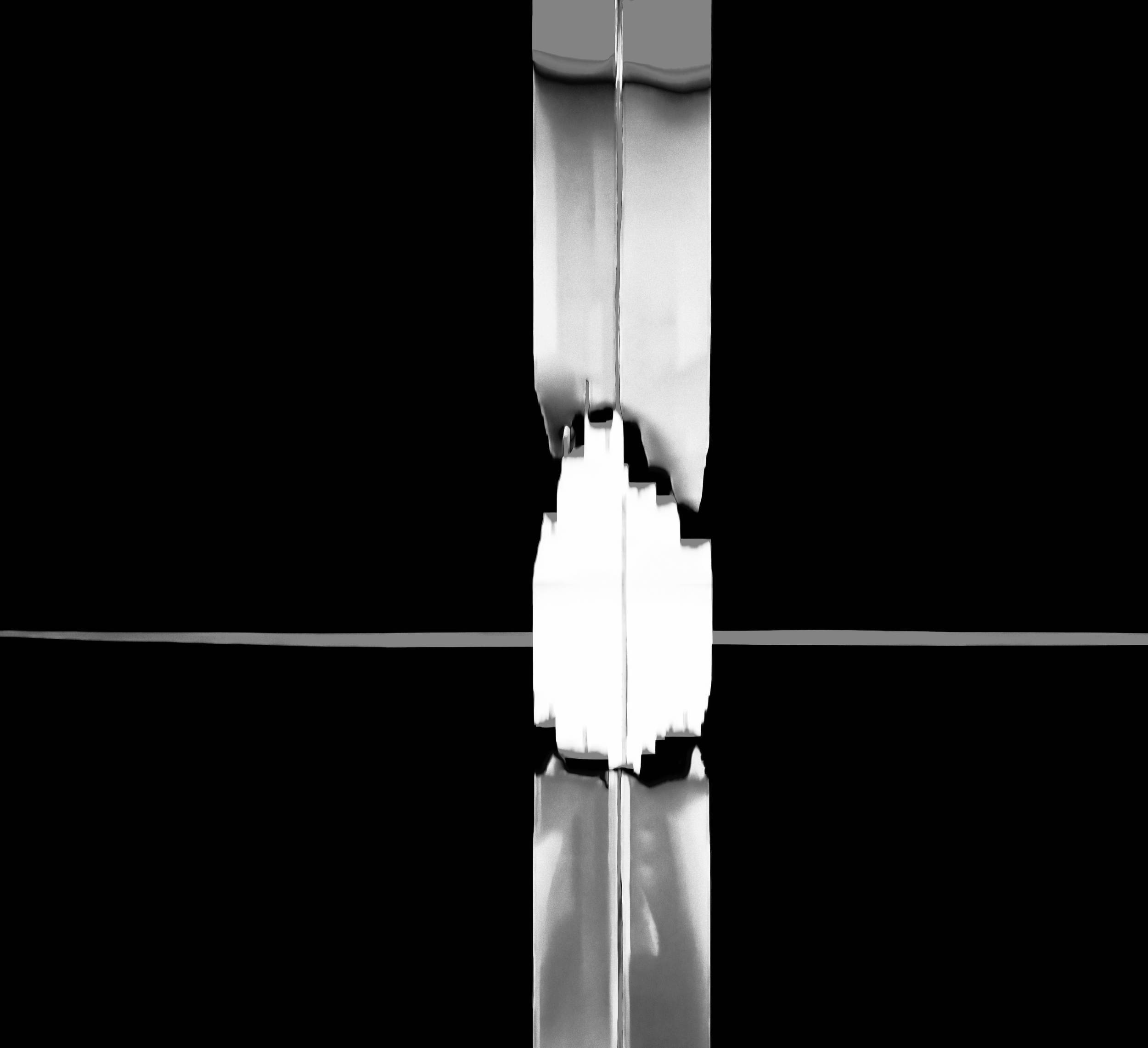
Rather than depicting form as fixed, the image tests how colour bands, geometric fragments, and directional motion blur interact to create a sense of vibration and instability.
Horizontal displacement and chromatic separation suggest energy passing through the image plane, while simplified geometric forms act as anchors within an otherwise fluid system.
The result is a visual language where structure is momentary, emerging, dissolving, and reforming, reflecting Bohm’s view of reality as an unfolding process rather than a collection of objects.
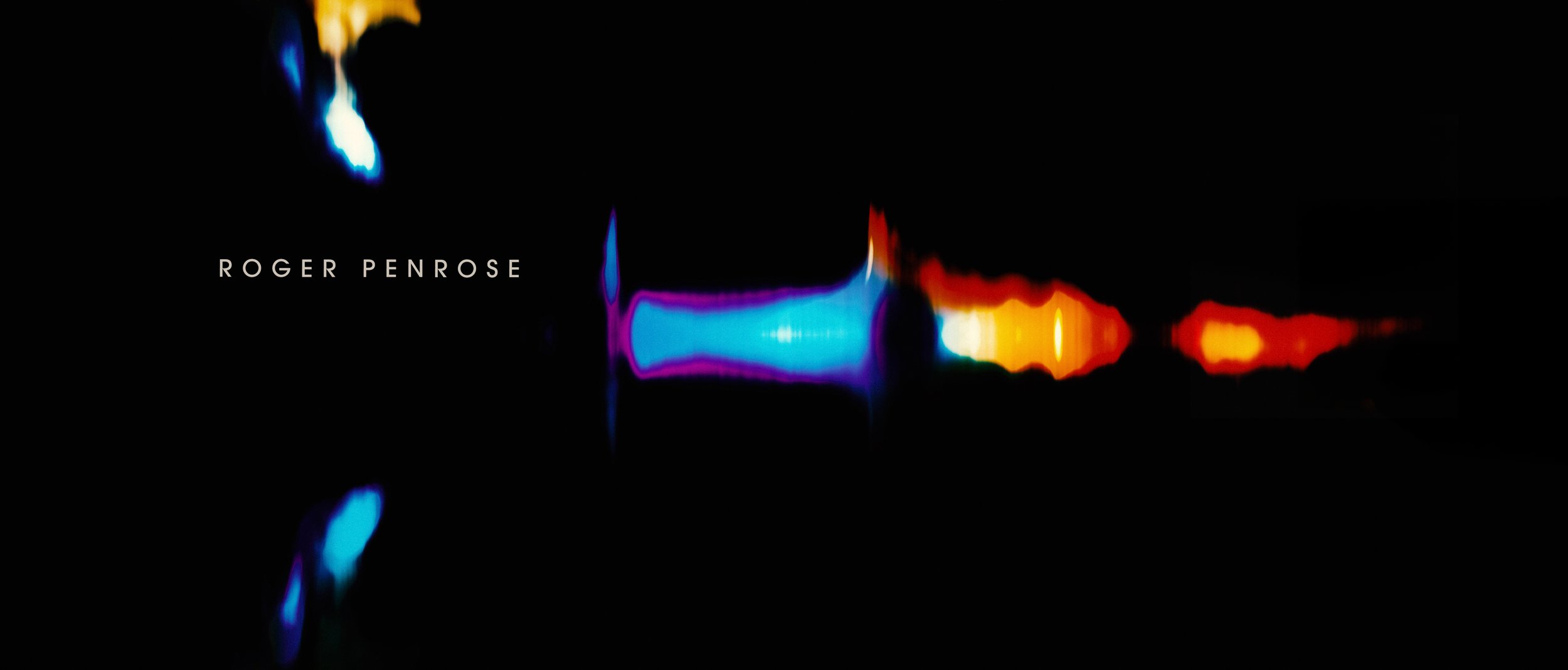
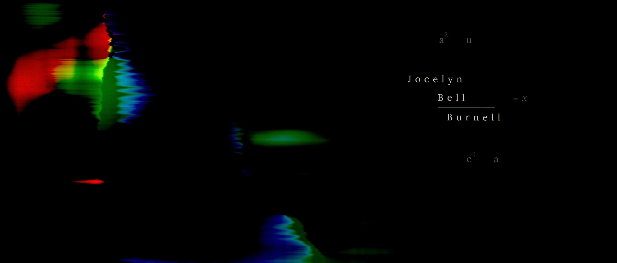
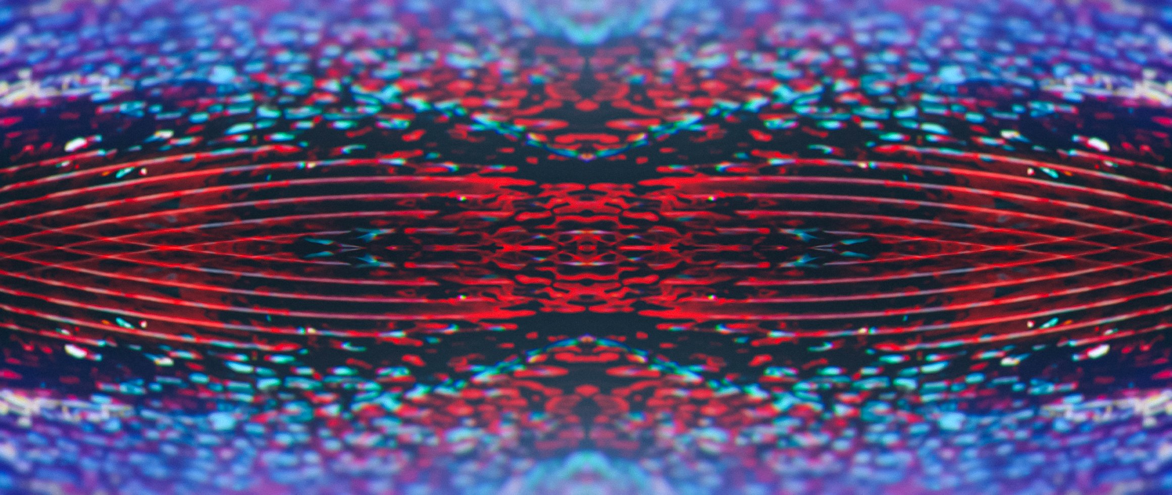
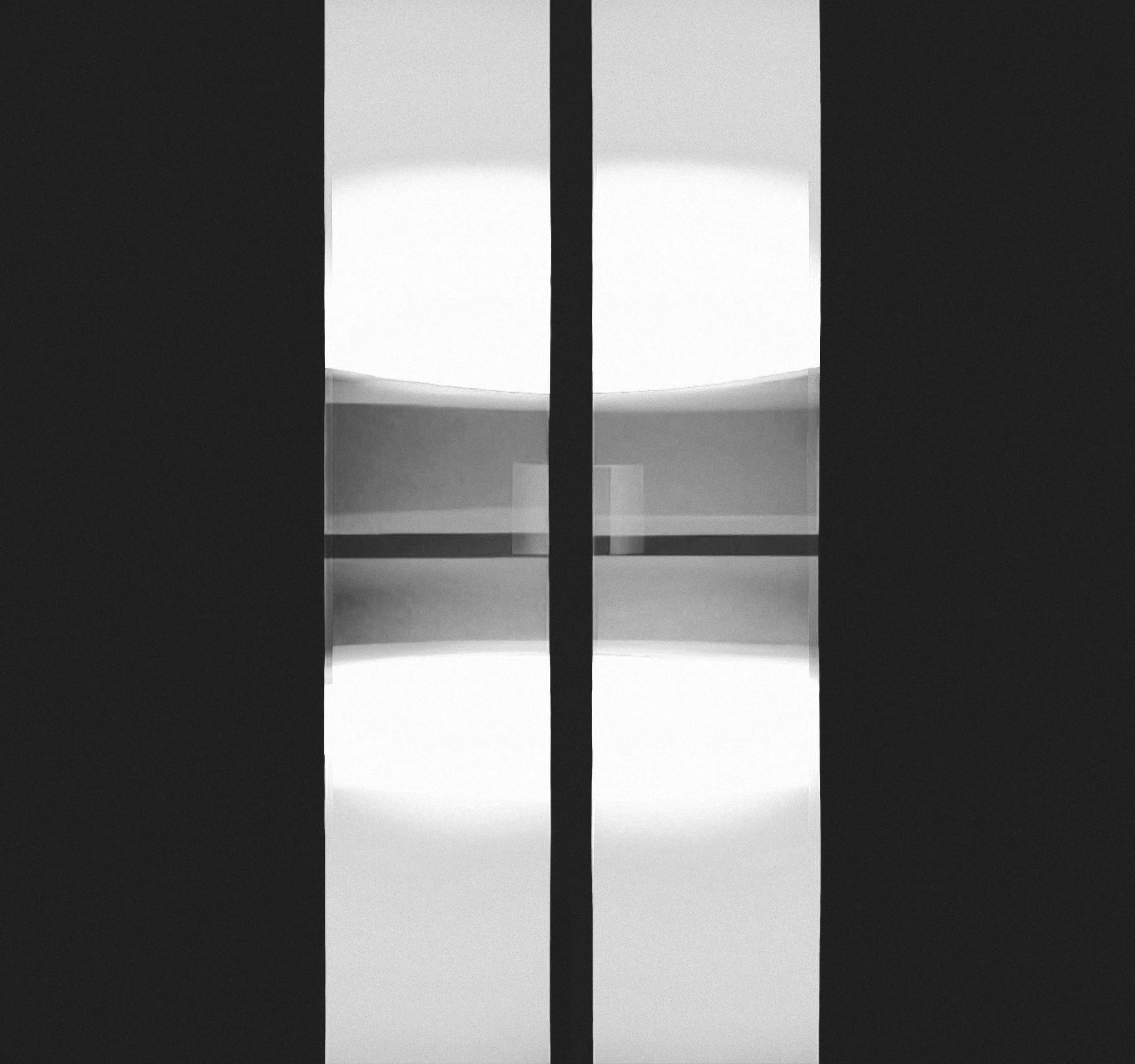
TONE BOARD SET — INTERFERENCE, MOTION, PERCEPTUAL SHIFT & TYPOGRAPHY
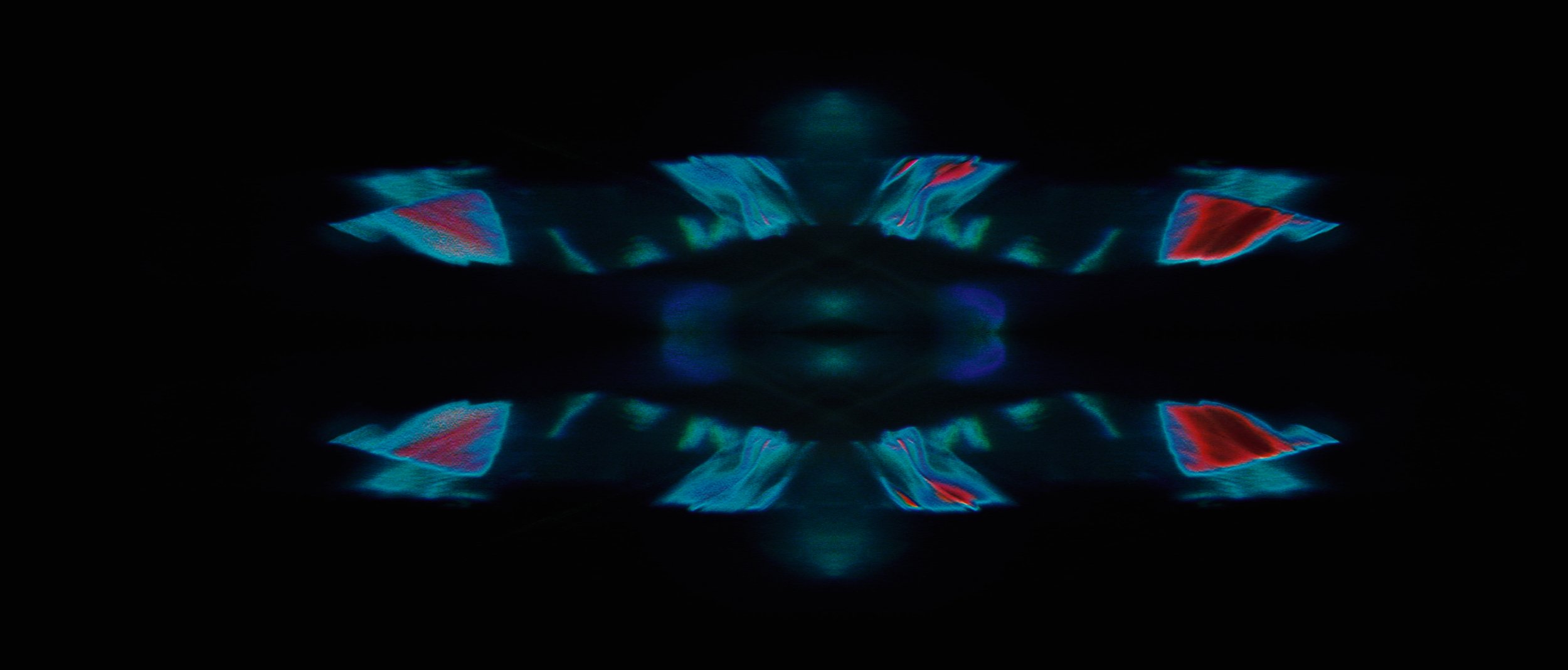
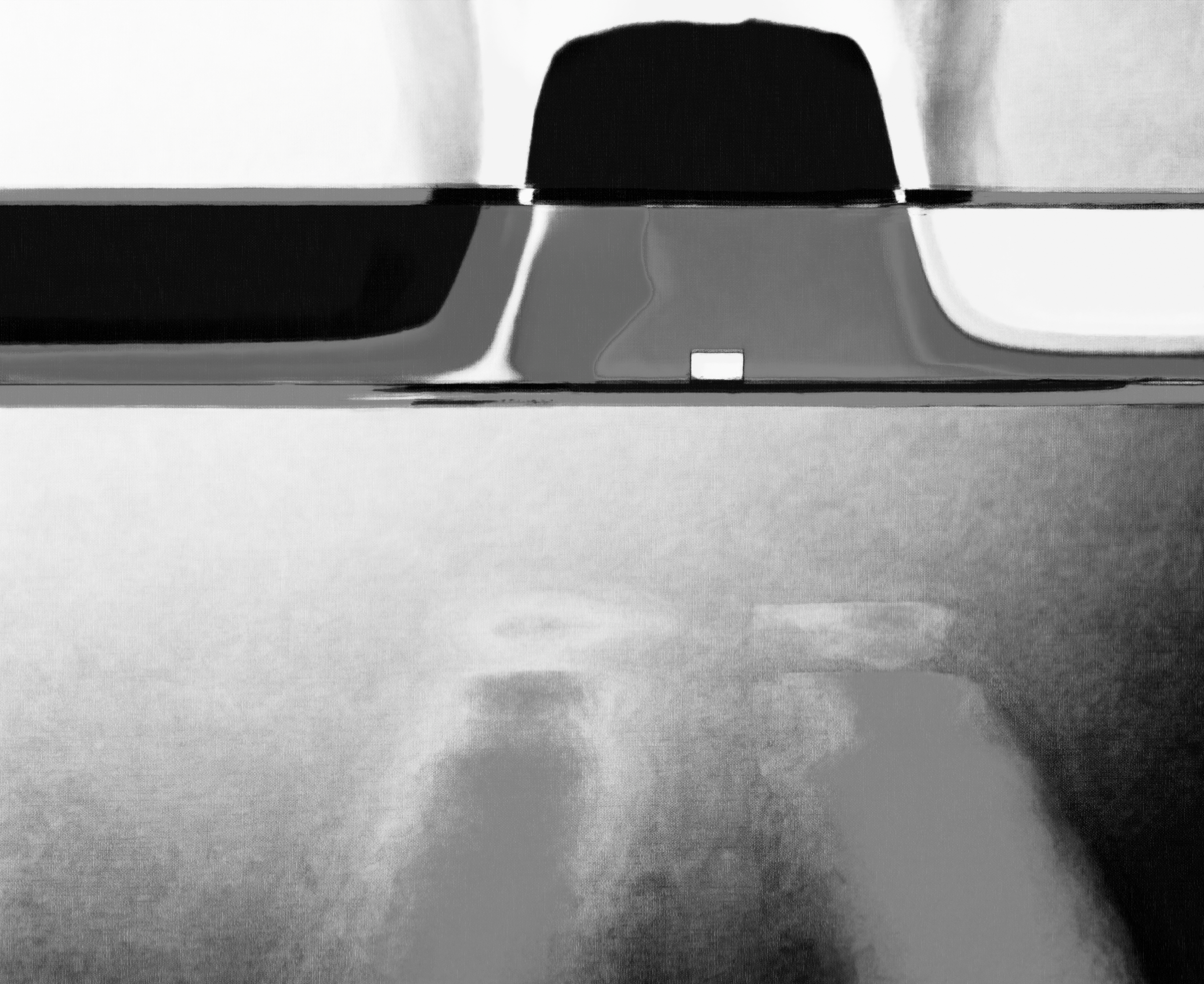
These frames explore how form breaks down under motion and interference.
Colour and geometry are treated as energetic fields rather than stable shapes, testing how perception changes when information is stretched, displaced, and partially obscured.
Also, the relationship between unstable motion fields and stable typographic elements.
The typography is treated as a fixed point of clarity within a shifting perceptual environment, testing legibility, hierarchy, and contrast under motion distortion.


TONE STUDIES / Typographic Development
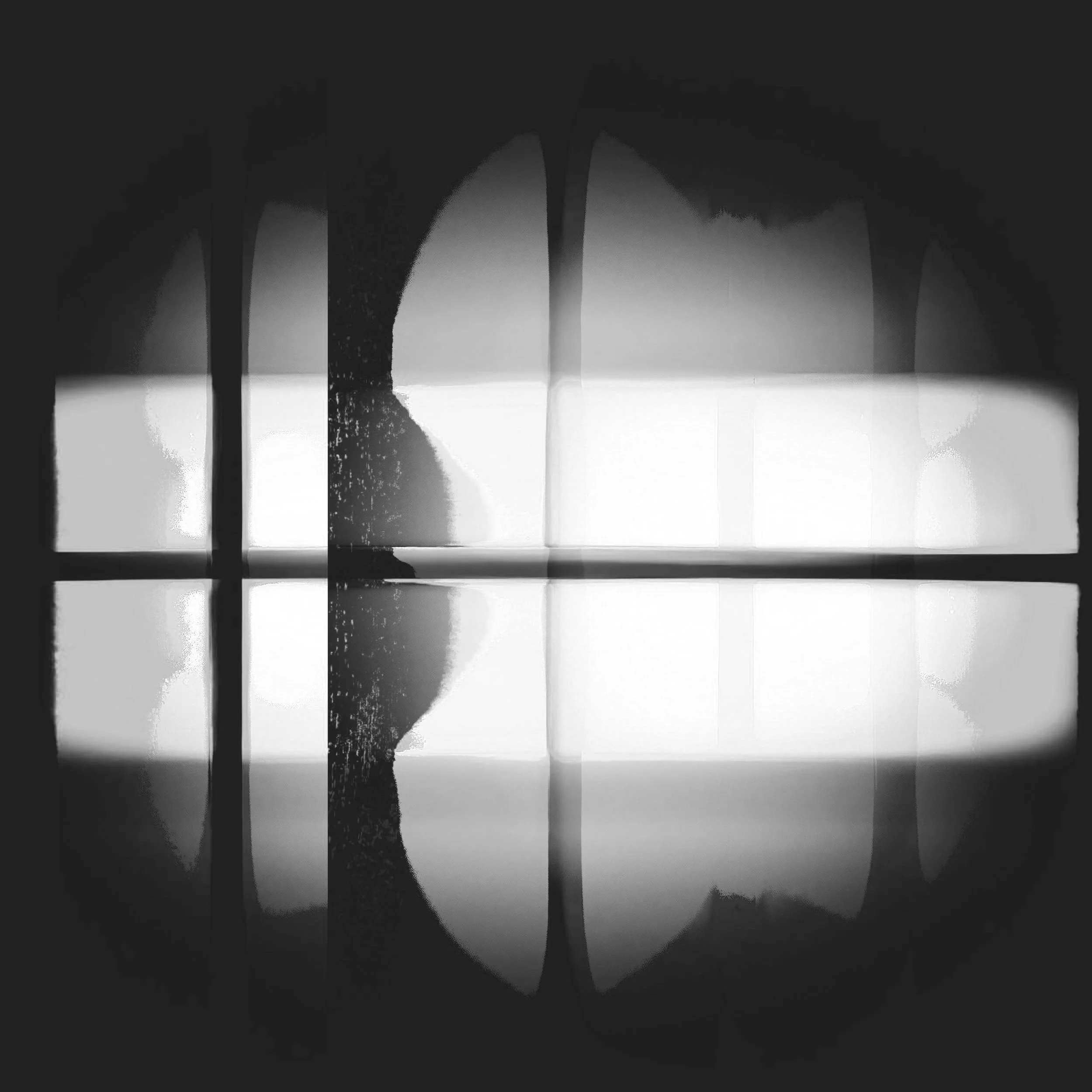
TONE STUDY — ENERGY FIELD COMPOSITION WITH TYPOGRAPHY
Establishes the overall spatial rhythm and atmosphere.
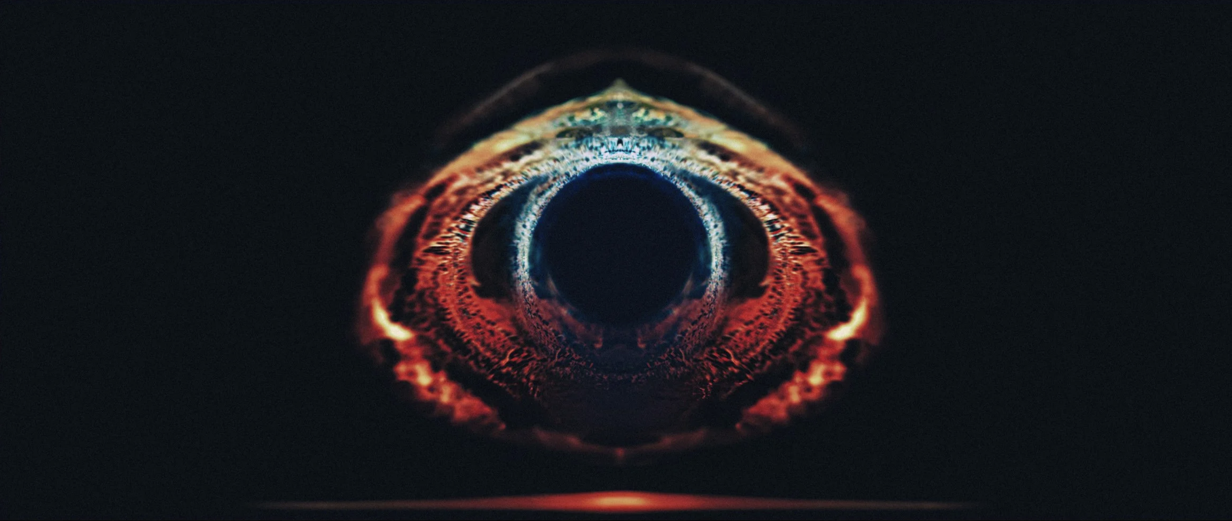
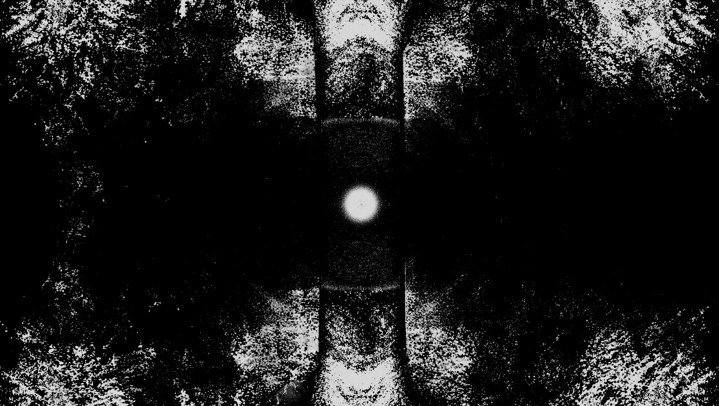
TONE STUDY — VIBRATORY PATTERN — MOTION AS MATTER
Links the motion concept to Bohm’s theory
Shows how illumination defines the geometry
Adds tonal texture and environmental depth


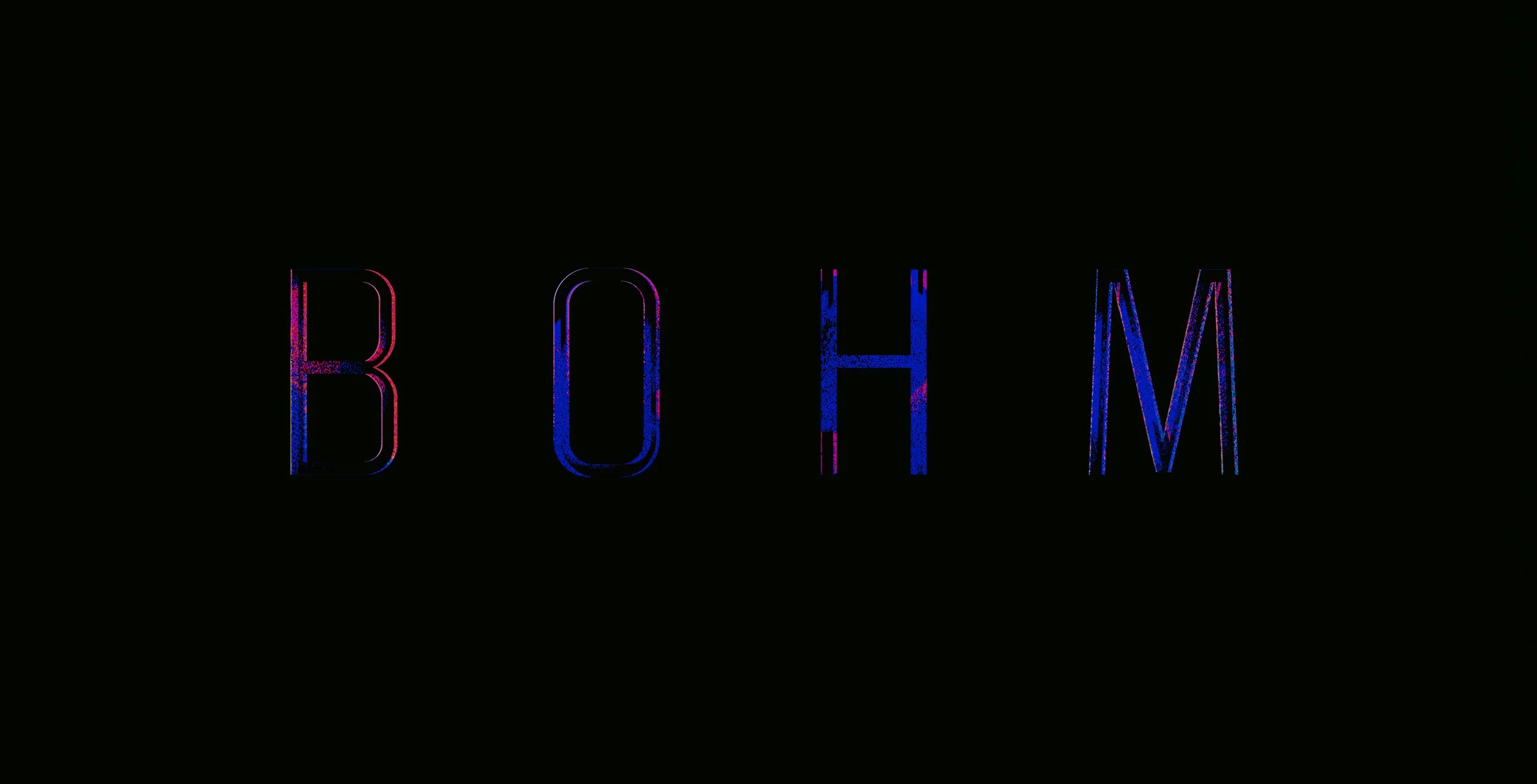
TONE STUDY — TYPOGRAPHY & ENERGY FLOW ALIGNMENT
Demonstrates how type integrates with directional light.


TONE STUDY — MATTER AS RHYTHM — LAYER DEPTH & DENSITY
Explores depth and field relationships.
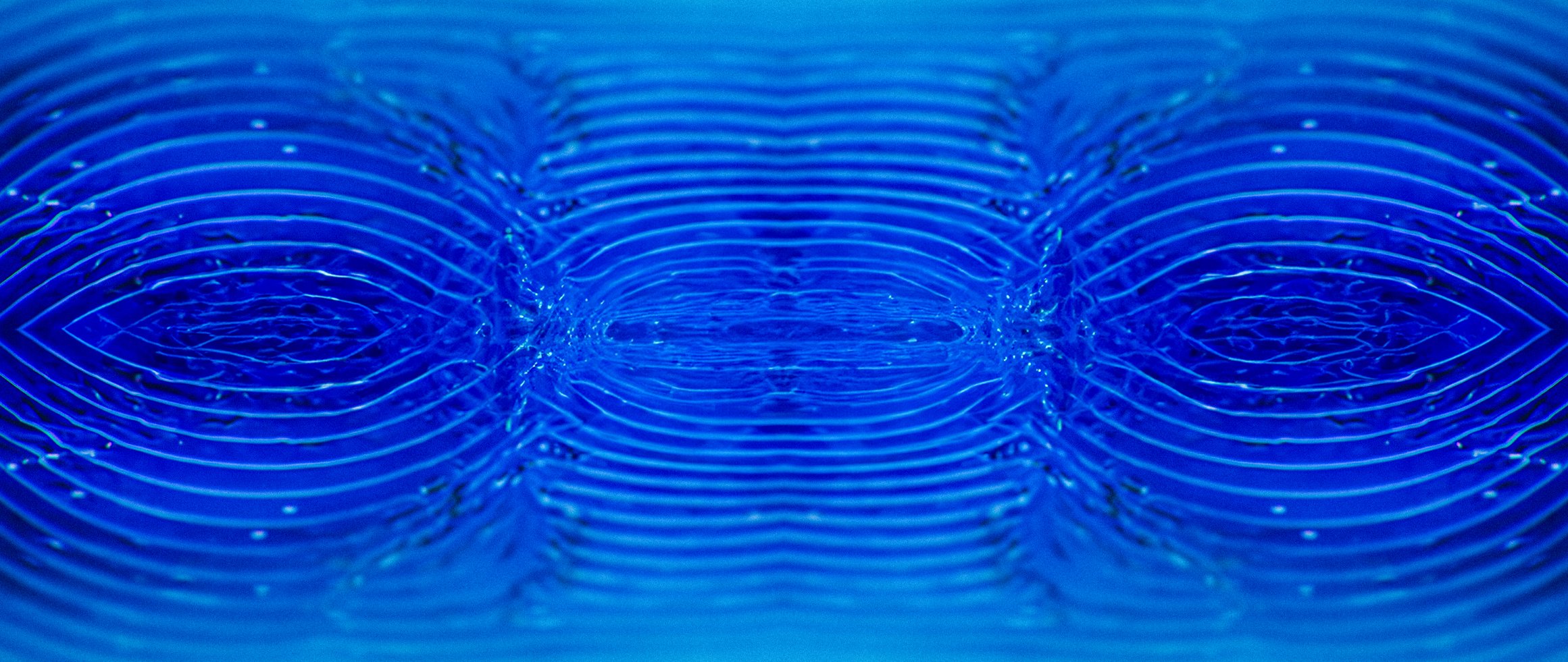
TONE STUDY — GEOMETRIC CONVERGENCE — UNBROKEN FIELD
Suggests unity and coherence within the frame.
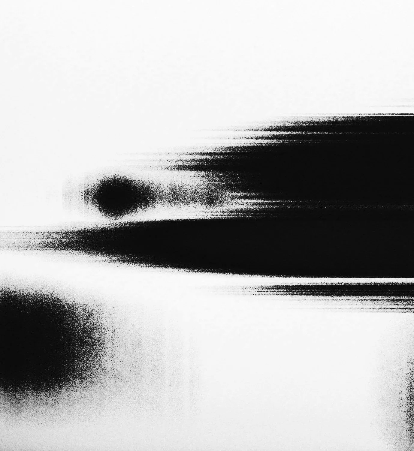
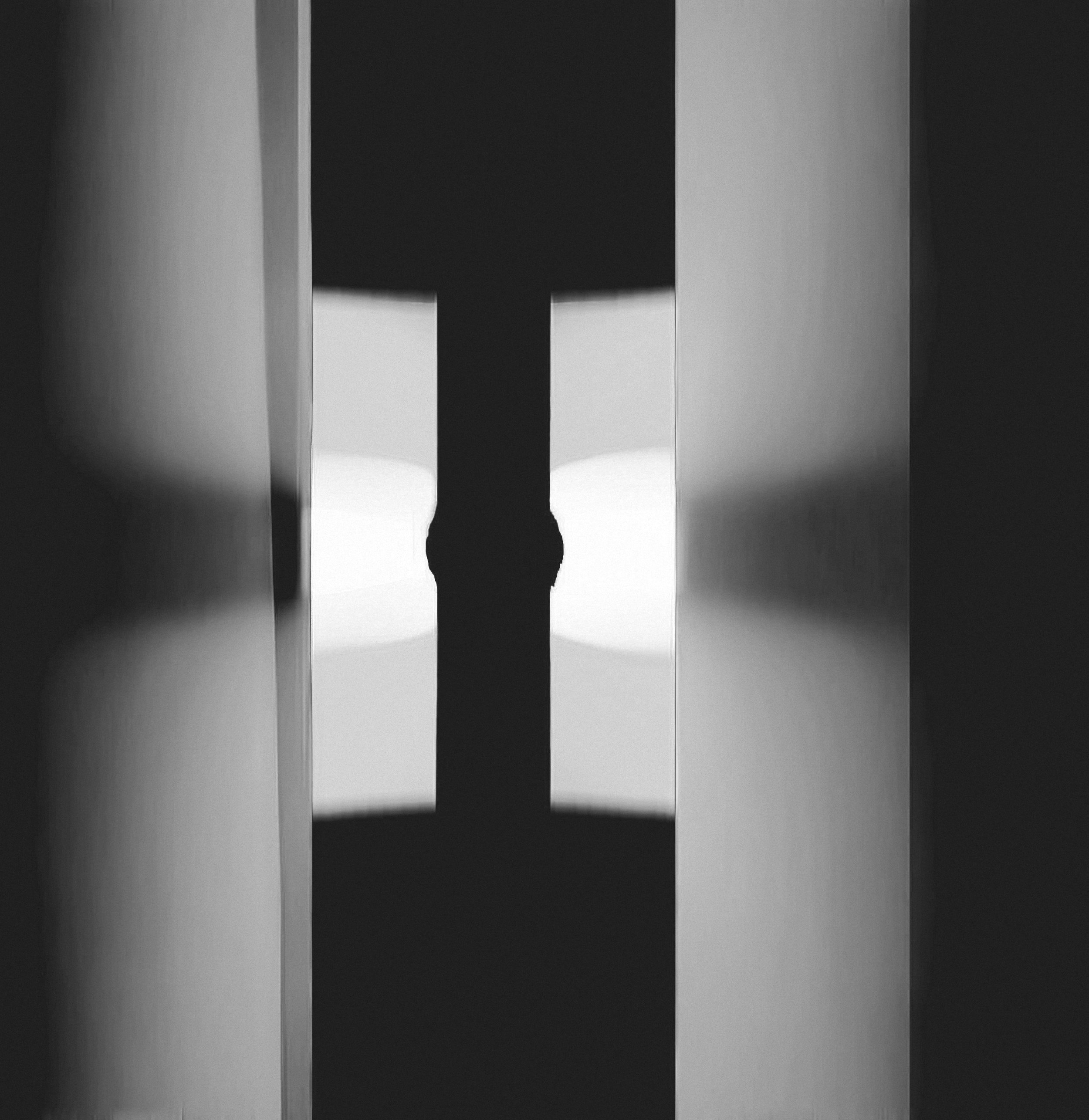
BLACK AND WHITE SHAPE STUDIES
Preliminary explorations in form, rhythm, and spatial balance.
These sketches were an early part of the development process, quick studies testing the compositional logic behind the motion. By stripping away light and texture, the focus shifted to pure geometry and flow, the underlying rhythm that later informed the sequence’s tone and typography.
Before light, there is structure.
SHAPE STUDY — MOTION AXIS


SHAPE STUDY — FORM IN TENSION

SHAPE STUDY — STRUCTURAL BALANCE
RESULT
The outcome functions as a visual meditation on energy and coherence, a speculative title world where scientific principle meets cinematic tone. It established a framework for translating abstract theory into legible motion design, bridging conceptual physics and visual storytelling.
CREDITS
Client · TCTS Studio
Role · Concept, Direction & Visual Development
© THE CIRCLE THE SQUARE 2026. All rights reserved.