EXPEDIA
OVERVIEW
The project explored the creation of an abstract visual language for a custom lozenge-shaped display environment. Rather than relying on literal travel imagery, the work investigated how colour, atmosphere, movement and geometry could communicate the emotional experience of travel within the constraints of the format.
The process focused on building a flexible system capable of expressing anticipation, transition and arrival while remaining adaptable across a large-scale live environment.
Visual Development for a Large-Scale Live Experience
In collaboration with Nathan Prince Studio
VISUAL DEVELOPMENT
Phase 01
CORE LANGUAGE EXPLORATION
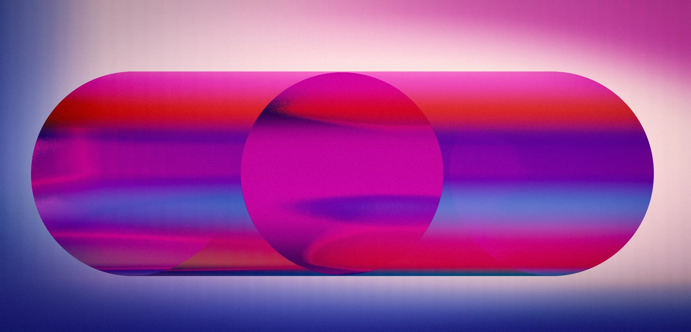
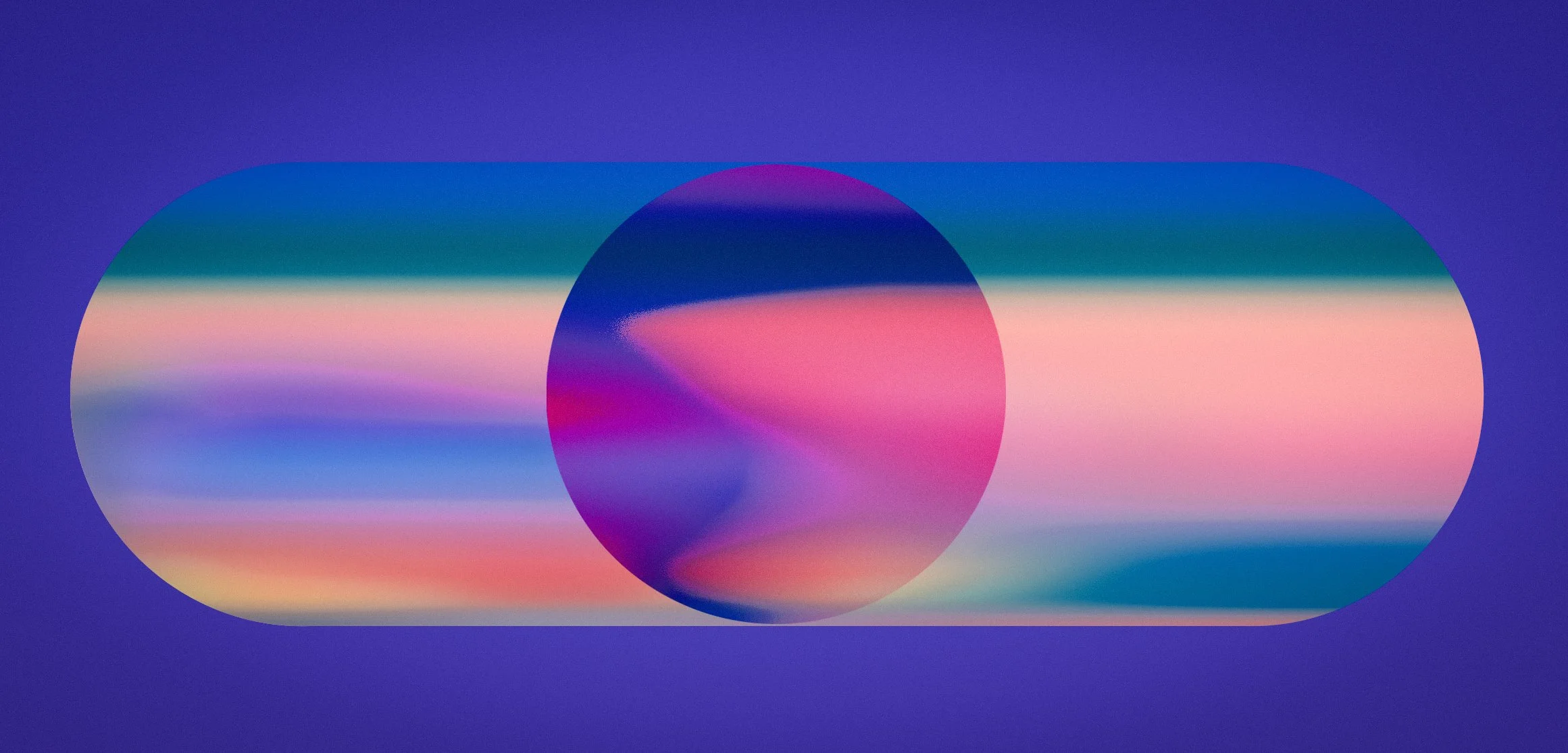
The event architecture established the primary lozenge-shaped display format from the outset. The challenge was therefore not to define a screen shape, but to develop a visual language capable of inhabiting that form with clarity, flexibility and emotional resonance.
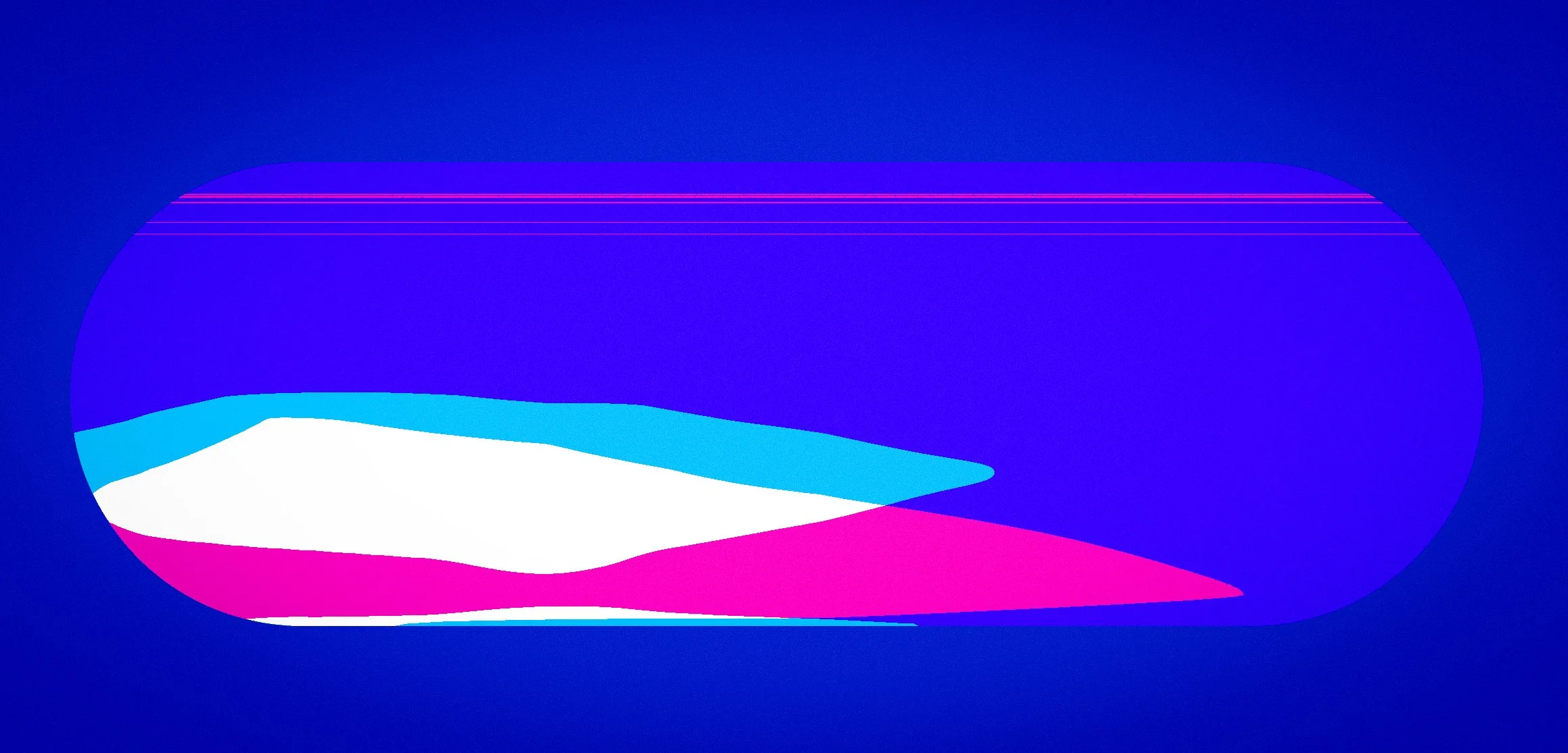
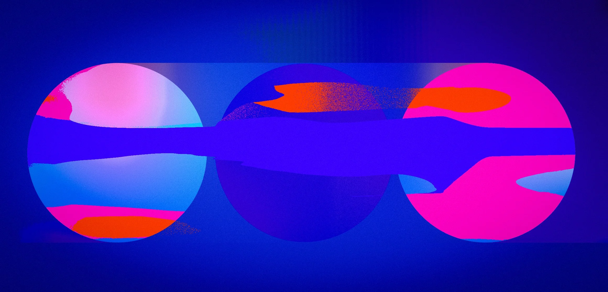
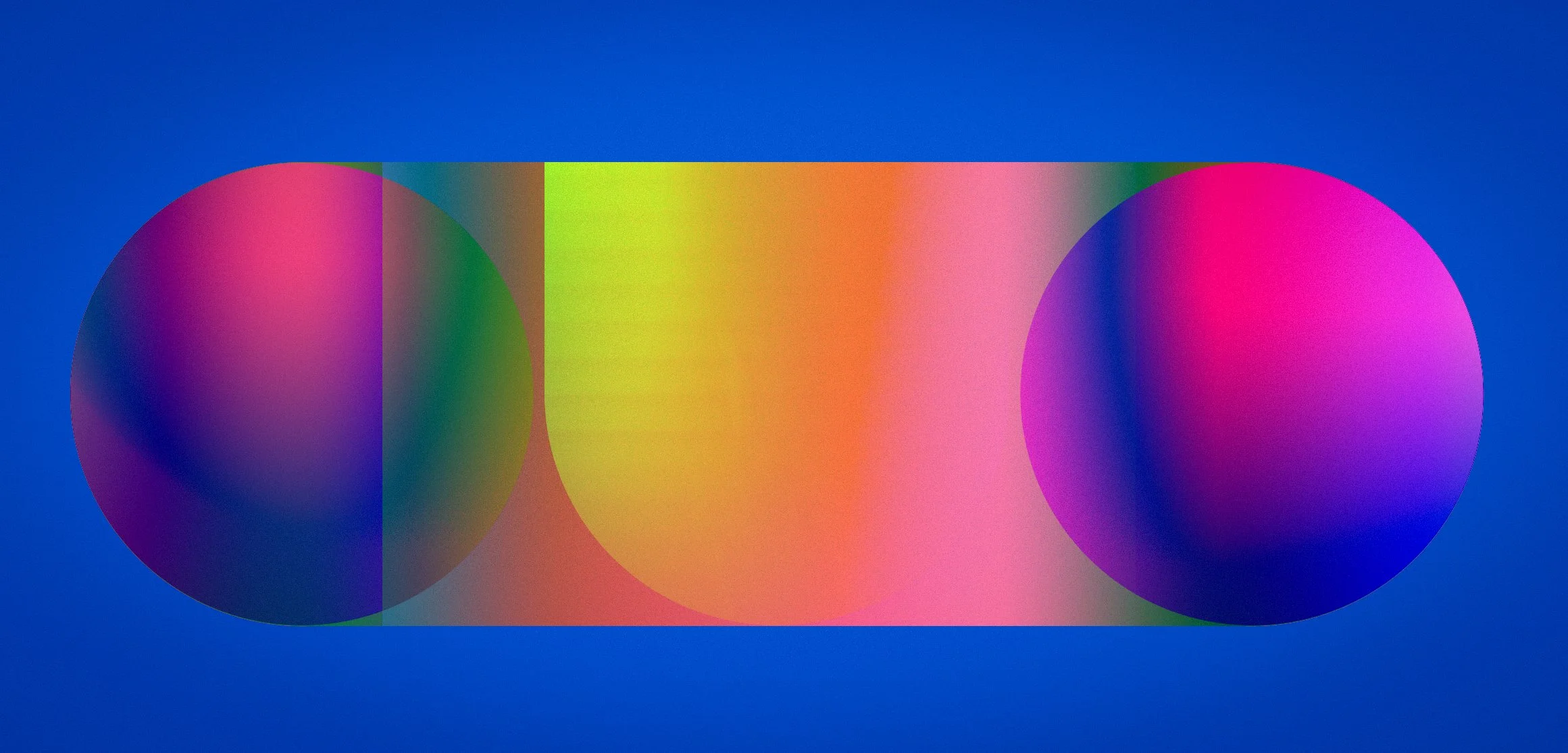
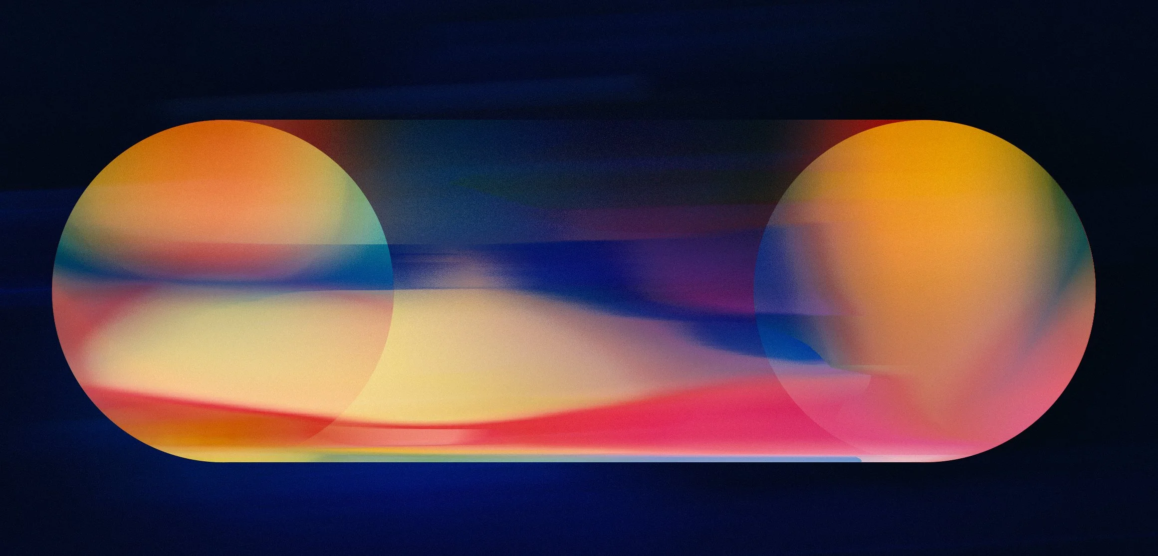
Initial exploration focused on transparency, colour interaction, spatial layering and graphic rhythm. The objective was to establish a system that could feel both atmospheric and structured while remaining adaptable across different scales and environments.
GRAPHIC & STRUCTURAL STUDIES
TRANSPARENCY & MOTION BEHAVIOUR
Phase 02
ATMOSPHERIC DISTILLATION
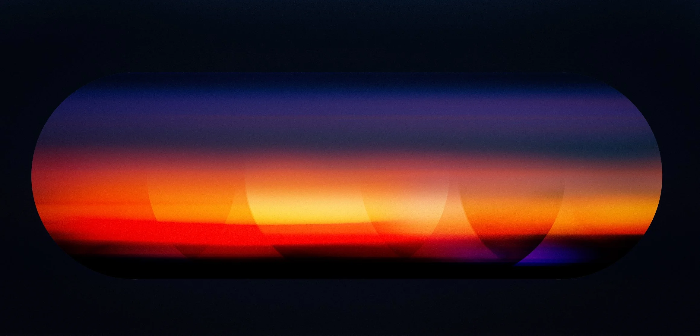
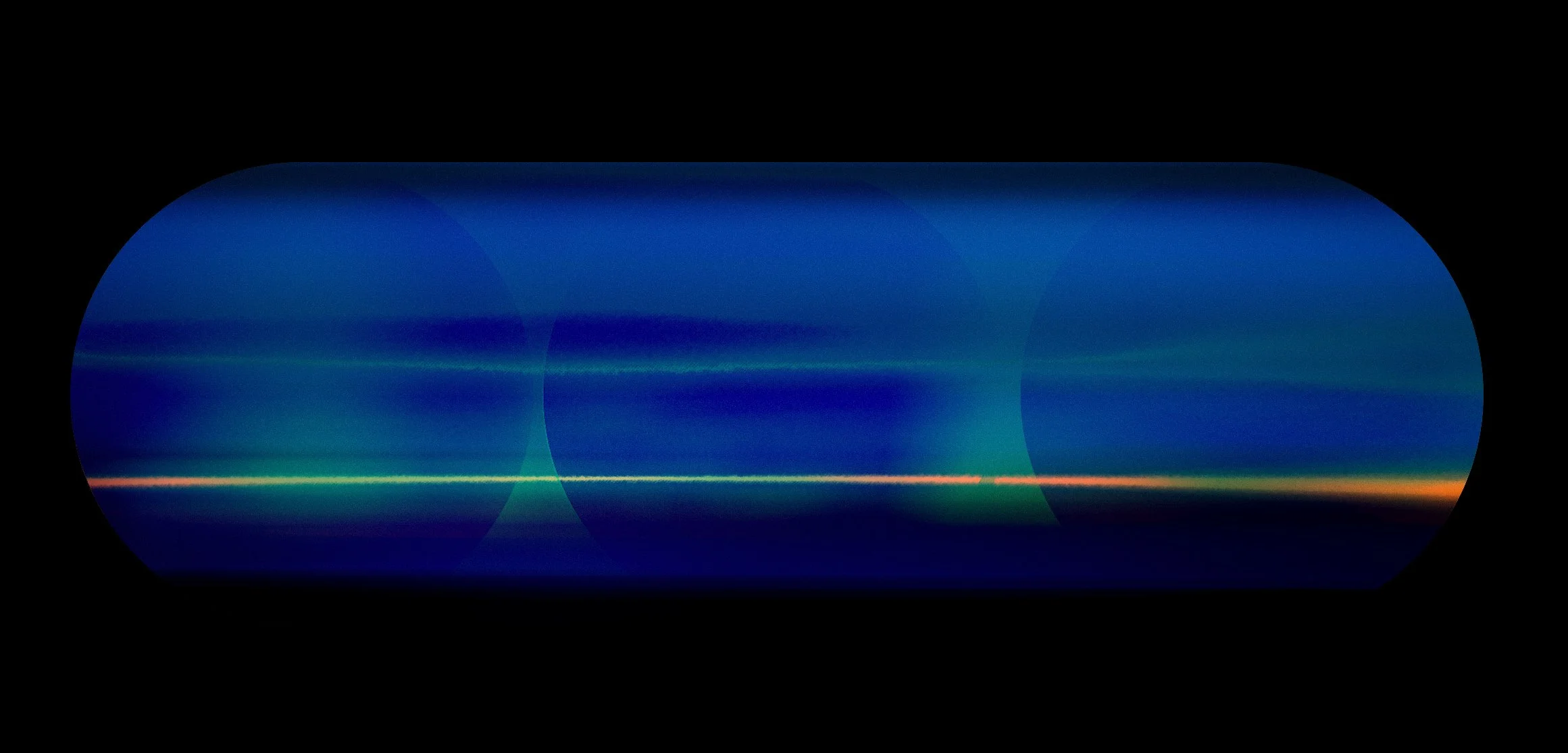
Following the development of the core visual language, exploration shifted towards reduction and atmosphere. Earlier graphic elements were progressively removed, allowing colour, light and transparency to become the primary carriers of meaning.
The objective was to determine how much visual information could be stripped away while retaining a sense of motion, depth and emotional resonance within the fixed screen architecture.
Phase 03
Material & OPTICAL SYSTEMS
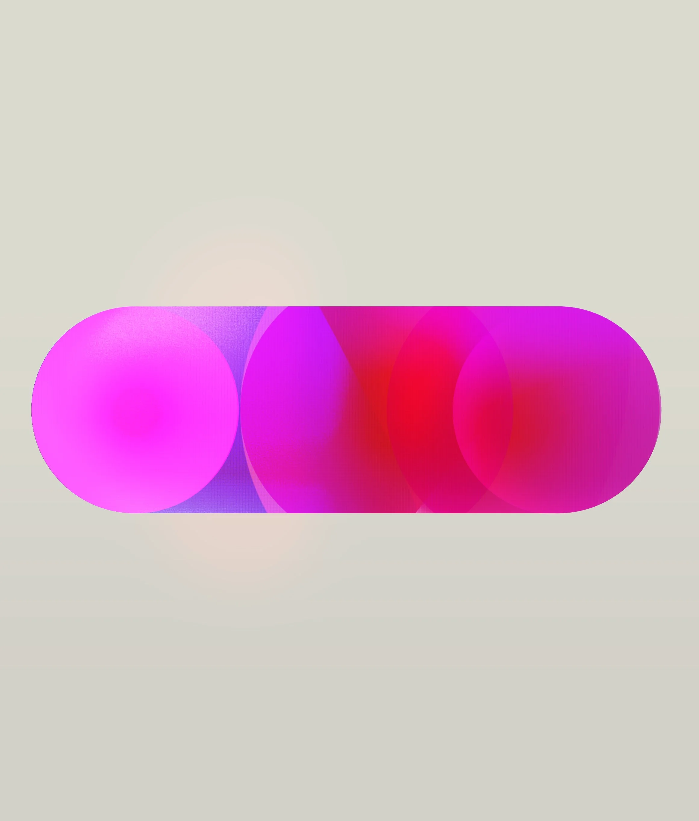
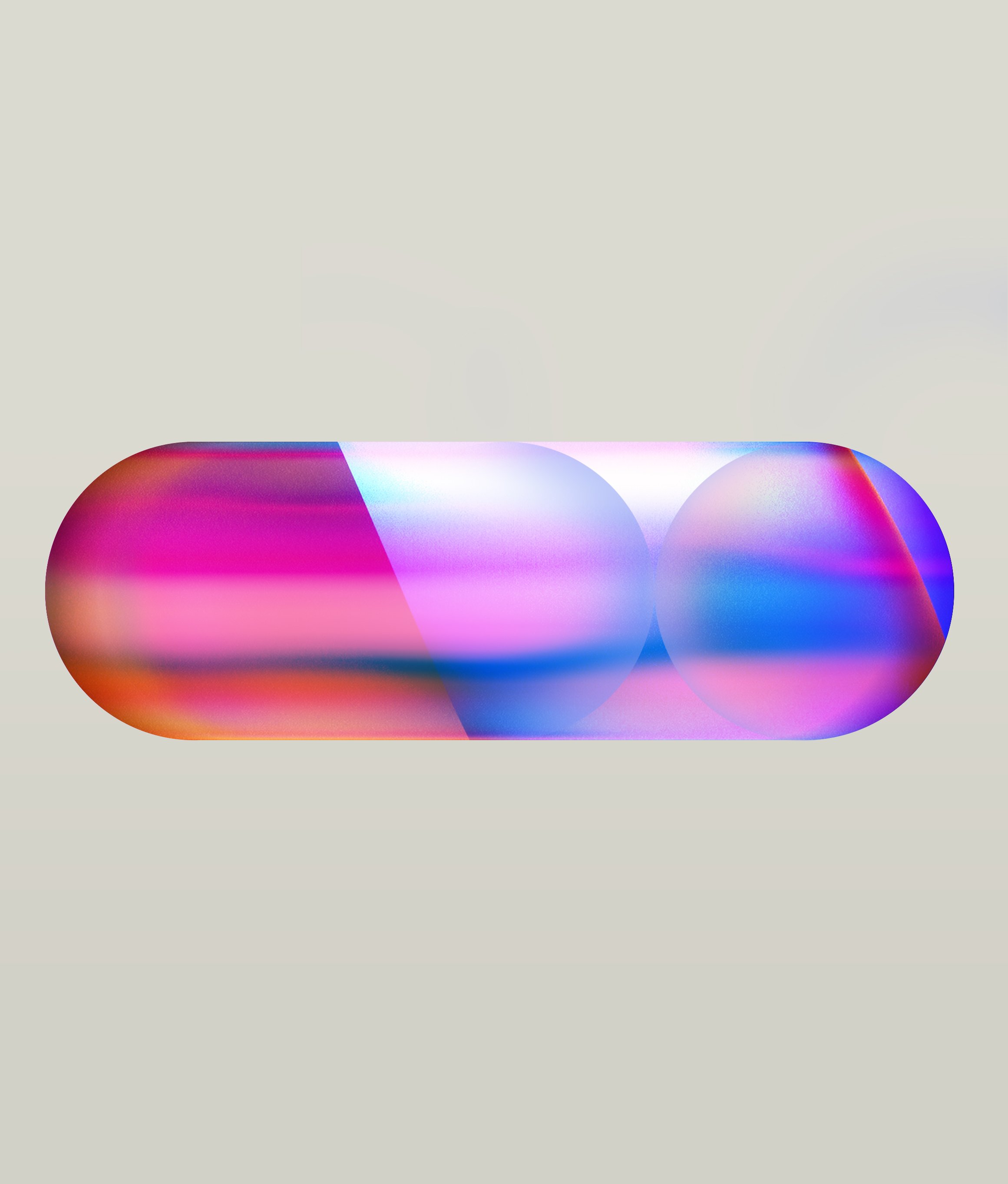
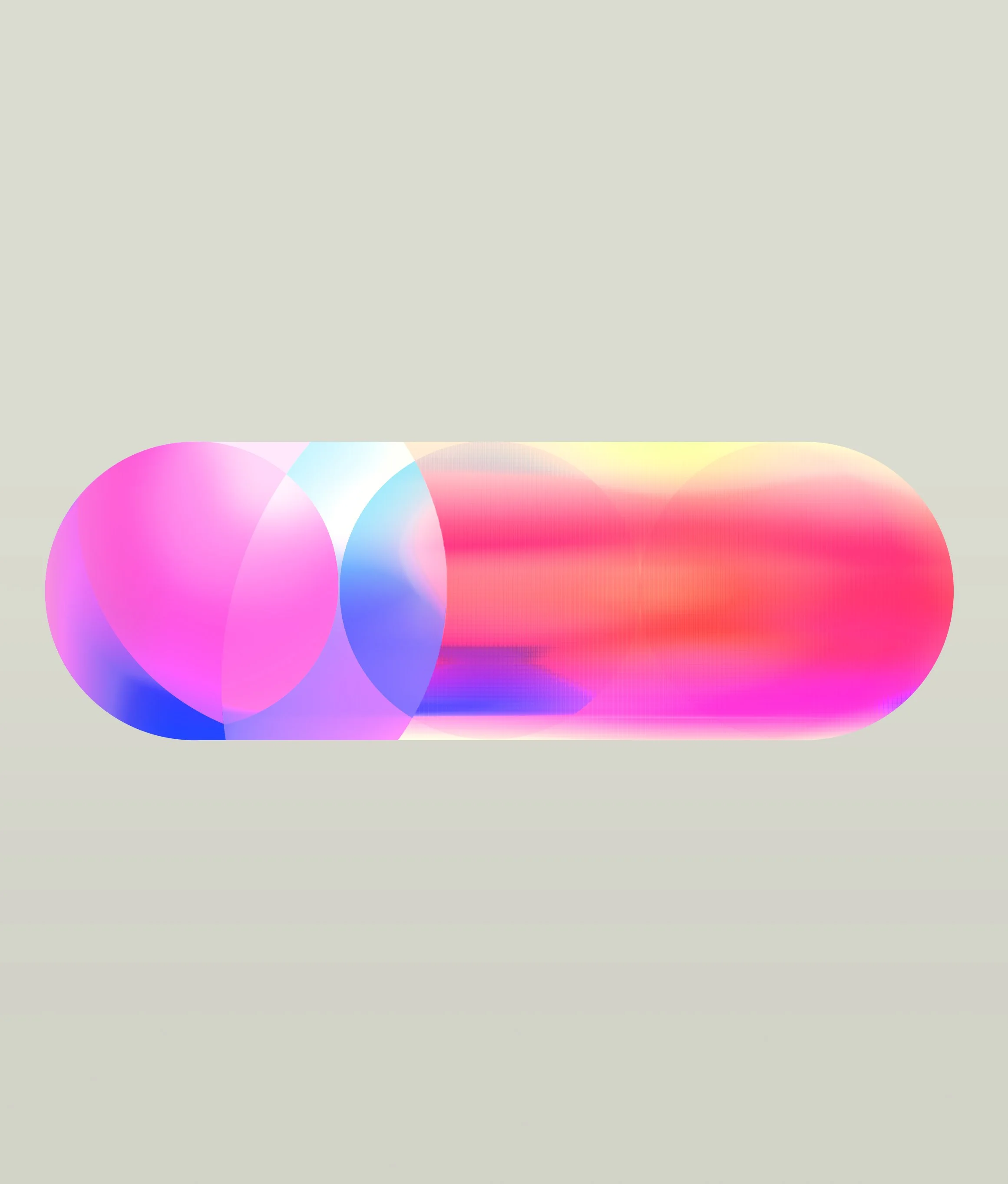
Following the establishment of the core visual language and atmospheric studies, exploration focused on material qualities within the screen architecture.
The objective was to understand how transparency, layering, overlap and colour interaction could create depth, movement and visual richness without introducing additional graphic complexity.
Rather than defining new forms, the phase investigated how existing forms could behave as materials, producing a more immersive and luminous visual experience.
TRANSPARENCY STUDIES
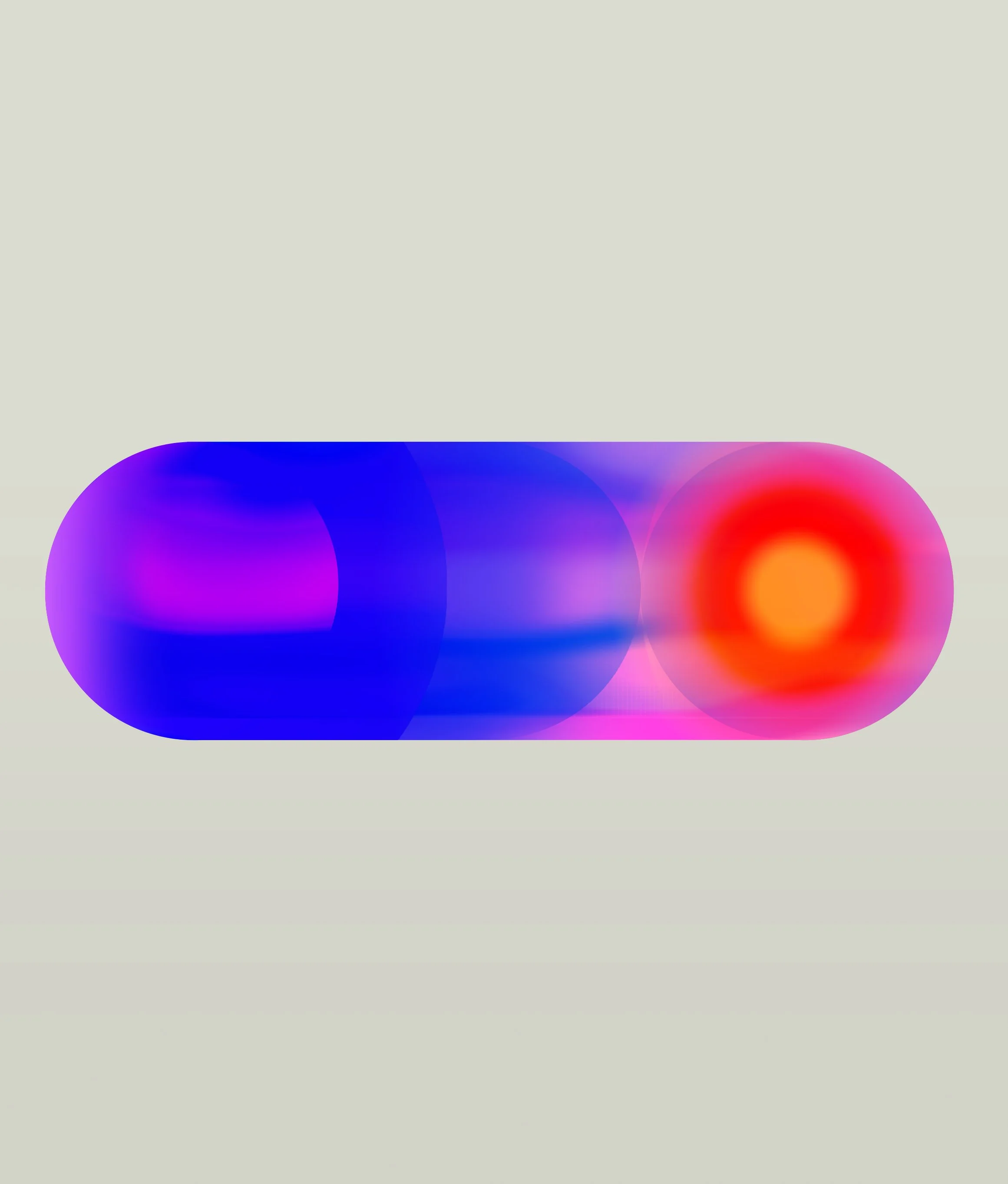
REFRACTION & LENS BEHAVIOUR
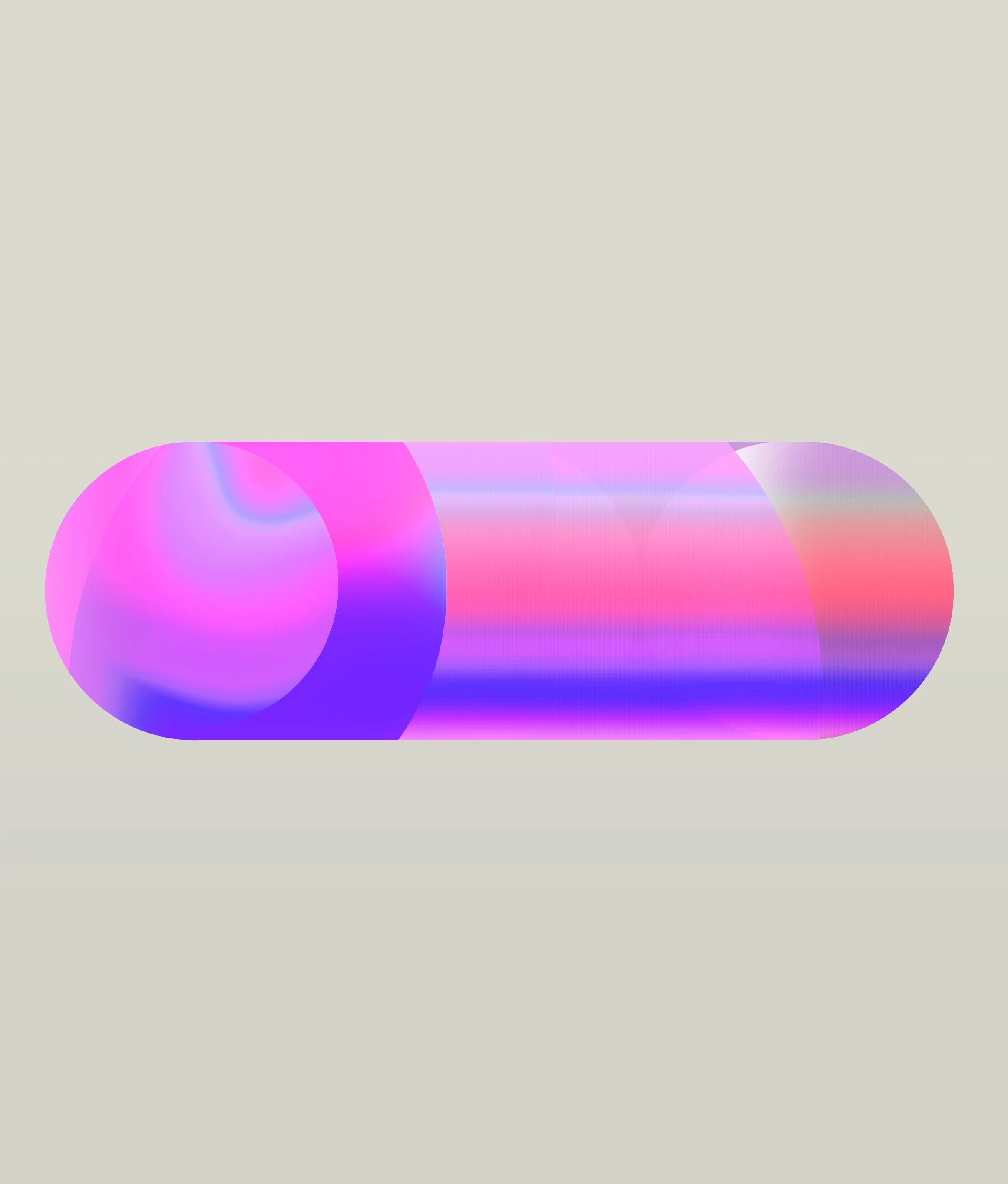
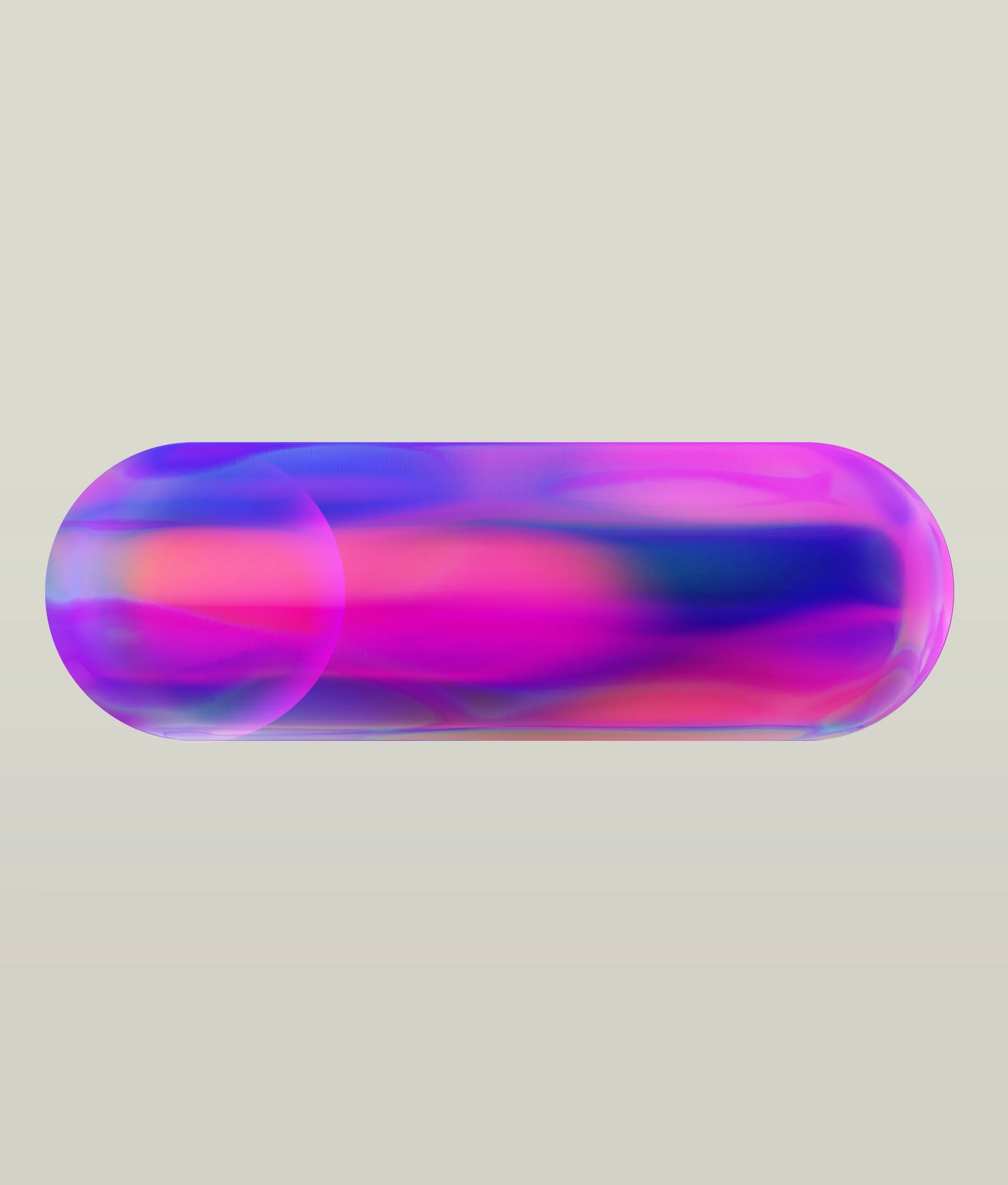
COLOUR INTERACTION STUDIES
Phase 04
SCENARIO TESTING
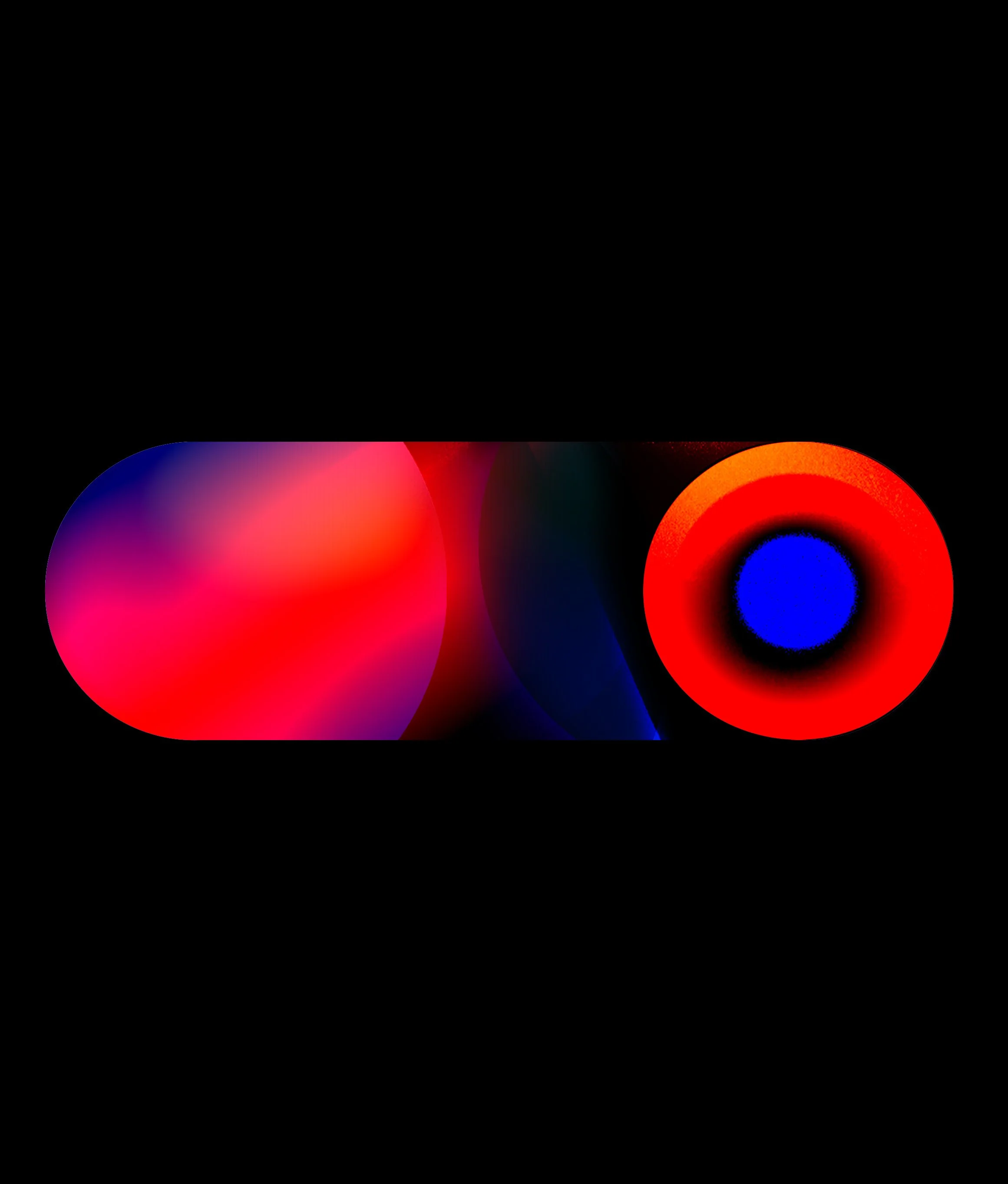
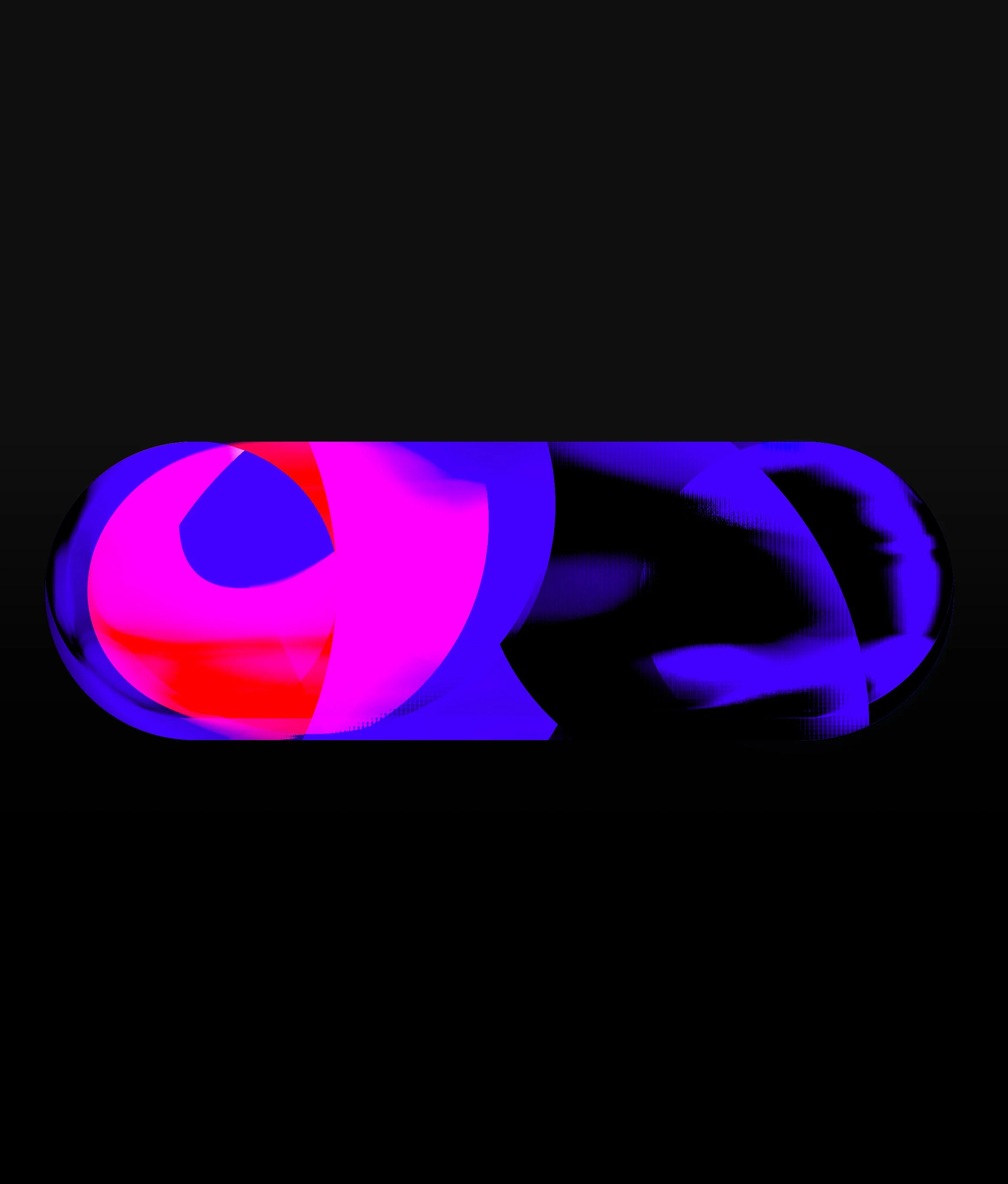
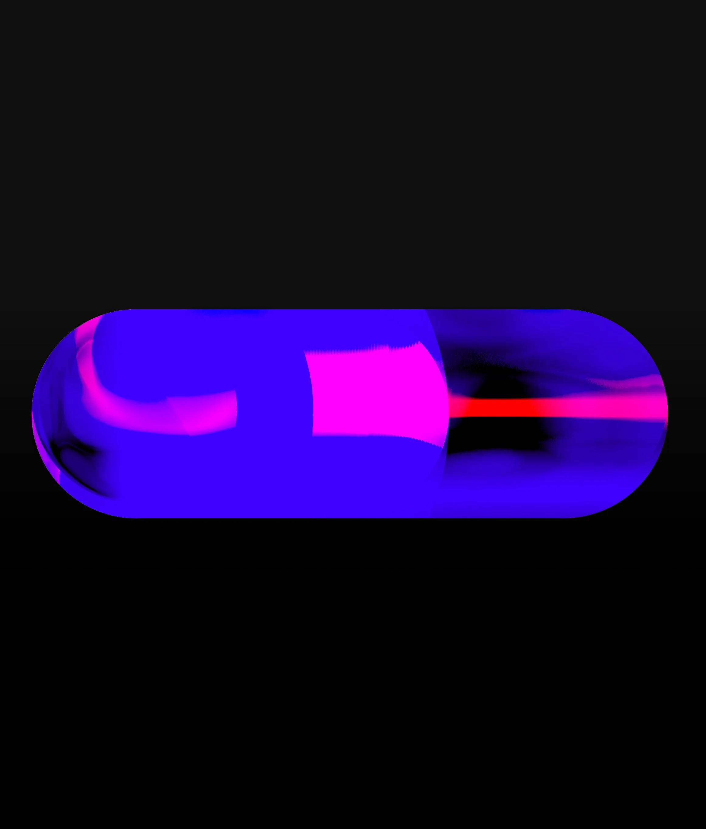
The language was tested against different environmental conditions to understand how texture, rhythm and contrast influenced perception at scale.
The objective was not to create multiple styles but to determine which visual behaviours remained legible and emotionally effective across varying conditions.
FINAL DIRECTION
SELECTED VISUAL LANGUAGE
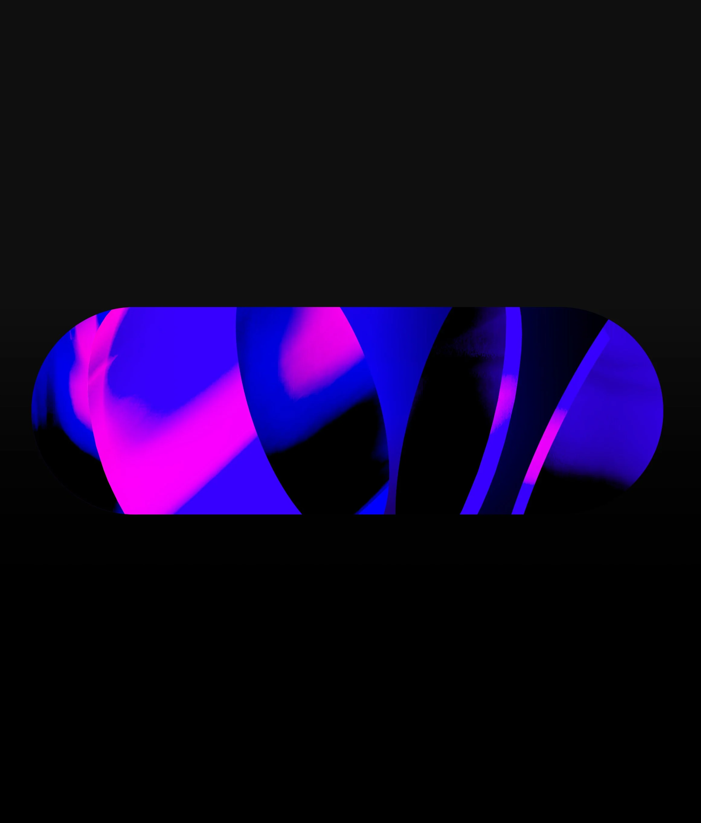
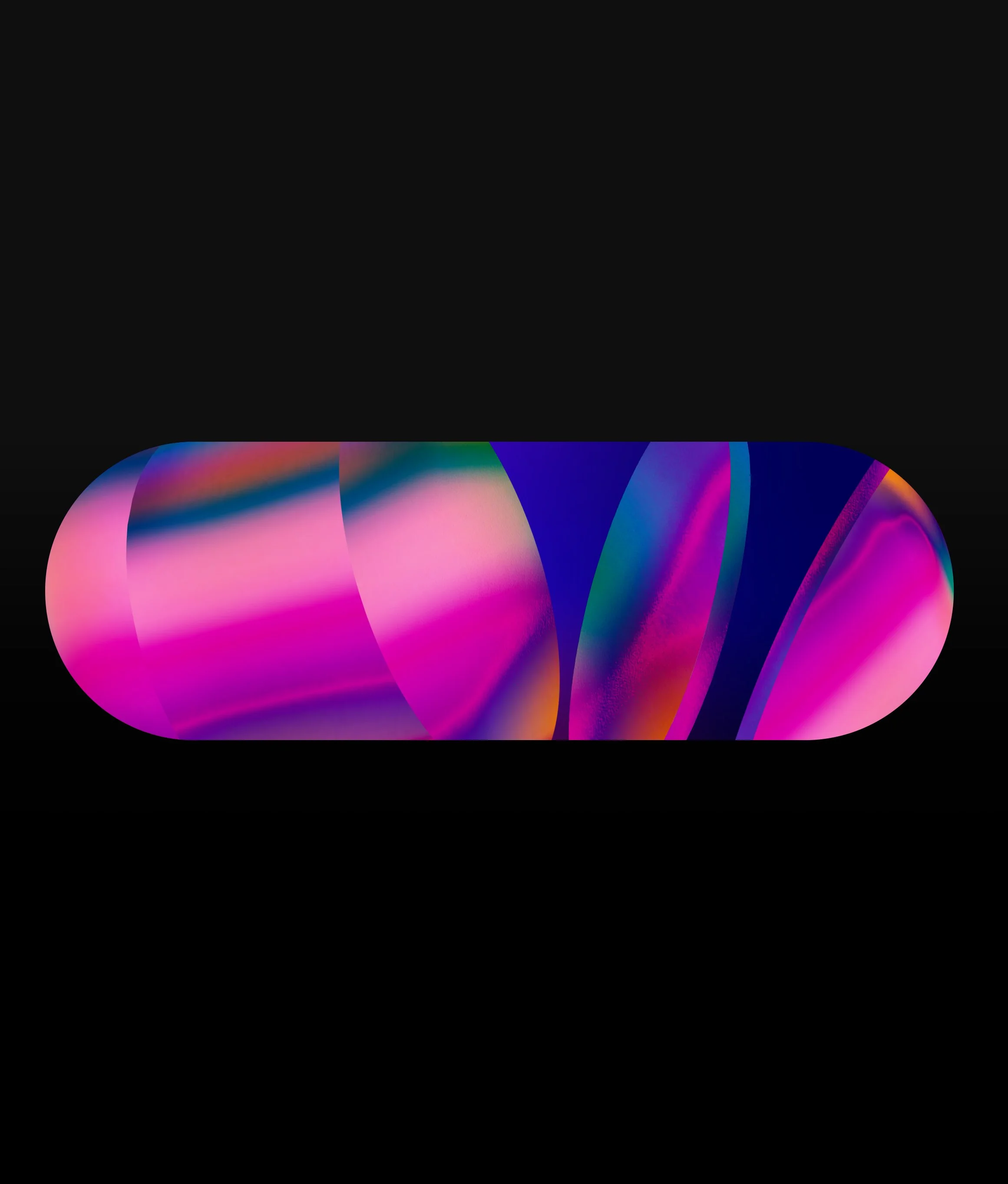
Following multiple phases of visual development, the final direction brought together the strongest qualities discovered throughout the process.
The selected language balanced atmosphere, materiality and graphic clarity while remaining adaptable across different content requirements and environmental conditions.
Working within the fixed lozenge architecture of the event screens, the system provided a flexible framework capable of supporting both ambient and high-energy visual moments.
Environmental Visualisation
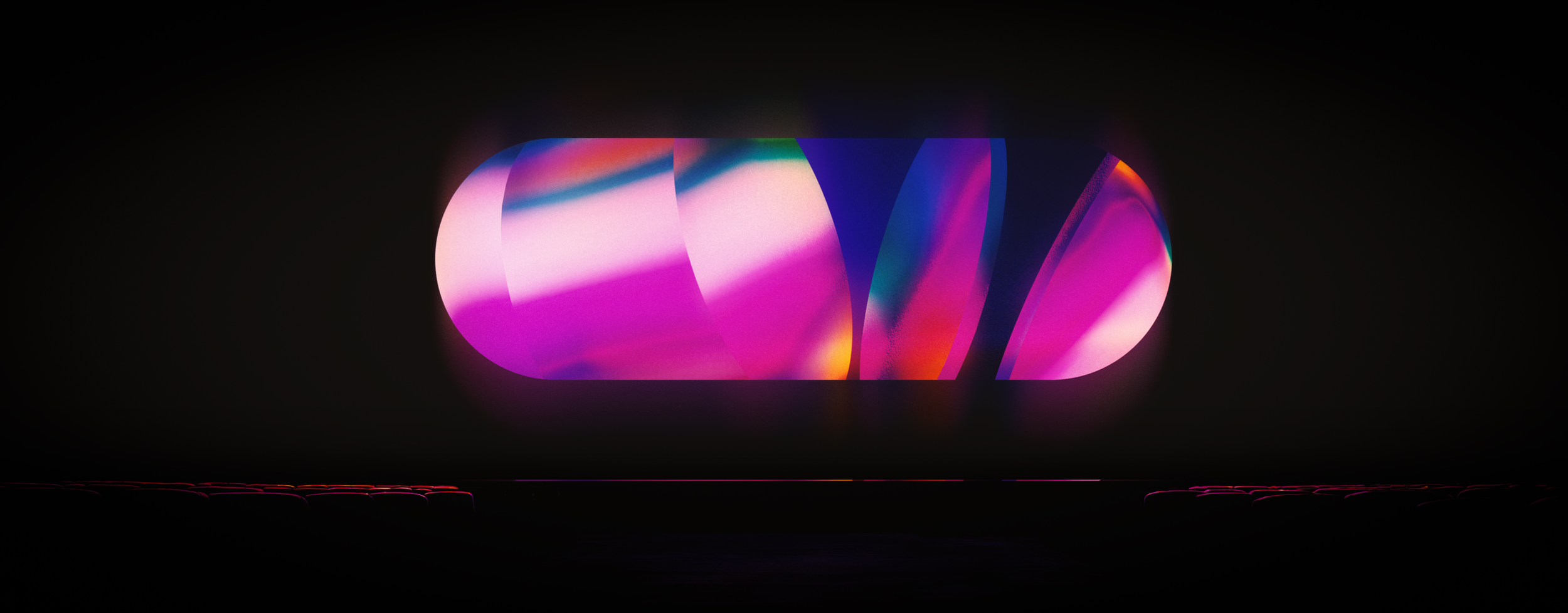
TESTING THE SELECTED DIRECTION WITHIN THE EVENT SPACE
The visual language was composited into the auditorium to evaluate scale, contrast, and atmosphere within its intended environment. Viewing the work in context helped ensure the graphics responded to the architecture and audience experience as a coherent whole.
RESULT
The visual system became a defining component of the project’s creative development, transforming the fixed lozenge-shaped screen architecture into a flexible and expressive visual platform.
Through successive stages of exploration, the language evolved from graphic structure into a richer material and atmospheric system, capable of supporting both ambient environmental content and more energetic visual moments. Transparency, colour interaction, optical layering, and scale became central characteristics of the final direction.
The resulting framework established a cohesive visual identity that could adapt across different content requirements and viewing conditions. Rather than functioning as a collection of individual visuals, the work defined a unified visual language capable of extending across the wider event environment.
Although the final direction was ultimately not implemented in its intended form due to production budget constraints, the development process successfully established a clear visual framework and demonstrated how the screen architecture could support a distinctive and immersive visual experience.
The result was a resolved visual language that balanced atmosphere, clarity, and flexibility while providing a strong foundation for future implementation.
CREDITS
Client · Expedia
Studios · Nathan Prince Studio
Role · Conceptual Direction & Visual Development
© THE CIRCLE THE SQUARE 2026. All rights reserved.