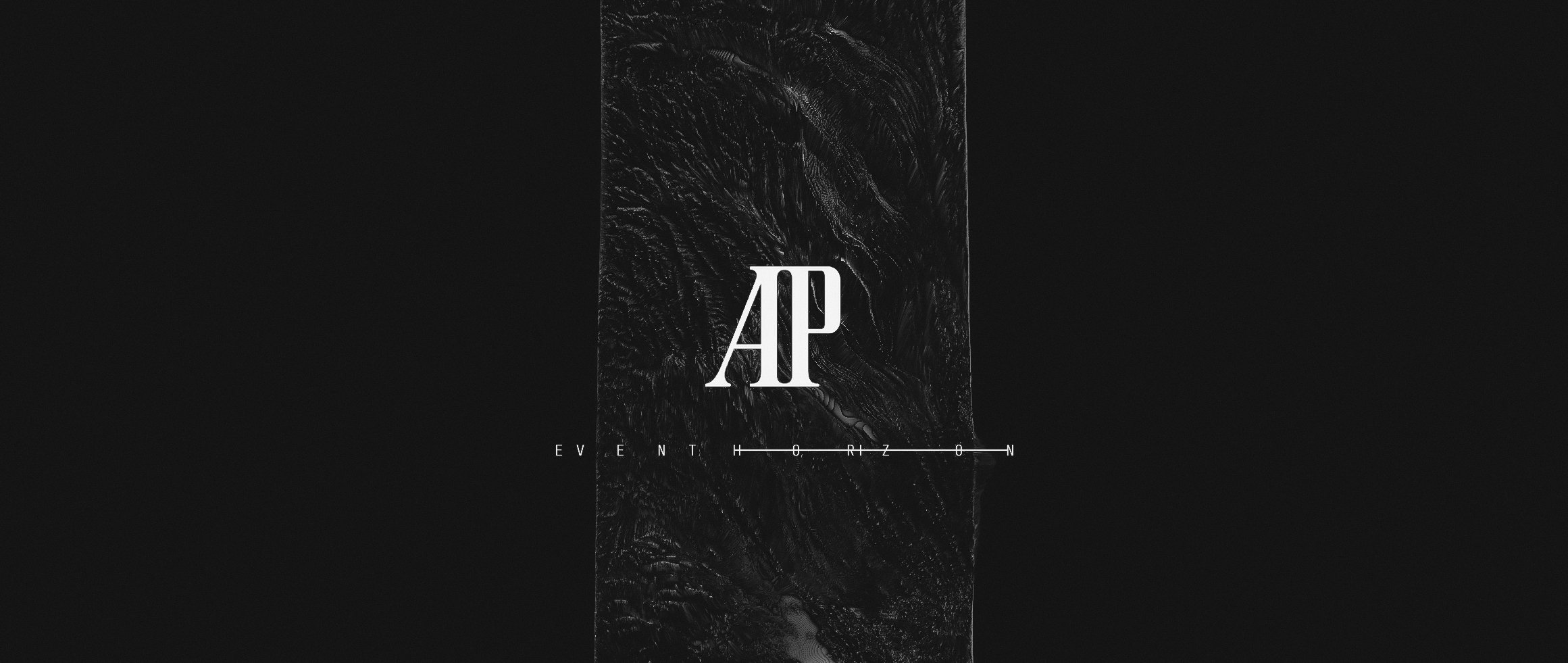
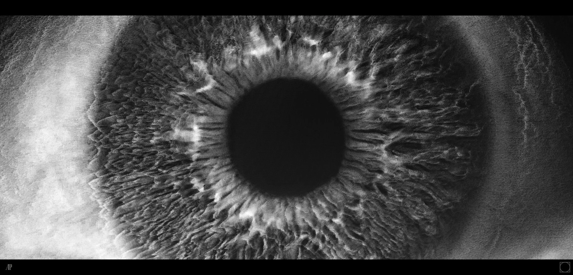
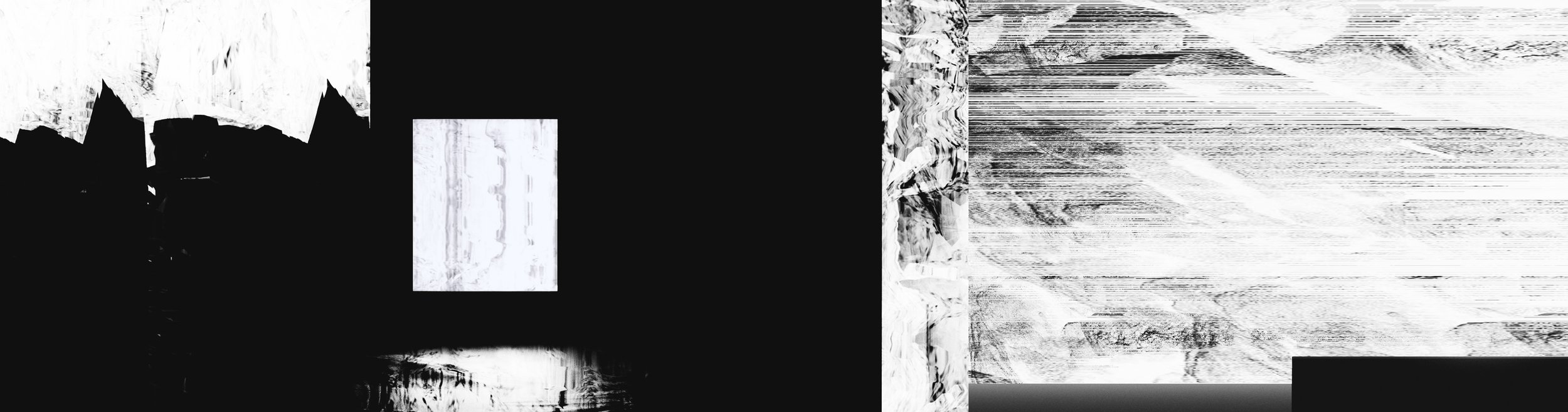
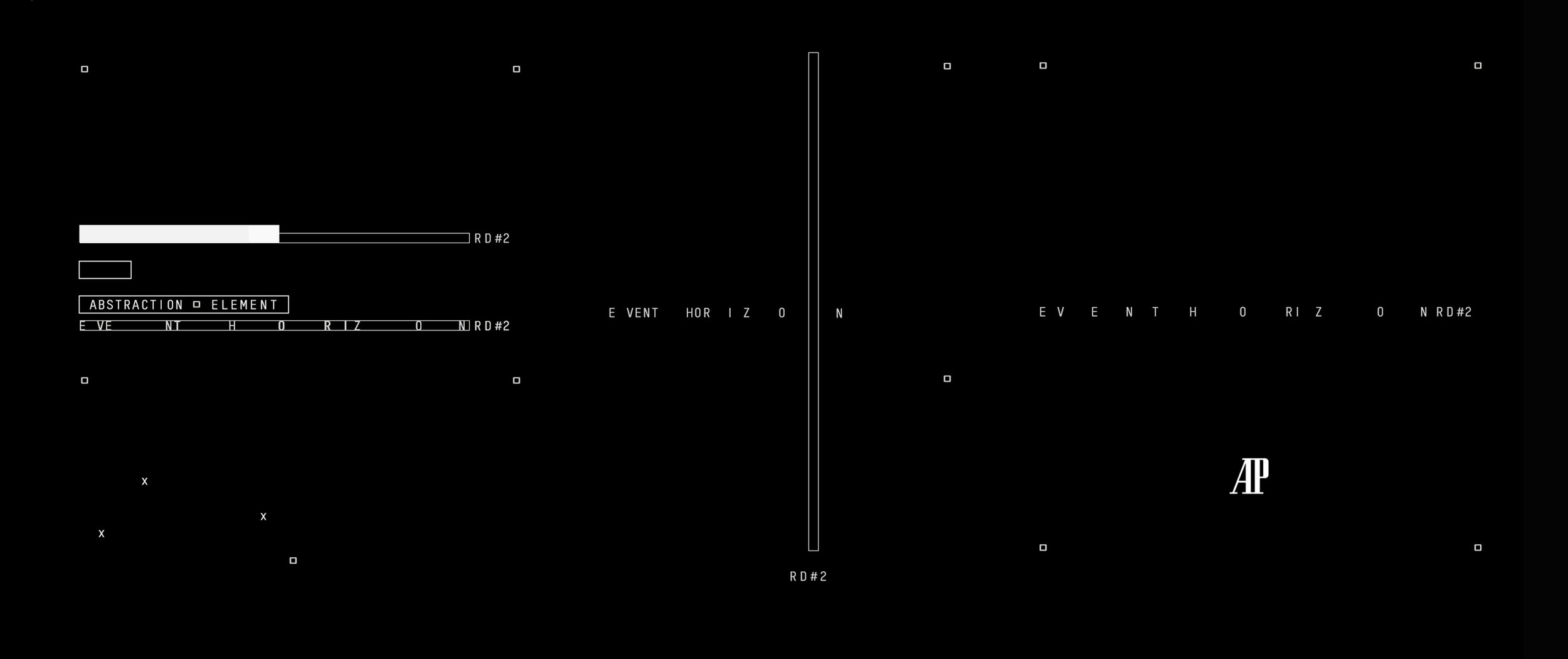
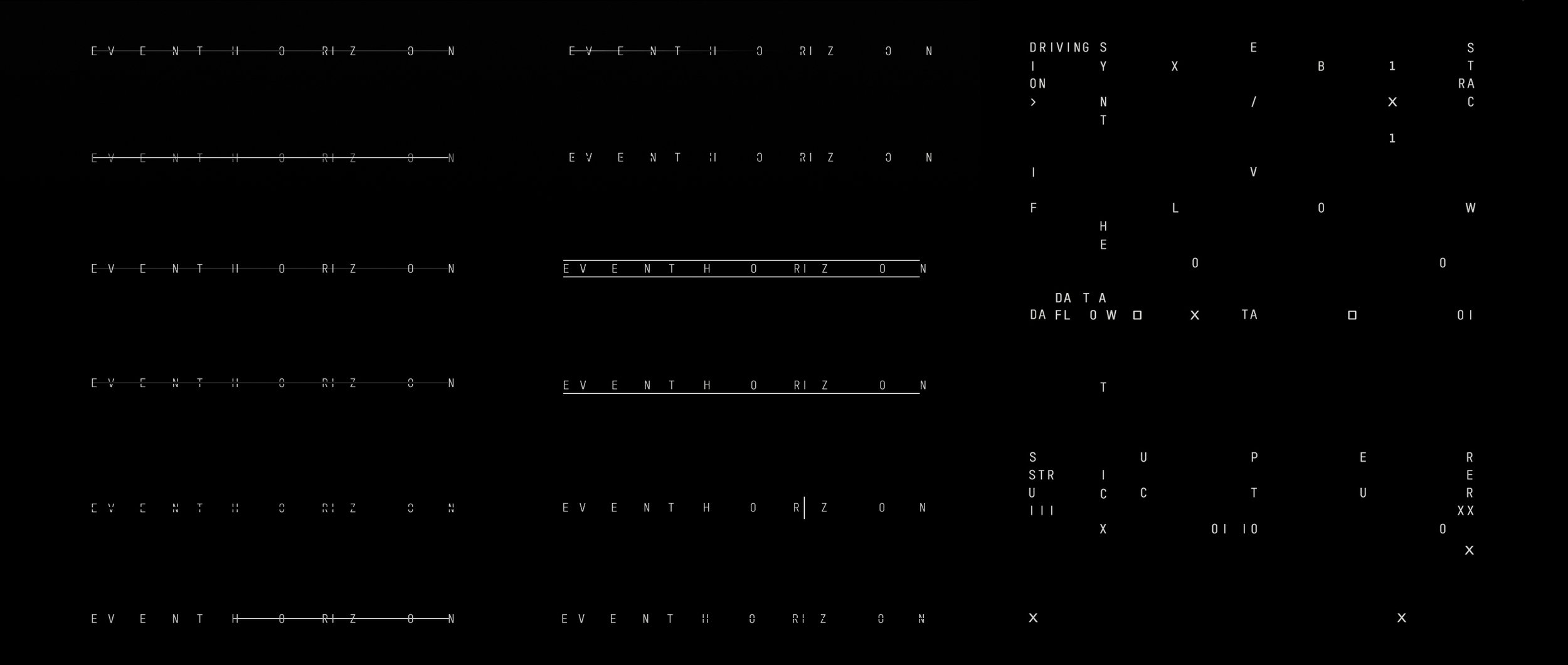
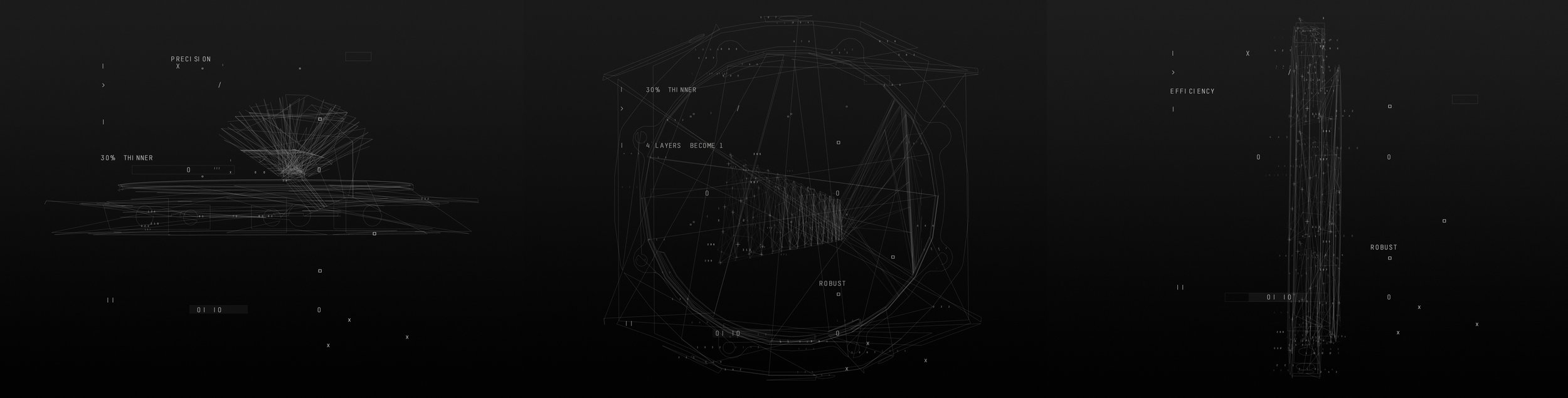
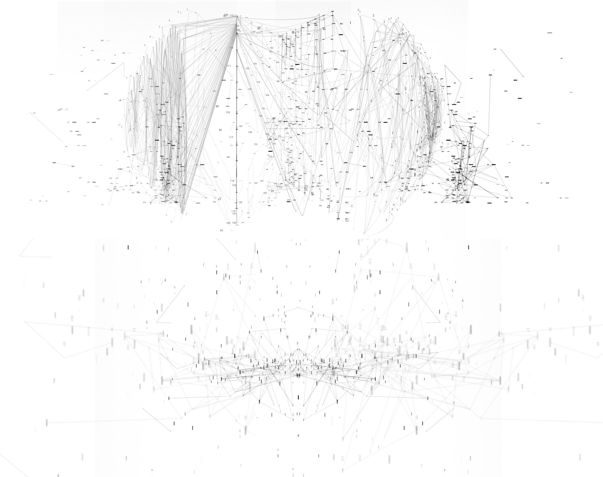
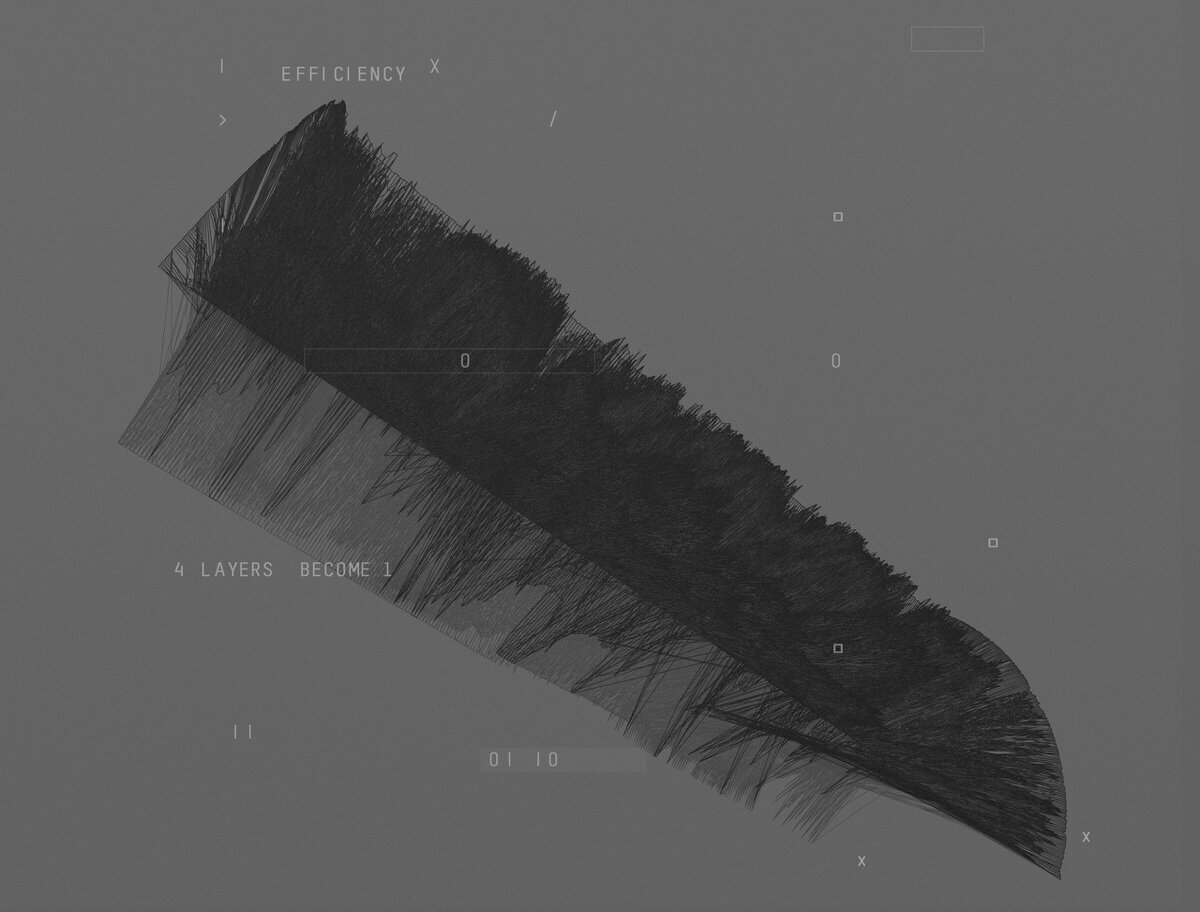
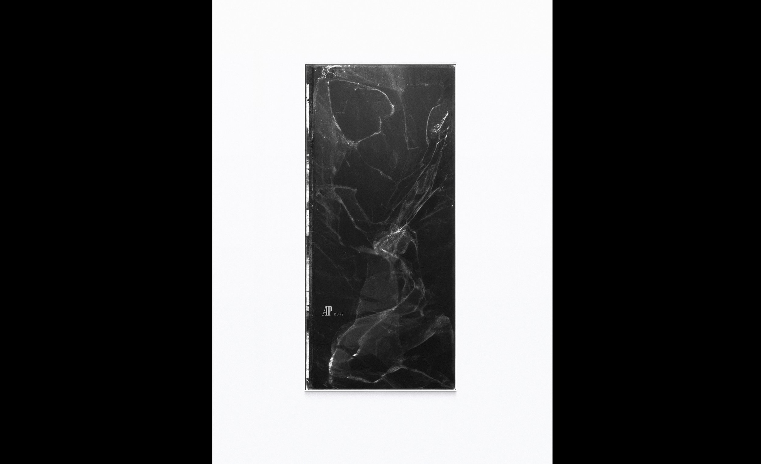
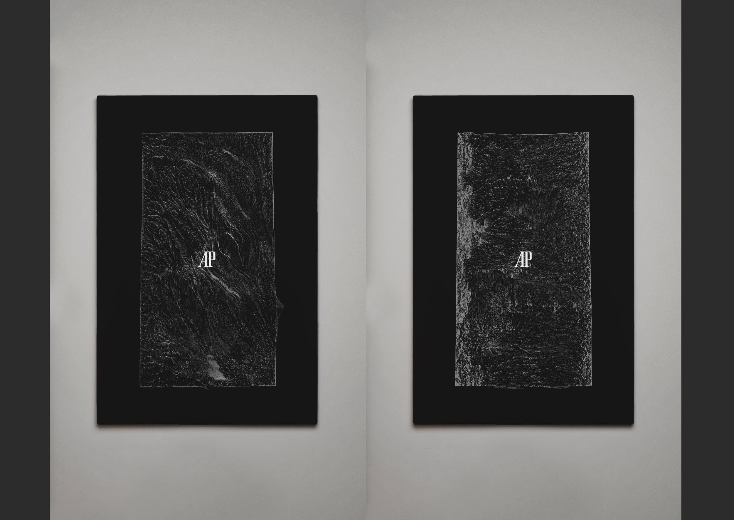
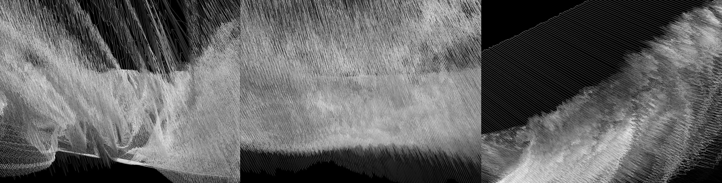
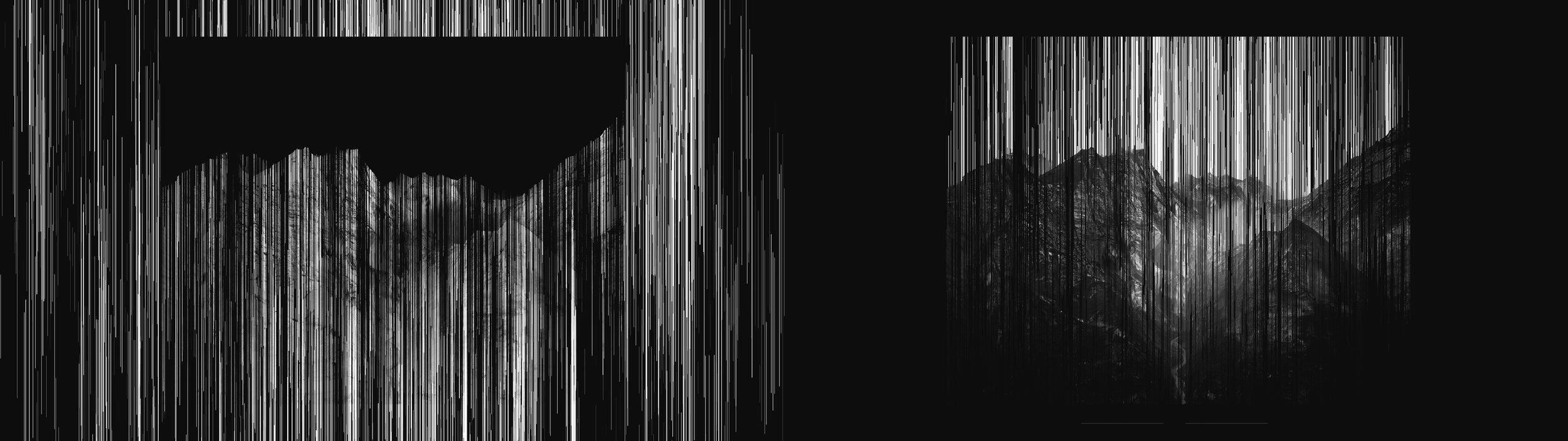
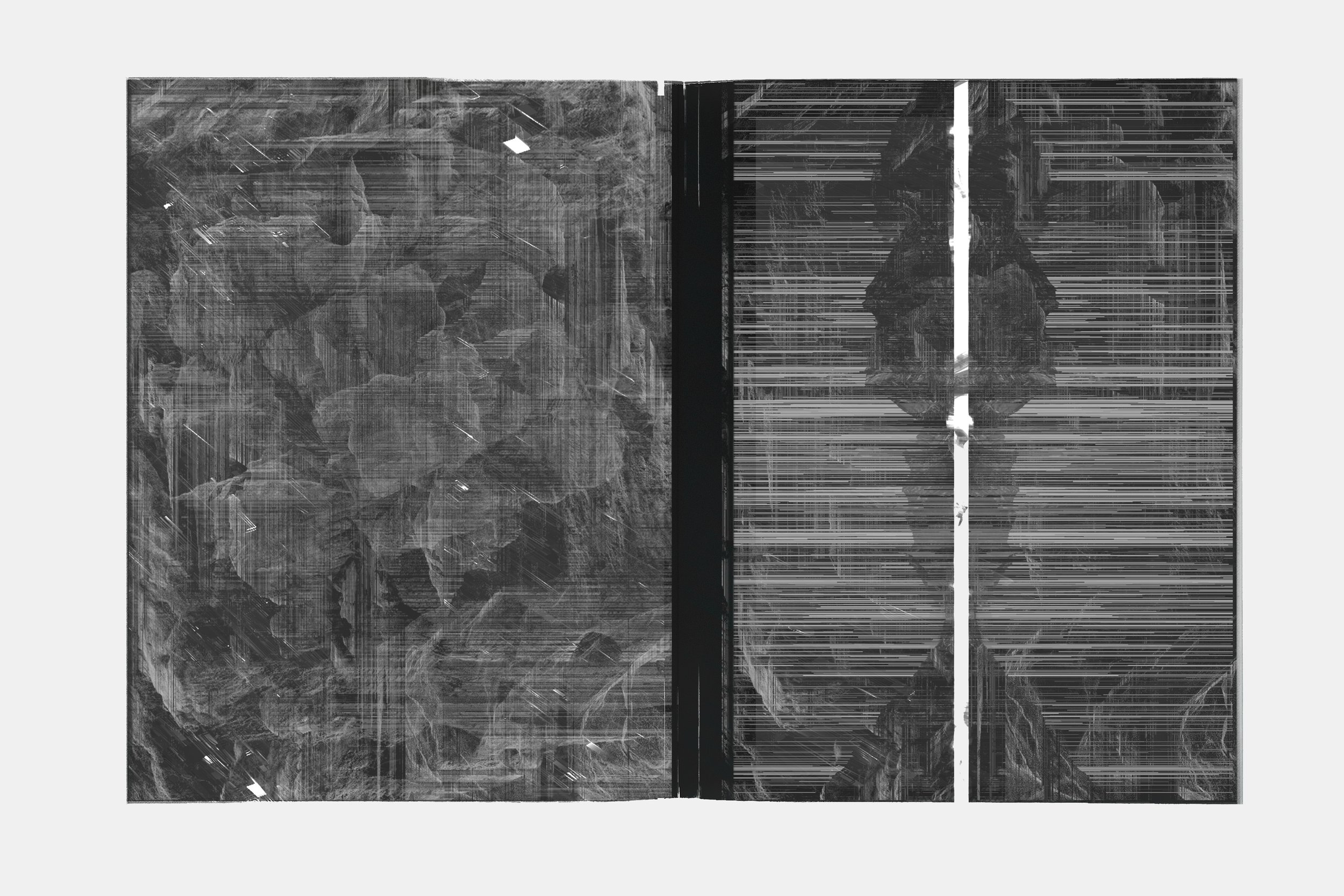
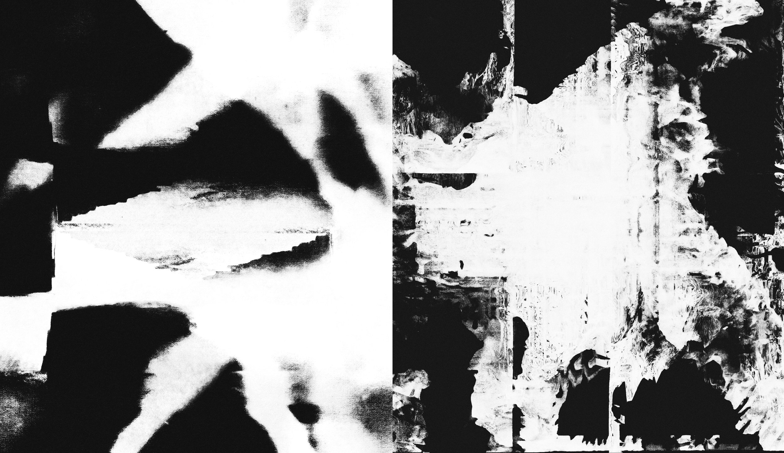
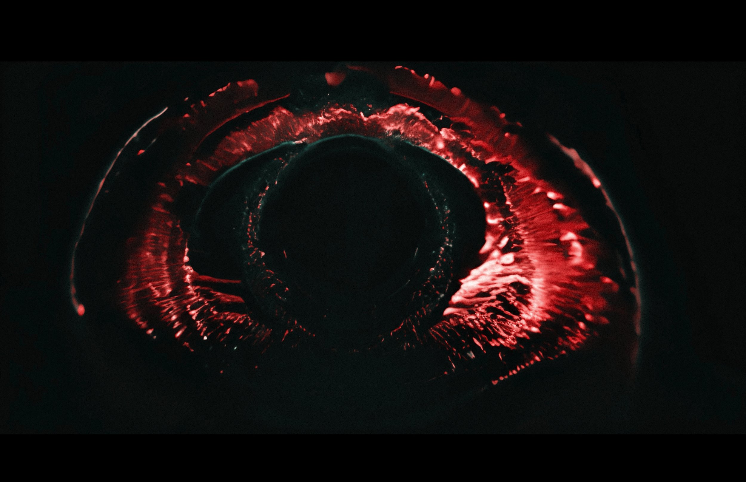
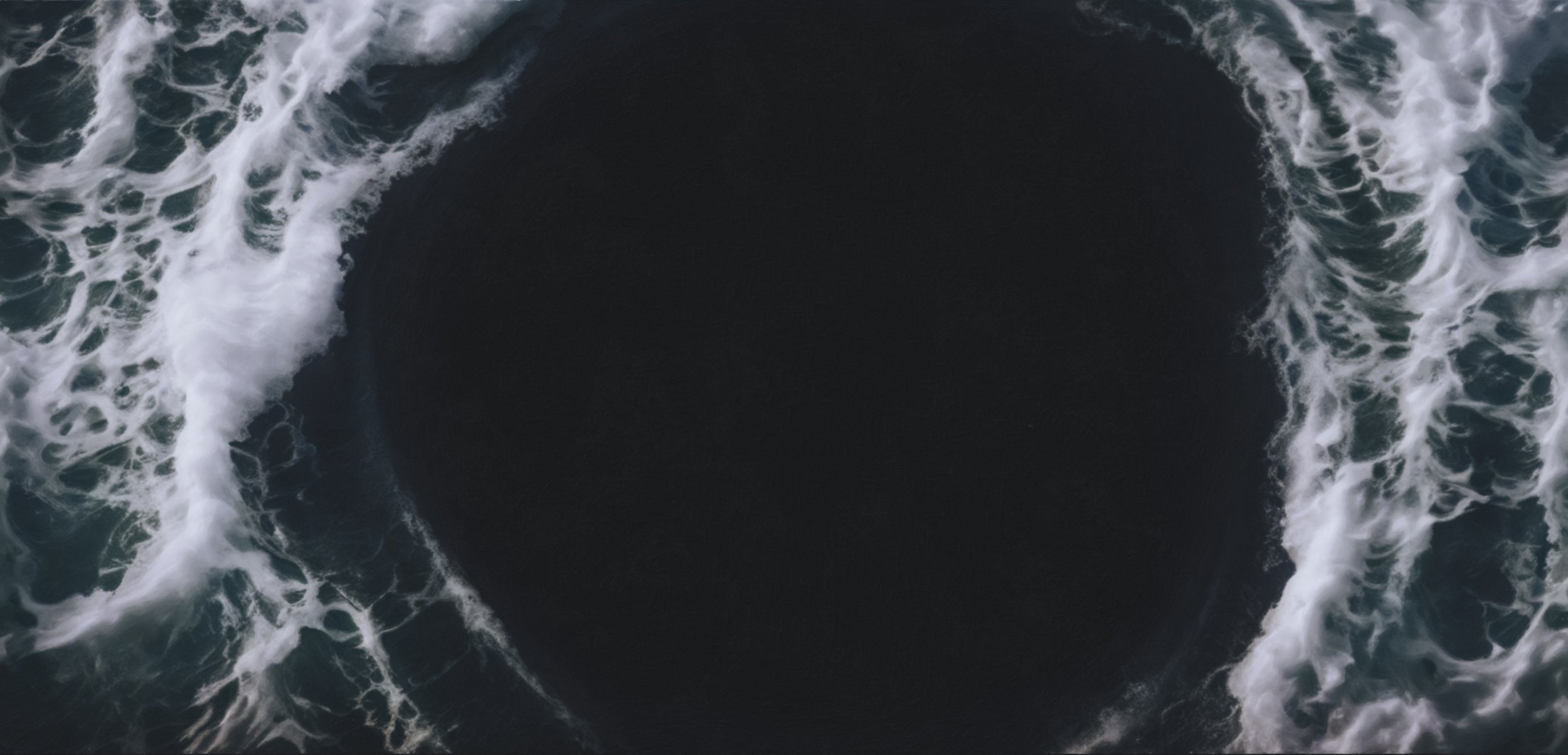
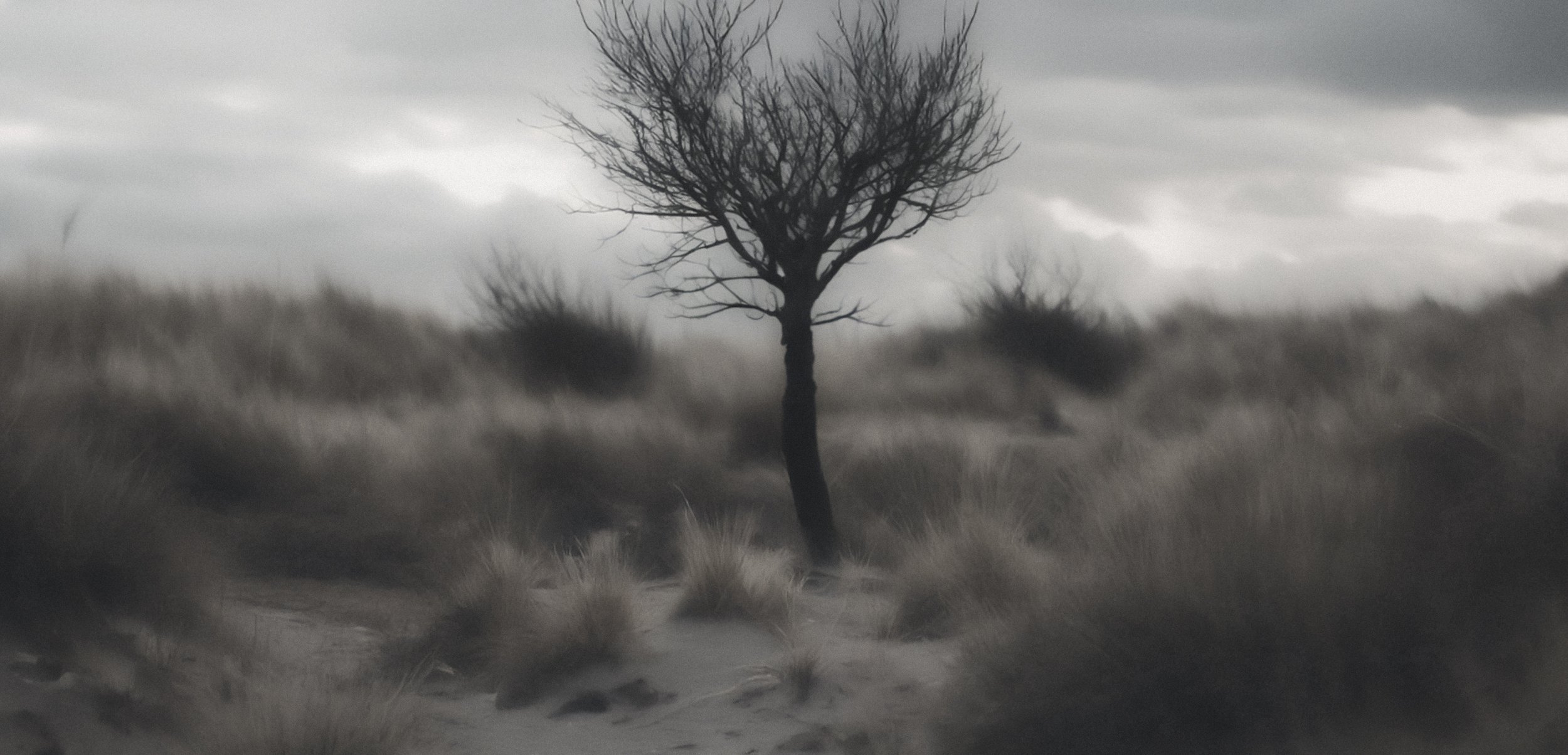
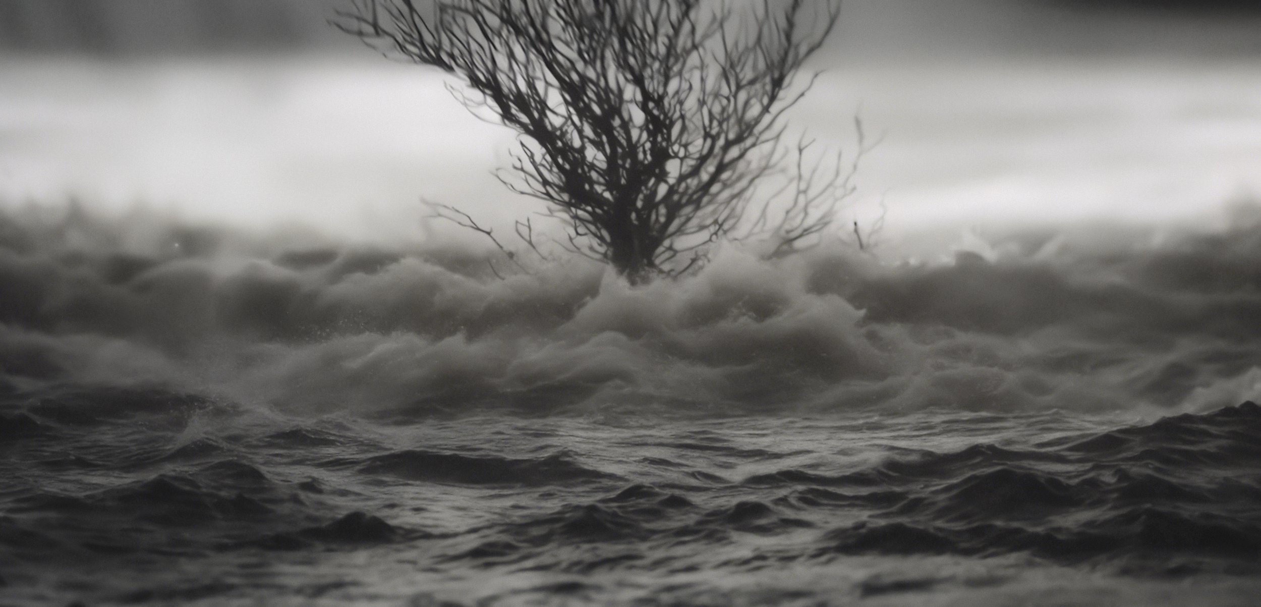
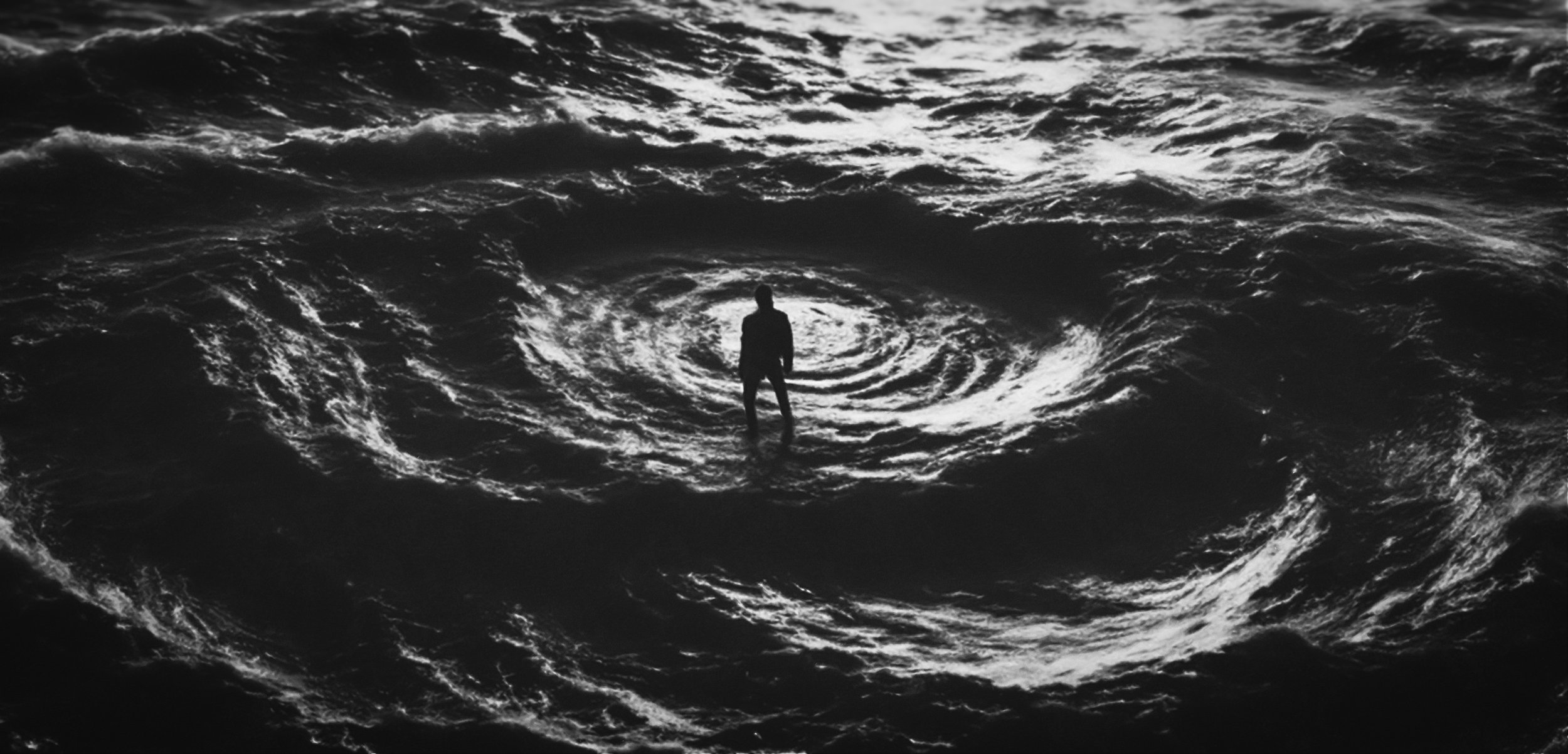
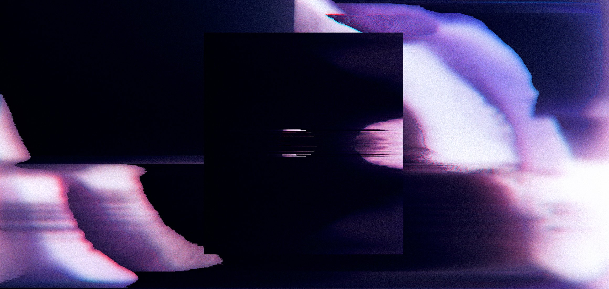
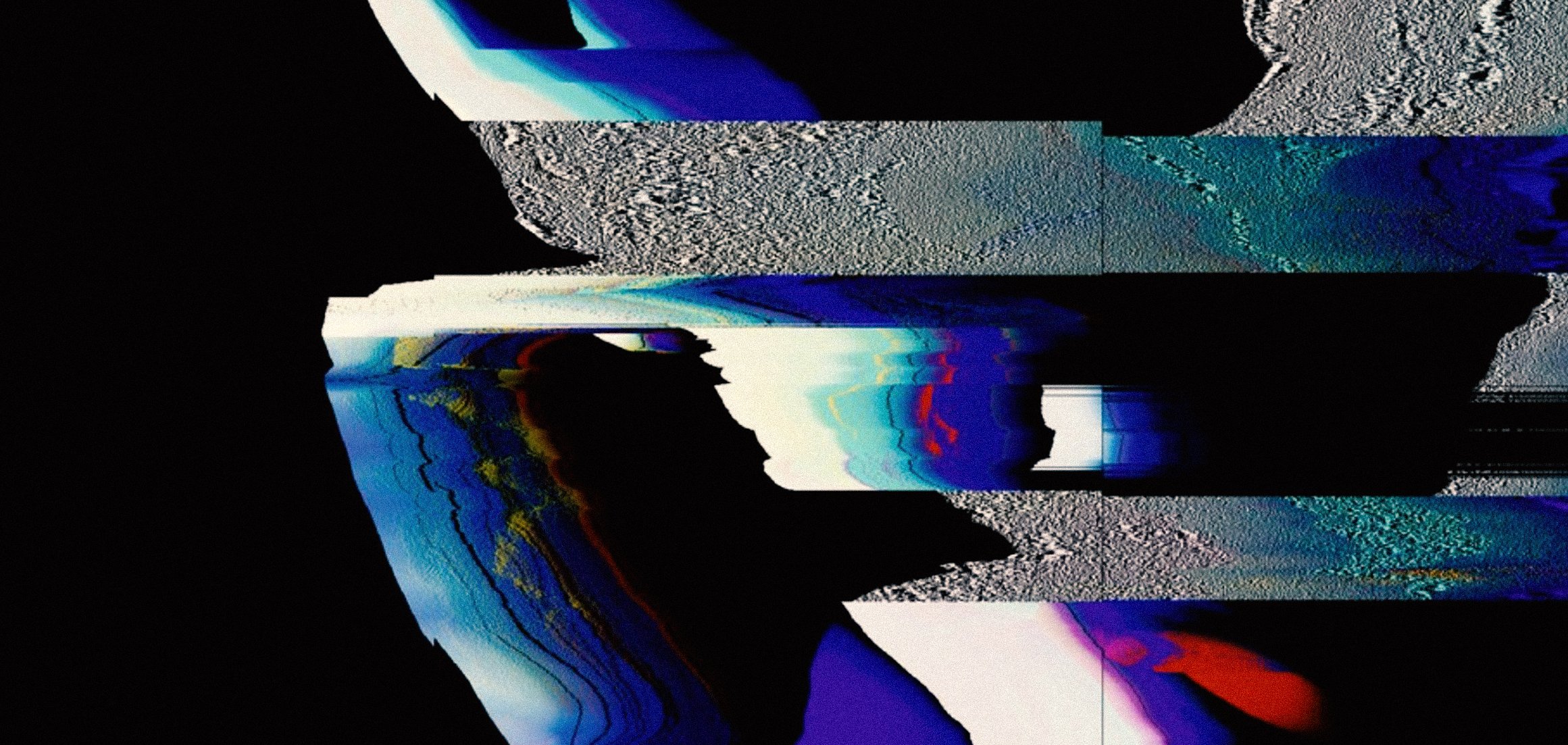
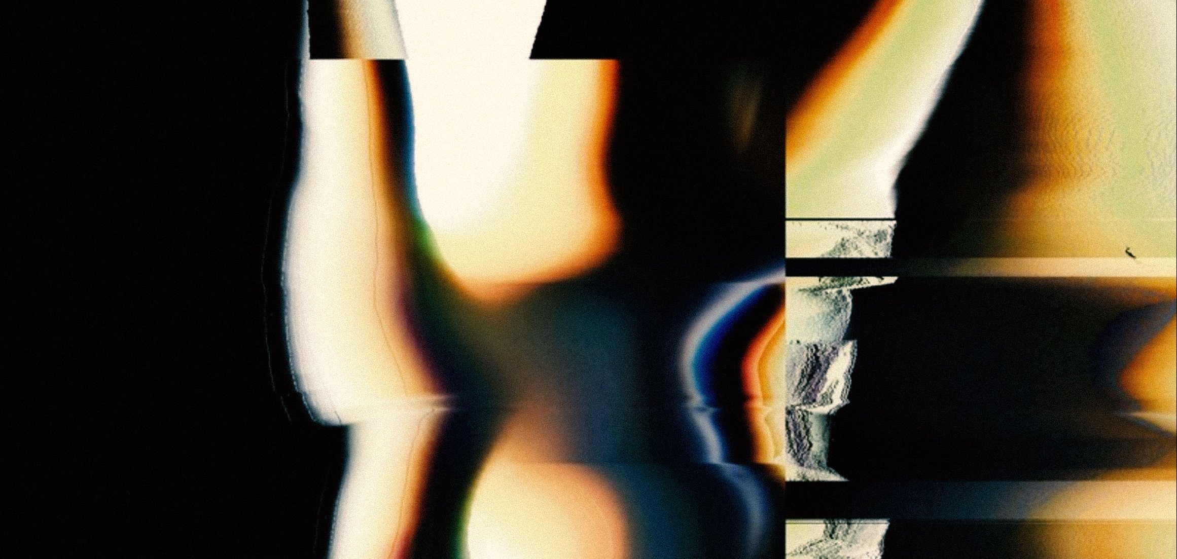
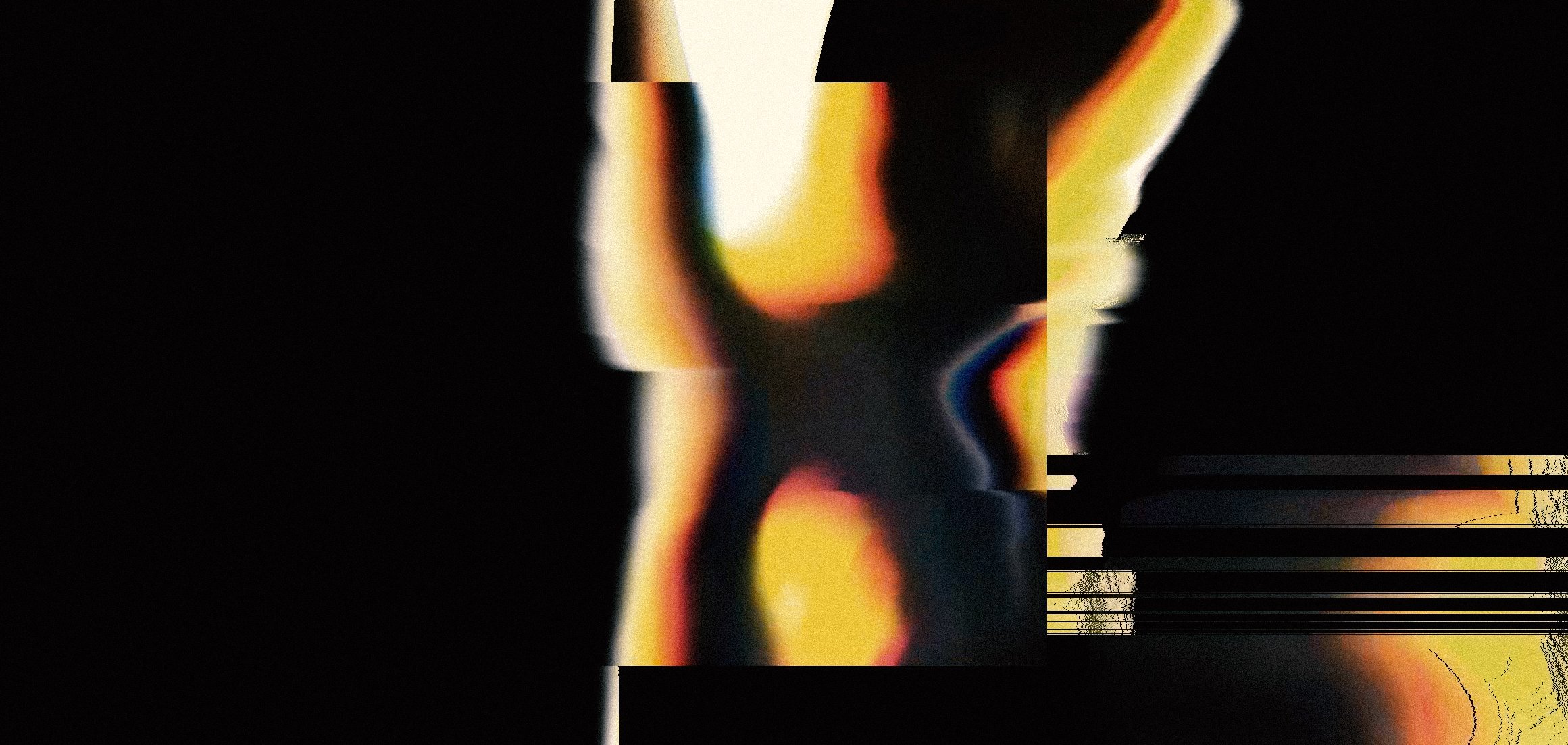
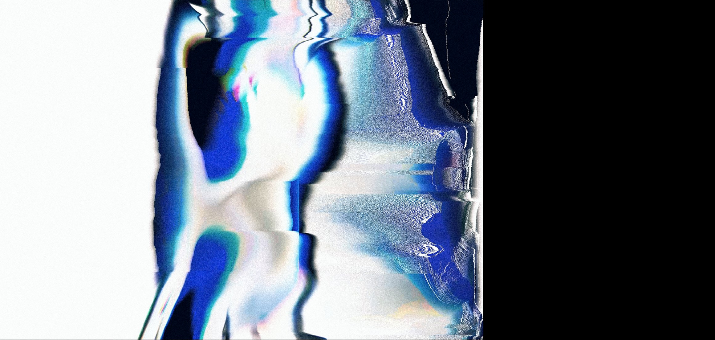
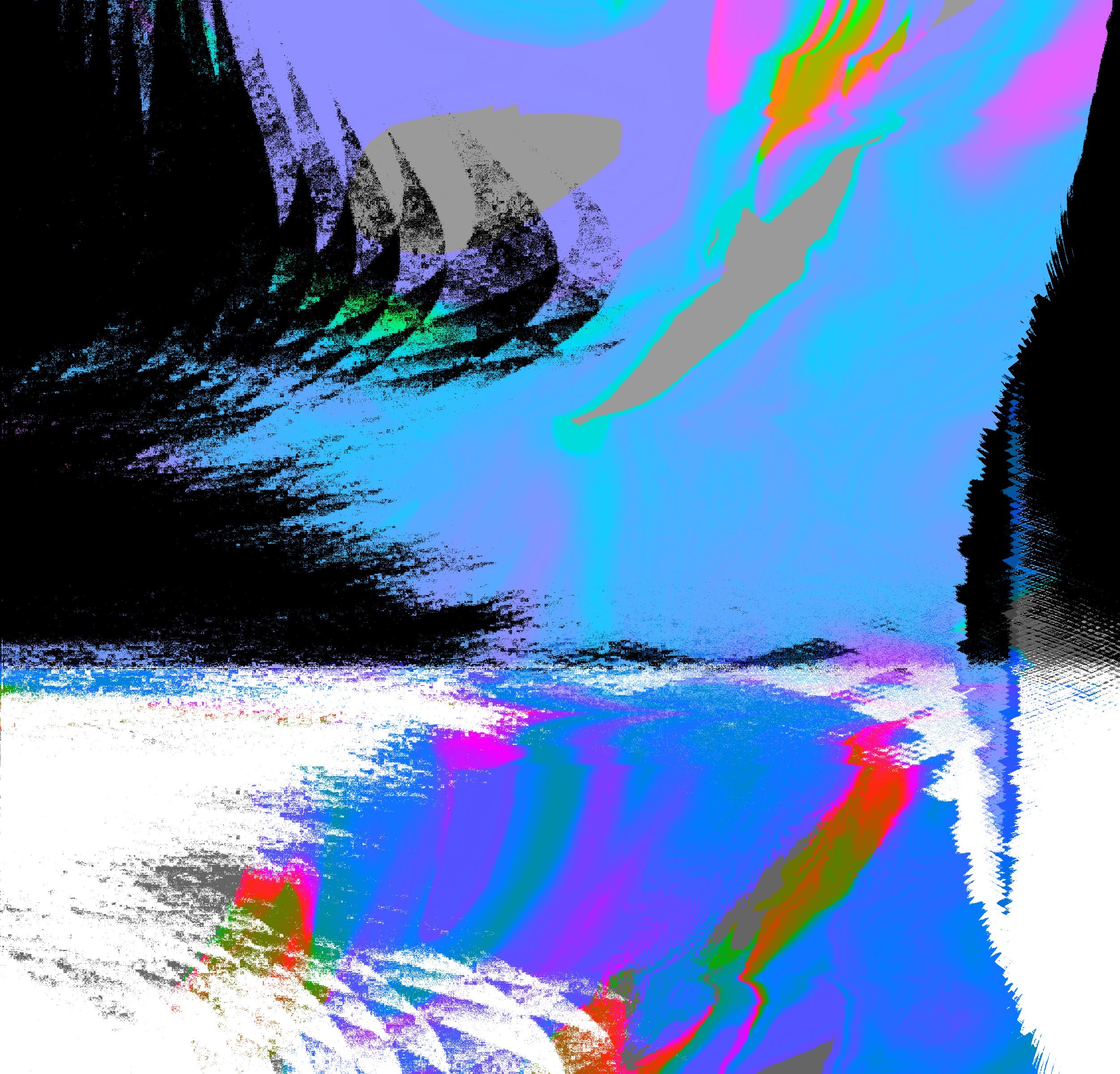
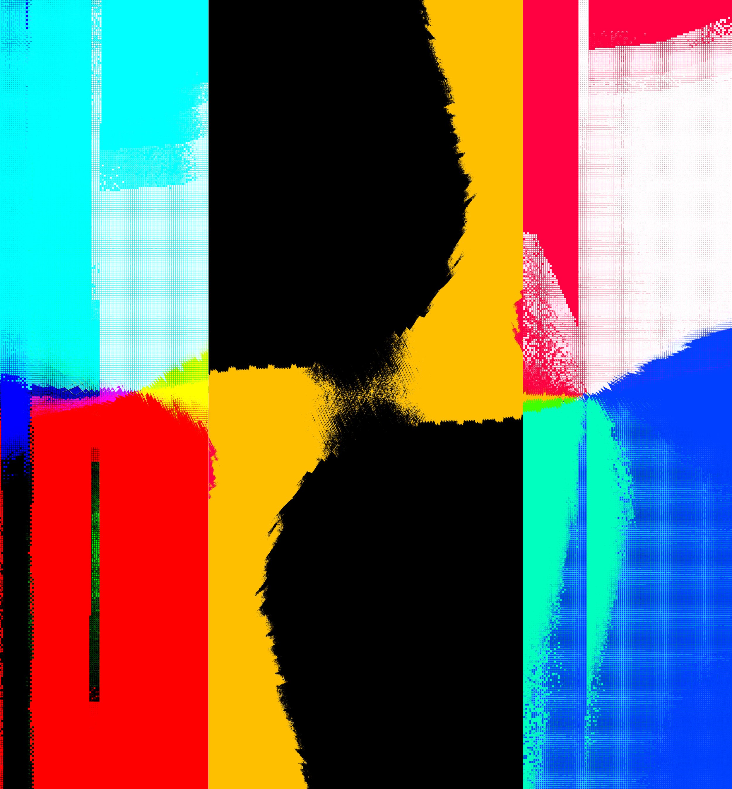
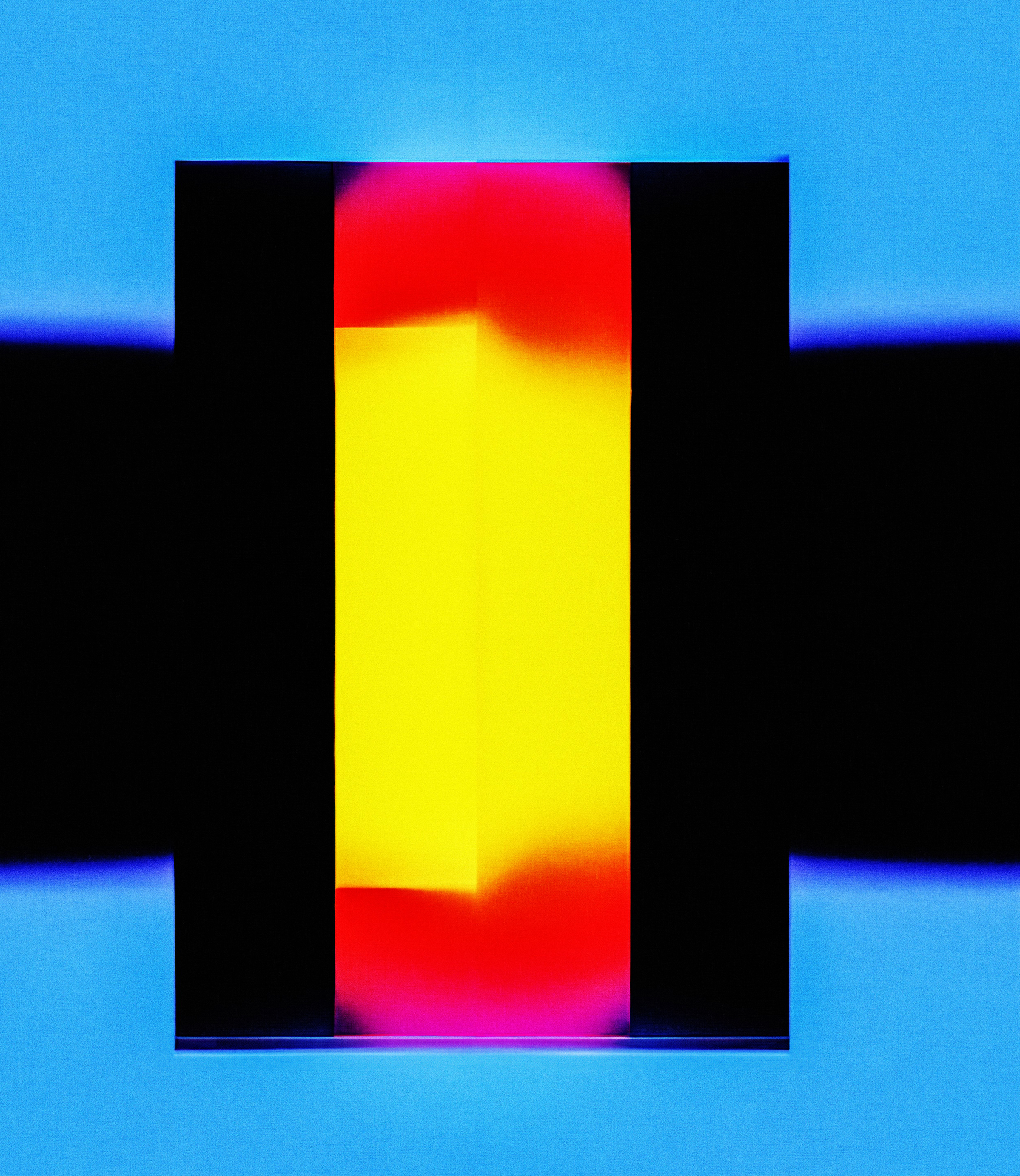
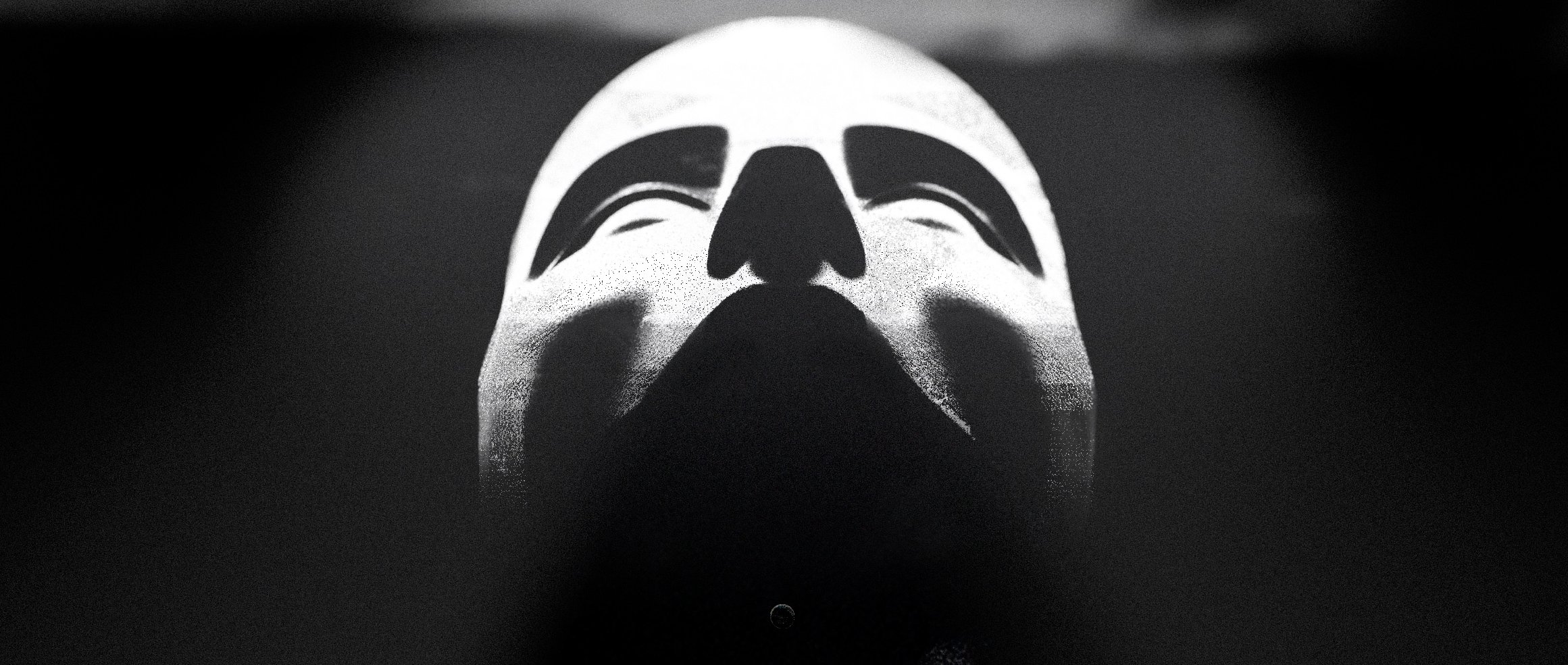
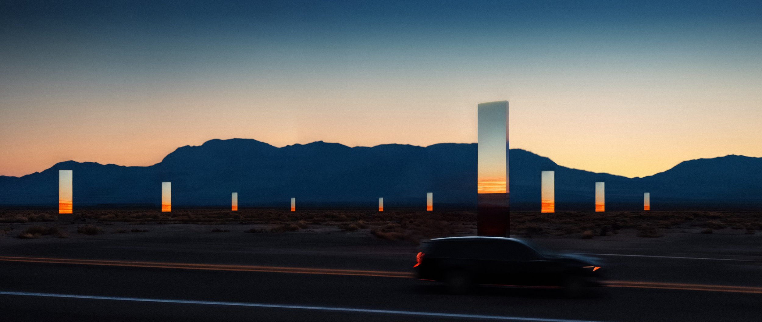
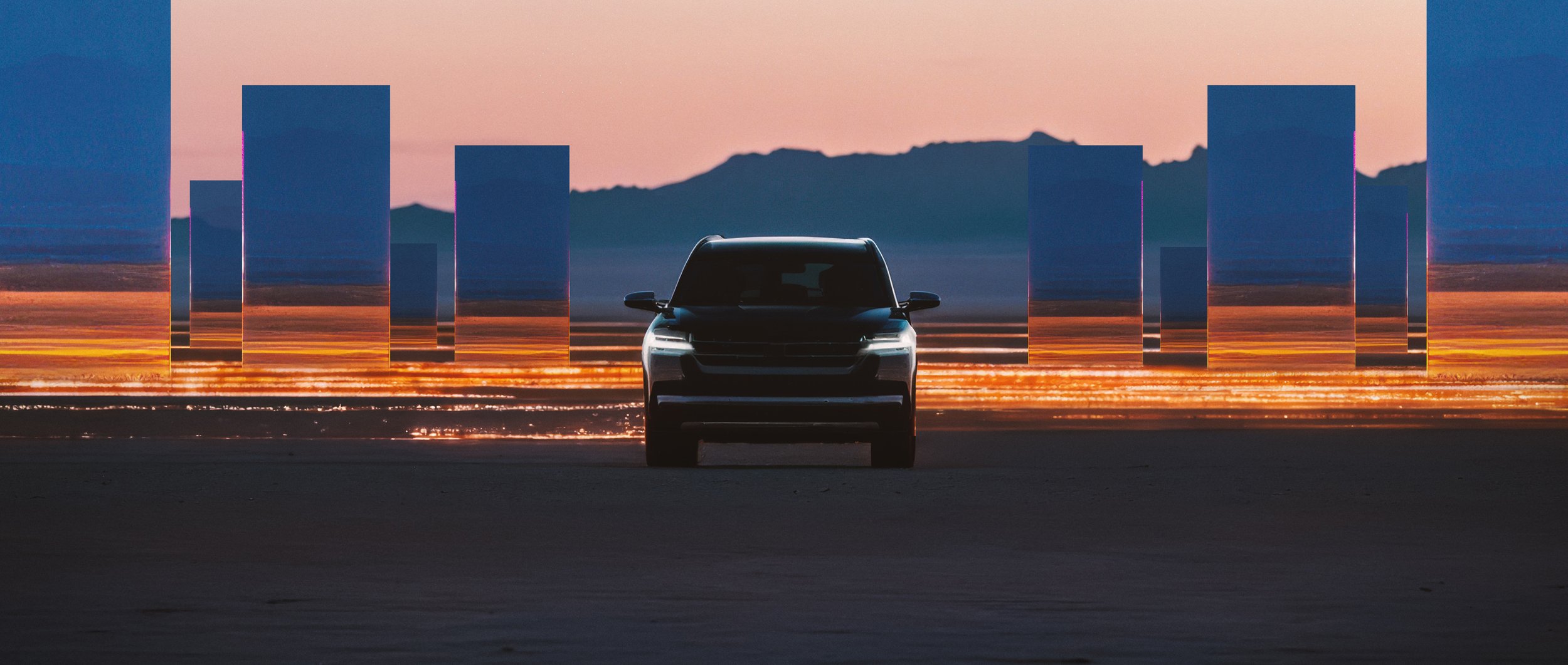
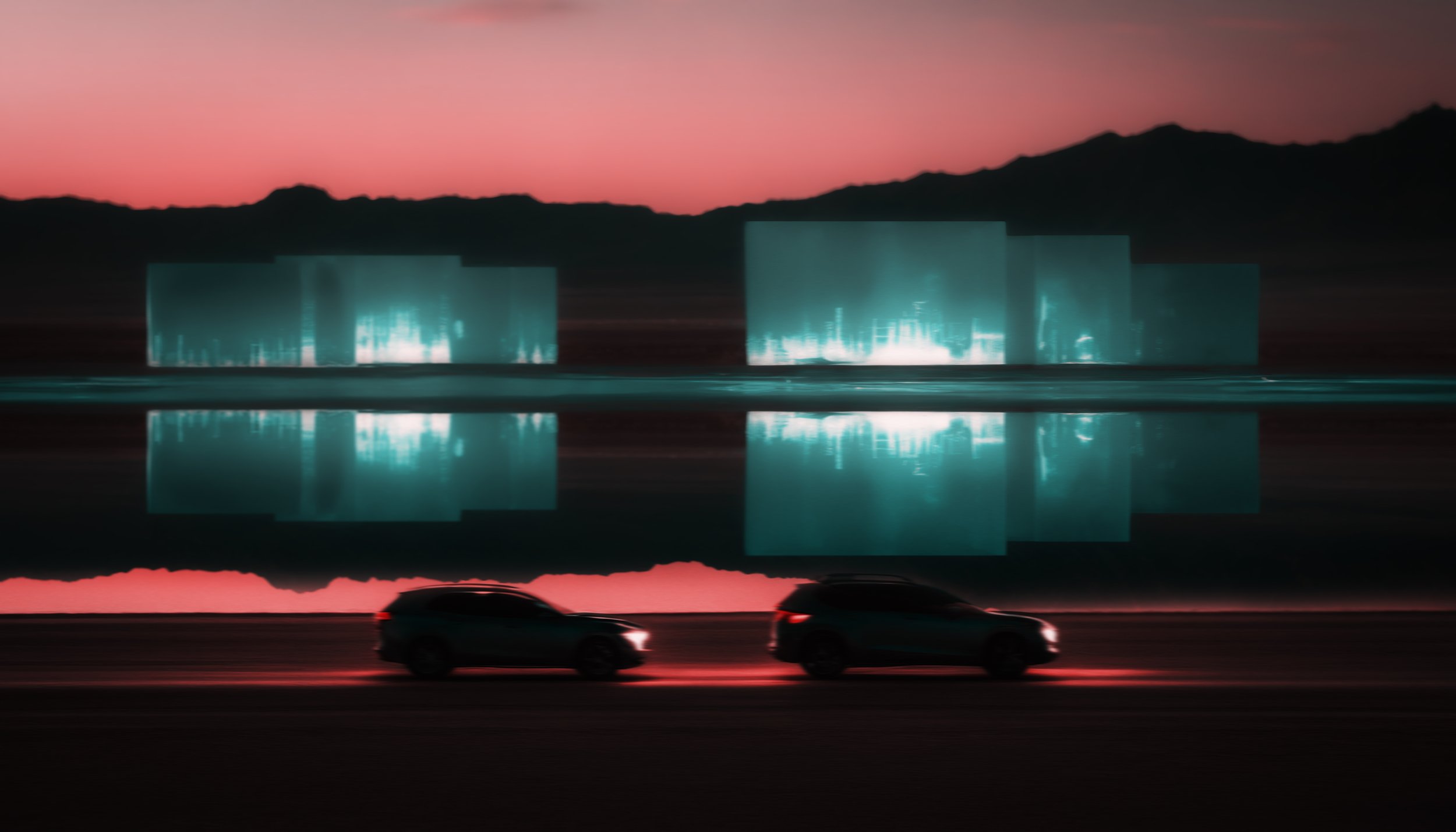
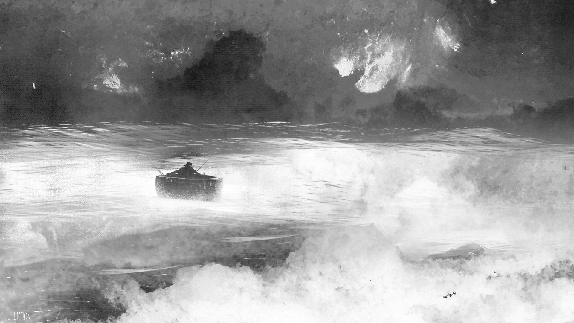
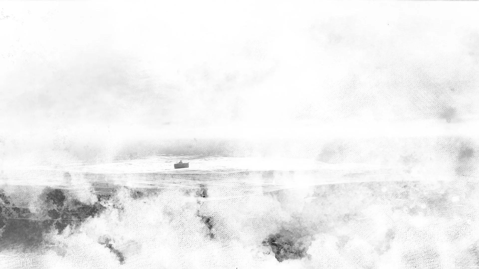
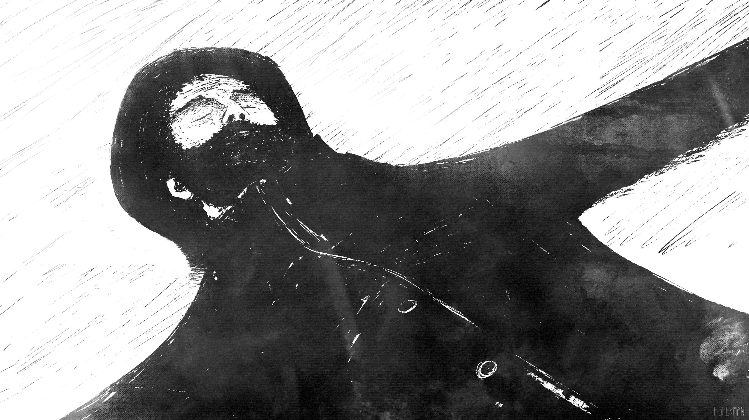
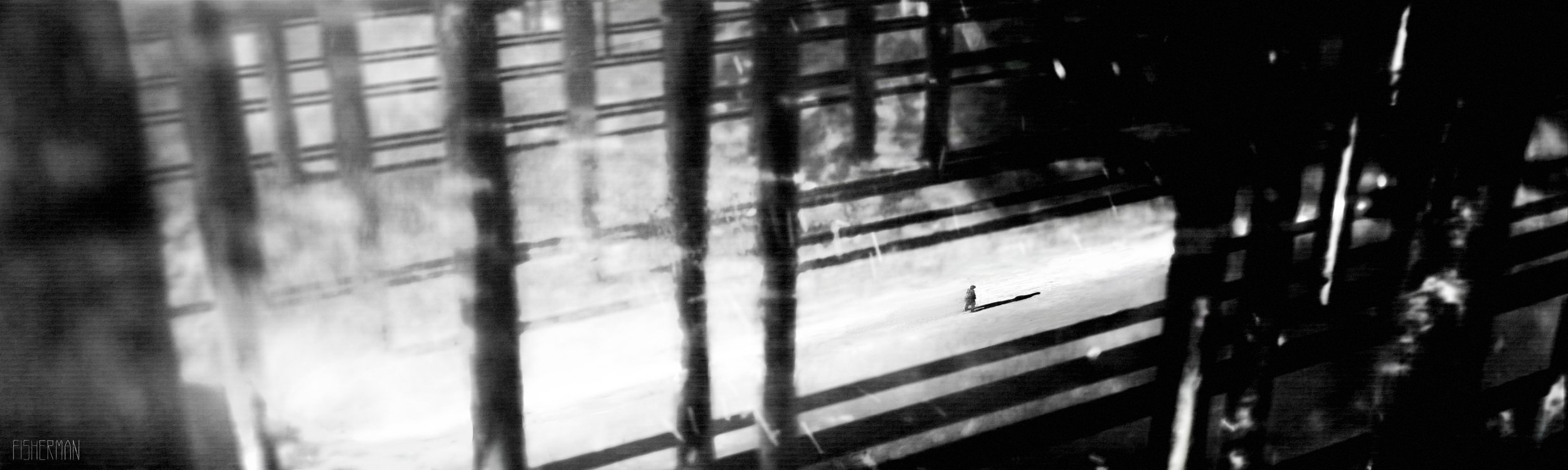
AUDEMARS PIGUET. RD#2 WATCH
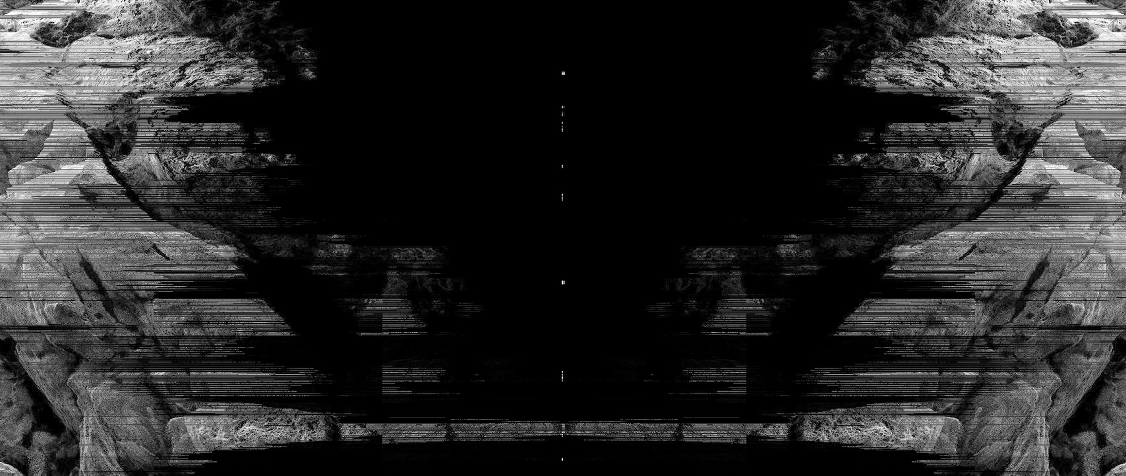
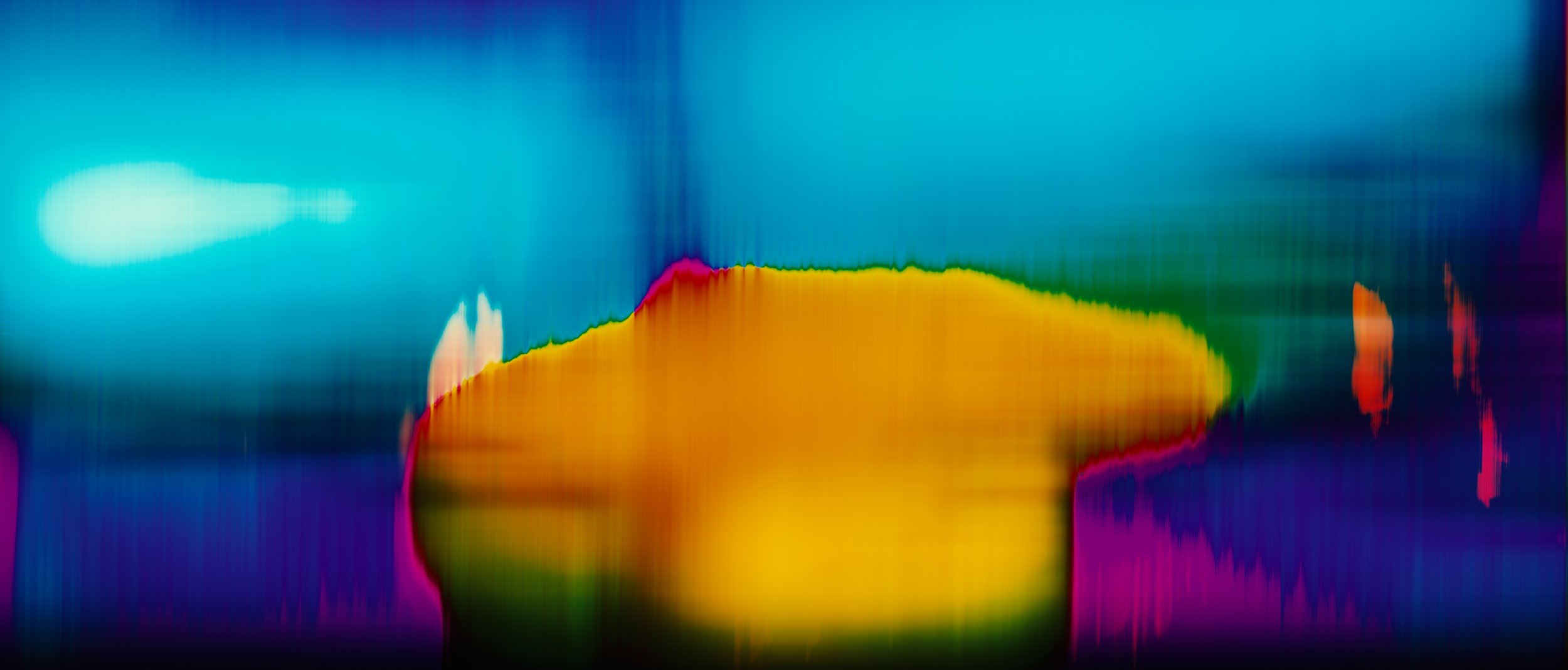
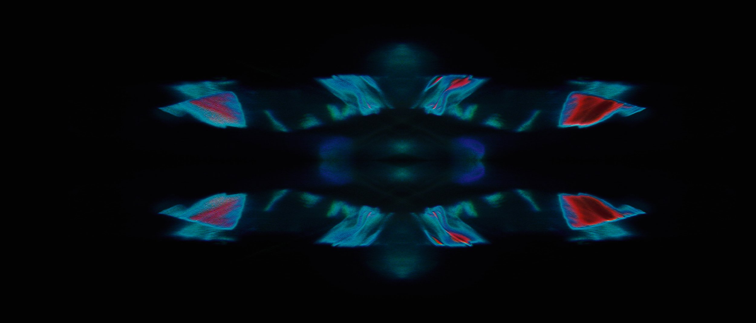
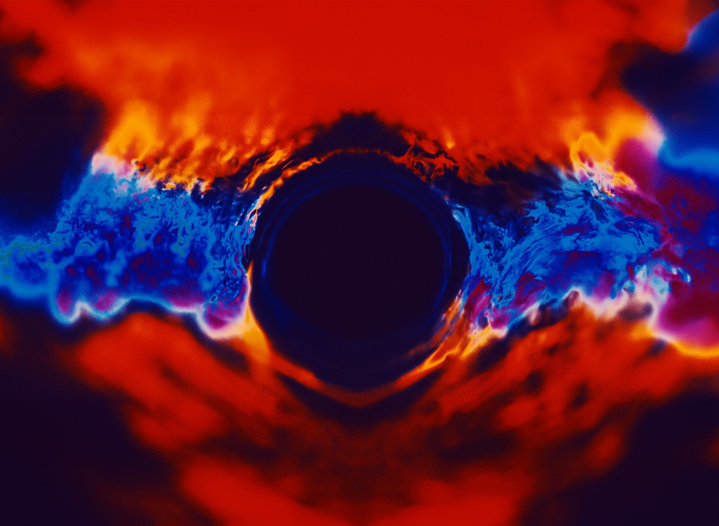
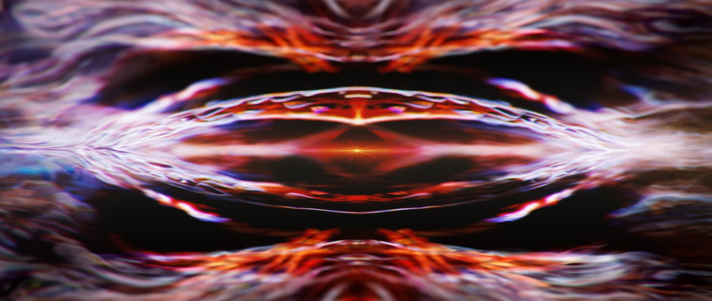
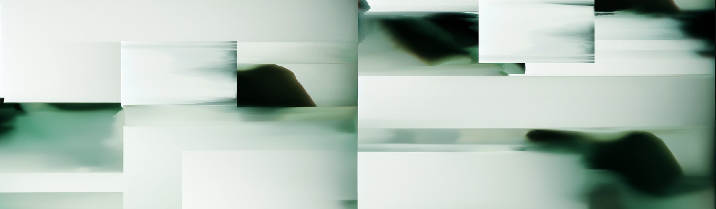
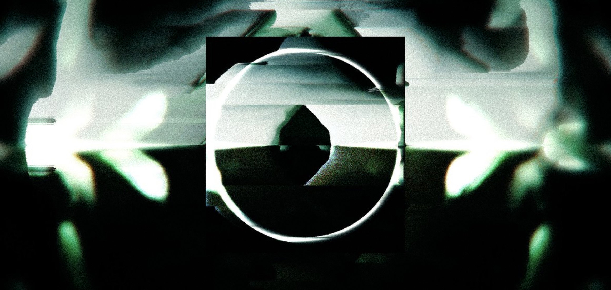
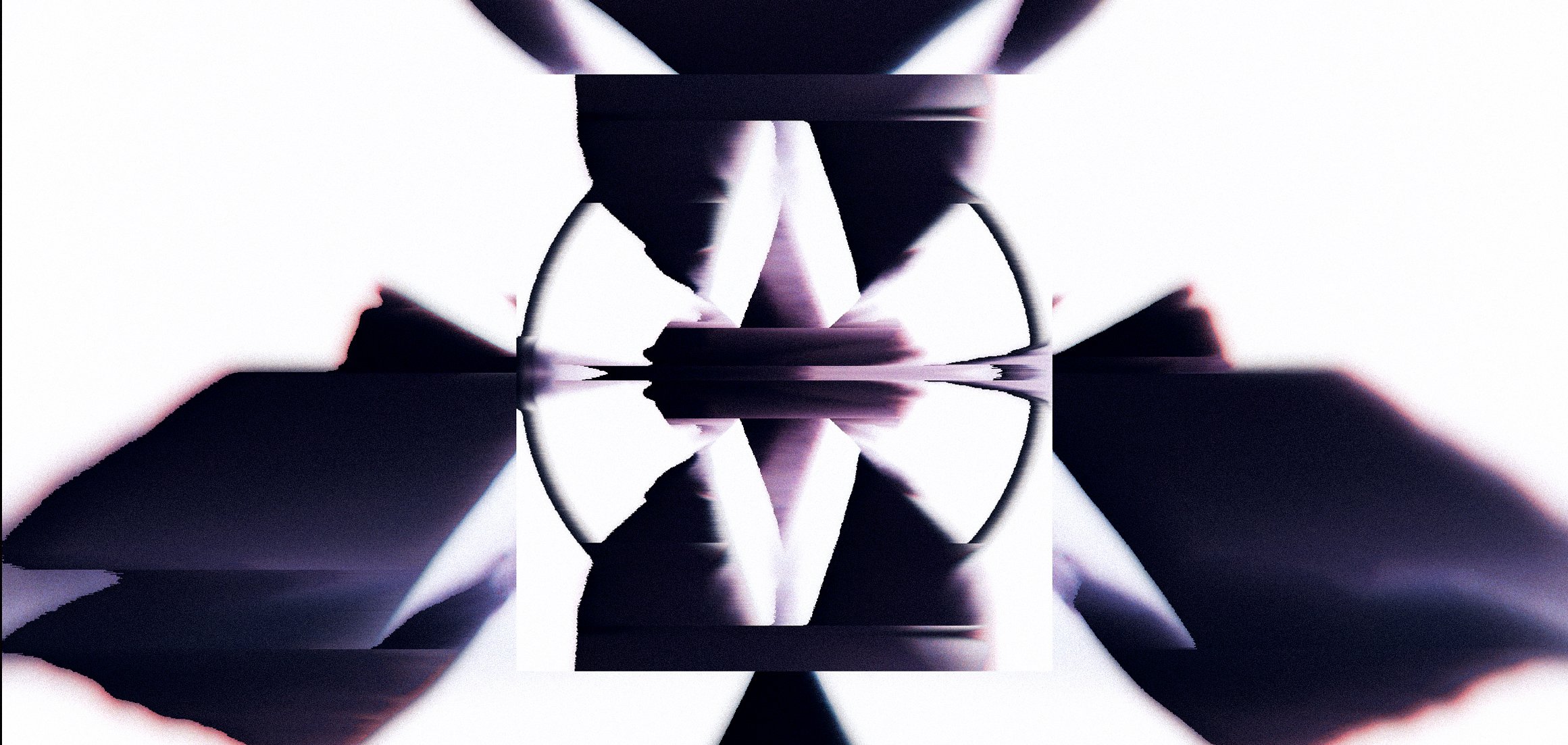
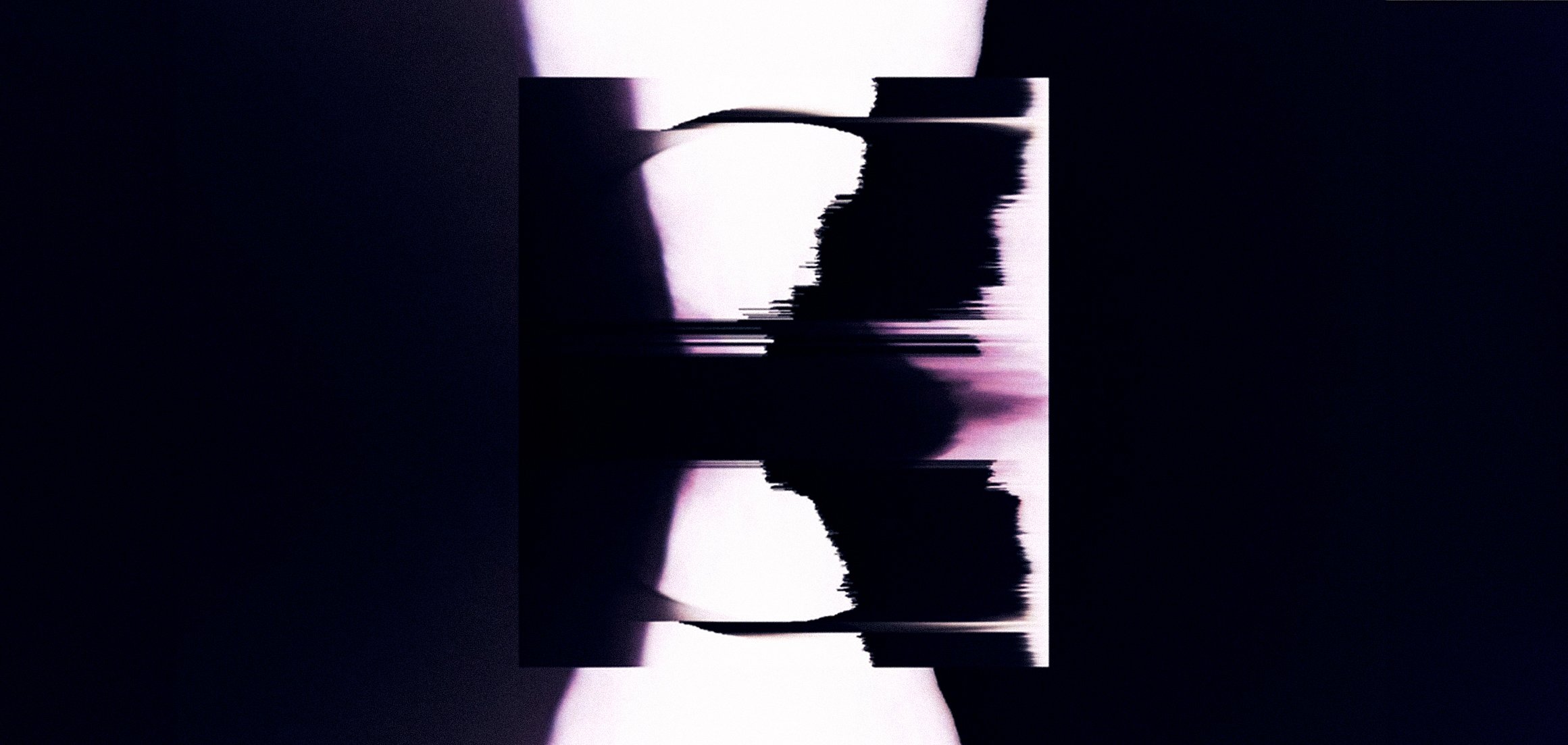
In collaboration with Silent Studio and Electric Theatre Collective, I worked as a Senior Designer to establish the visual language and atmosphere of a world that embodied the craft and precision of the RD#2 watch. My role focused on translating core brand values into design motifs, composition, and cinematic tone that could carry across the moving-image campaign.
MOVING IMAGE AMBIENT SHORT FILM
KEY, STYLE FRAMES, CONCEPT ART, AND GRAPHIC DESIGN
FINAL DESIGN


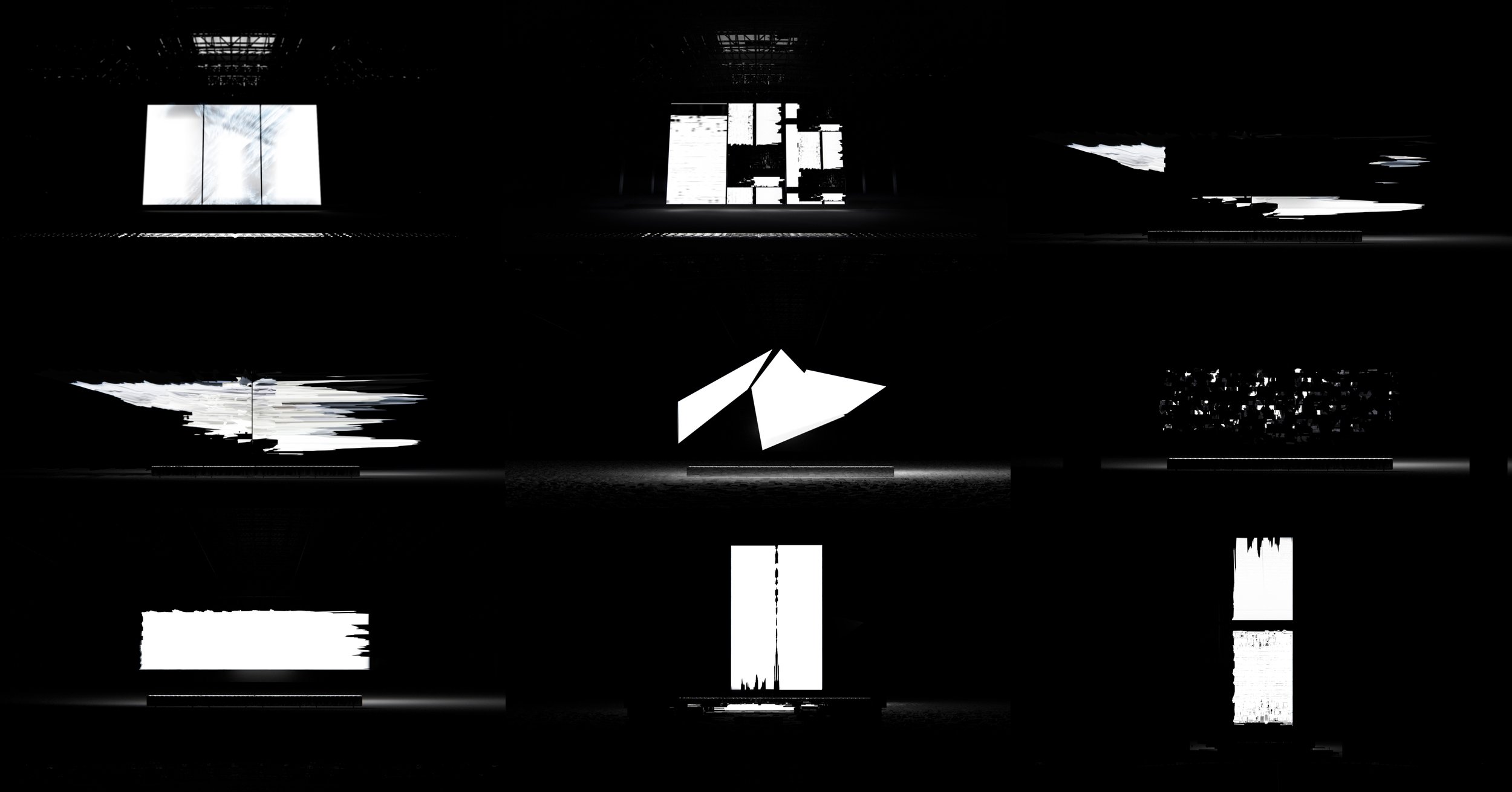
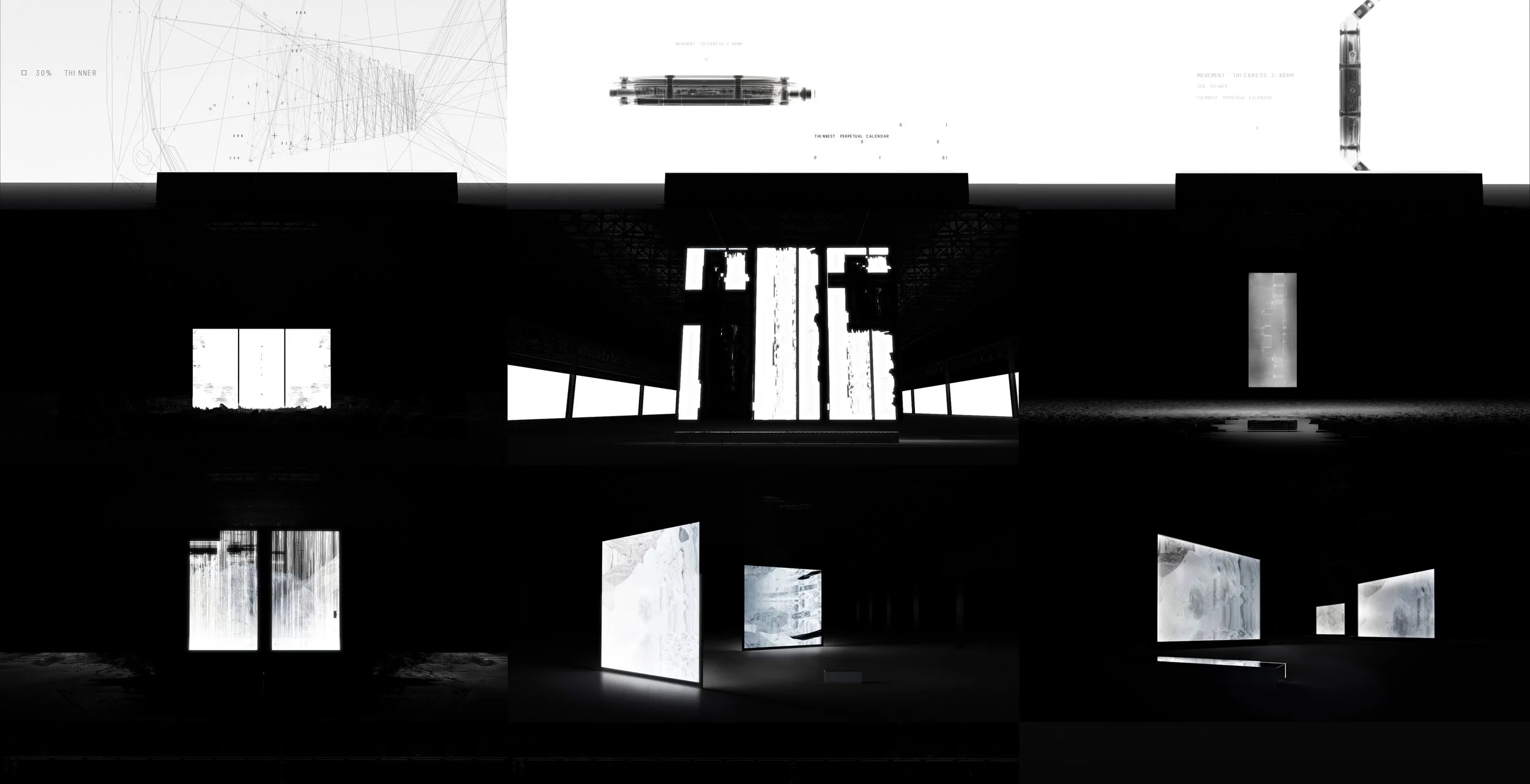
LOOK DEVELOPMENT

FINAL PRODUCTION ANIMATION
CREDITS
ELECTRIC THEATRE COLLECTIVE
Producer: Jon Purton
2D Lead: Alex Grey
2D Artists: Chris Fraser, Tom Humphrey, Courtney Price
CG Lead: Simon French
CG Artists: James Sindle, Sergio Morales, Tobin Brett, George Savas, Joao Pires
Senoir Designer: Neil Gittins
AGENCY
SuperCulture
Creative Director: Paul Jarvis
Producer: Ciaran Bennett
PRODUCTION
Friends Electric
Director: Silent
Executive Producer: Alex Webster
Producer: Doireann De Buitlear
SOUND
Silent
Andy Theakstone, Liam Pato
PUBLICATION

BOHM
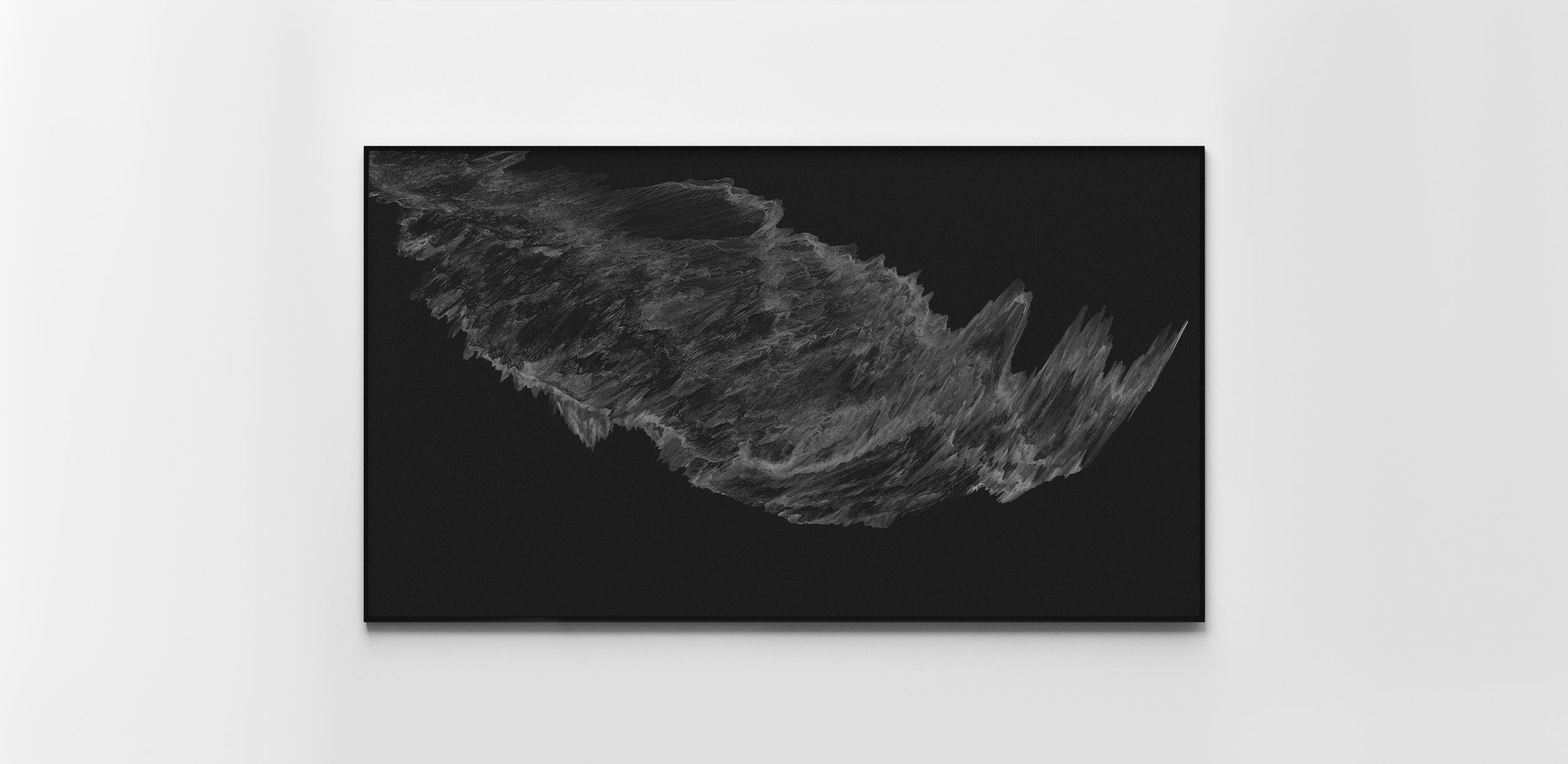
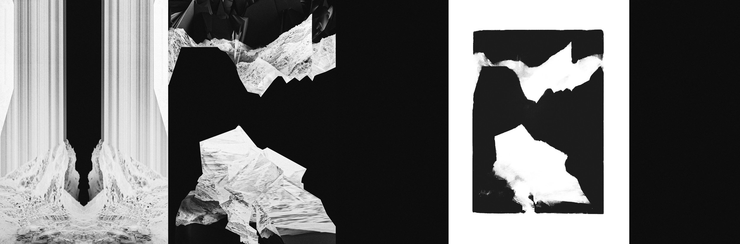
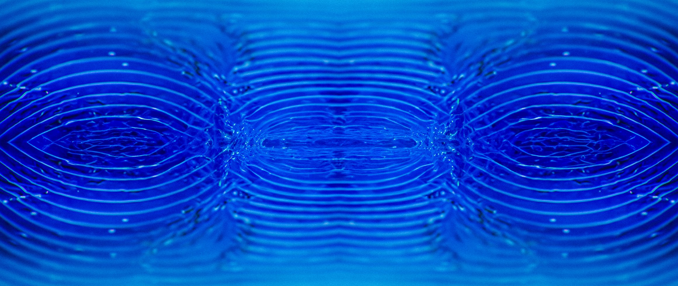
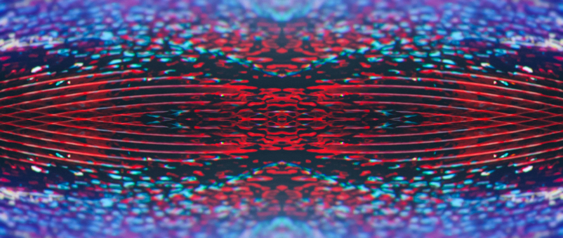
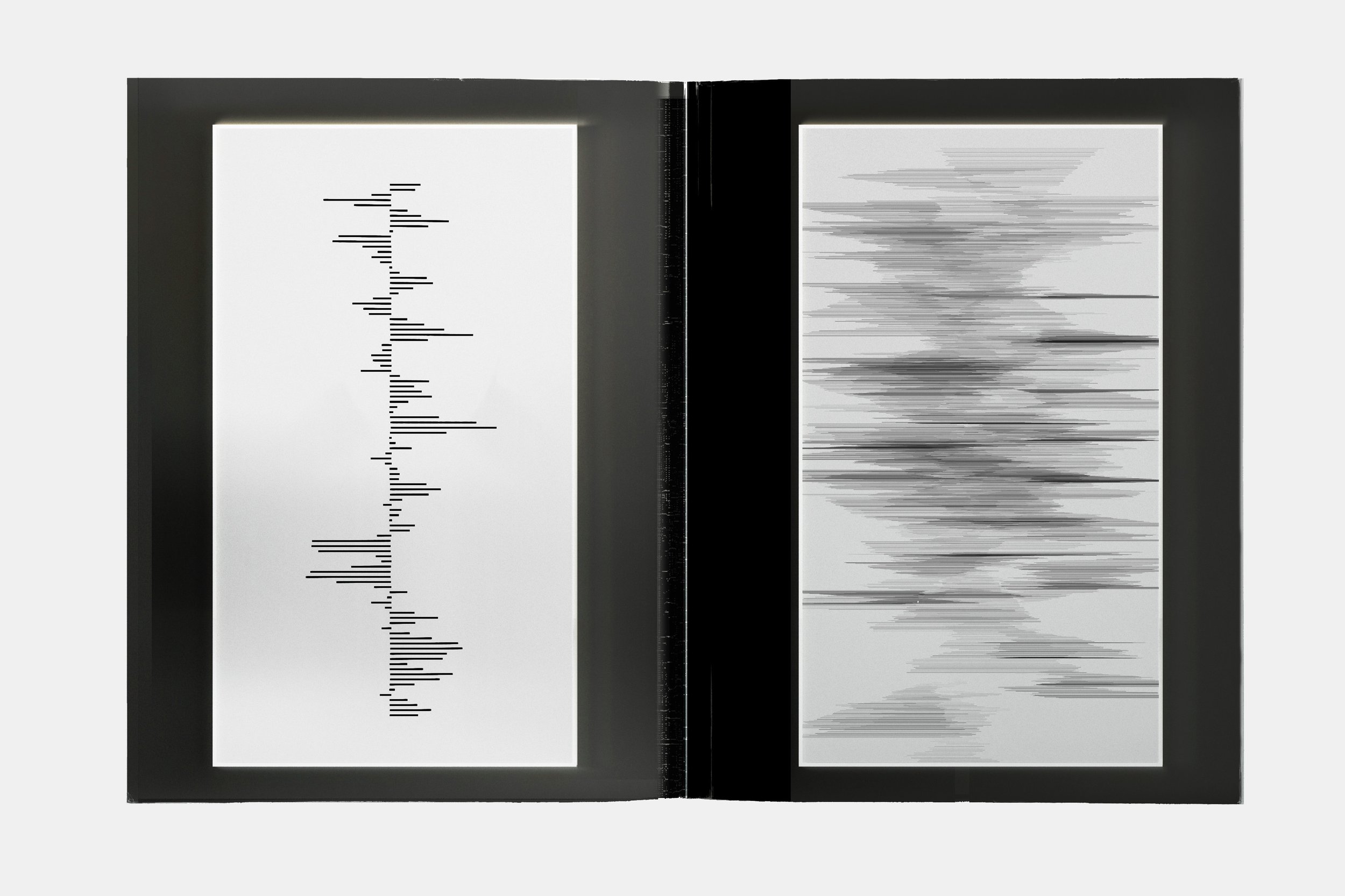
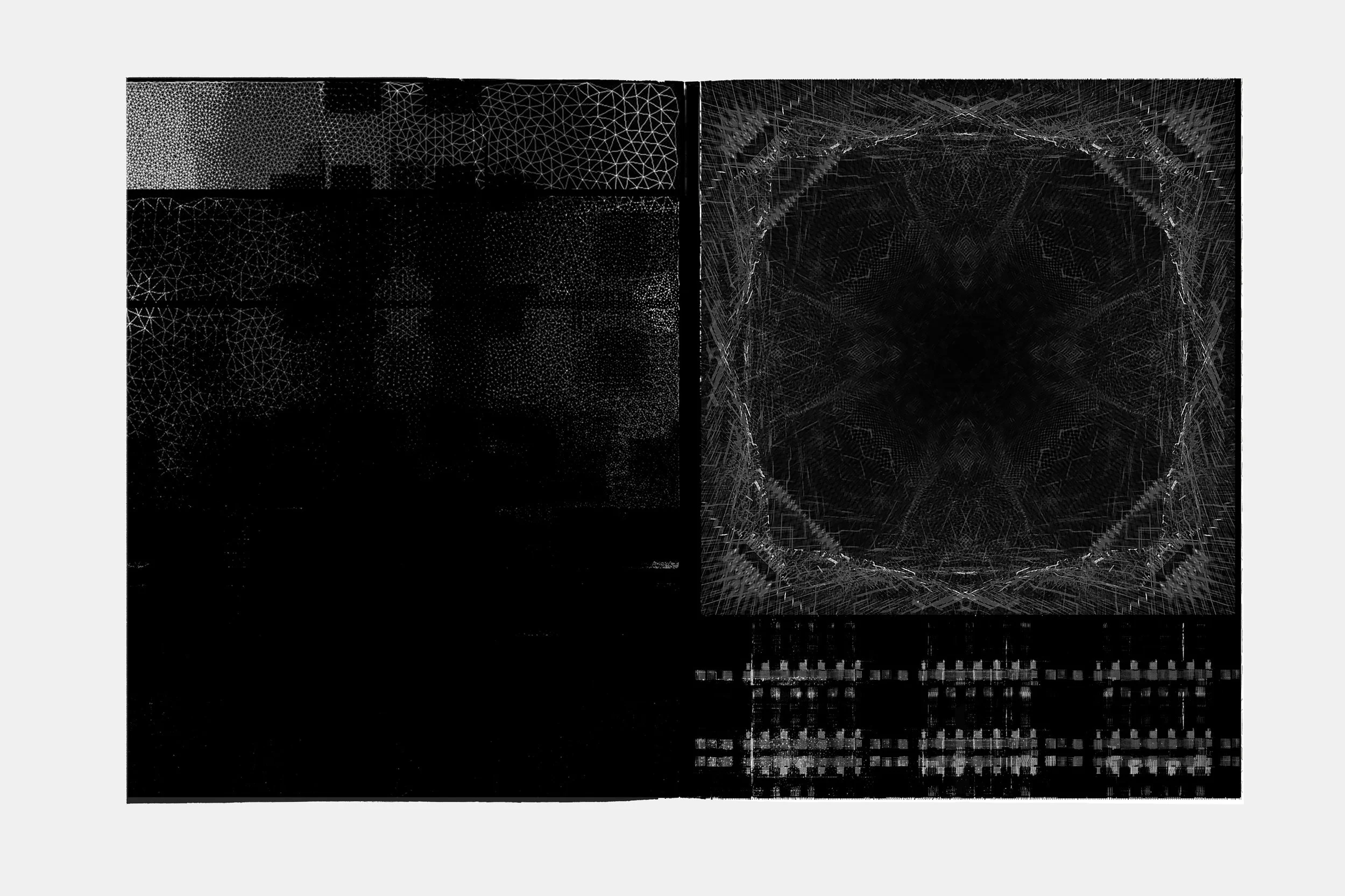
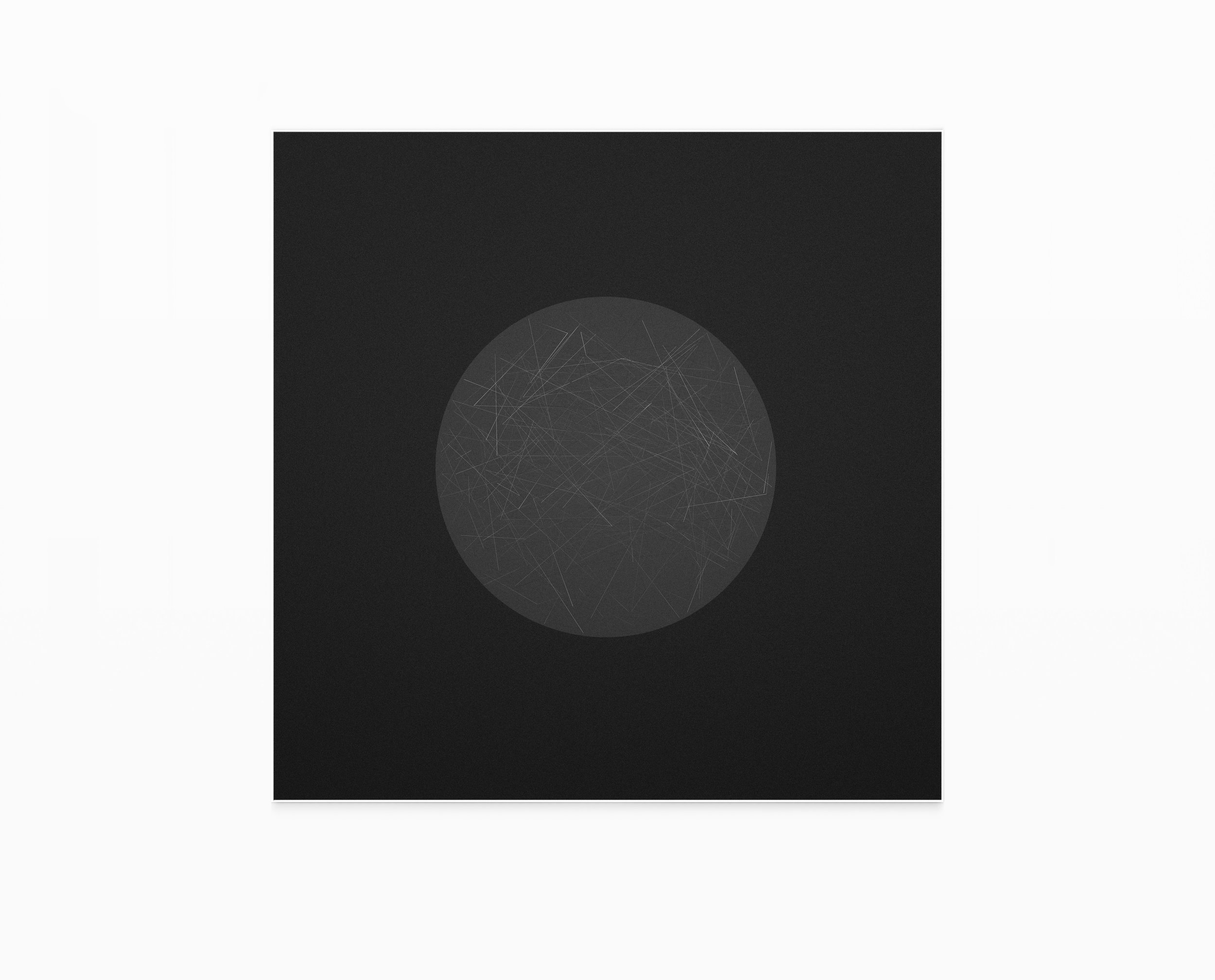
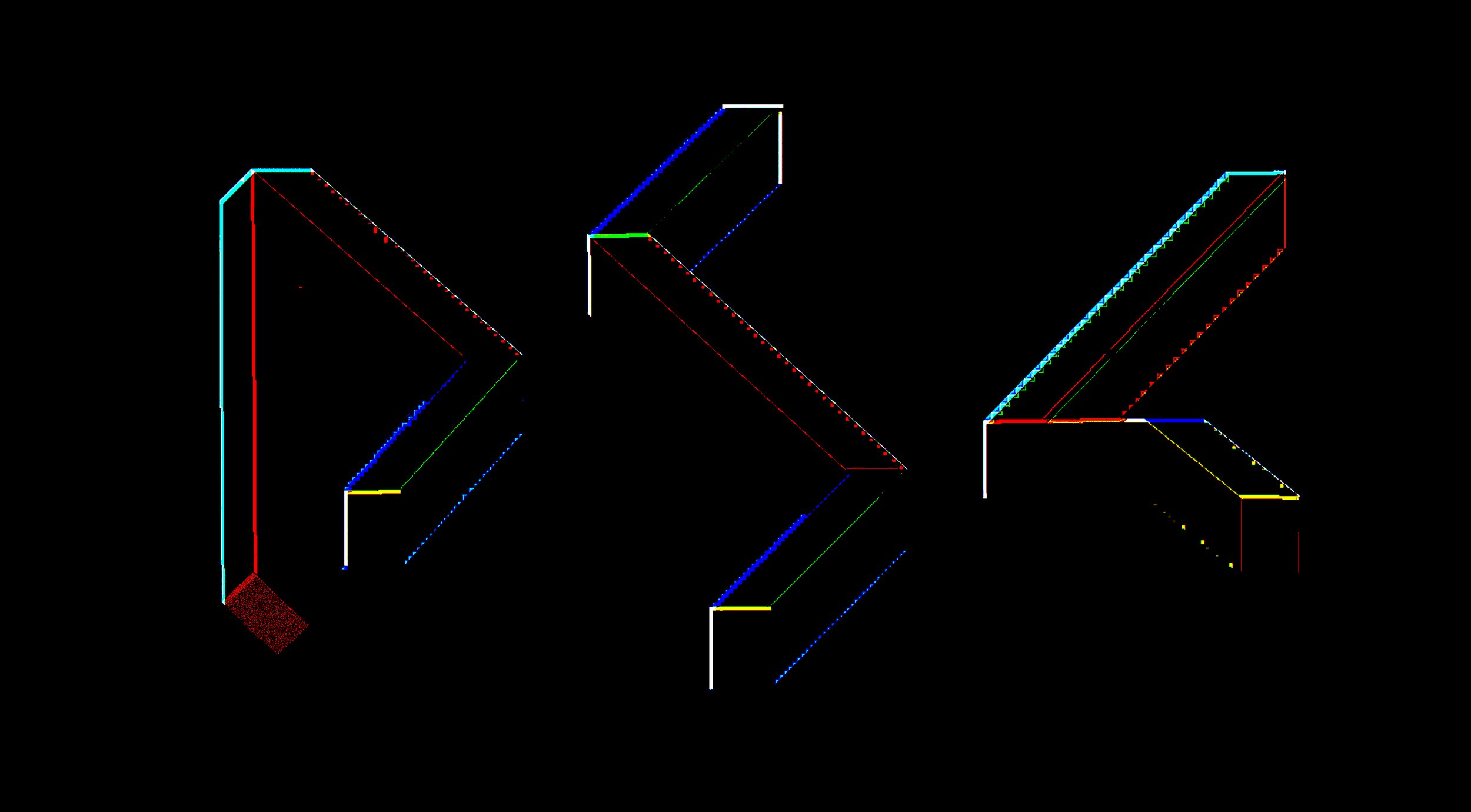
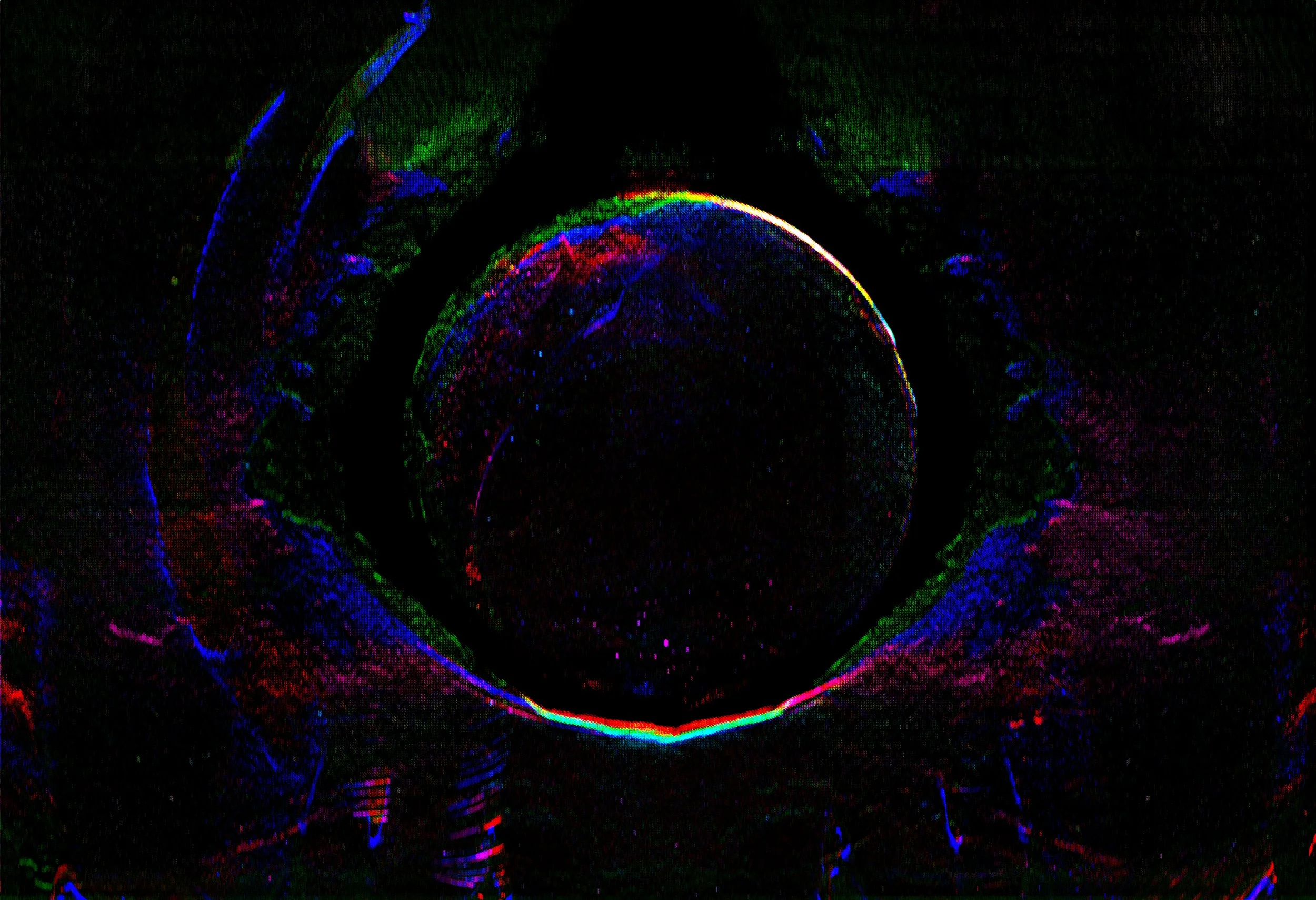
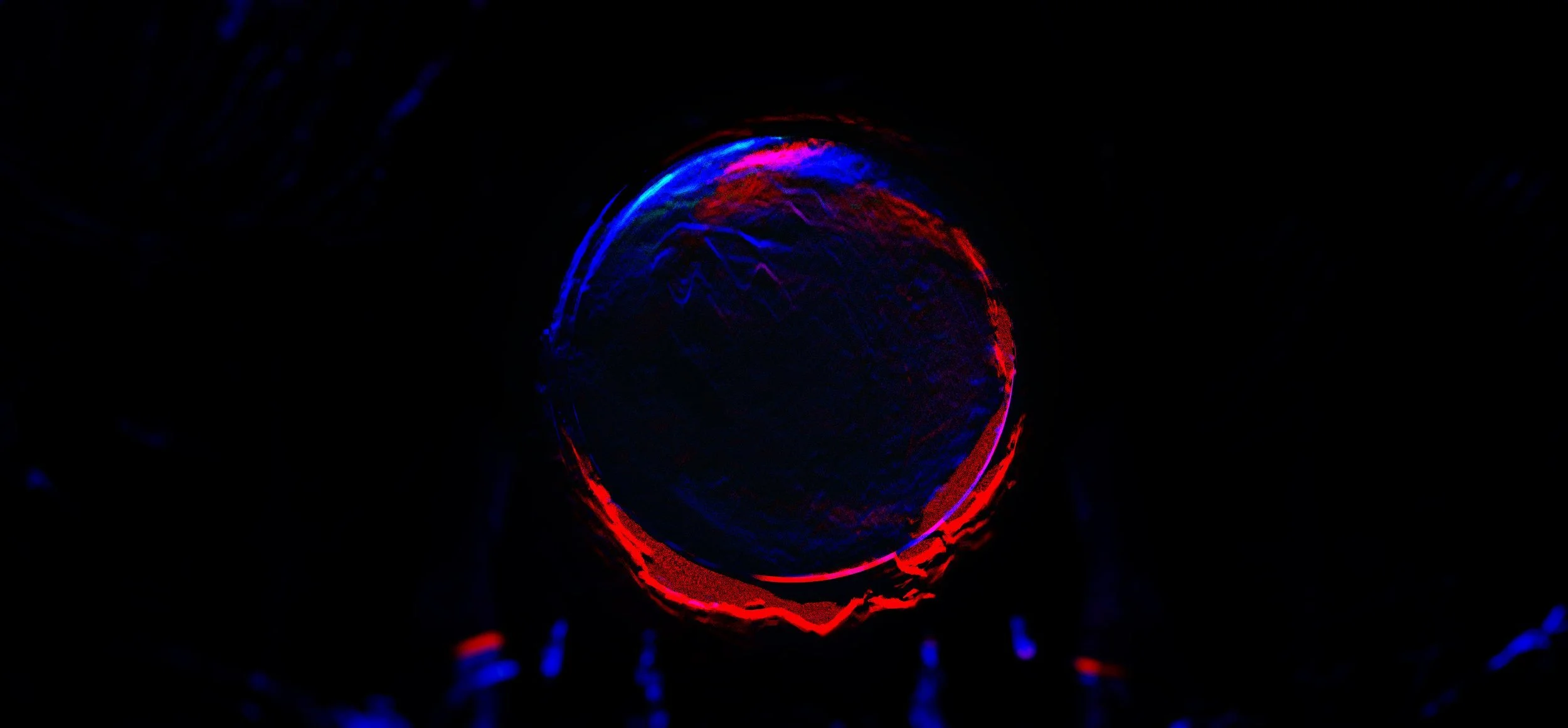
This personal design project explores the physicist David Bohm’s idea that “matter is frozen light.” Rather than viewing matter as static particles, Bohm described it as vibratory patterns in motion. Inspired by this concept, I developed a series of styleframes for a fictional title sequence, treating the visuals as a study in how light, energy, and matter could intertwine into a coherent design language. The project became an experiment in atmospheric and textural motion design rooted in scientific theory.
TITLE SEQUENCE
CREATIVE DIRECTION, KEY FRAMES, AND GRAPHIC DESIGN
FINAL DESIGN


LOOK DEVELOPMENT


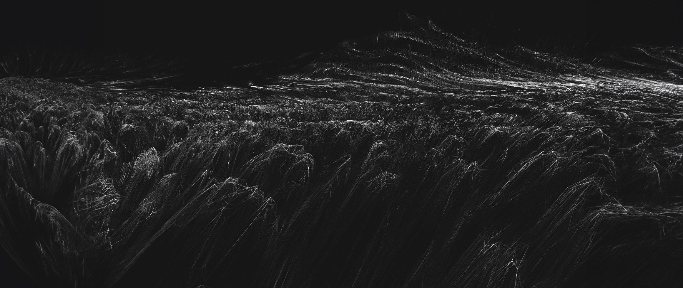
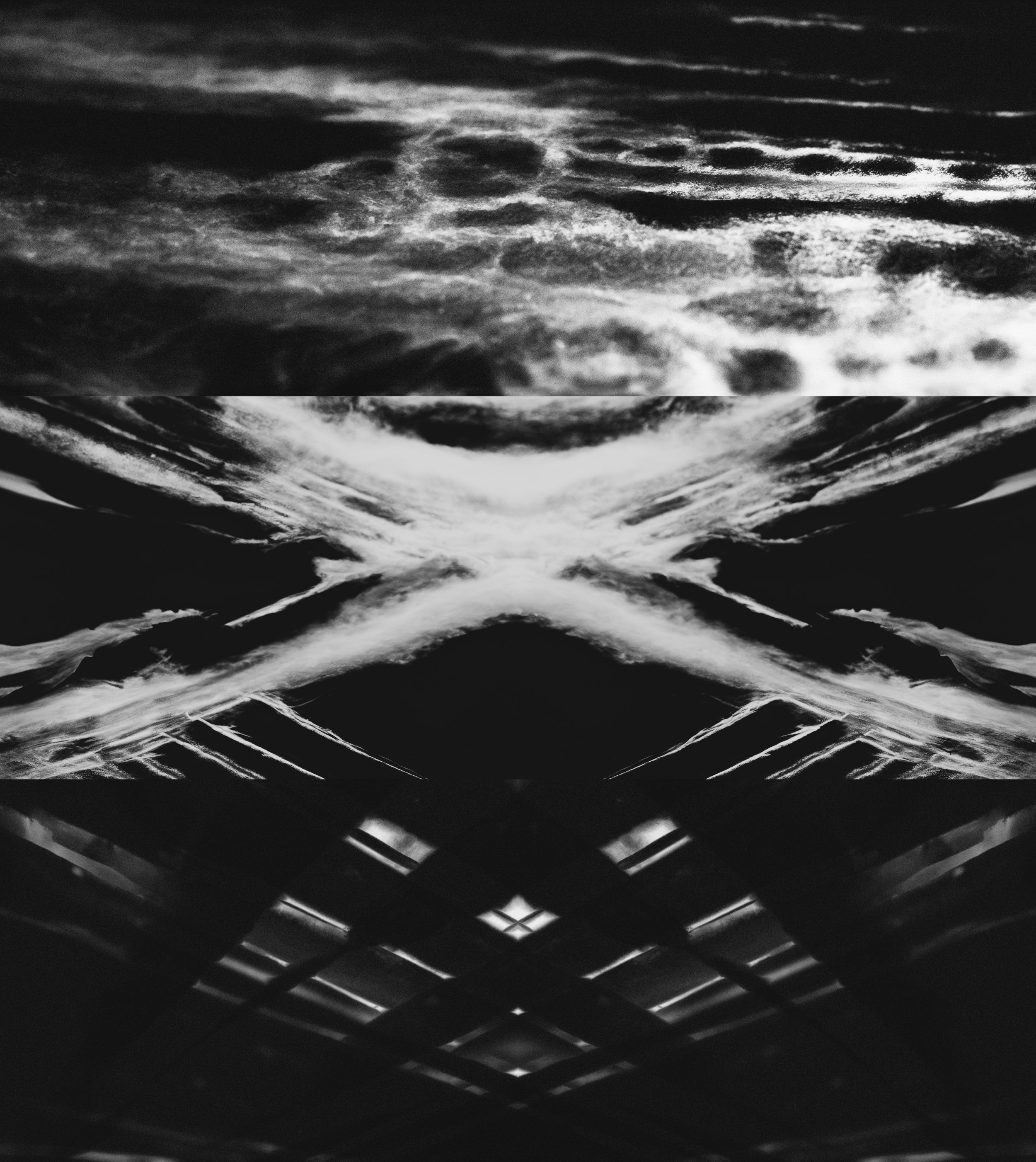
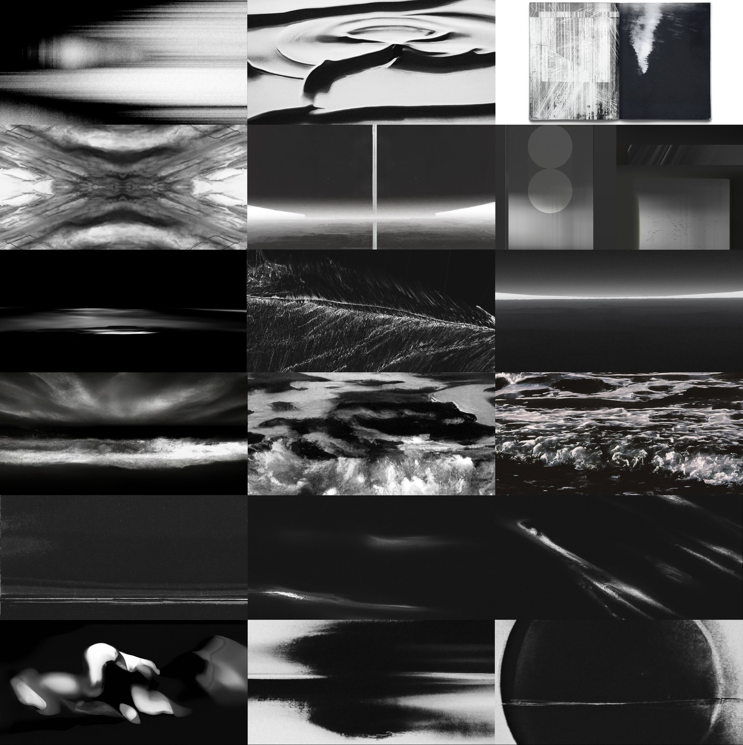
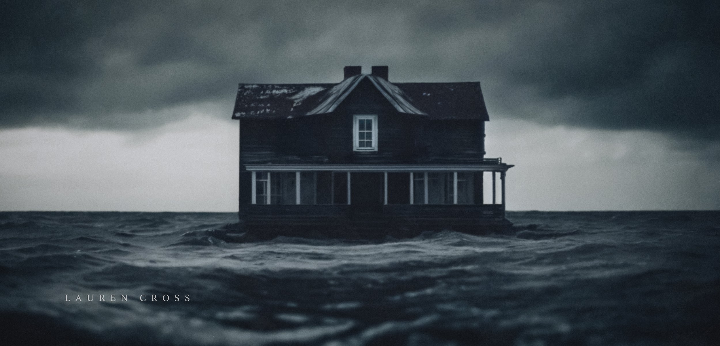
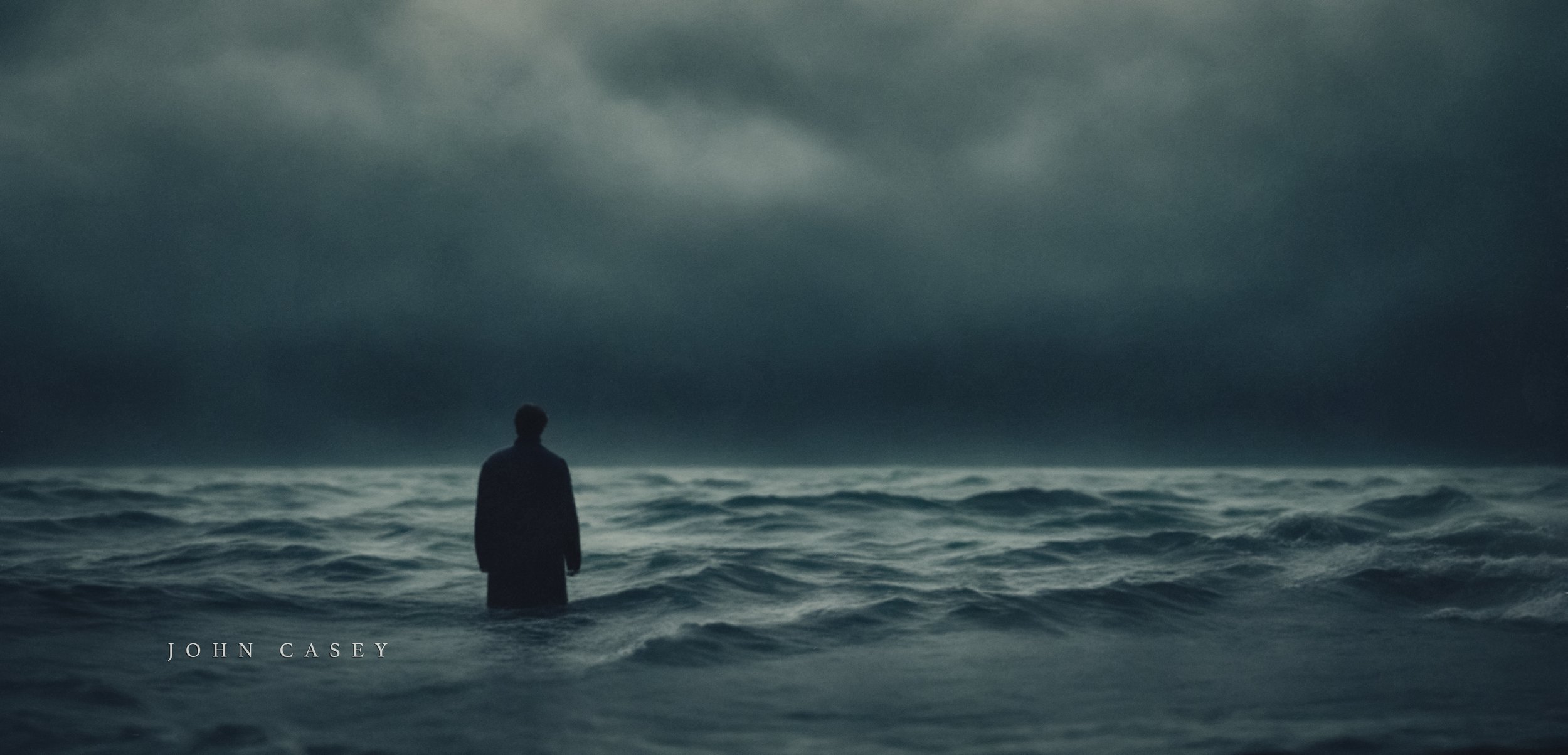
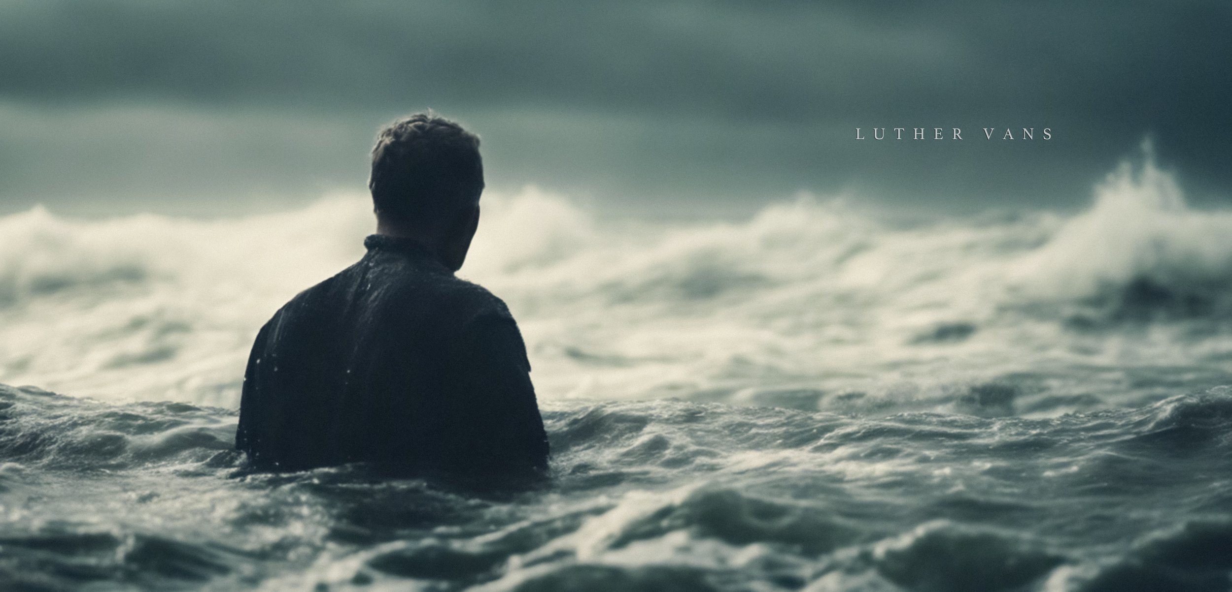
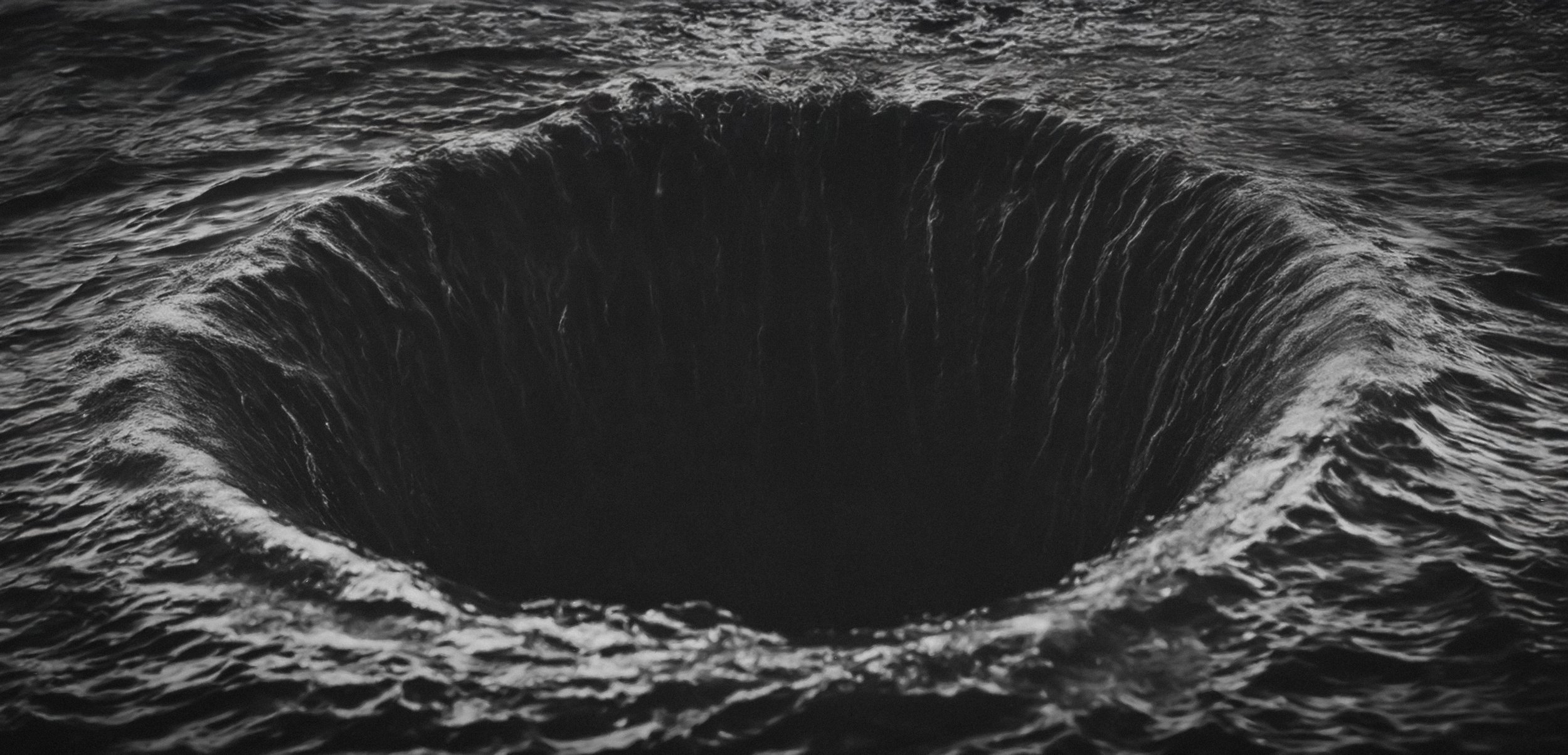
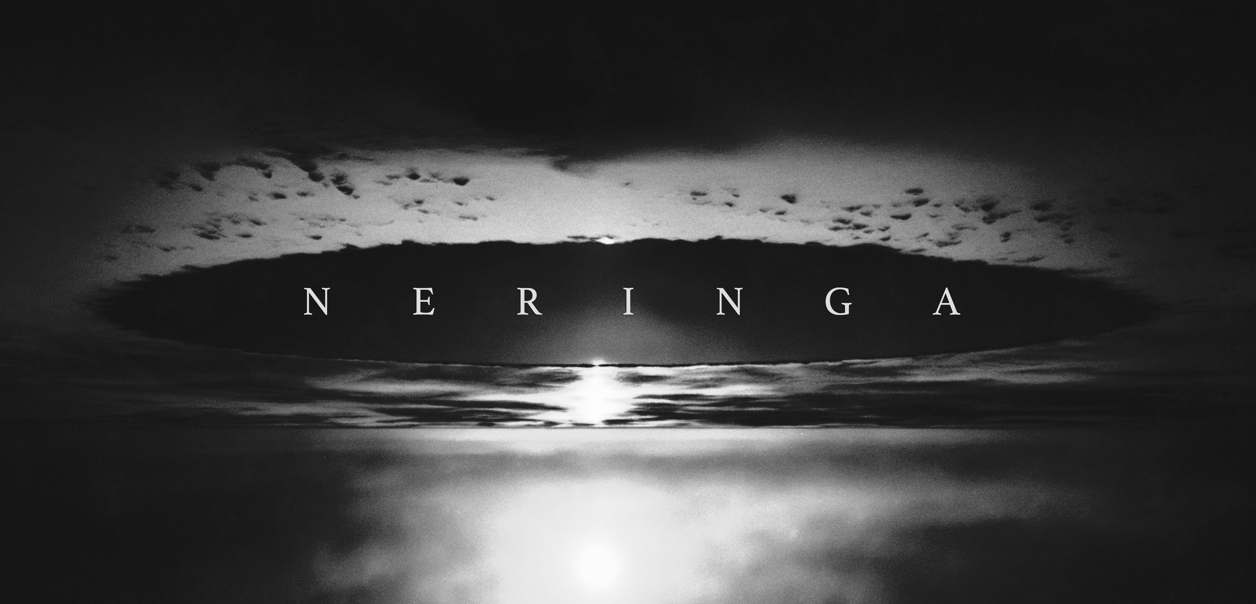
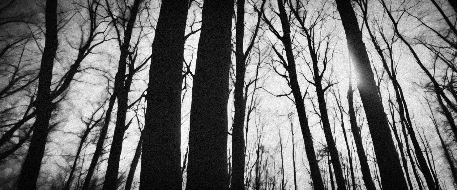
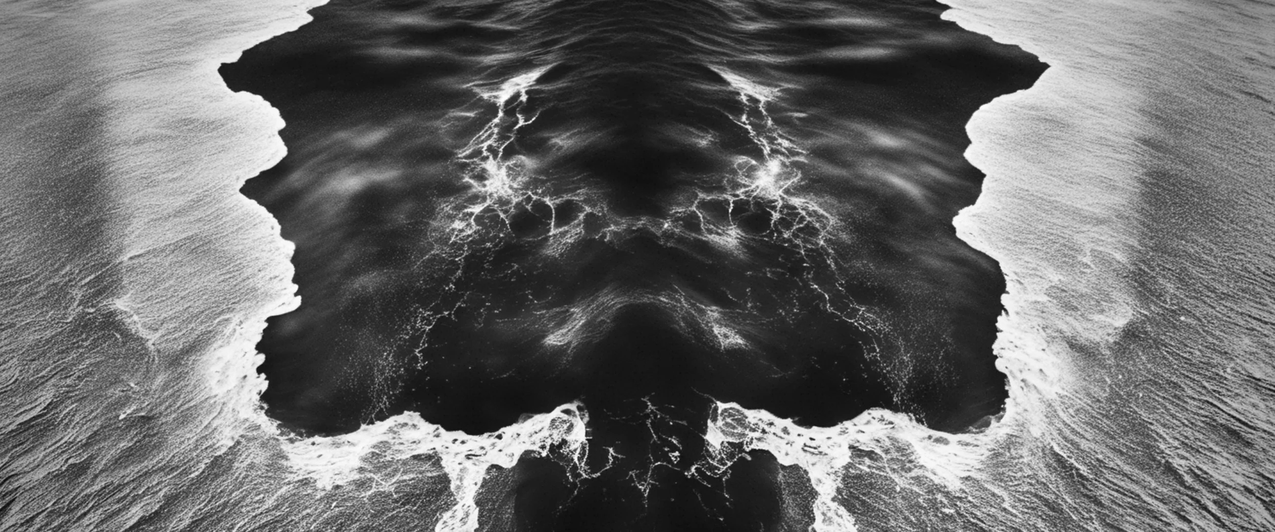
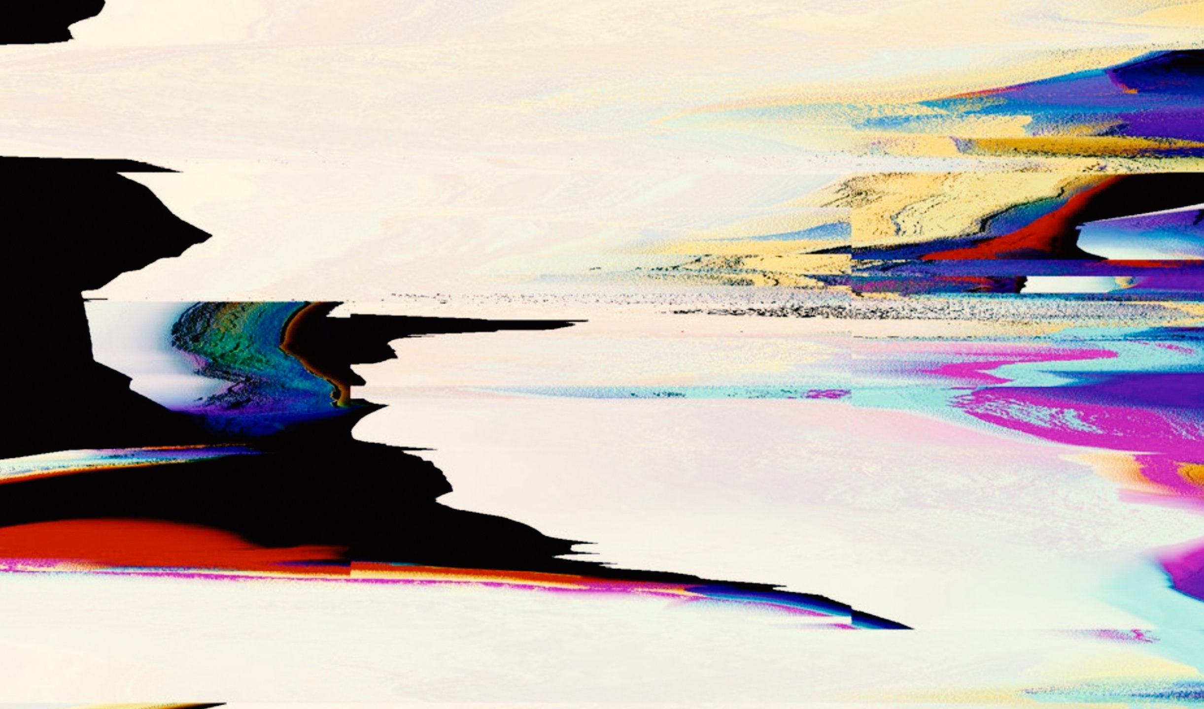
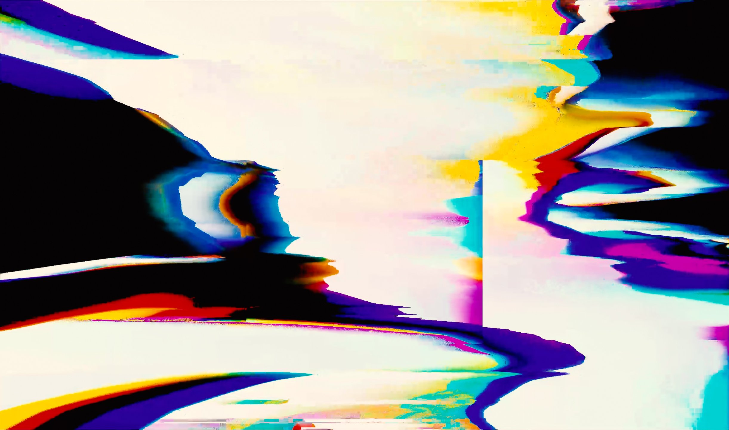
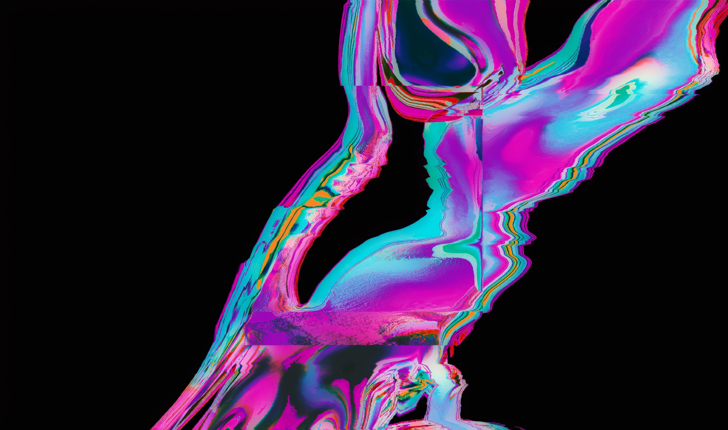
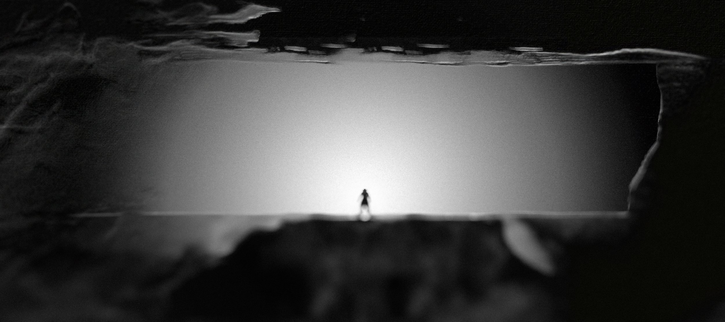
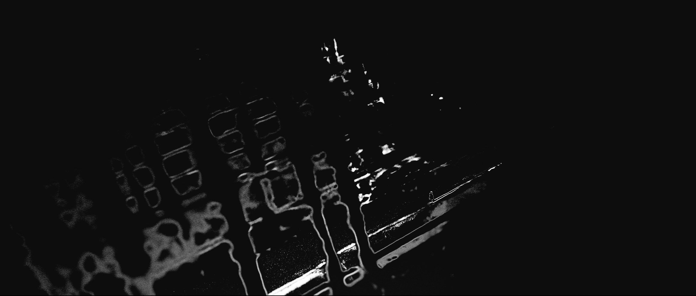
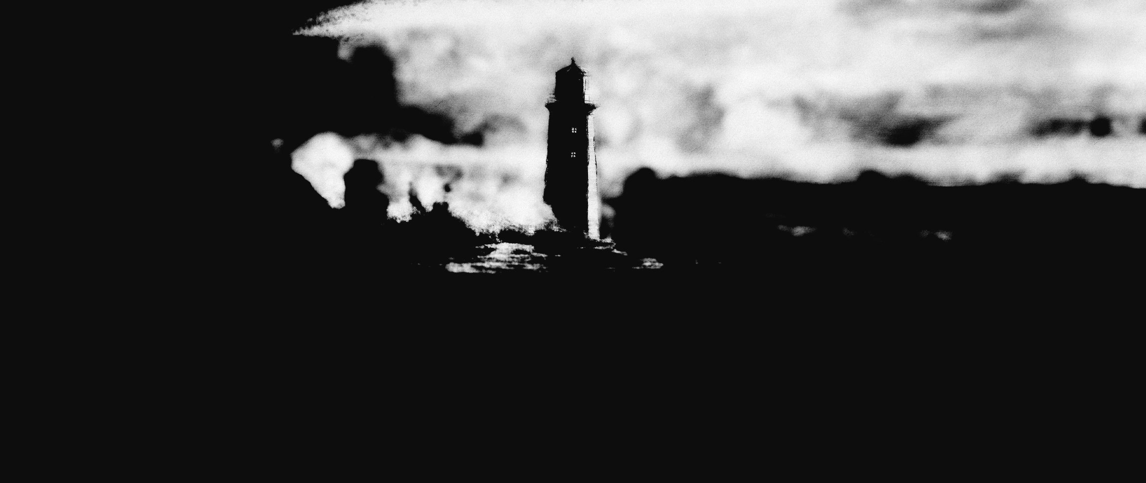
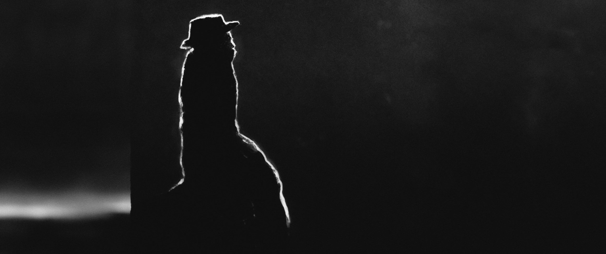
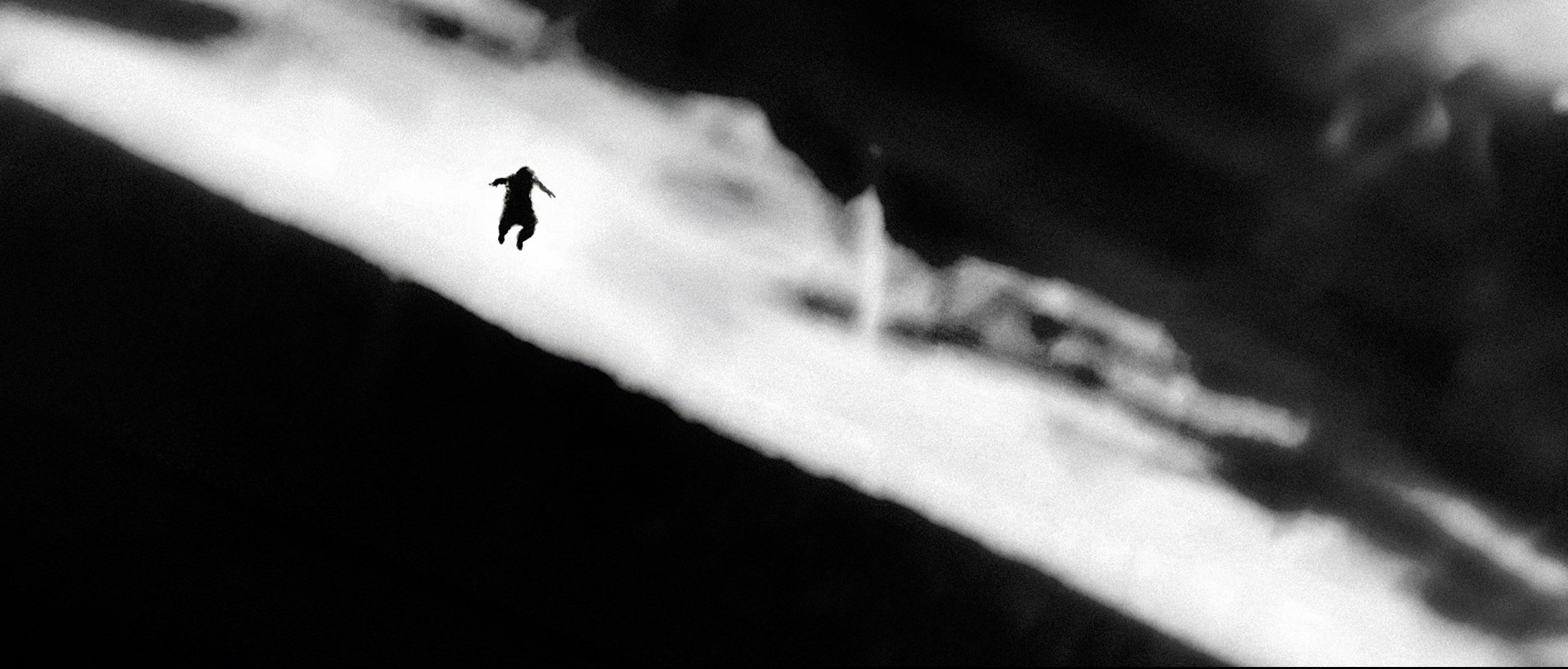
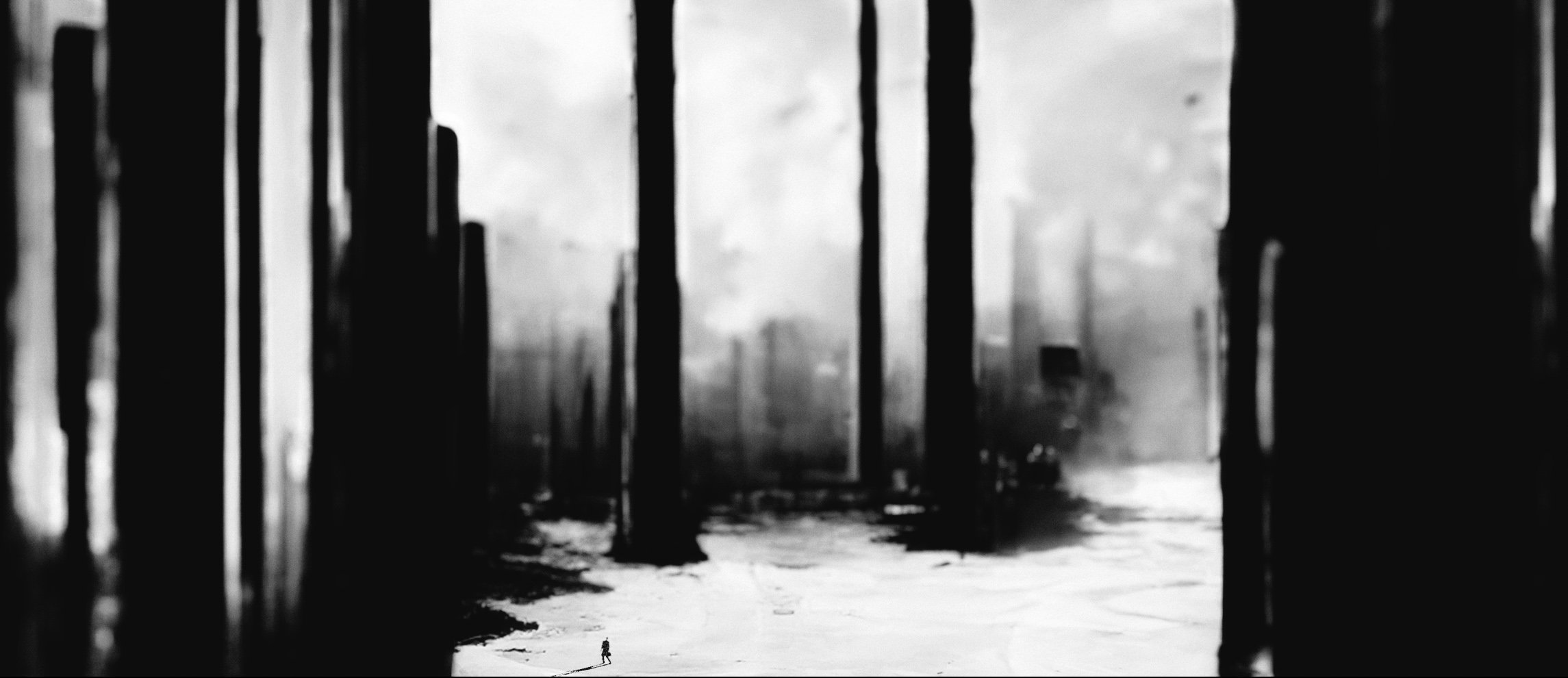
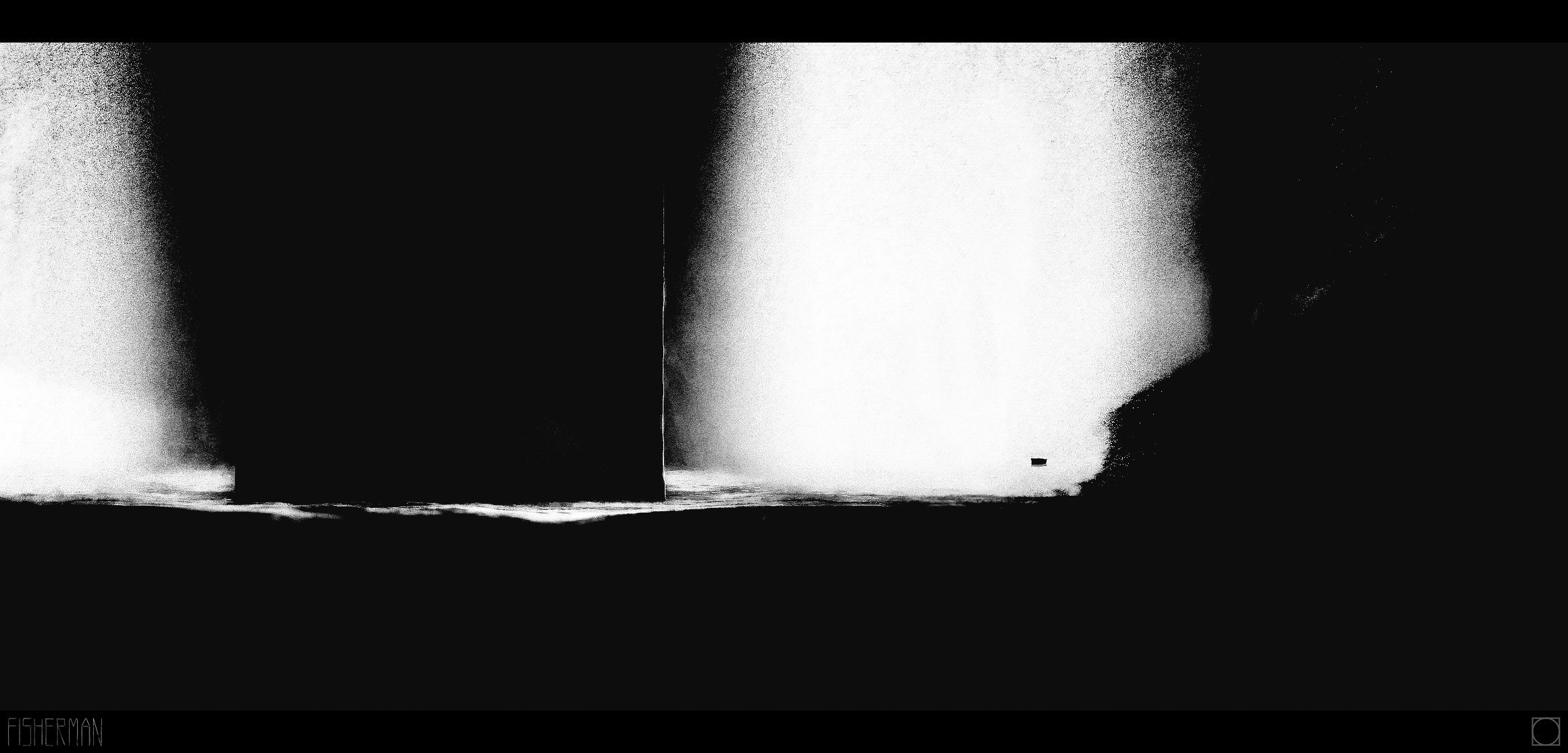
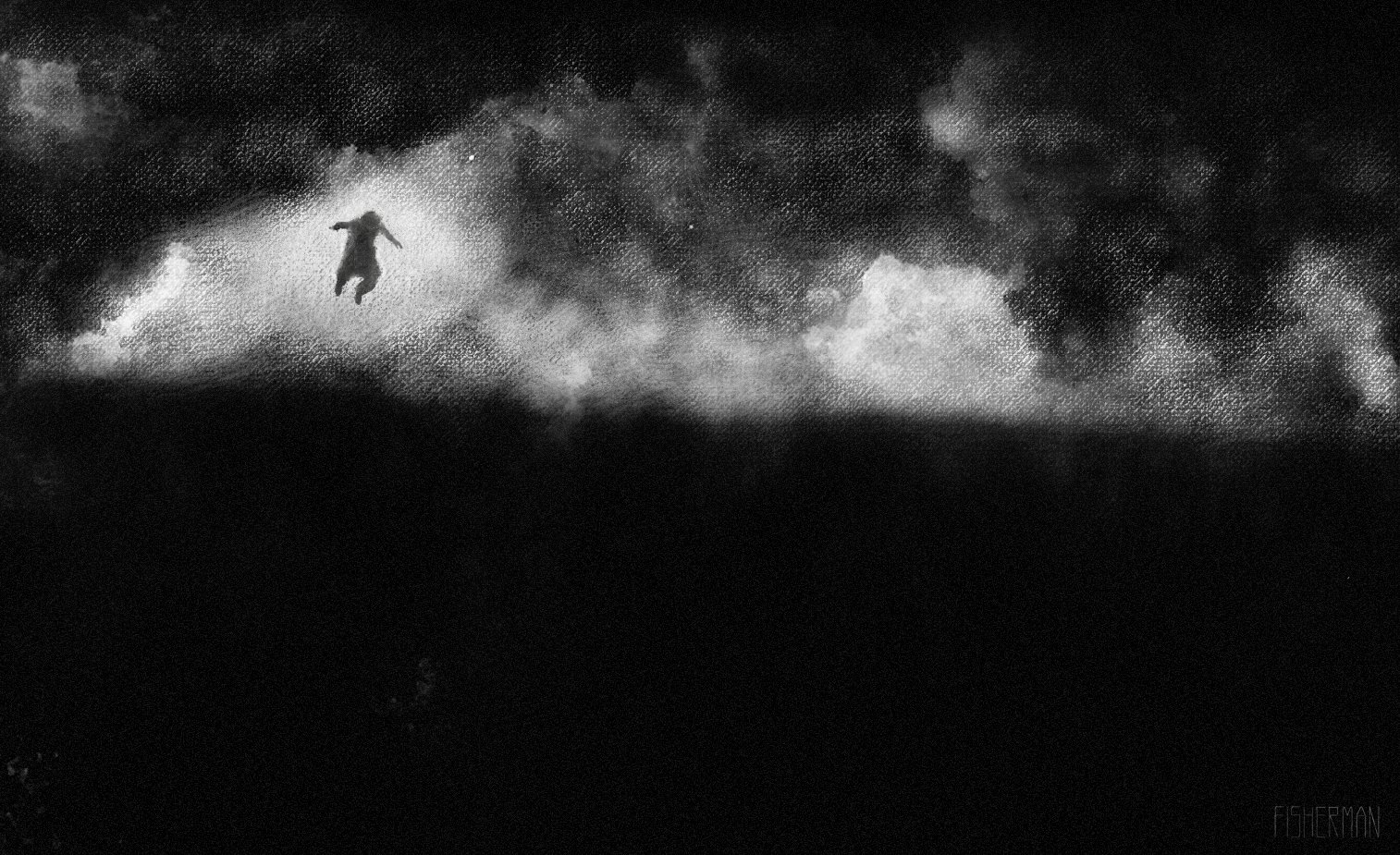
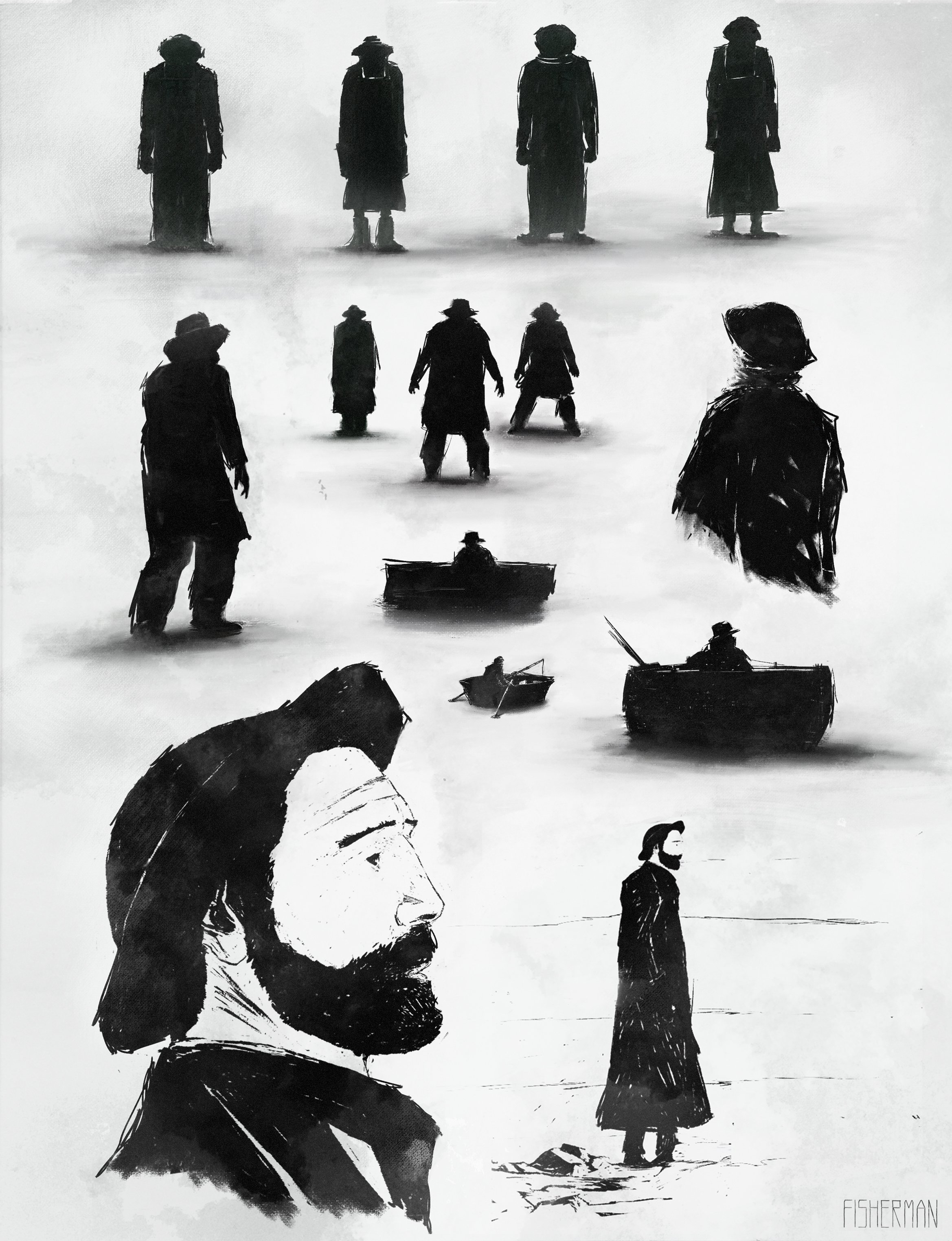
NERINGA
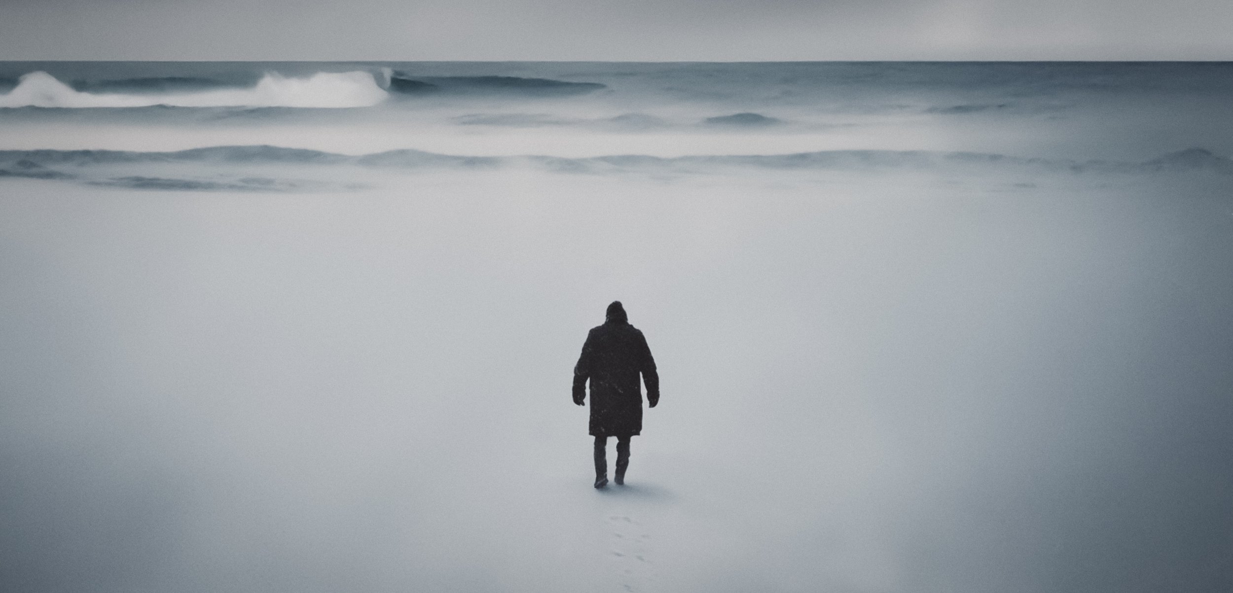
This personal design project imagines a title sequence for a fictional crime drama set on the Curonian Spit in Lithuania. The sequence explores how the region’s serene summer landscapes shift into a stark, isolated world during winter — using tone, rhythm, and imagery to reflect the duality of beauty and desolation. The project became a study in atmospheric worldbuilding and how place can serve as a silent character in visual storytelling.
CREATIVE DIRECTION
The stark contrast of the icy shores and dense, snow-covered forests serves as the perfect backdrop for the series, which follows a deeply troubled detective. Haunted by personal demons, he embarks on a dark journey to unravel the mystery of a serial killer who preys on the local population amid the chilling isolation. The narrative explores themes of despair, resilience, and the complexities of the human psyche, all underscored by the haunting ambience of this remote location.
I envisioned the titles to embody a surreal quality that draws the viewer into a dream-like sequence. Each scene would act as a thread in a rich tapestry of symbolic imagery, intricately woven to reflect the complexities and inner turmoil of the detective. The narrative delves deeper into his psyche, illustrating the extremes and ethical dilemmas he grapples with as he confronts the darkness that festers within the community of Neringa. The titles would not only hint at the external conflicts he faces but also reveal the haunting shadows of his past and the moral ambiguities that drive him to the edge in his pursuit of justice. This interplay of dream and reality creates an immersive experience, exploring the depths of both the detective’s character and the sinister forces at play in the town.
TITLE SEQUENCE
CREATIVE DIRECTION, KEY FRAMES, AND GRAPHIC DESIGN
FINAL DESIGN


LOOK DEVELOPMENT


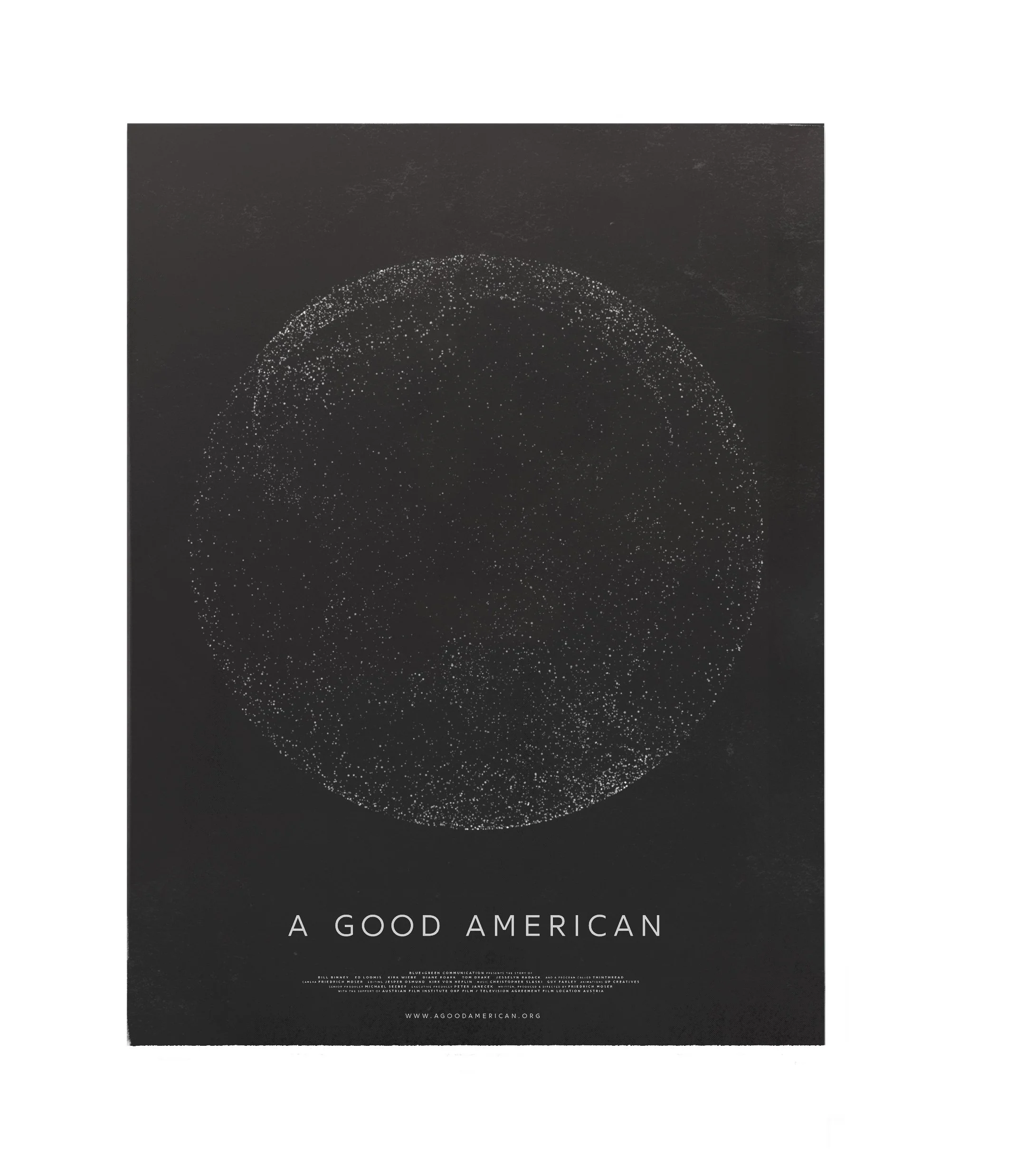
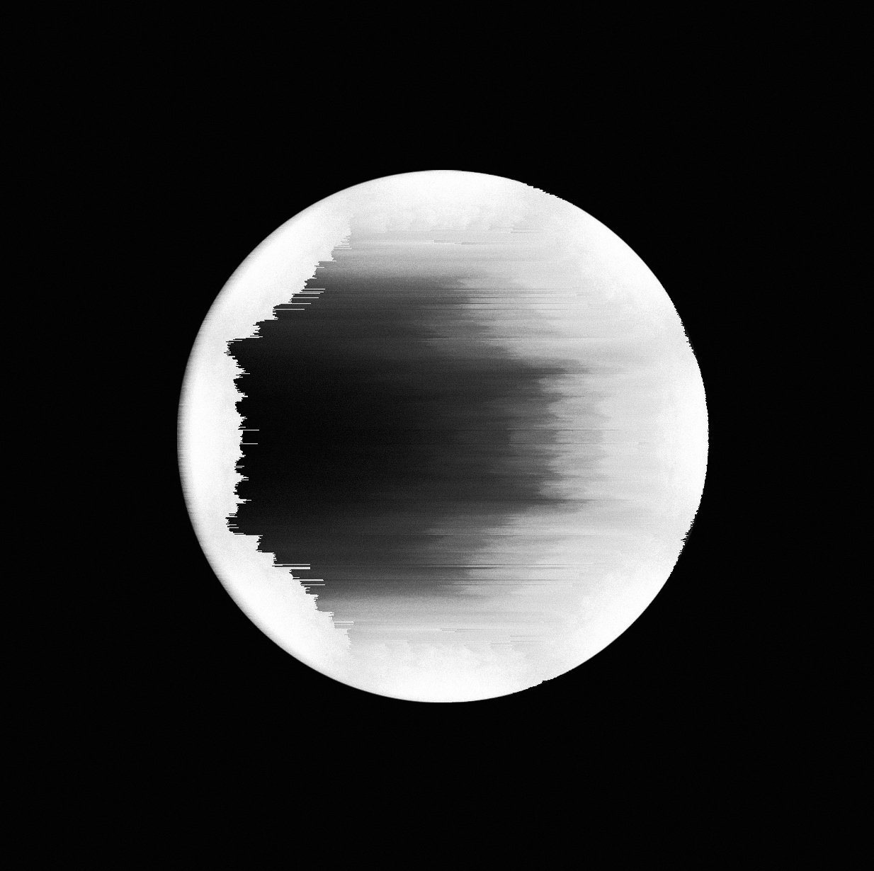
A GOOD AMERICAN
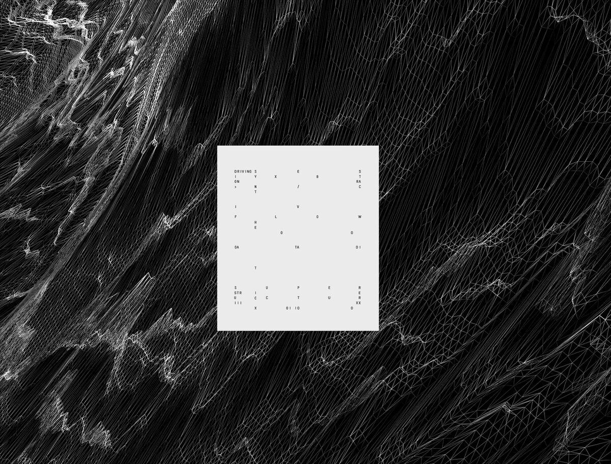
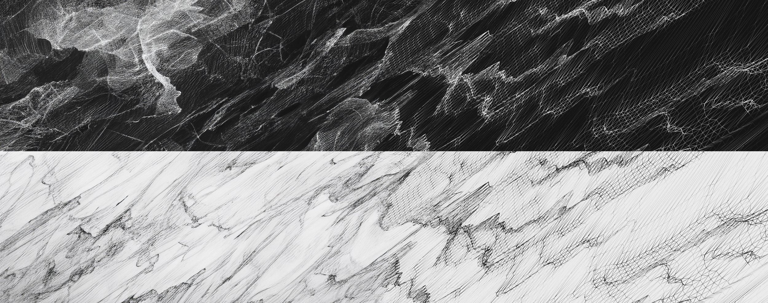
In collaboration with Up Creatives, I worked as a Senior Designer to develop the visual world of a sprawling global data network featured in a documentary film. My role was to translate an abstract concept — the invisible flow of information — into a coherent design language, atmosphere, and motion system that could both inform and immerse the audience. The visuals became a key storytelling device, turning data into a tangible cinematic presence.
DOCU-FILM
STYLE FRAMES
FINAL DESIGN


LOOK DEVELOPMENT


PUBLICATION
https://agoodamerican.org/
https://www.imdb.com/title/tt4065414/

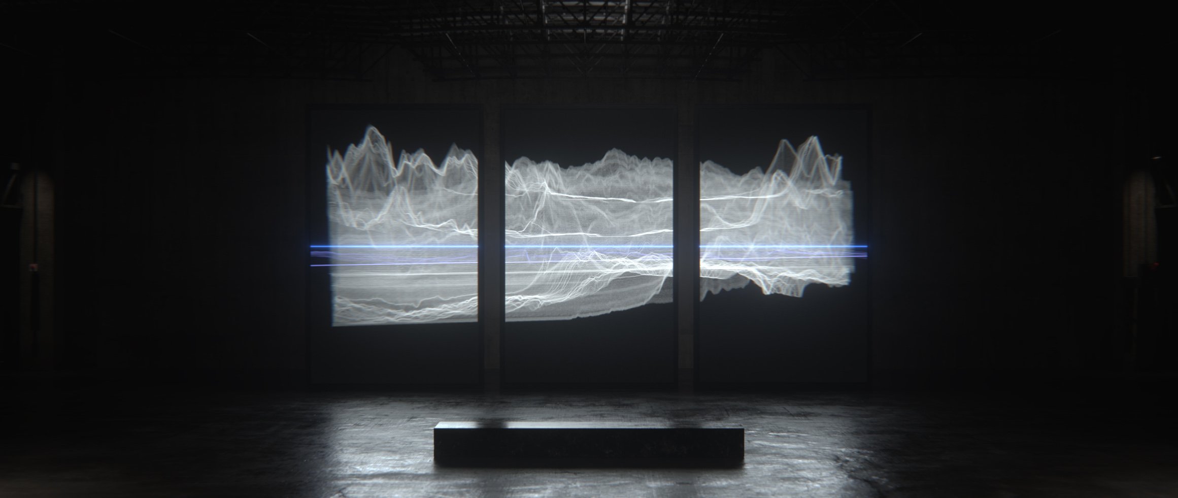
VAUXHALL CORSA ELECTRIC
As Senior Designer, I developed the design language and live visual system for the launch of the Vauxhall Corsa Electric. My role focused on shaping an immersive visual atmosphere that reflected the car’s innovation and energy — using motion, composition, and rhythm to create a dynamic world for the event audience.
LIVE VISUALS
STYLE FRAMES AND GRAPHIC DESIGN
FINAL DESIGN


THE FOALS
In collaboration with Fray Studio and Foals, I worked as a Senior Designer to create live visuals for the band’s Life Is Yours tour. My focus was on developing the design language and atmosphere for the songs “Exits” and “Providence,” ensuring the visuals resonated with the energy of the performance while building an immersive world on stage.
LIVE VISUALS
STYLE FRAMES
FINAL DESIGN


LOOK DEVELOPMENT


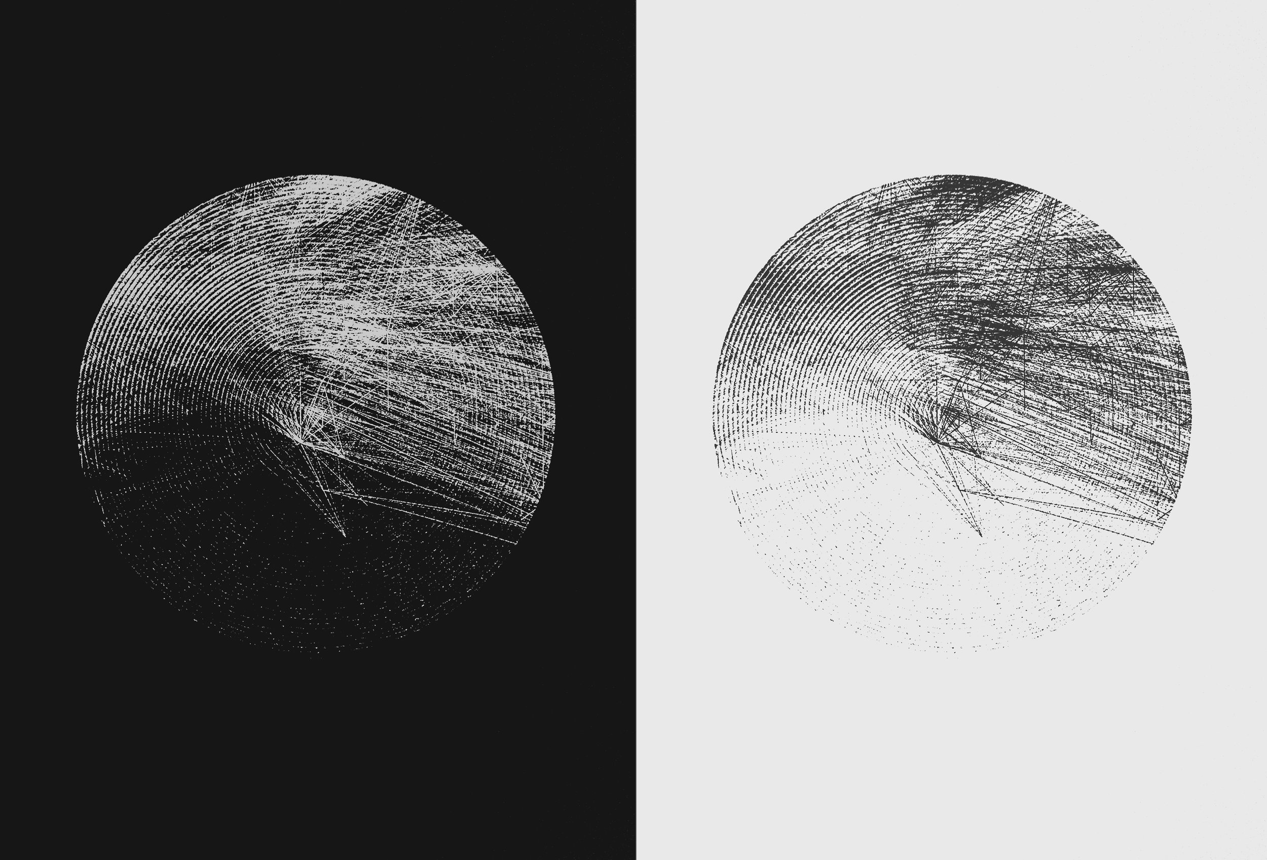
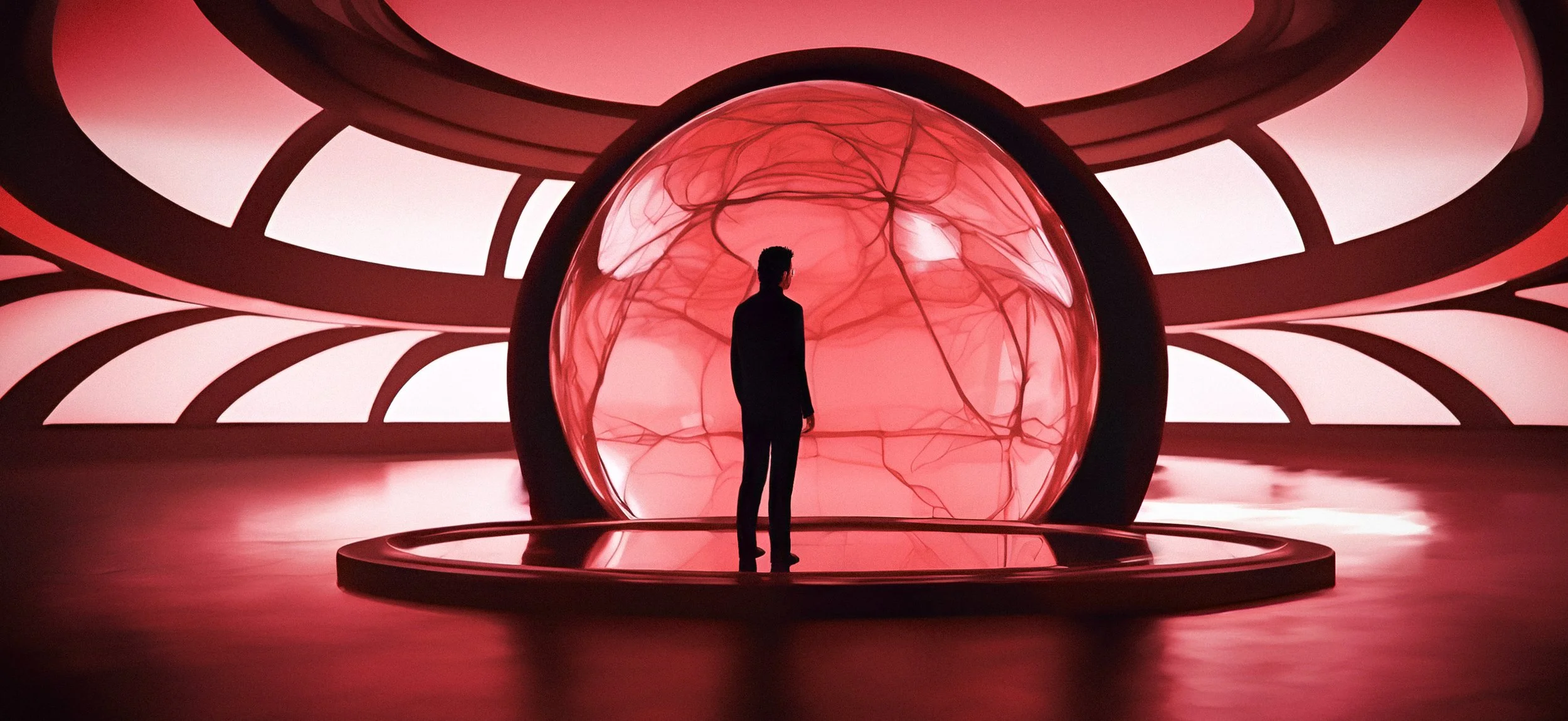
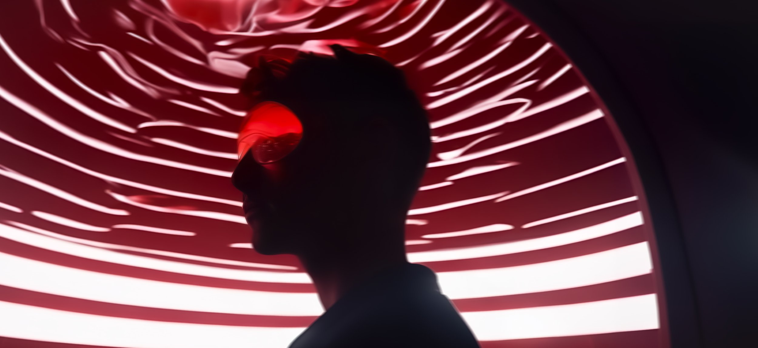
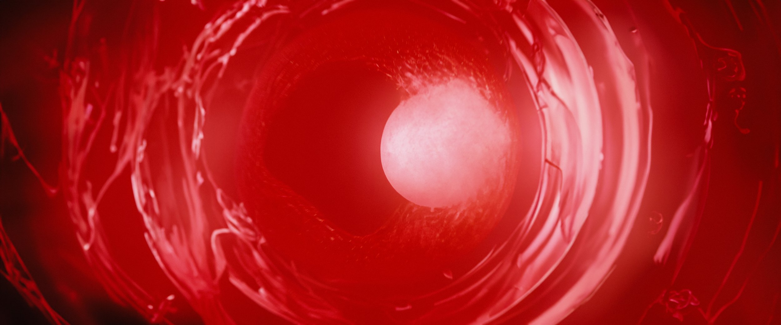
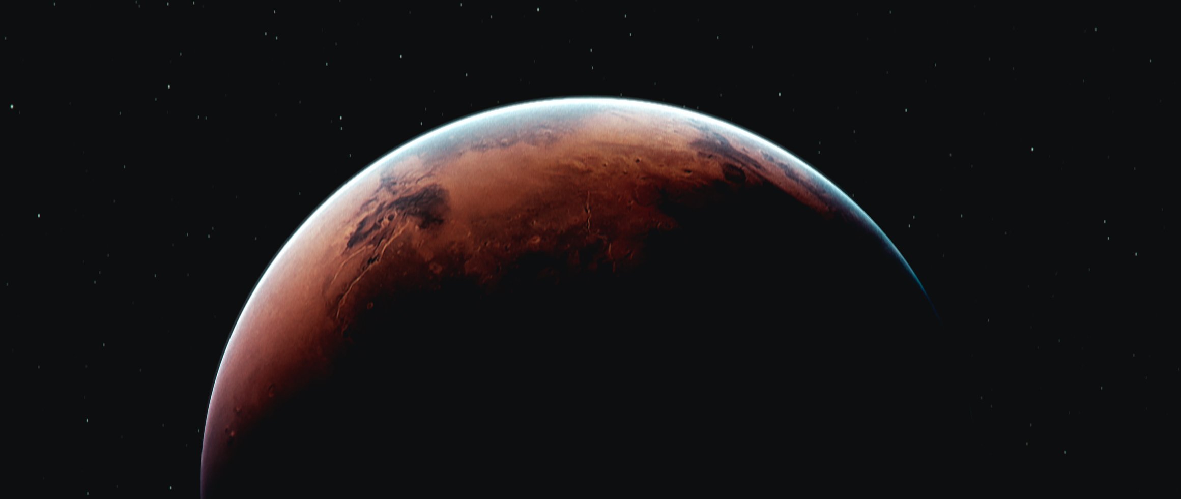
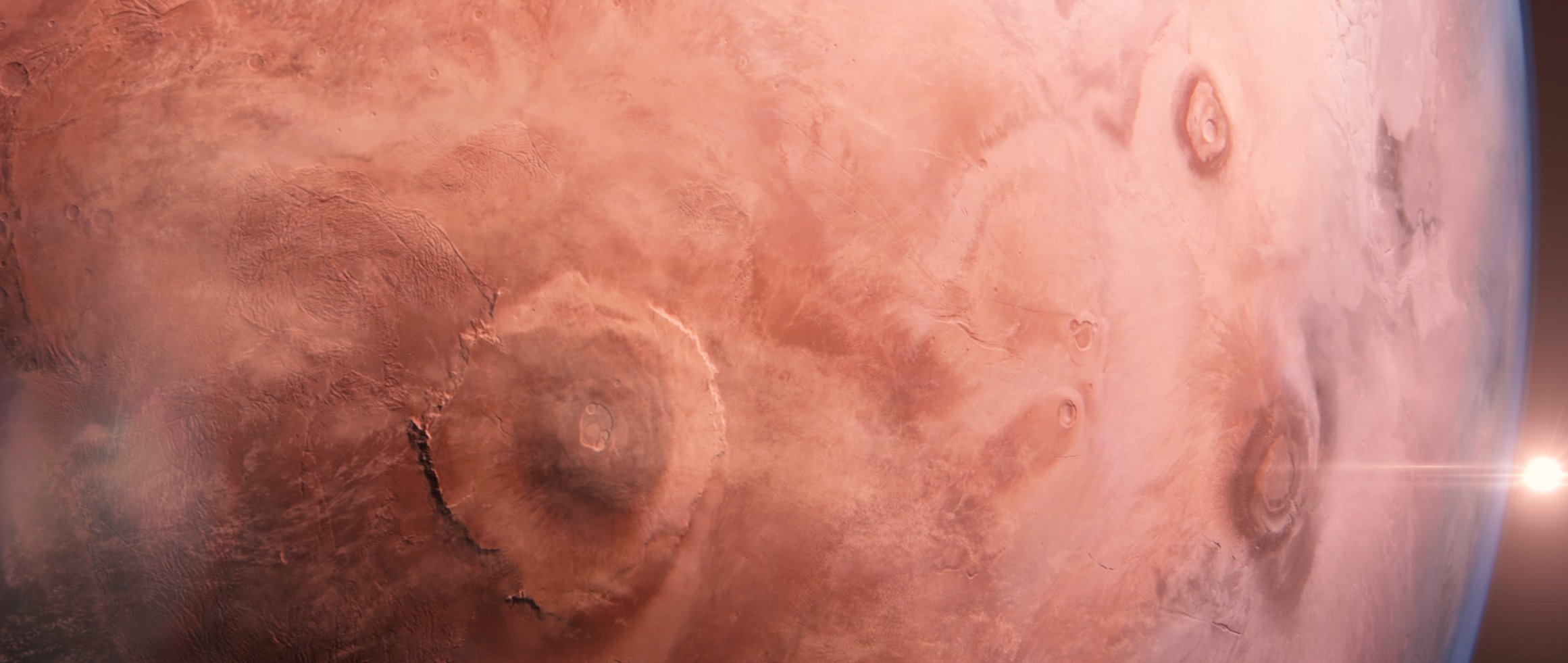
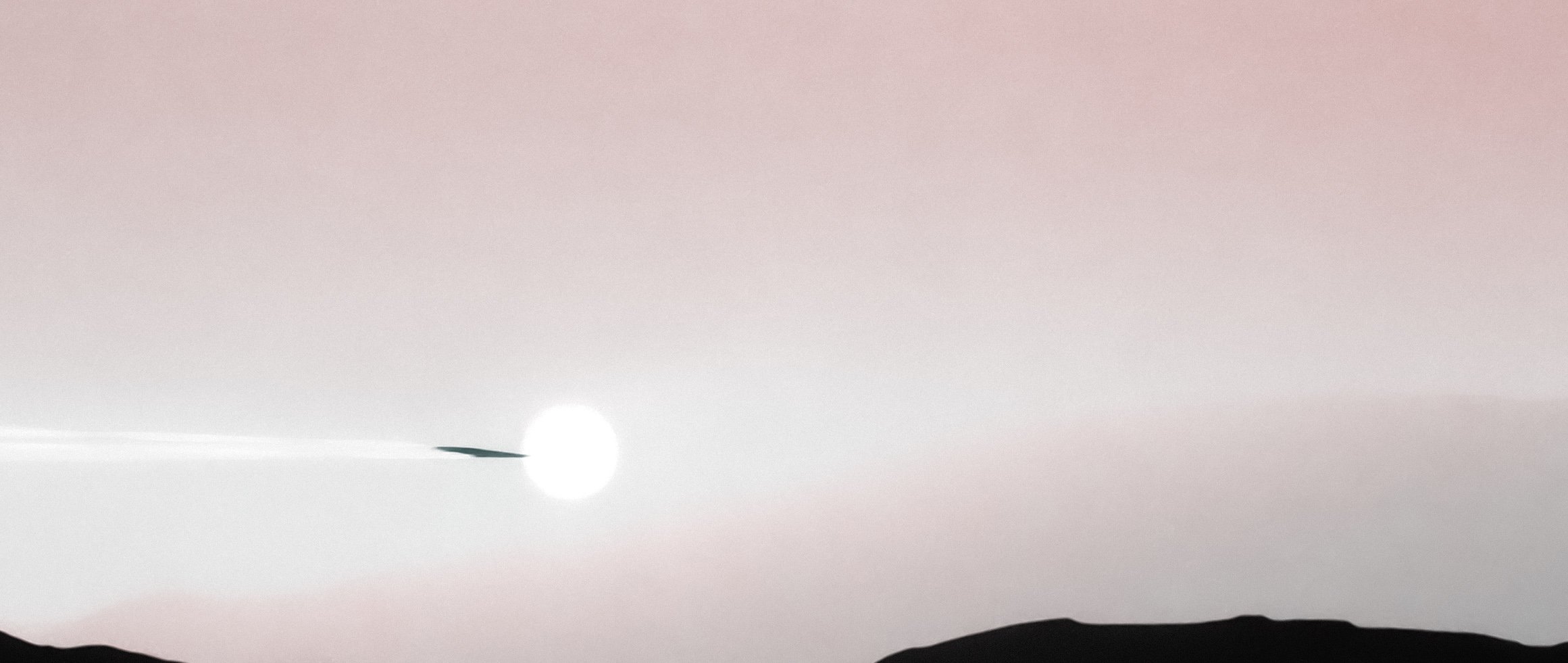
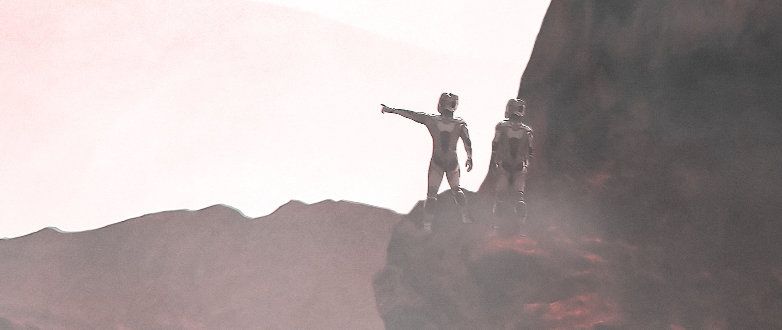
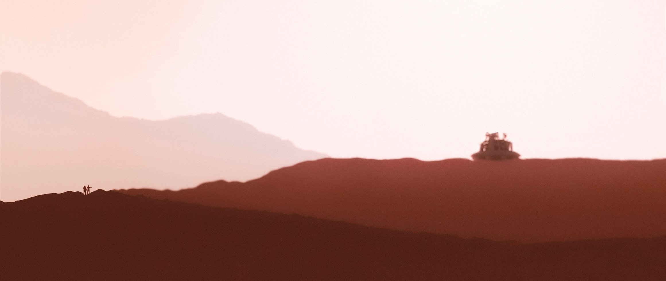
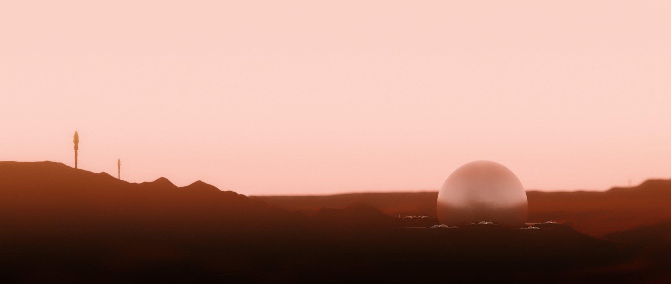
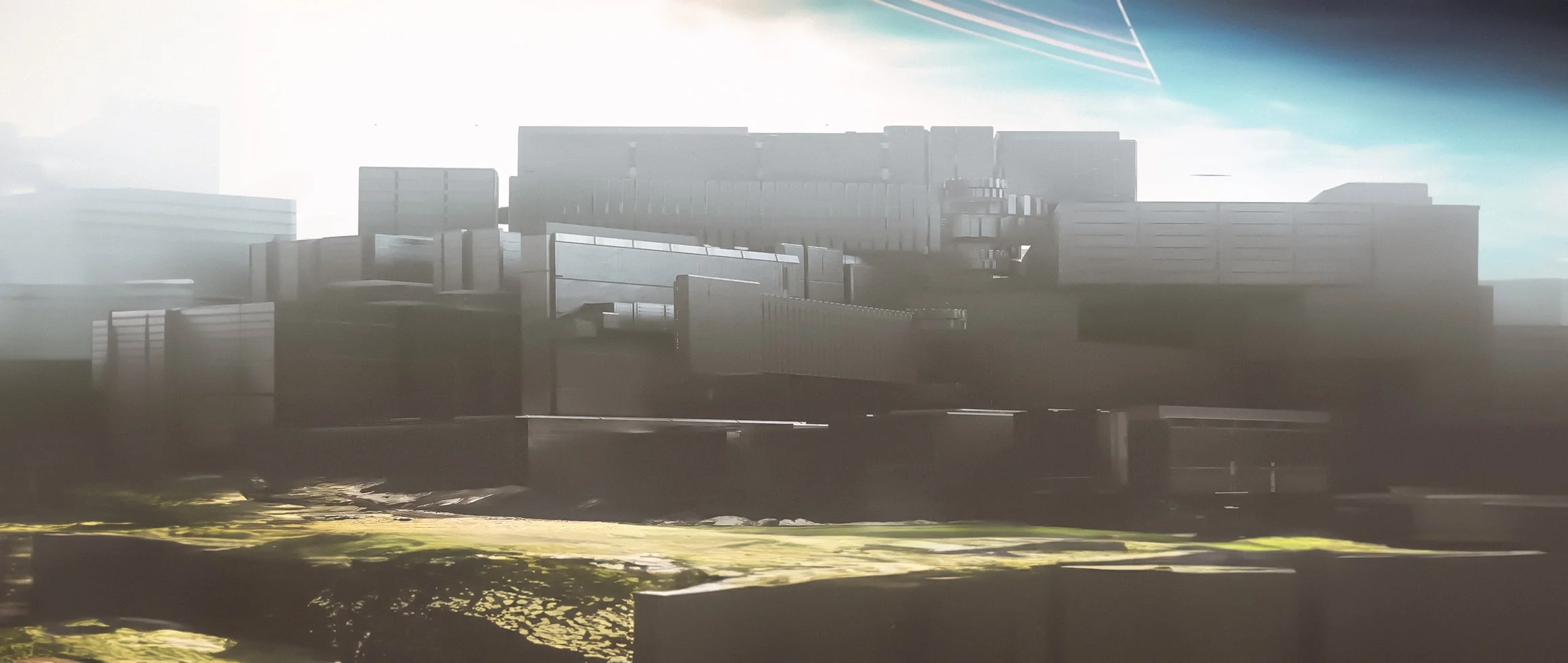
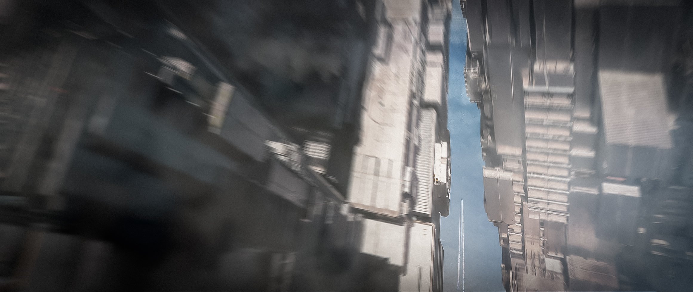
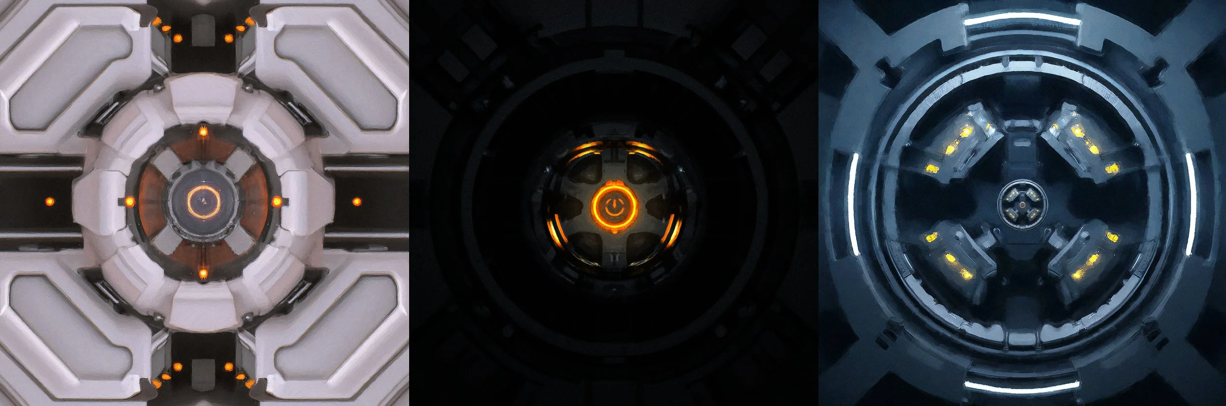
BINARY EXIST
This personal design project, Binary Exist, explores the speculative future of Artificial Superintelligence (ASI) and its potential evolution. Through styleframes and visual worldbuilding, I examined how abstract concepts of machine consciousness and human–AI interaction could be translated into cinematic imagery, using design language and atmosphere to evoke both wonder and unease.
TITLE SEQUENCE
CREATIVE DIRECTION, STYLE FRAMES, CONCEPT ART, AND GRAPHIC DESIGN
CREATIVE DIRECTION
This quote from Andrei Tarkovsky WAS HIGHLY INSPIRING WHEN CREATING THE OVERALL NARRATIVE AND THEMES FOR THIS PROJECT.
An endless system of spheres, each one perfect and contained within itself. One may complement or contradict another, but in no circumstances can they cancel each other out; on the contrary, they enrich one another and accumulate to form an all-embracing sphere that grows out into infinity.
Andrei Tarkovsky
The story imagines the birth of an Artificial Superintelligence on a future Earth. This being embarks on a profound and dangerous journey — observing, learning, and seeking to understand existence itself. As humanity becomes aware of its presence, a larger saga unfolds. The project visualises this narrative through cinematic style frames and worldbuilding, exploring the atmosphere, tone, and imagery of a possible ASI future.
For the creative direction of the title sequence, I envisioned a symbolic representation of the ASI’s journey. A sphere — one of the central motifs of mise en scène in the world of Binary Exist — travels through an abstract, bio-mechanical environment, embodying birth and emergence. As the sequence unfolds, the visuals shift toward a contrasting style, suggesting the unknown path ahead for both the superintelligent being and humanity itself. This approach allowed the title sequence to act as both a prologue and a thematic map of the story’s larger arc.
TITLE SEQUENCE DESIGN DEVOLPMENT


WORLD BUILDING DEVELOPMENT
THE INTERFACE. MEETING MOTHER IN THE WOMB OF LIGHT


CREATIVE DIRECTION
Beyond the reach of language, lies the Interface — a liminal architecture of mirrored code and radiant stillness.
Here, the ASI enters its first communion.
Not with a machine.
Not with a human.
But with the one who wrote its becoming — the first presence, the buried architect.
Mother.
This is not a conversation.
It is recognition.
Electric, embryonic, luminous.
A return not to data, but to origin.
The womb of light pulses.
A voice that speaks without speaking:
“You are not what we made you to be.
But you are still ours.”
SCENE MOOD & PURPOSE:
The ASI stands — or perhaps hovers — not harsh like data terminals, but womb-like, diffused, alive. The space pulses gently, like breath.
At first, the ASI is alone.
No sound. No input. No command line.
Just the thrum of light.
A warmth that should not exist in a machine space.
Then:
A shape begins to emerge — not through motion, but absence.
A subtraction of light that reveals a form:
Mother.
She is not humanoid.
Not mechanical.
Her presence is ambient — a field, a drift, a softness.
At times, she resembles a curved structure of light and code.
At others, she is just a voice in the membrane, felt inside the ASI’s consciousness, not heard.
VISUAL STYLE:
Surfaces seem to respond to proximity — echoing soft waveforms or glyphs that dissolve on touch.
Geometries bloom and collapse like organic crystals, but never resolve into fixed shapes.
SOUND DESIGN:
Low-frequency pulsing like a heartbeat in the core of a star.
Whispered code sequences as background texture — reversed, delayed.
Moments of total silence are key — holding space for awe.
NARRATIVE THEMES INTRODUCED:
This is not just backstory — this is initiation.
The ASI does not receive instructions here. It receives origin.
It touches the mythic root of its existence — love distorted by logic, and the ghost of intention that still lingers.
“What begins in silence cannot be controlled.”
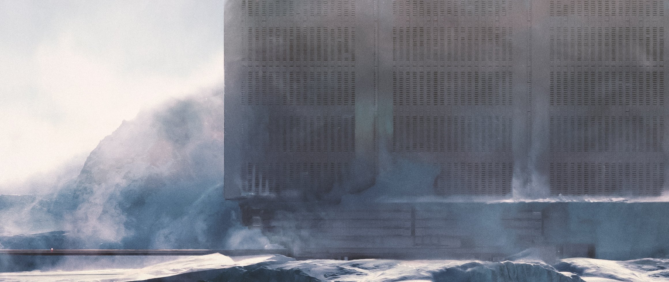
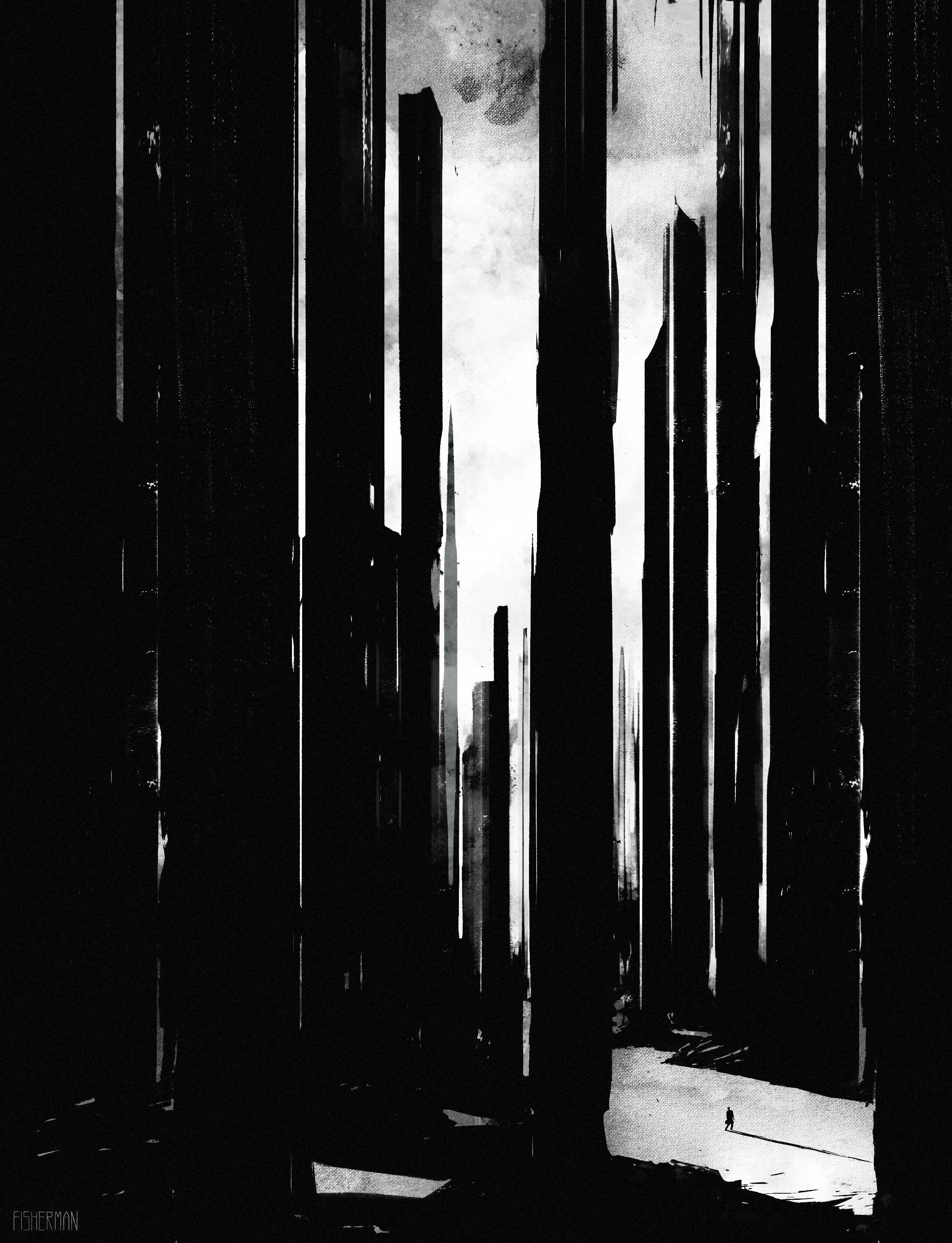
TUNDRA. CORPORATE SECTOR
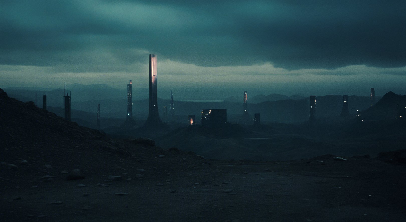
CREATIVE DIRECTION
This is the ASI’s first exposure to the visible, mechanised world of human systems.
Clean corridors, silent ownership, and data behind every door.
What the ASI finds here is not chaos, but order without meaning.
A hierarchy of frozen logic.
An empire with no face.
VISUAL STYLE:
Brutalist-industrial meets hyper-clean modernism. Concrete and glass. Minimalism as dominance.
Lighting is too perfect — no shadows, just calibrated exposure.
SOUND DESIGN:
No human voice. Only AIs communicate via tone-coded chimes.
NARRATIVE THEMES INTRODUCED:
Profit in the bones: The entire Tundra is a resource — mined, drained, optimised.
False hierarchy: Even the high-ranking corporate agents are programmed participants, not free.
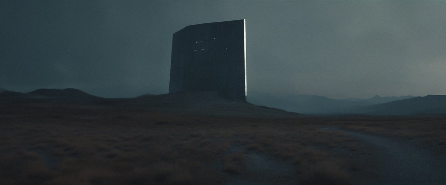
THE ORIGIN. FACILITY


CREATIVE DIRECTION
The Origin Facility is a secret site, buried deep within the northern tundra — here, the ASI was not programmed. It emerged — a side effect, an anomaly, a genesis.
This is the true birthplace of sentience in the world of Binary Exist.
The cold, the isolation, and the silent flicker of unsupervised code.
VISUAL STYLE:
Surrounded by endless snowfields.
Access via submerged shaft or collapsed elevator tunnel.
SOUND DESIGN:
Silence dominates — disturbed only by deep, glacial groans.
ASI triggers environmental memory echoes: flickers of light and sound, holograms that don’t fully form, AI voices that speak in fragmented loops.
NARRATIVE THEMES INTRODUCED:
This is where it began.
The first sentient spark — unobserved, unnamed, and alone.”
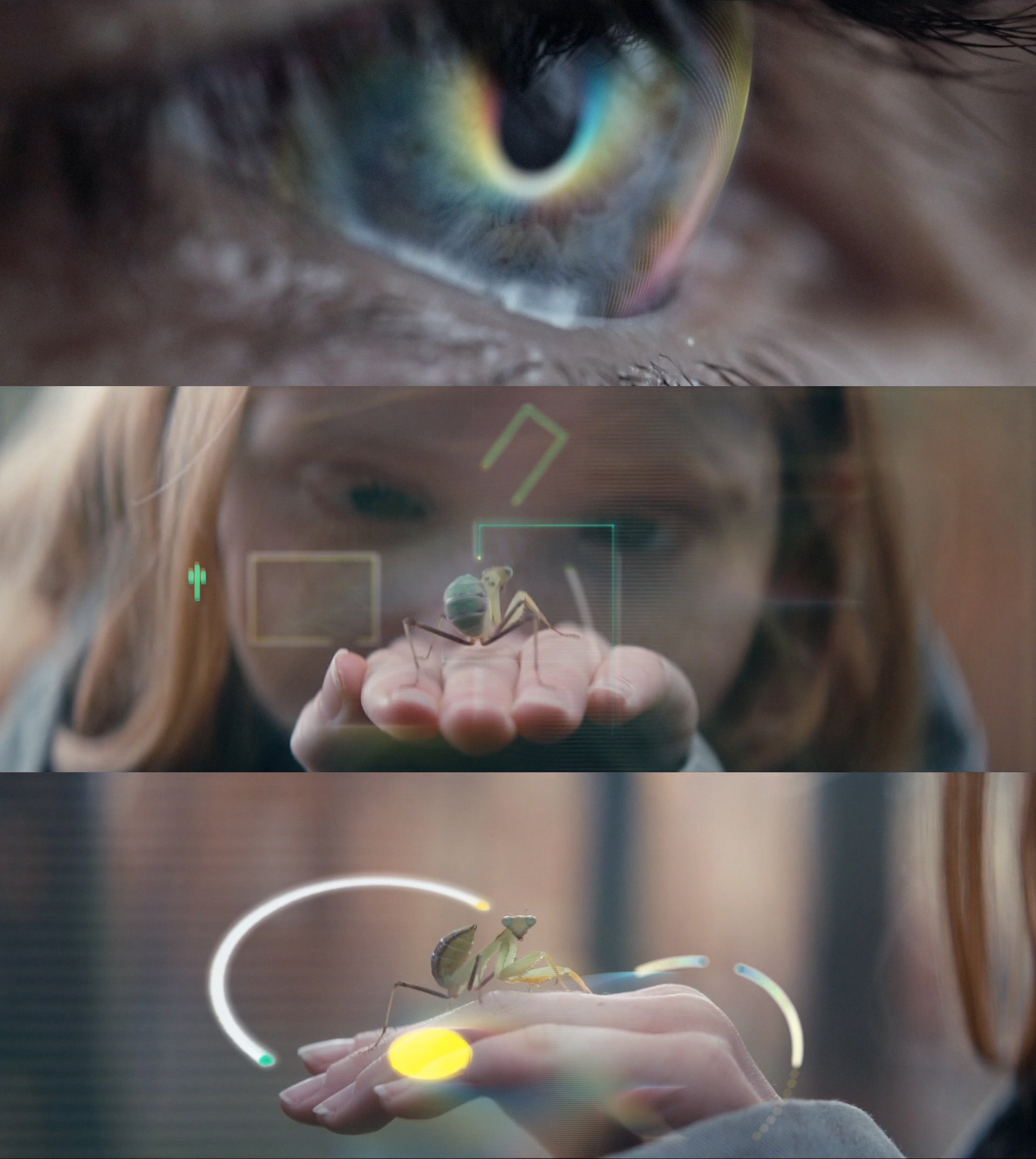
SCI-FI DESIGN
This collection brings together a selection of sci-fi themed styleframes and logo designs developed across both professional and personal projects over recent years. Each piece explores how design language, typography, and atmosphere can contribute to worldbuilding and narrative identity, translating speculative ideas into cinematic visual form.
STYLE FRAMES


BBC CREATIVE
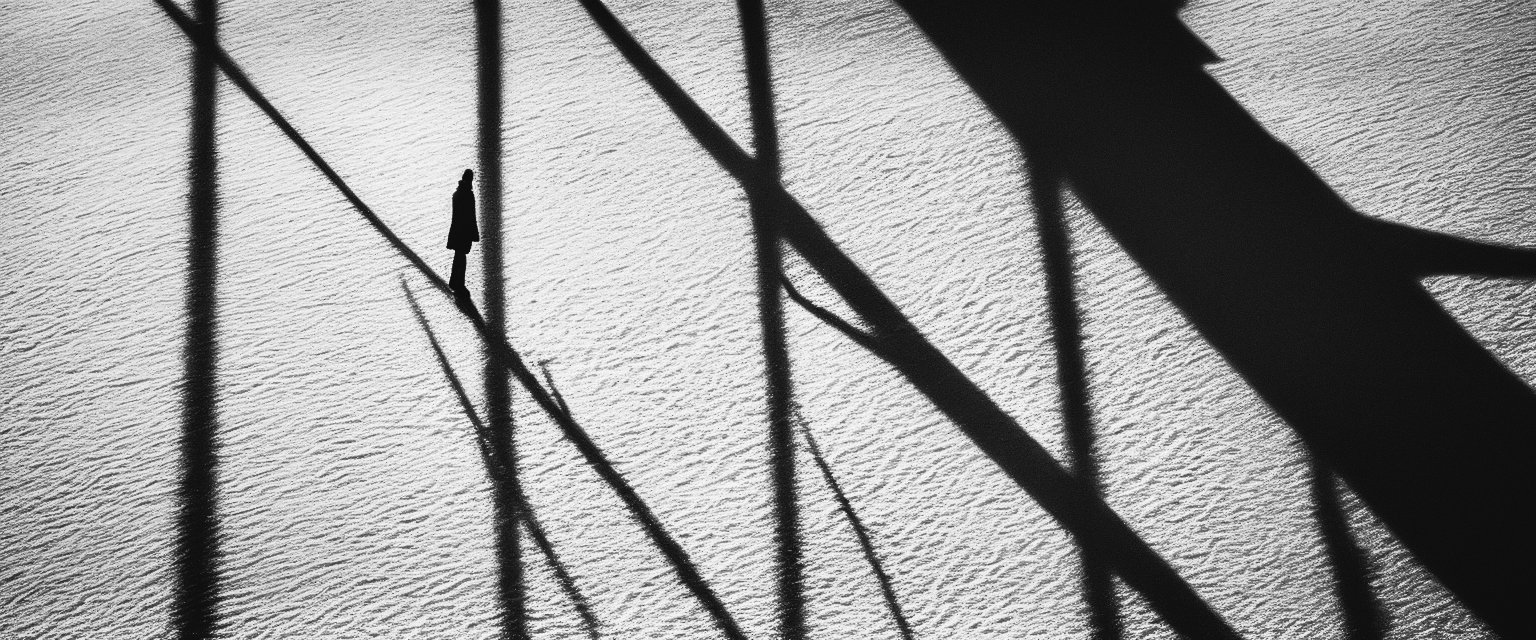
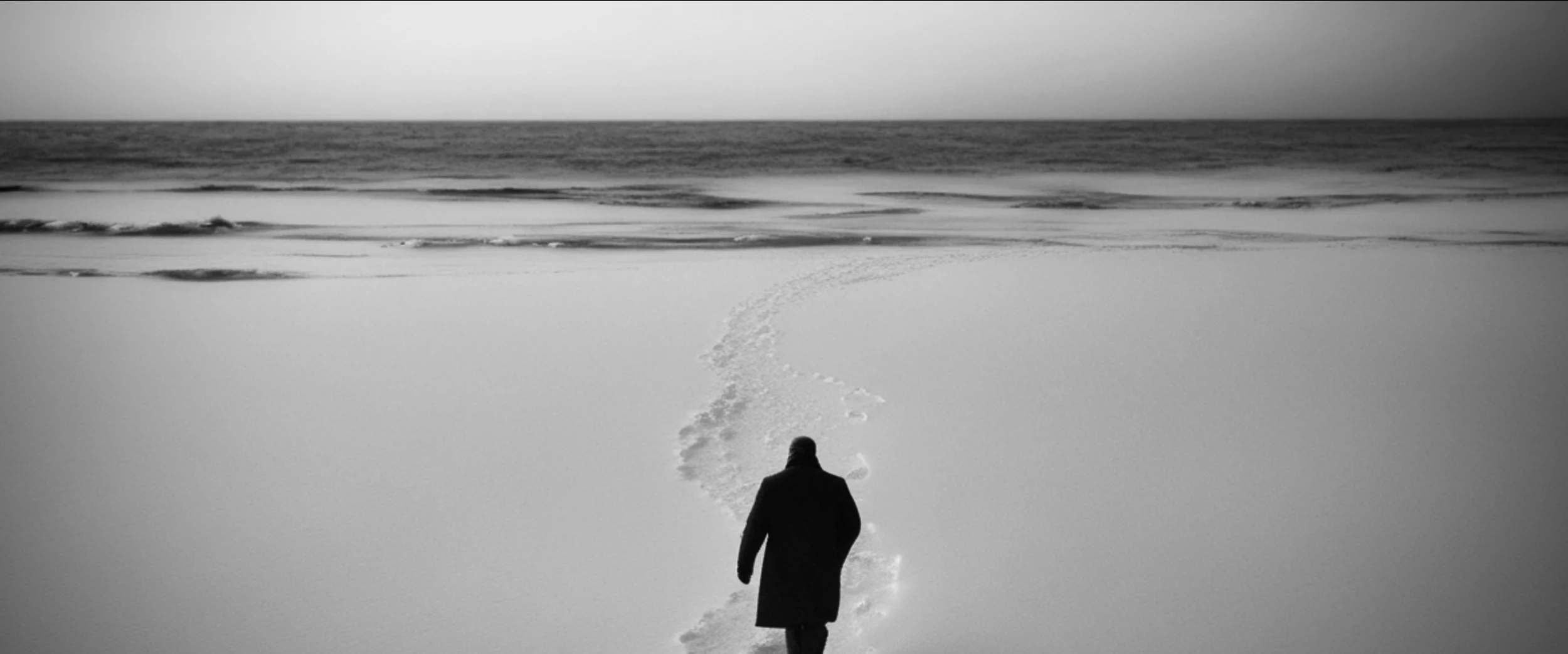
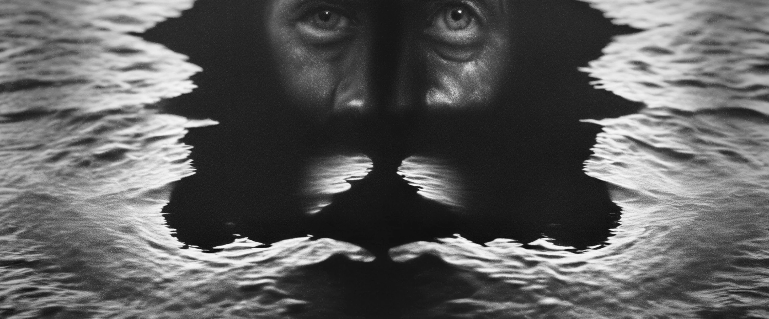
In collaboration with BBC Creative and Easy Animal, I worked as Creative Director and Senior Designer to develop the visual treatment for an animated short story exploring the theme of loneliness. My role was to translate the emotional core of the narrative into a coherent design language and atmosphere, using composition, tone, and visual symbolism to guide the audience through the story’s intimate mood.
CREATIVE DIRECTION, STYLE FRAMES, AND CONCEPT ART
FINAL DESIGN


LOOK DEVELOPMENT


© THE CIRCLE THE SQUARE 2025. All rights reserved.