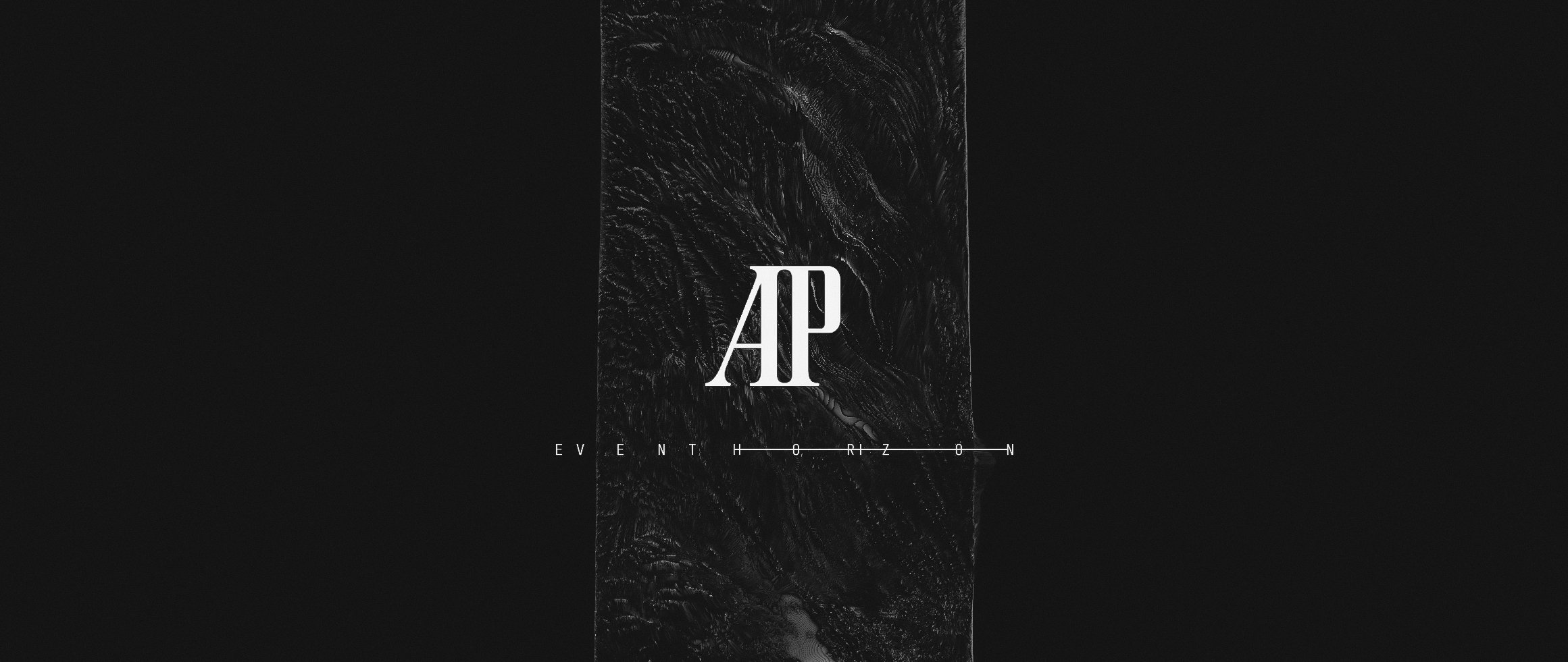
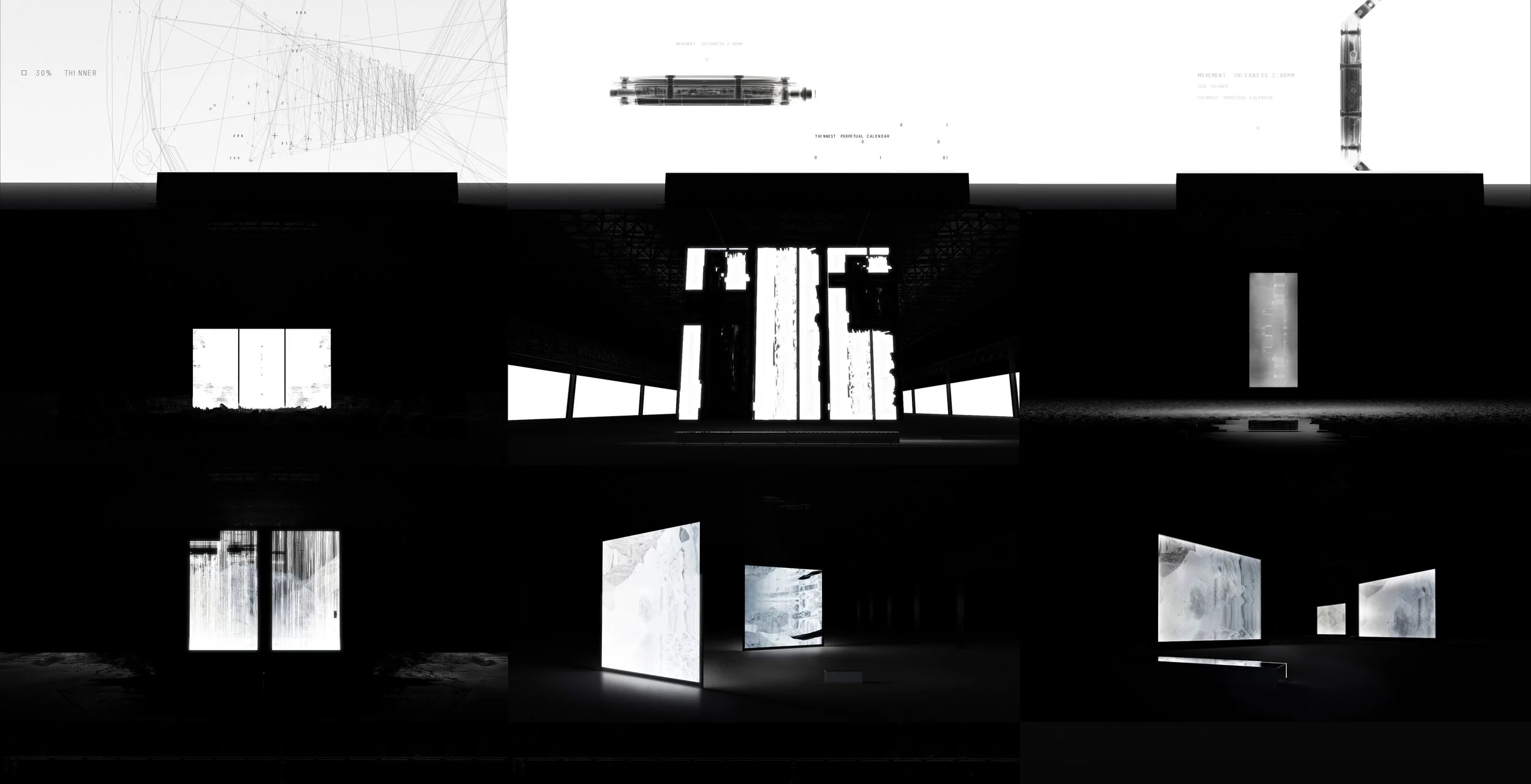
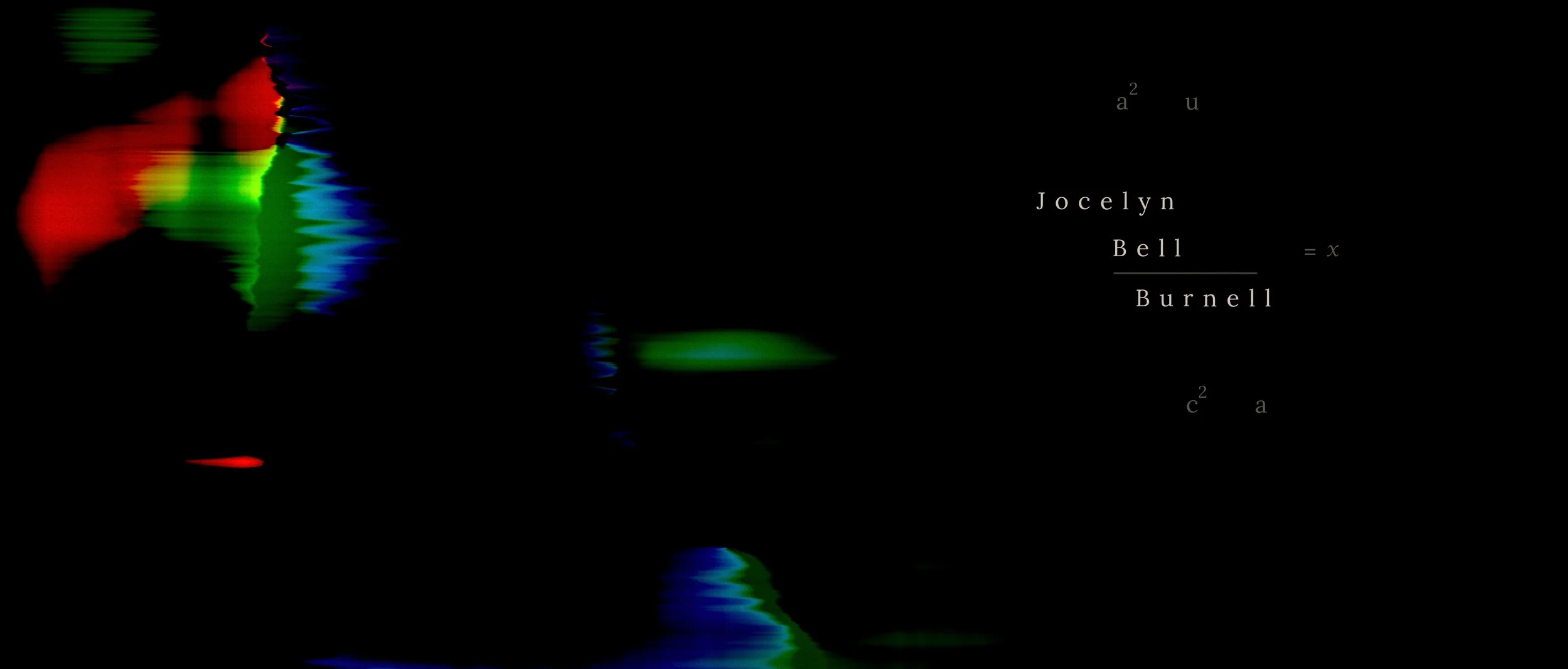
FEATURED PROJECT
AUDEMARS PIGUET. RD#2
OVERVIEW
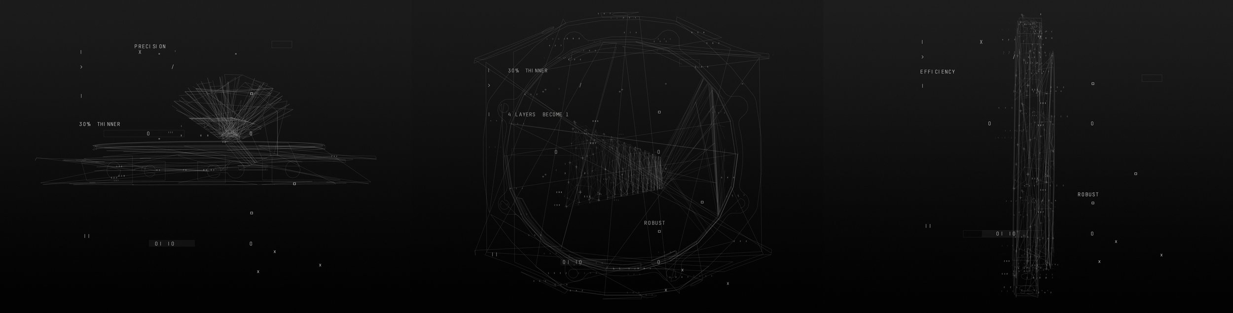
The RD#2 film explored the relationship between precision engineering and the passage of time.
As Senior Designer, I helped define the project’s visual language and cinematic tone, translating the brand’s craftsmanship into form, motion, and light.
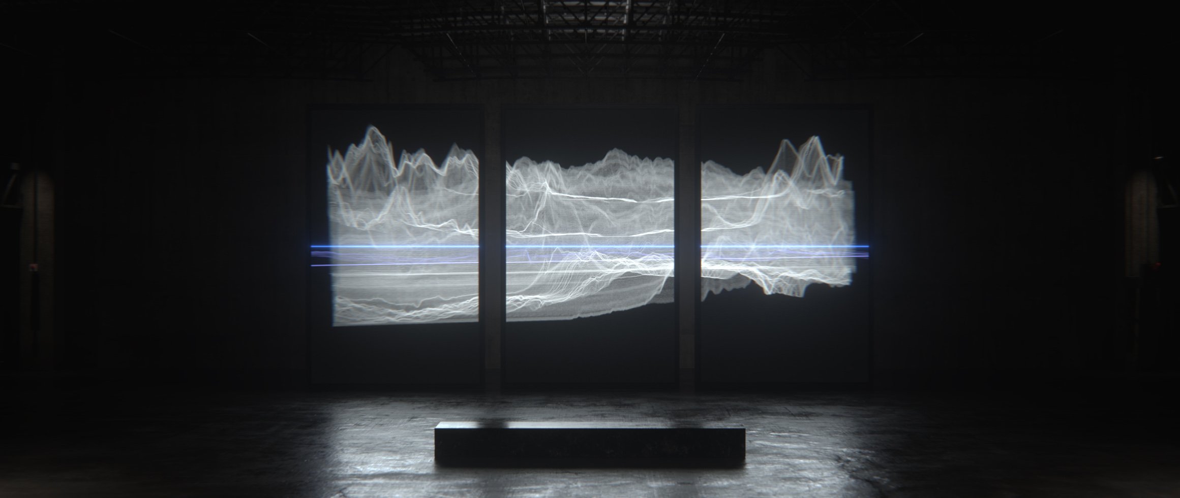
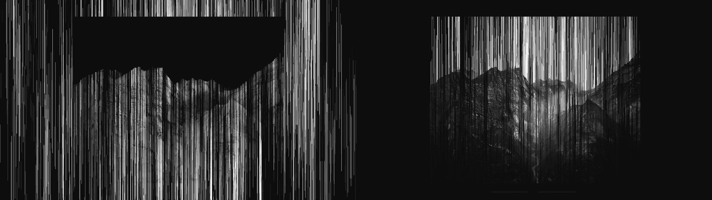
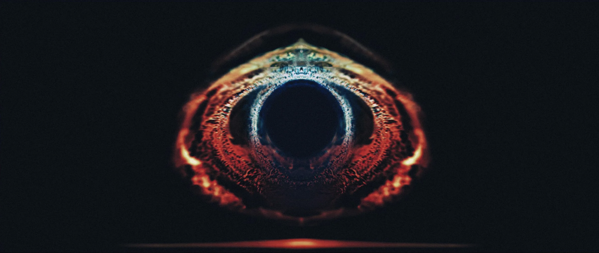
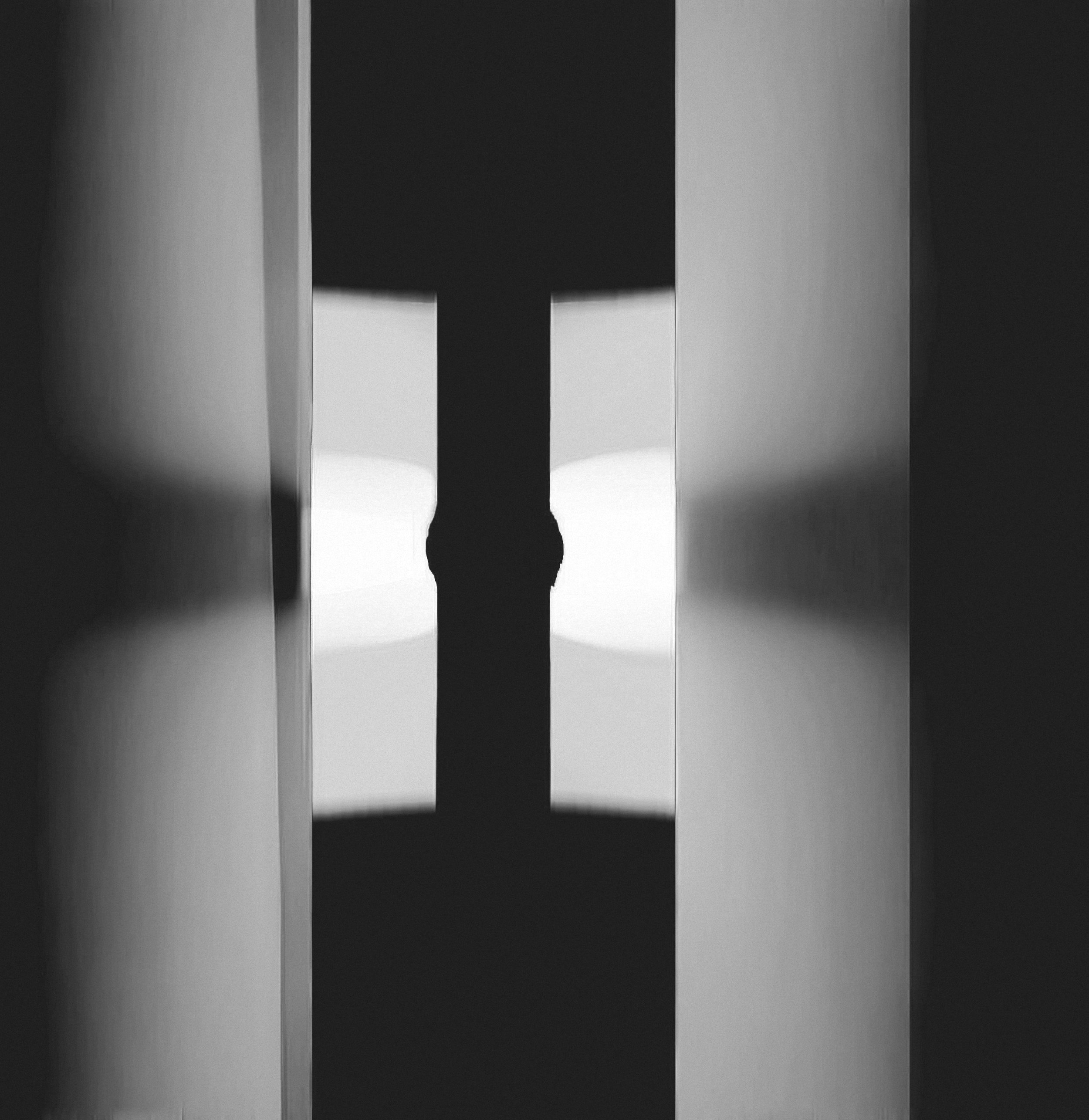
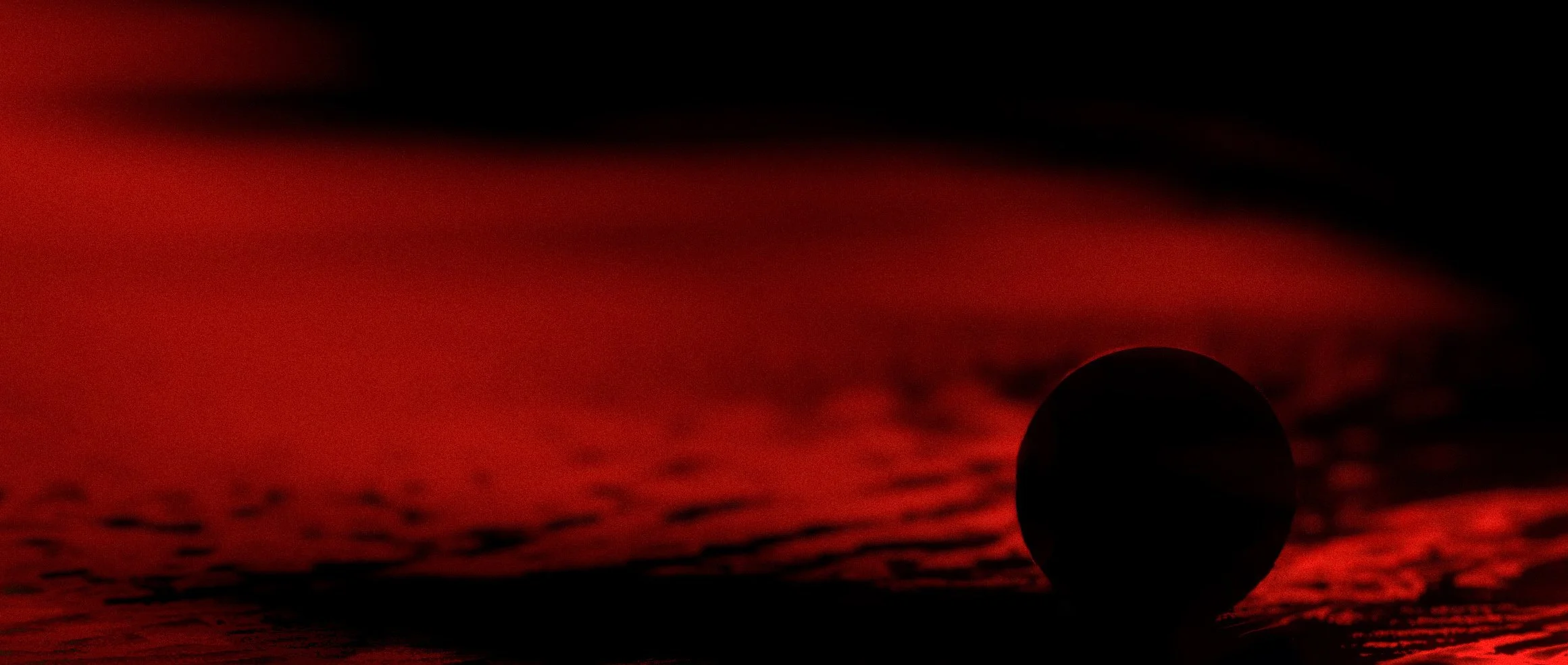
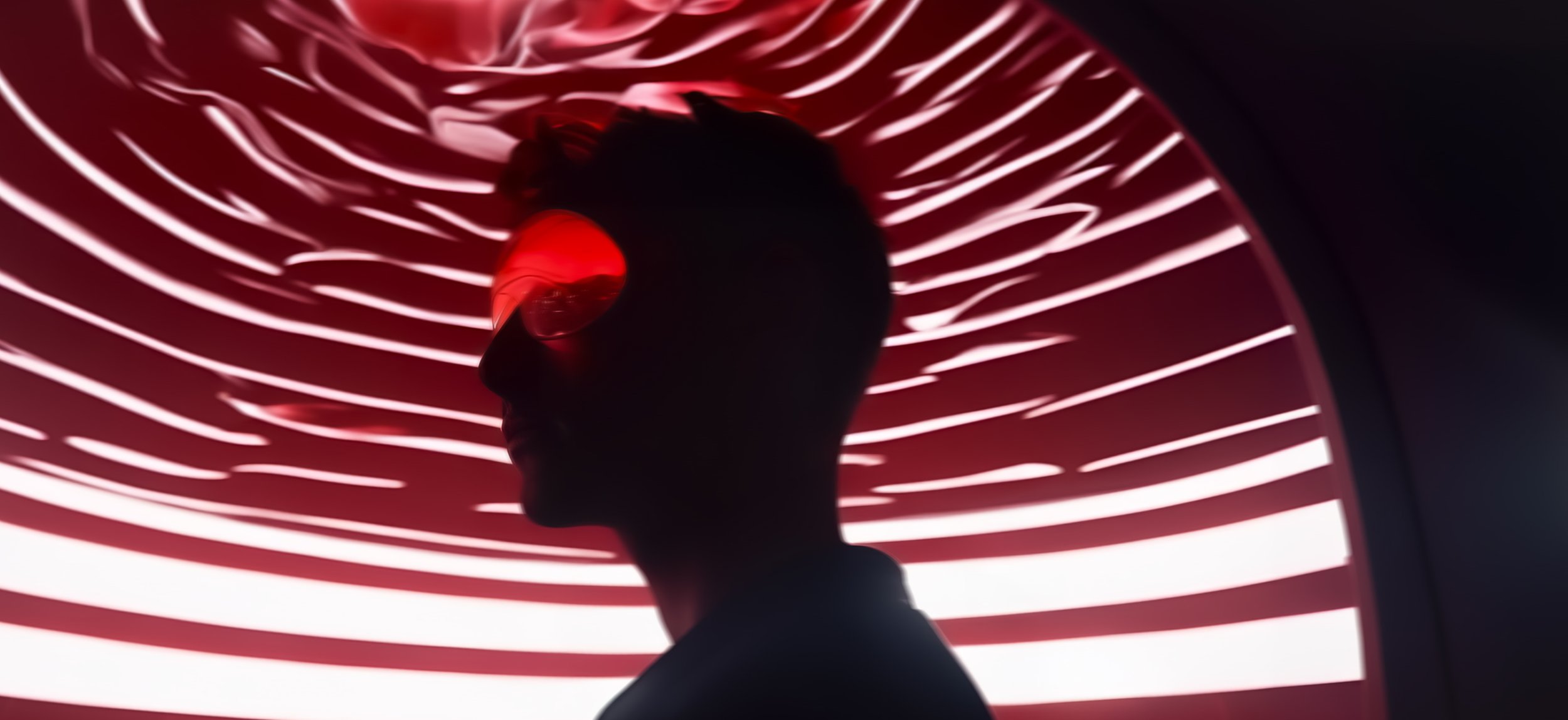
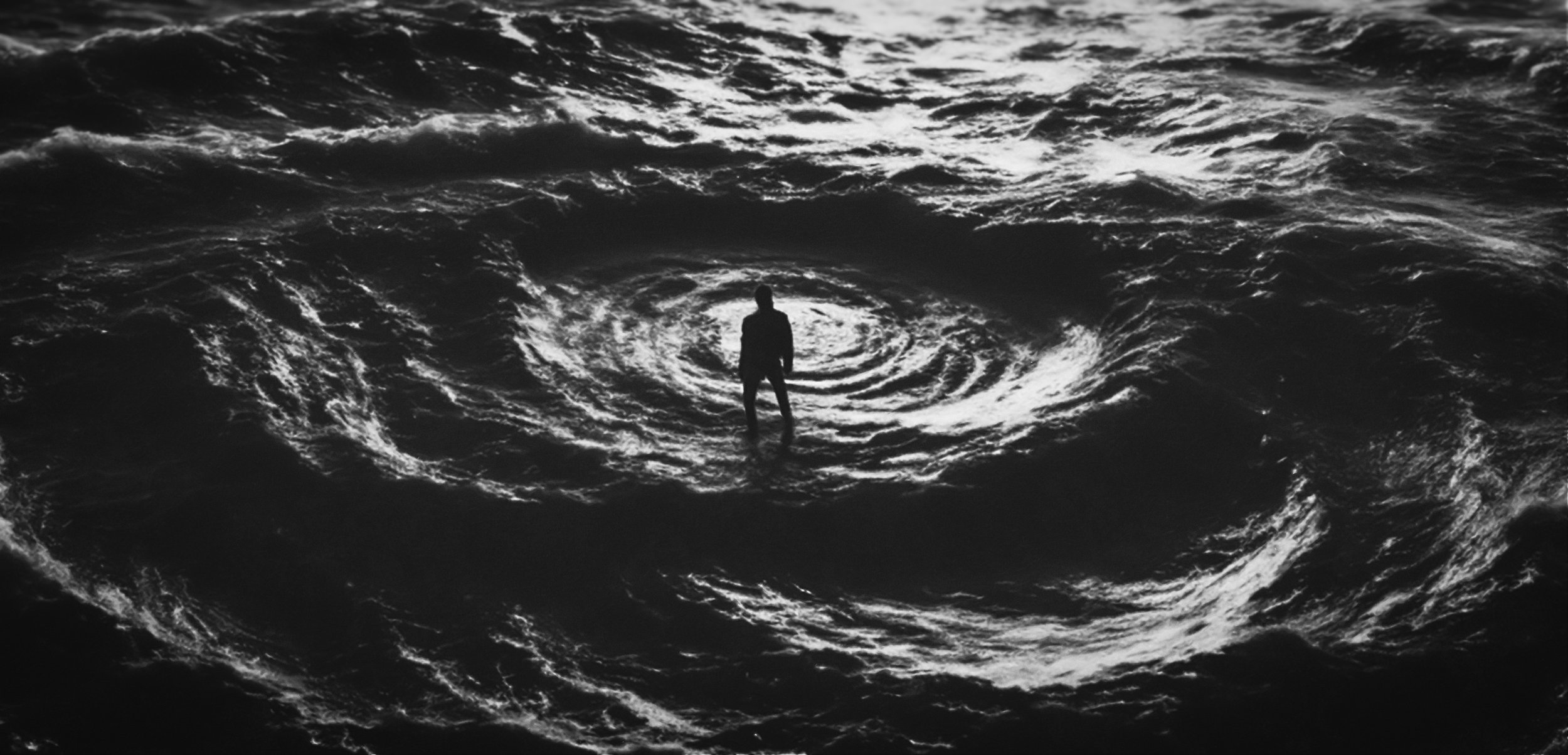
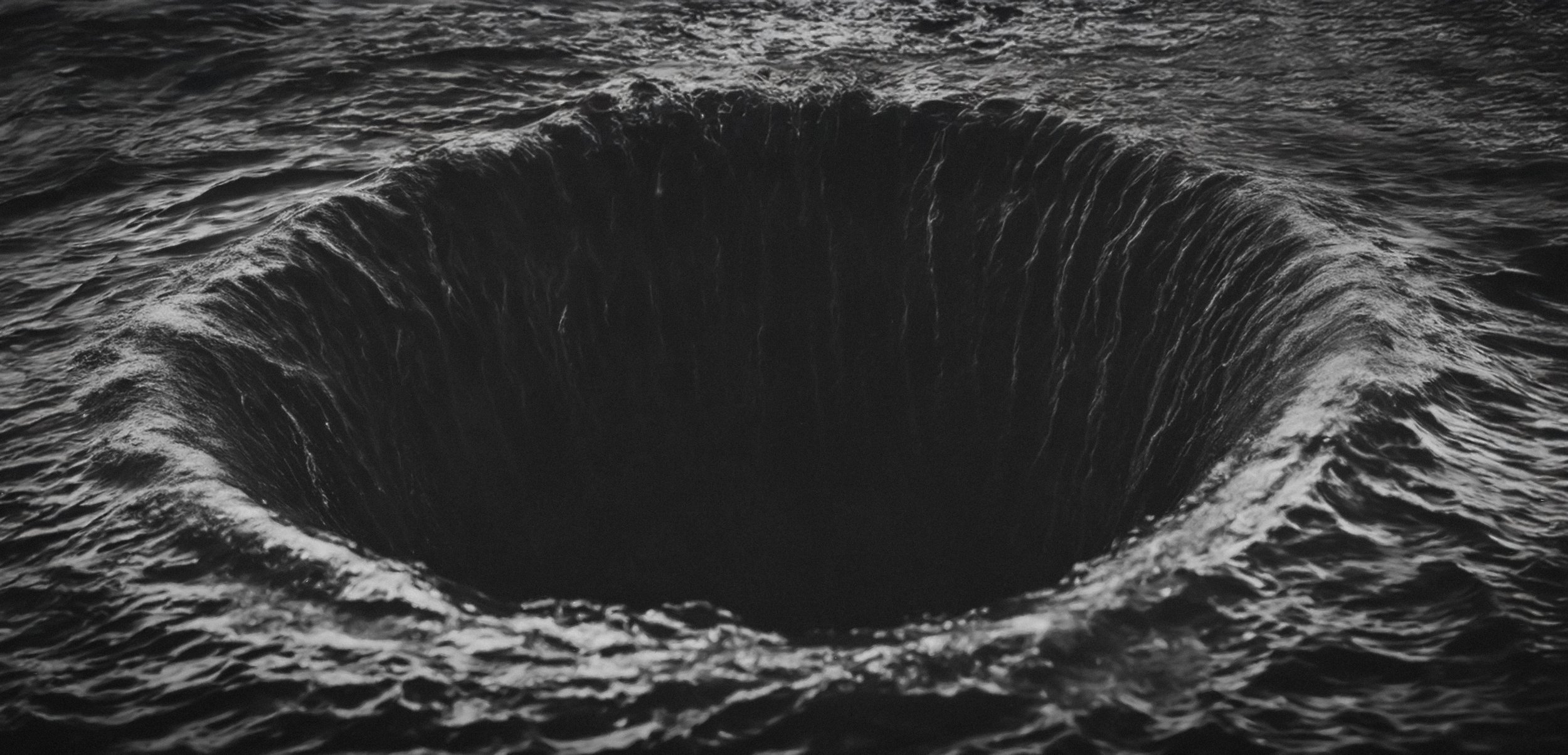
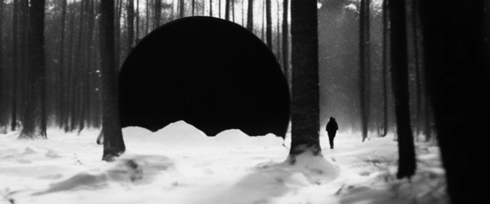
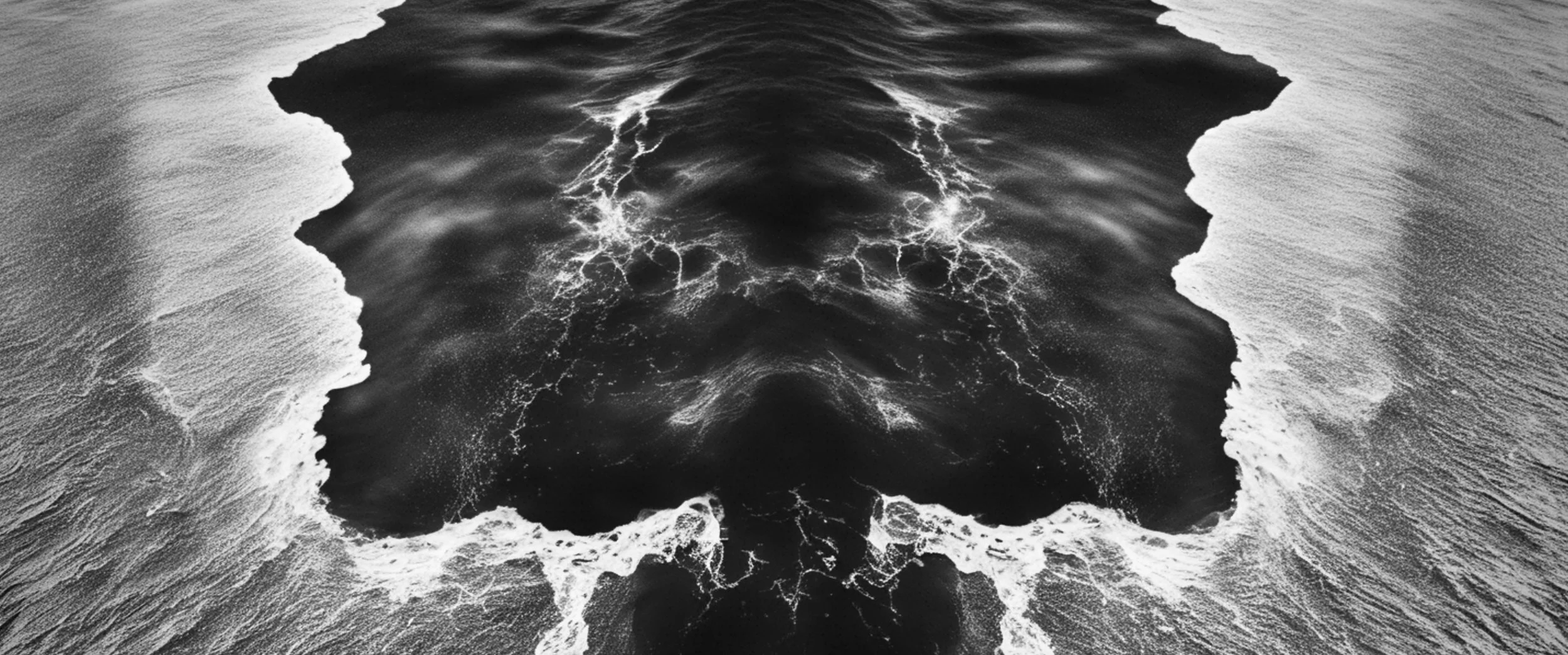
A key design element was the event horizon, used as a central visual metaphor for balance and control.
It served as a threshold between order and chaos, echoing the watch’s pursuit of technical perfection within the limits of time itself.
AMBIENT FILM & VISUAL LANGUAGE DEVELOPMENT
In collaboration with Silent Studio and Electric Theatre Collective
CONCEPT
The event horizon became the structural device for the piece.
Its geometry informed the layout, motion, and lighting design, creating a visual framework that suggested both containment and expansion.
Through this lens, the film examined time as precision: how mechanical accuracy can feel calm rather than cold.
Typography, composition, and rhythm were developed around this idea of tension held in equilibrium.
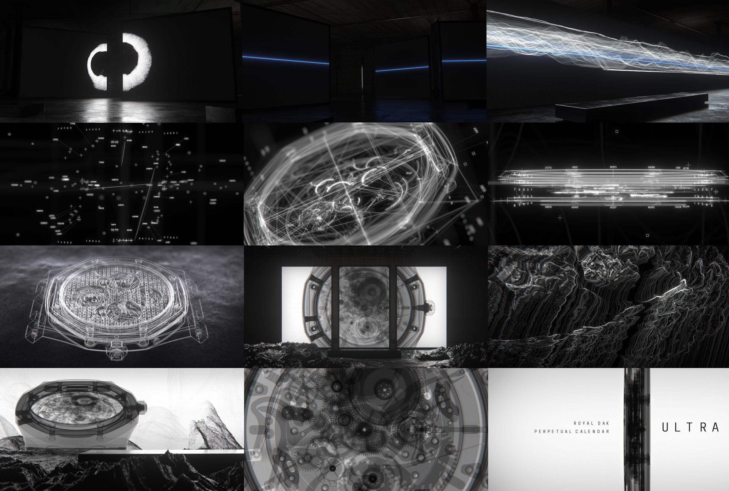
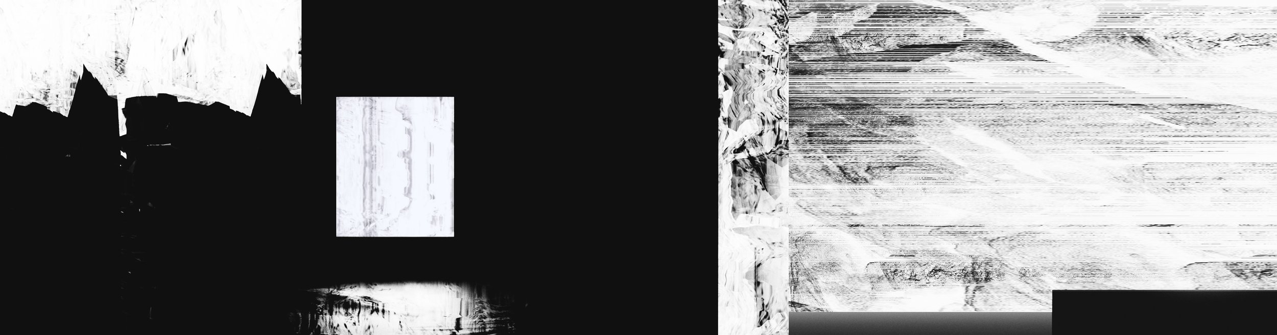
VISUAL LANGUAGE
Tone BOARDS
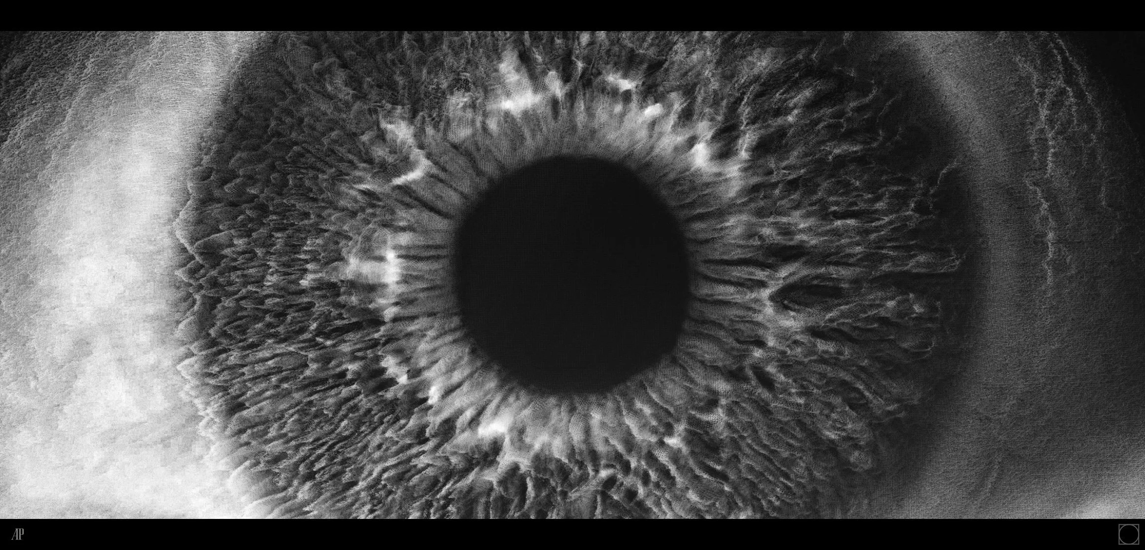
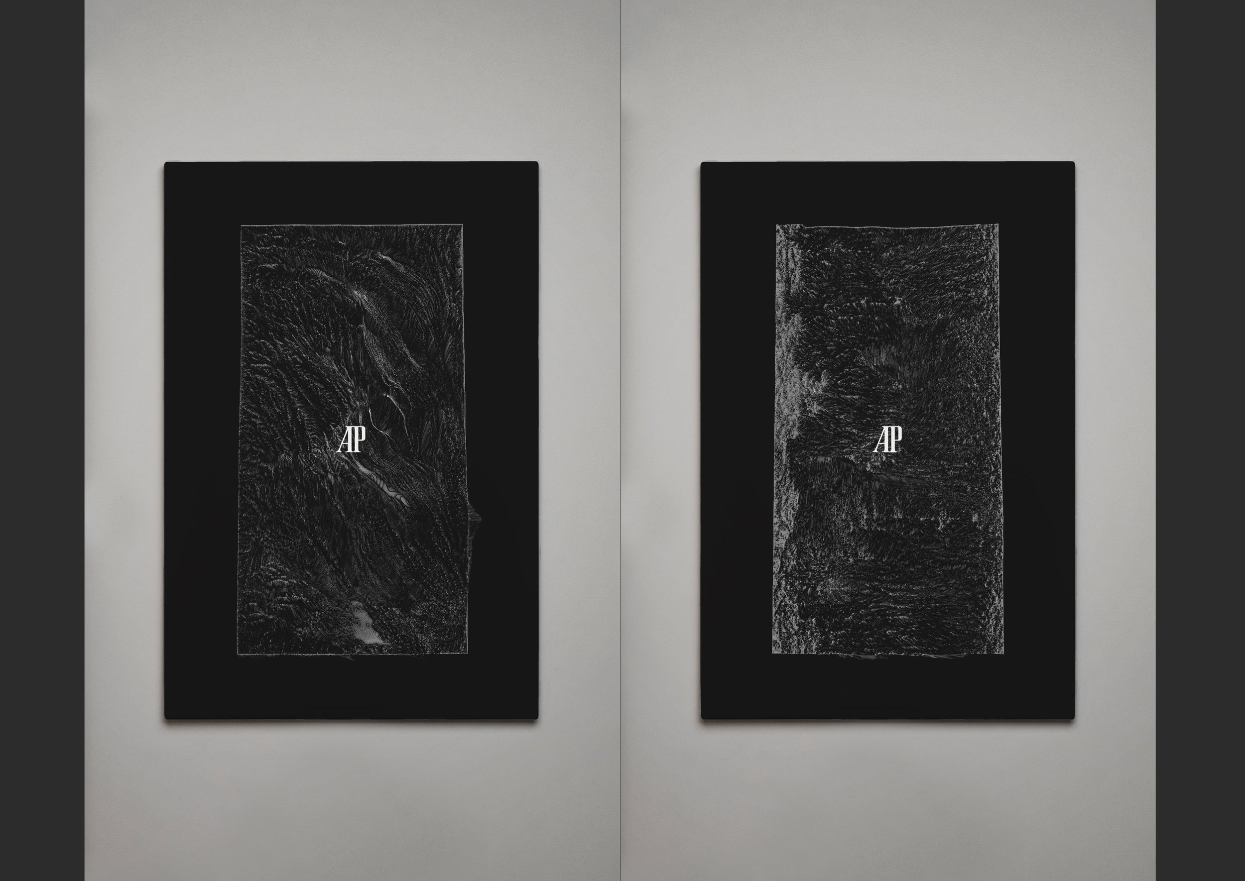
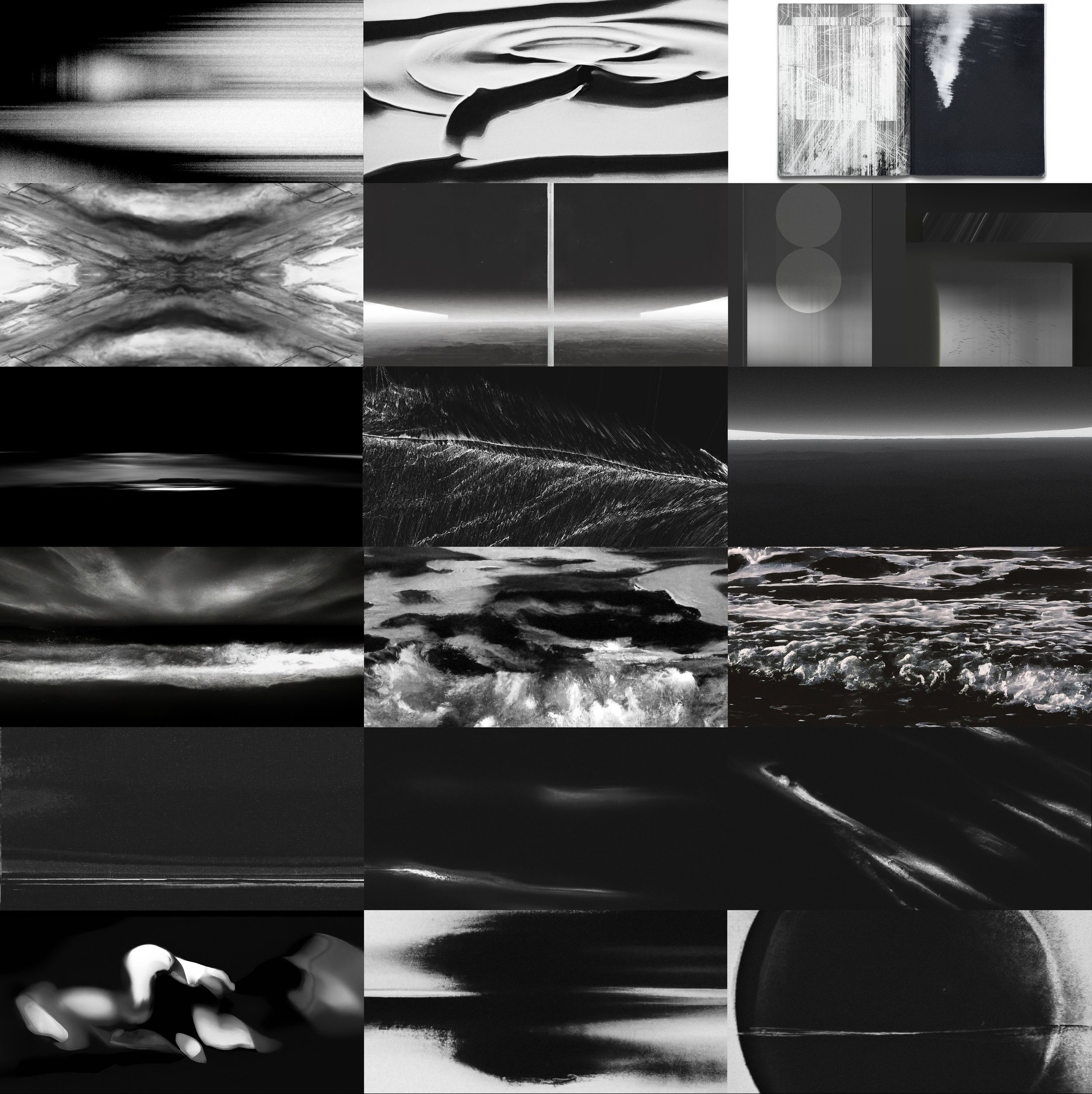
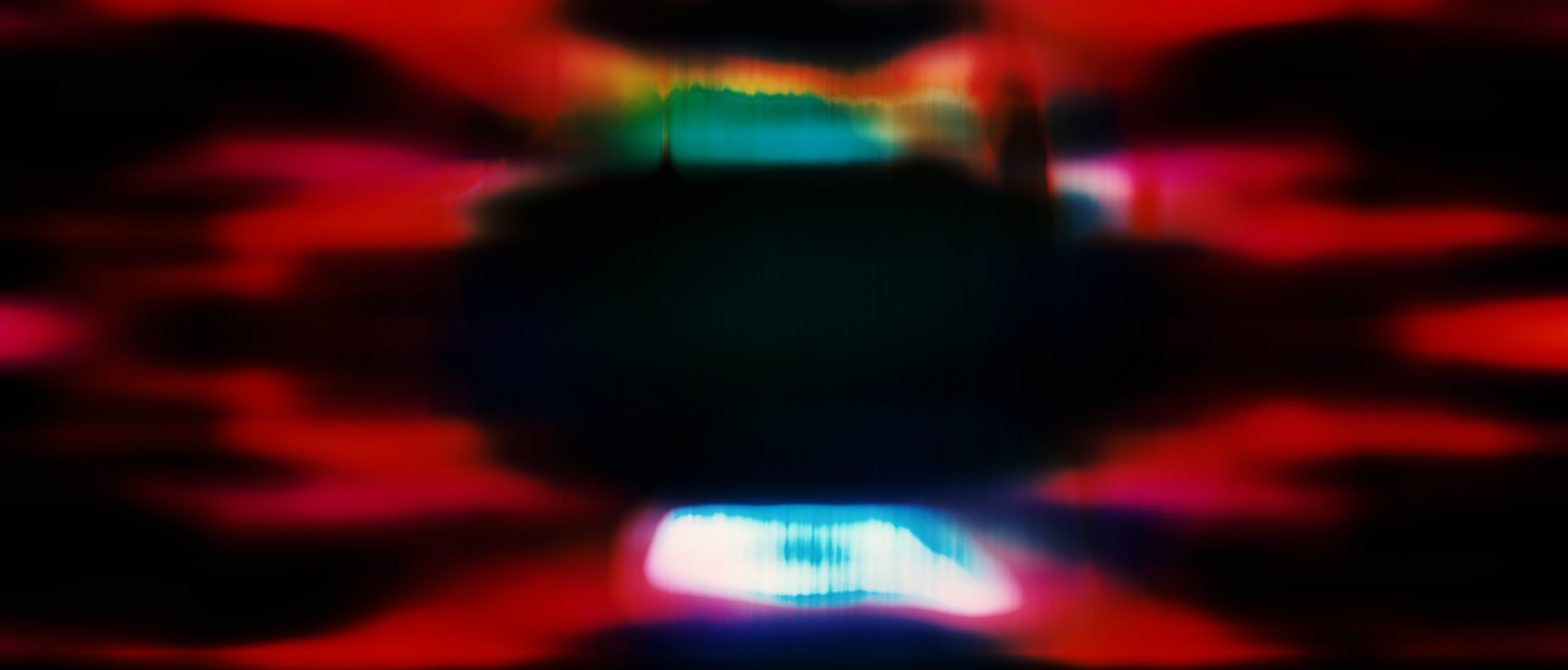
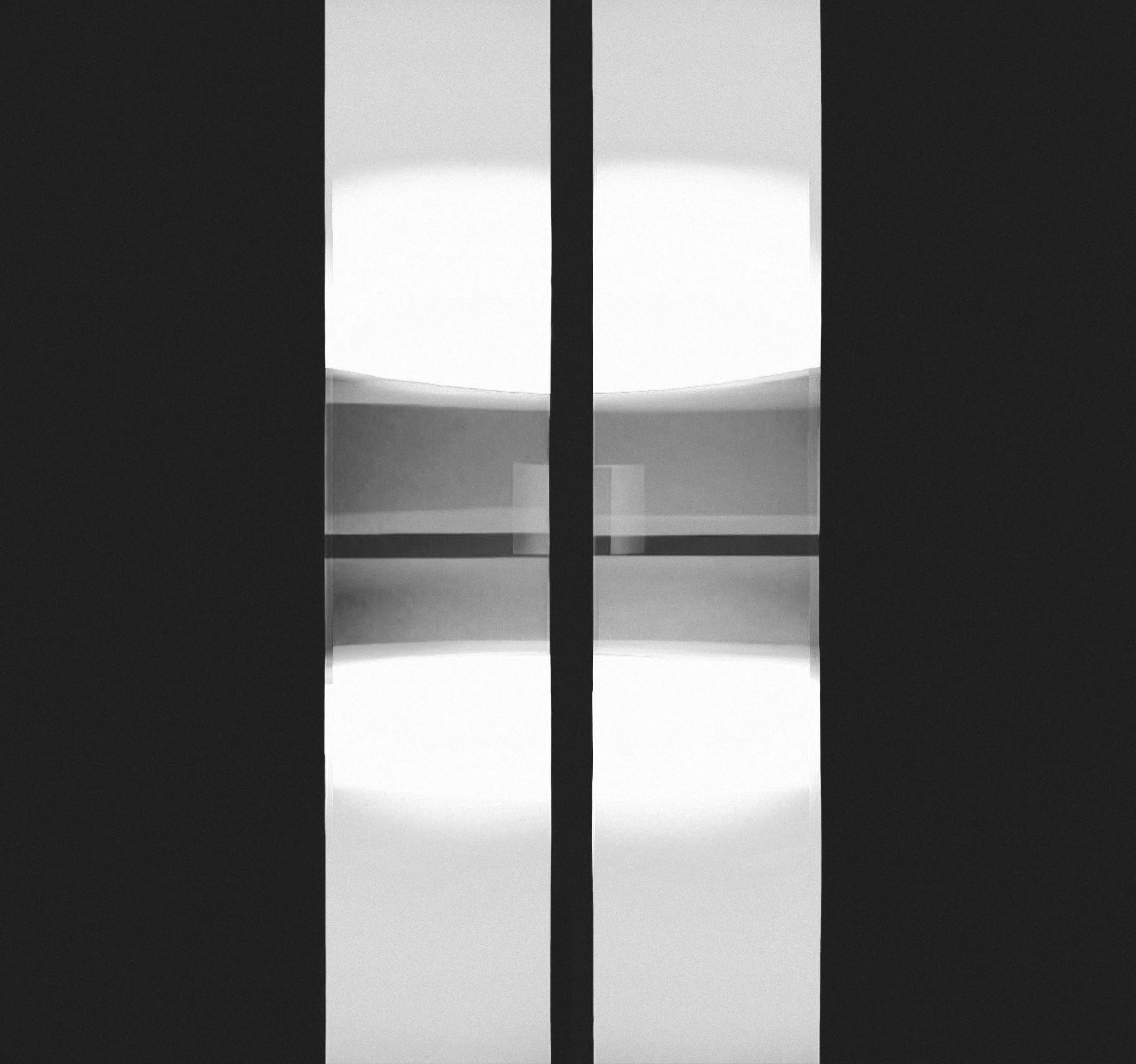
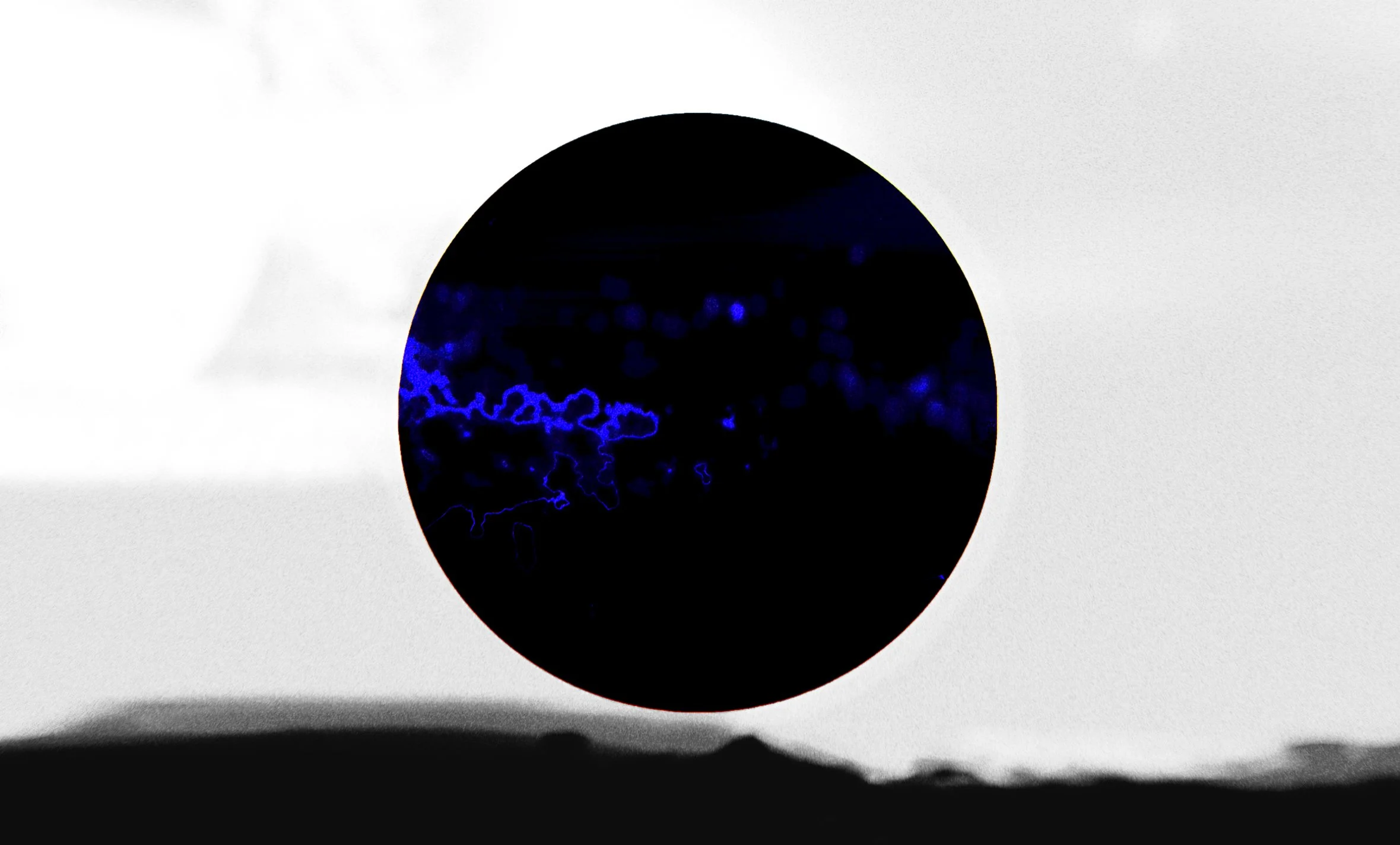
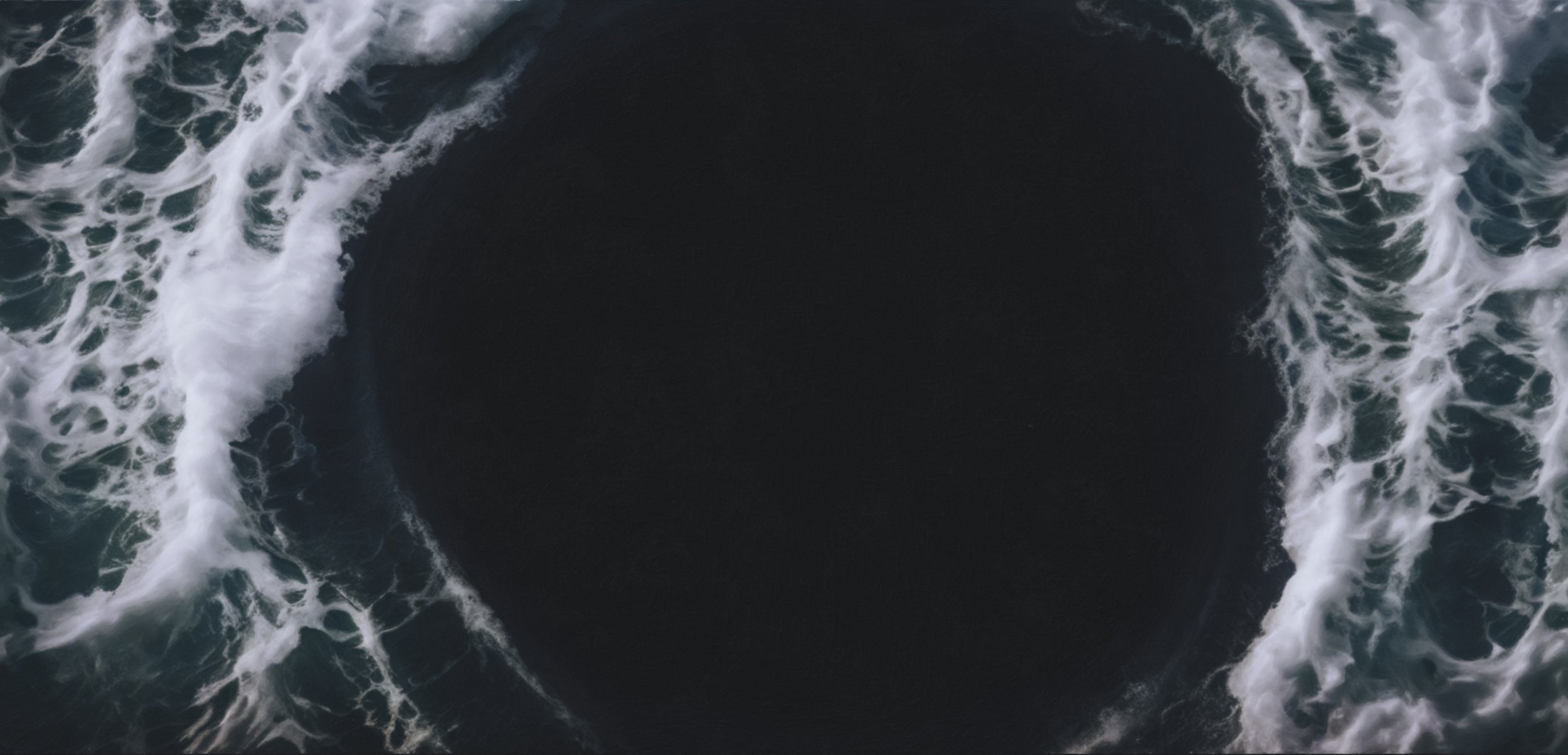
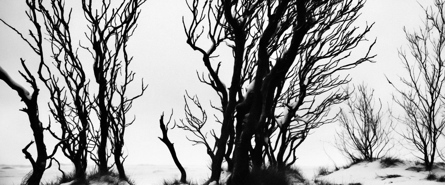
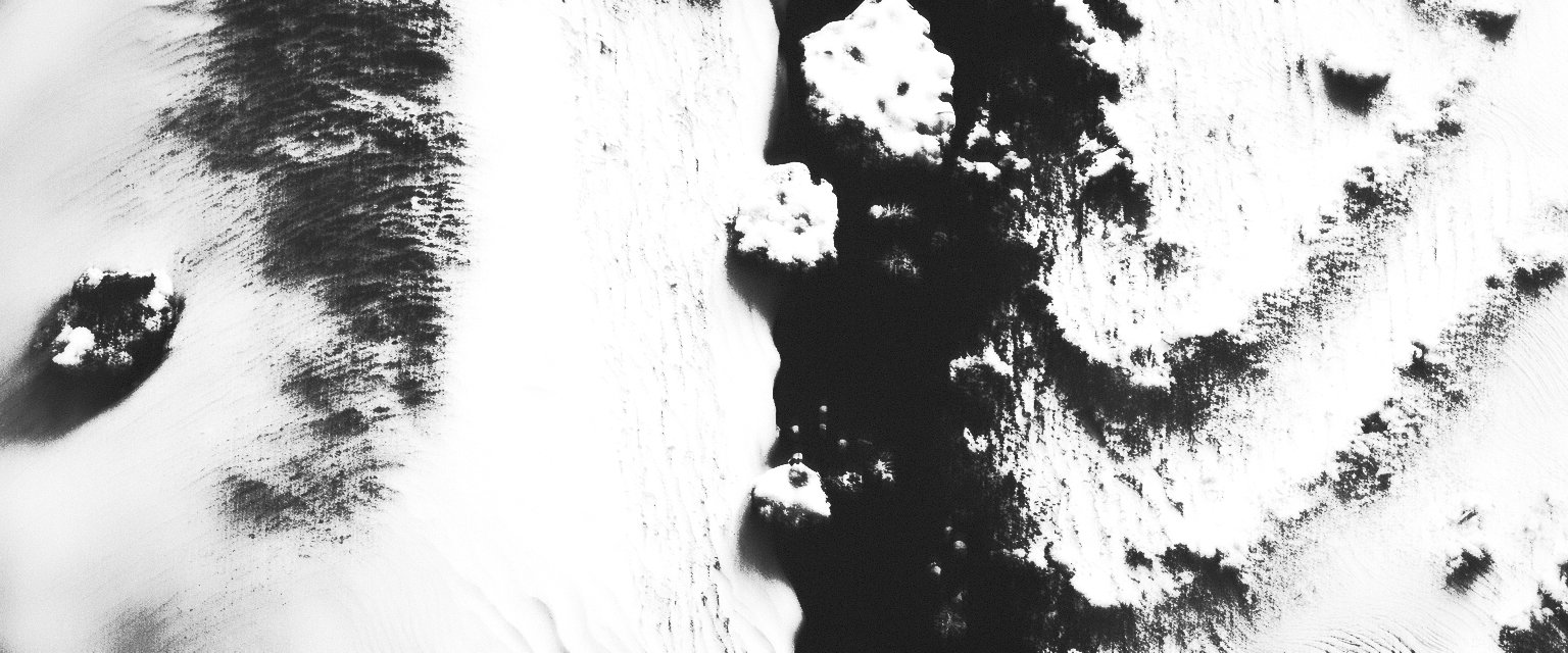
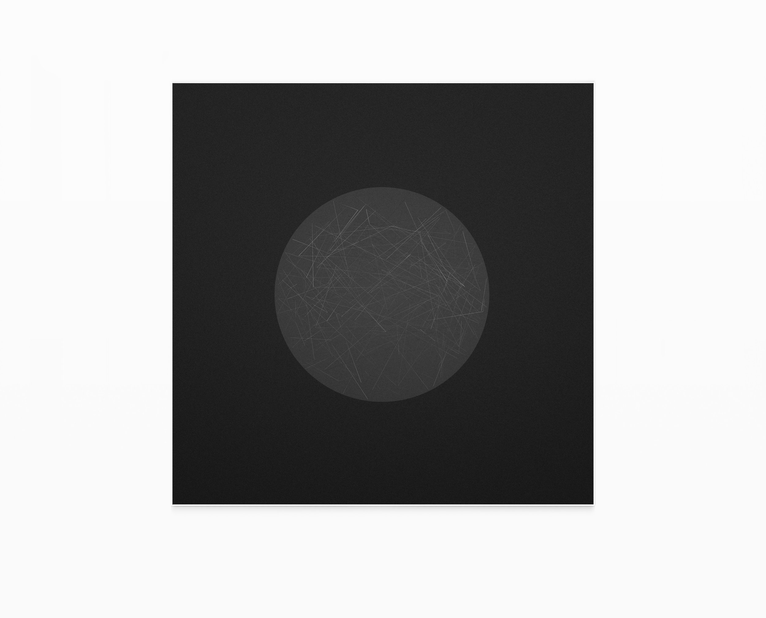
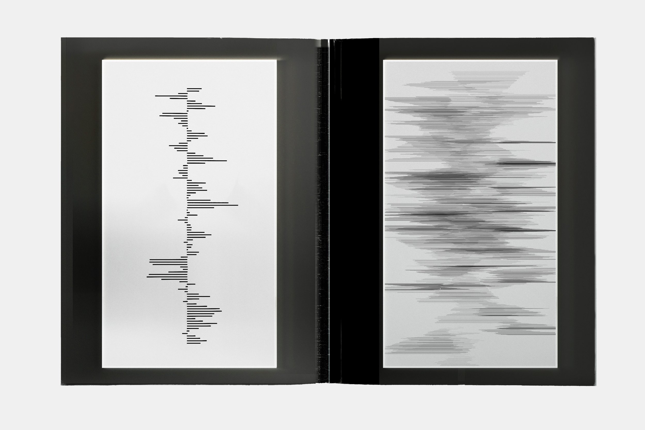
TONE BOARDS — EVENT HORIZON & MATERIAL GRAVITY
These tone boards explore the idea of the event horizon as a metaphor for craft, precision, and inevitability.
Rather than depicting the watch directly, the imagery focuses on material tension, gravitational pull, and threshold moments, where form appears to bend, compress, or collapse under invisible forces.
Natural landscapes, abstract textures, and controlled voids are treated as material studies rather than environments.
Surfaces feel dense, compressed, and directional, suggesting forces acting beneath the visible layer.
This approach allowed the visual language to express:
mechanical precision without literal mechanics
complexity without ornament
strength through restraint
luxury through inevitability rather than excess
The recurring use of voids, horizons, and compressed forms establishes a sense of controlled gravity, a visual parallel to the engineering discipline and temporal authority of the RD#2 watch.
These tone boards formed the foundation for the project’s cinematic logic, guiding decisions around contrast, pacing, composition, and typographic placement in the final moving image.


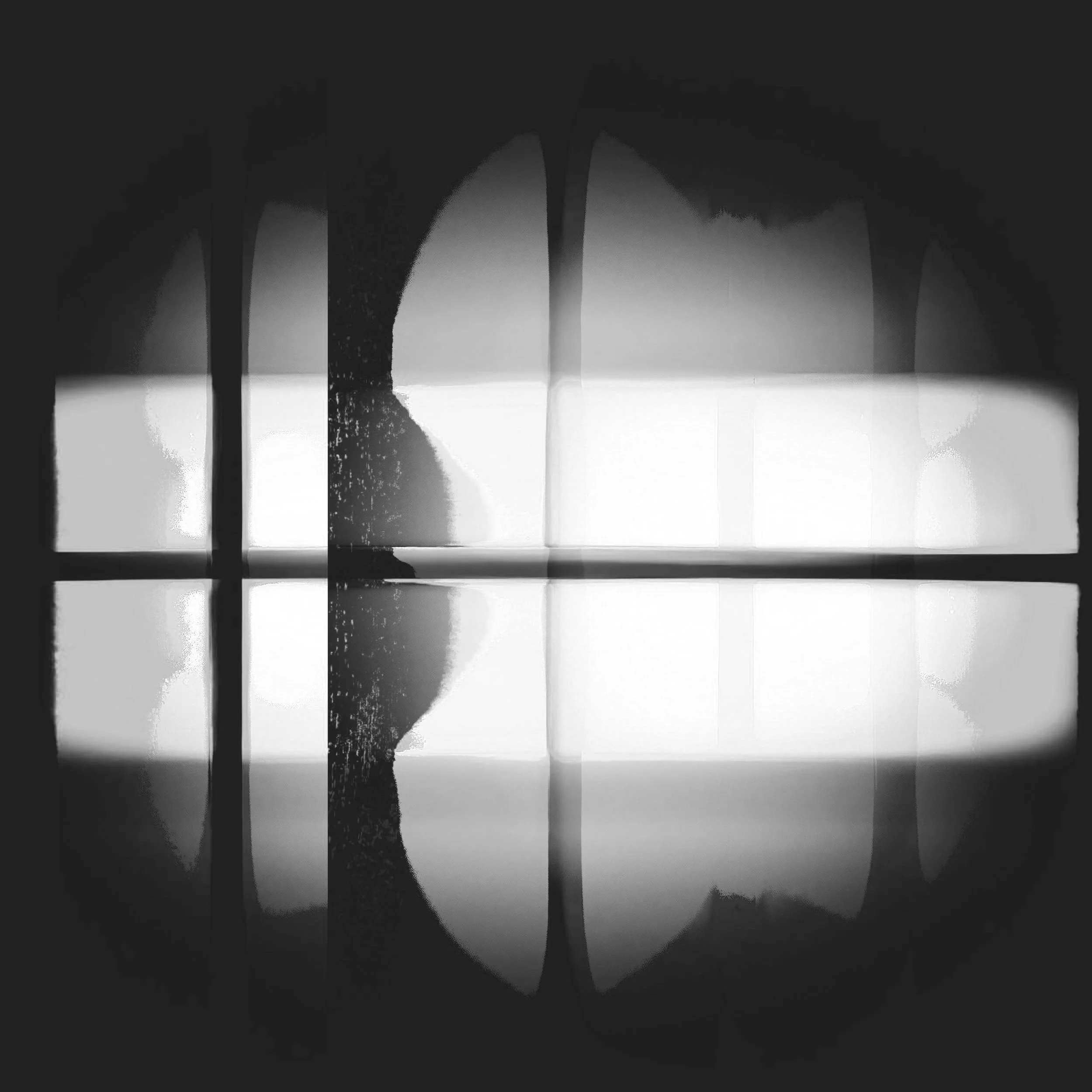
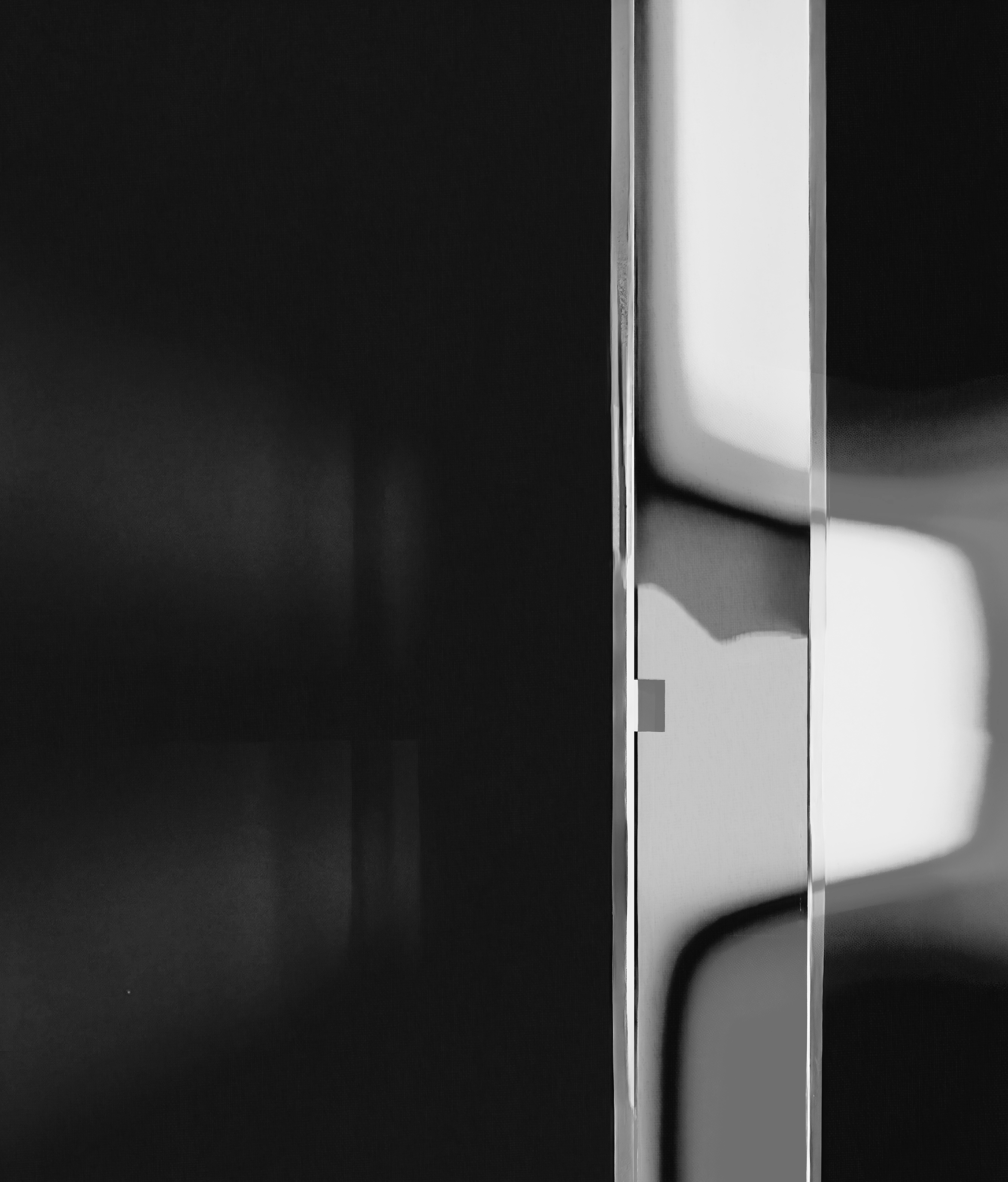
TONE BOARD — PRECISION AND BALANCE
Explores the relationship between control and calm.
TONE BOARD — Material Language
Defines surface behaviour, texture, and light quality.
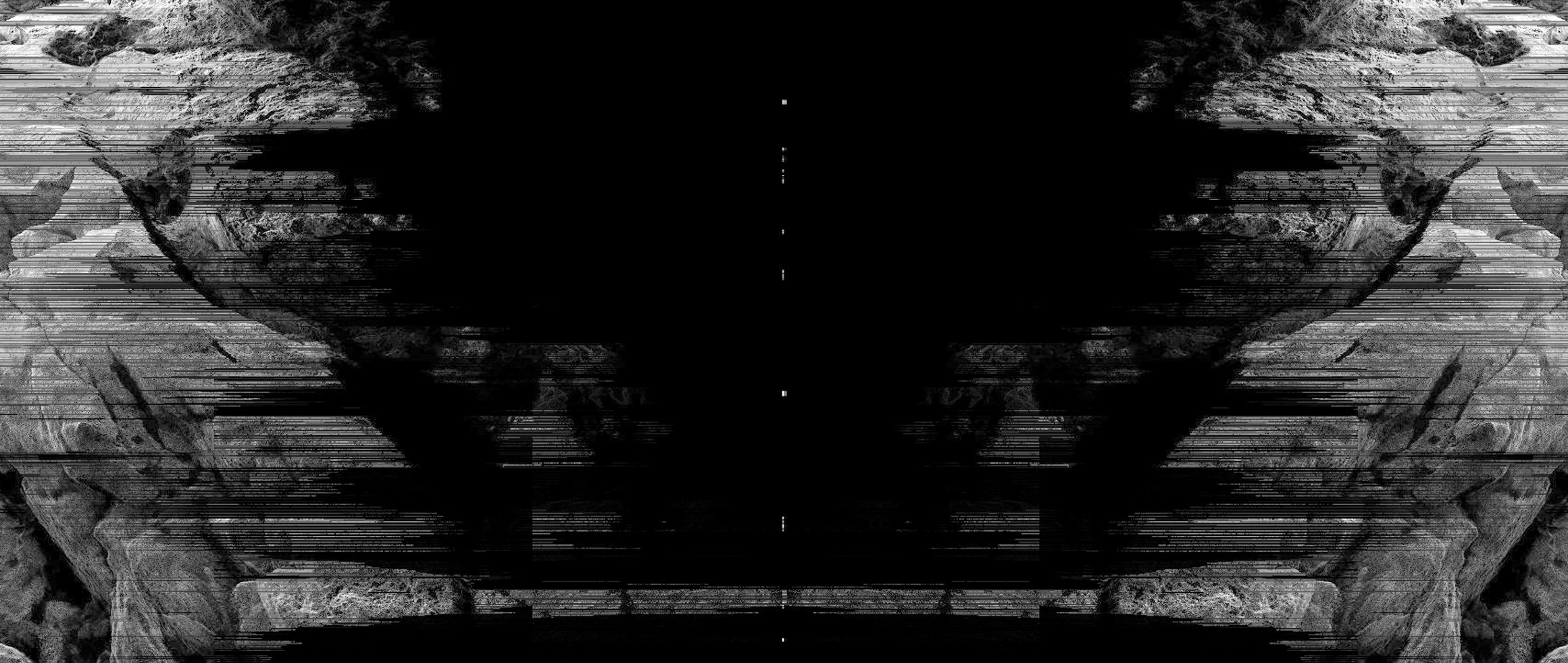
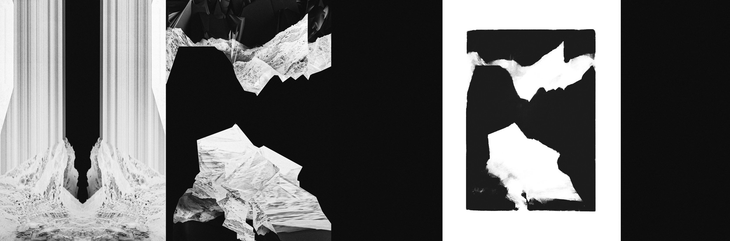
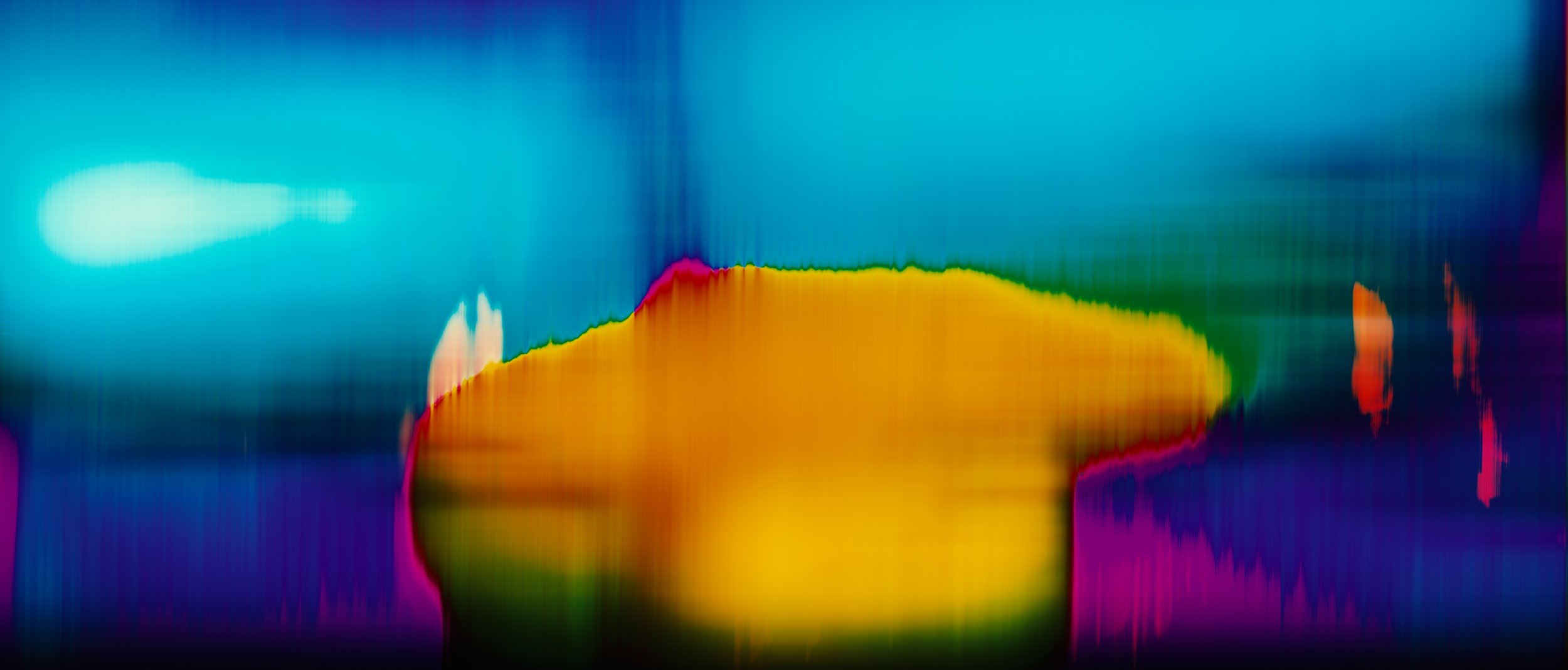
TONE STUDIES
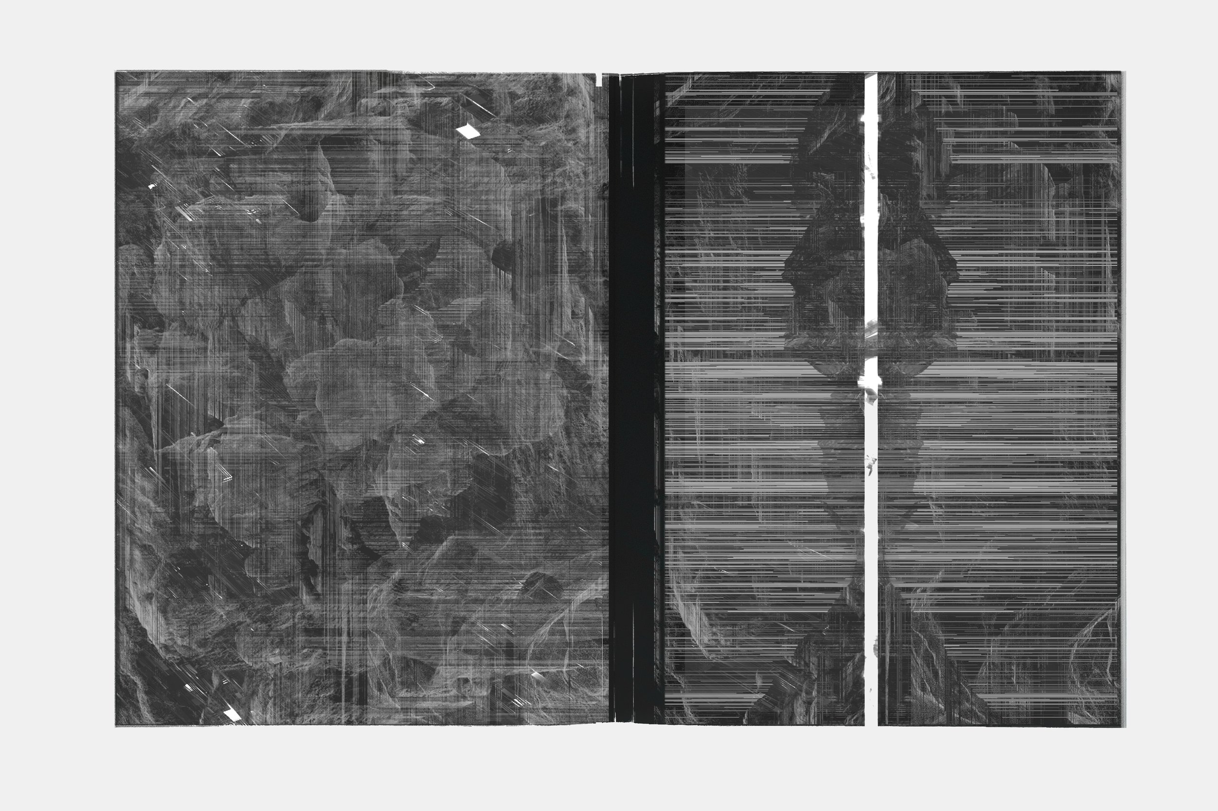
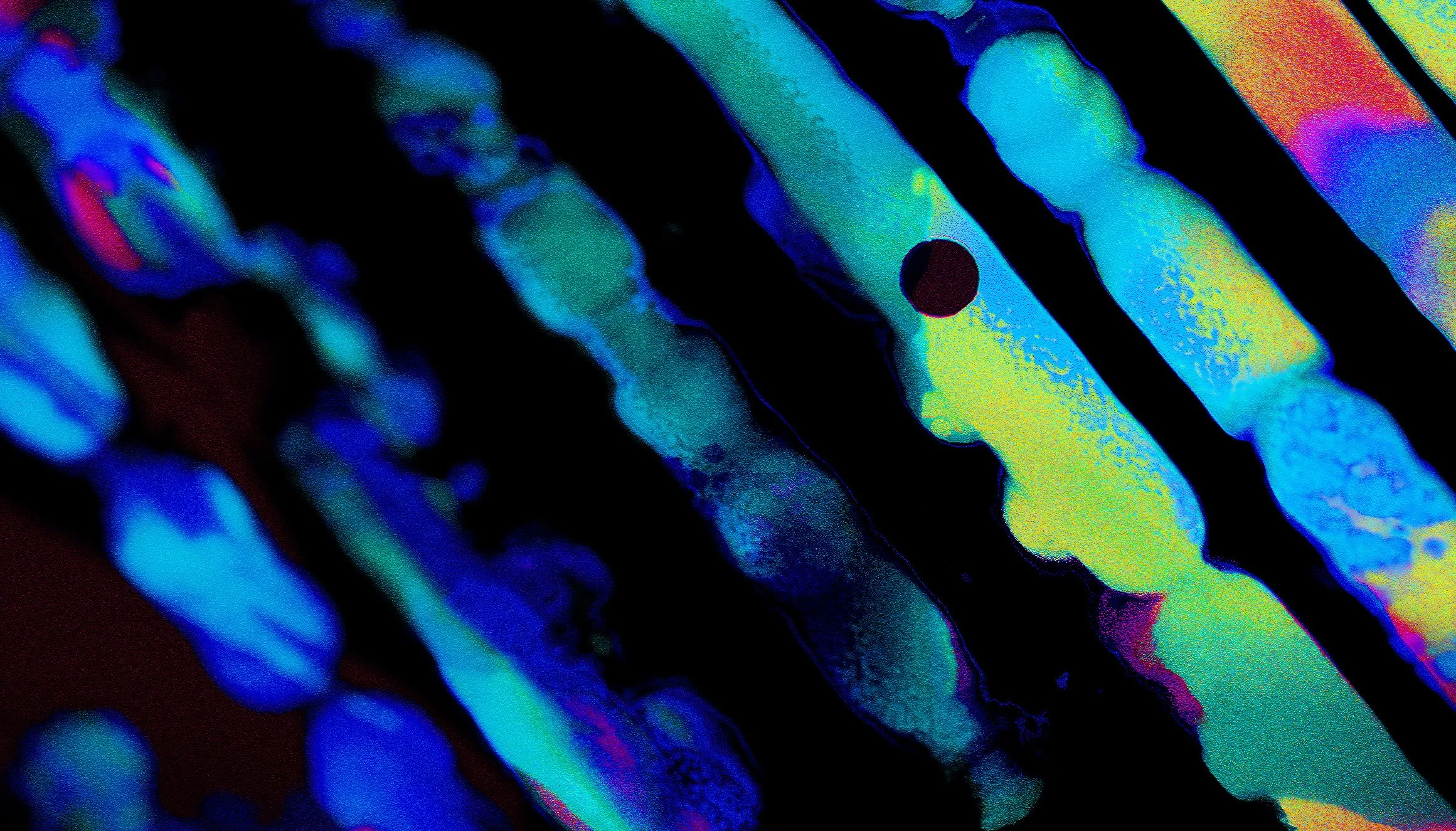
TONE & MATERIAL STUDIES
Material and tonal explorations for Audemars Piguet, investigating abstraction, texture, and time as expressions of precision and craft.
These tone studies explore visual systems developed for Audemars Piguet, focusing on the intersection of precision, materiality, and abstraction. Rather than illustrative imagery, the work investigates how texture, rhythm, and negative space can communicate the values of haute horology through a contemporary visual language.
The compositions draw from natural and engineered form, fractured landscapes, stratified surfaces, wave interference, and geological pressure, reinterpreted through a controlled monochromatic palette. Light and shadow are treated as structural elements, revealing depth, density, and surface tension in ways that echo the microscopic complexity of watchmaking.
Motion and distortion are used sparingly and intentionally. Vertical striations, compression artefacts, and sliced horizons suggest the passage of time, mechanical repetition, and the tension between order and rupture. These visual disruptions are not decorative; they act as metaphors for precision under stress, refinement through resistance, and the discipline required to achieve clarity.
Typography and branding elements are held in deliberate restraint. The AP mark is introduced as a quiet anchor, allowing the surrounding visual field to breathe while reinforcing balance, proportion, and permanence. Scale relationships and spatial hierarchy are carefully tuned to maintain a sense of luxury through subtraction rather than excess.
Collectively, these studies function as a material and tonal research phase, informing title sequences, brand films, and environmental applications. The work prioritises timelessness over trend, crafting a visual atmosphere that aligns with Audemars Piguet’s legacy of innovation, craftsmanship, and exacting standards.
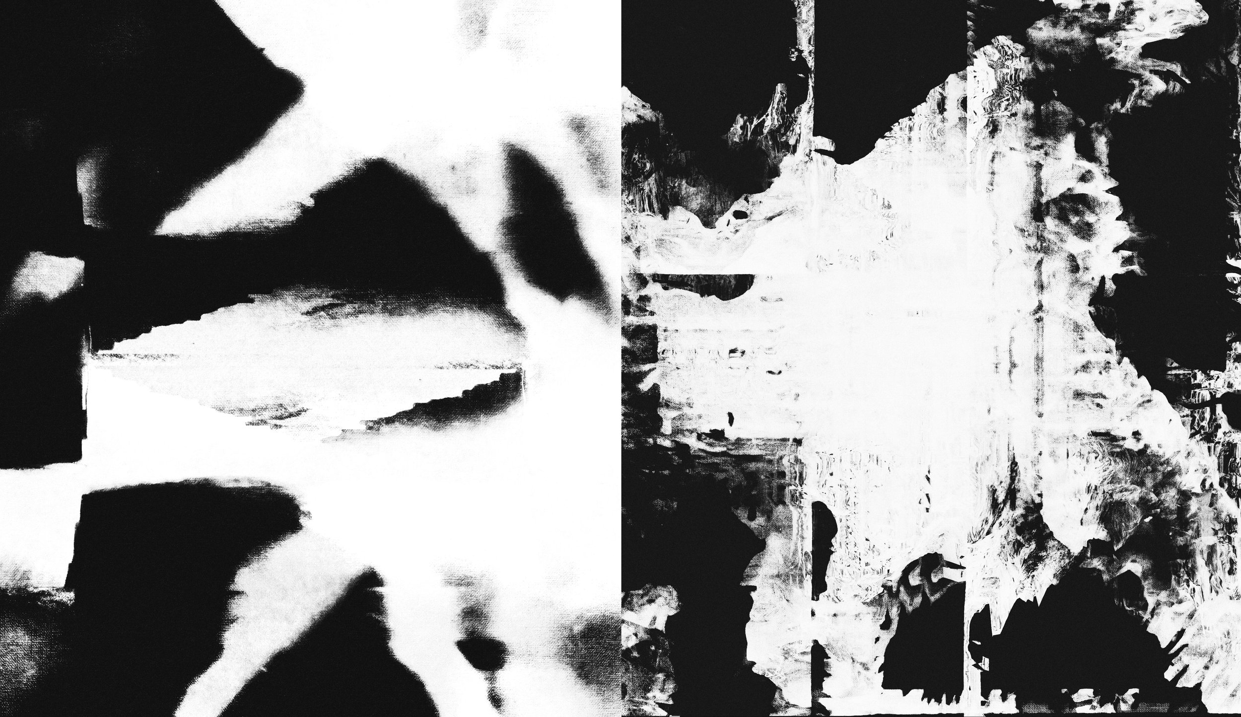
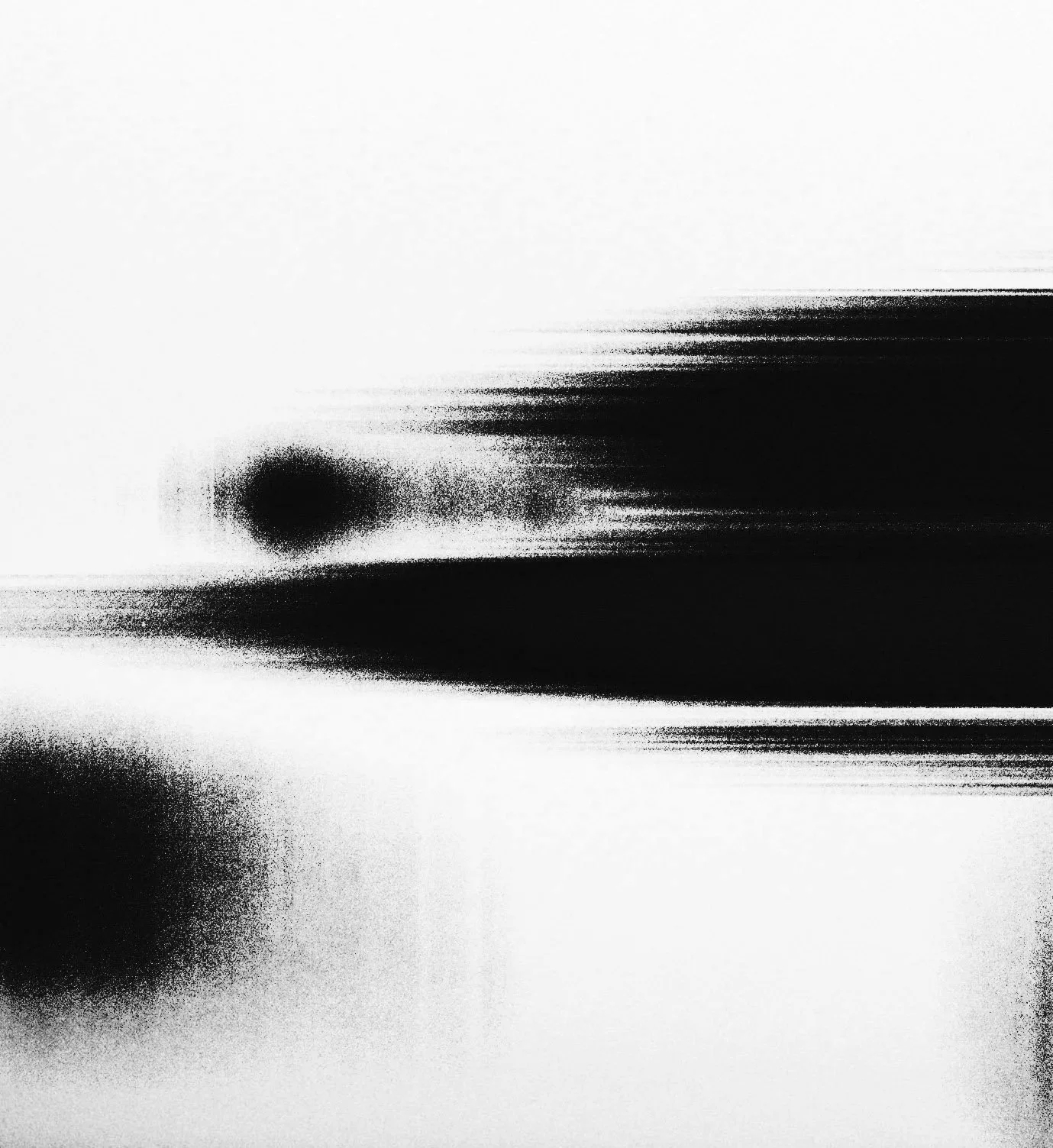
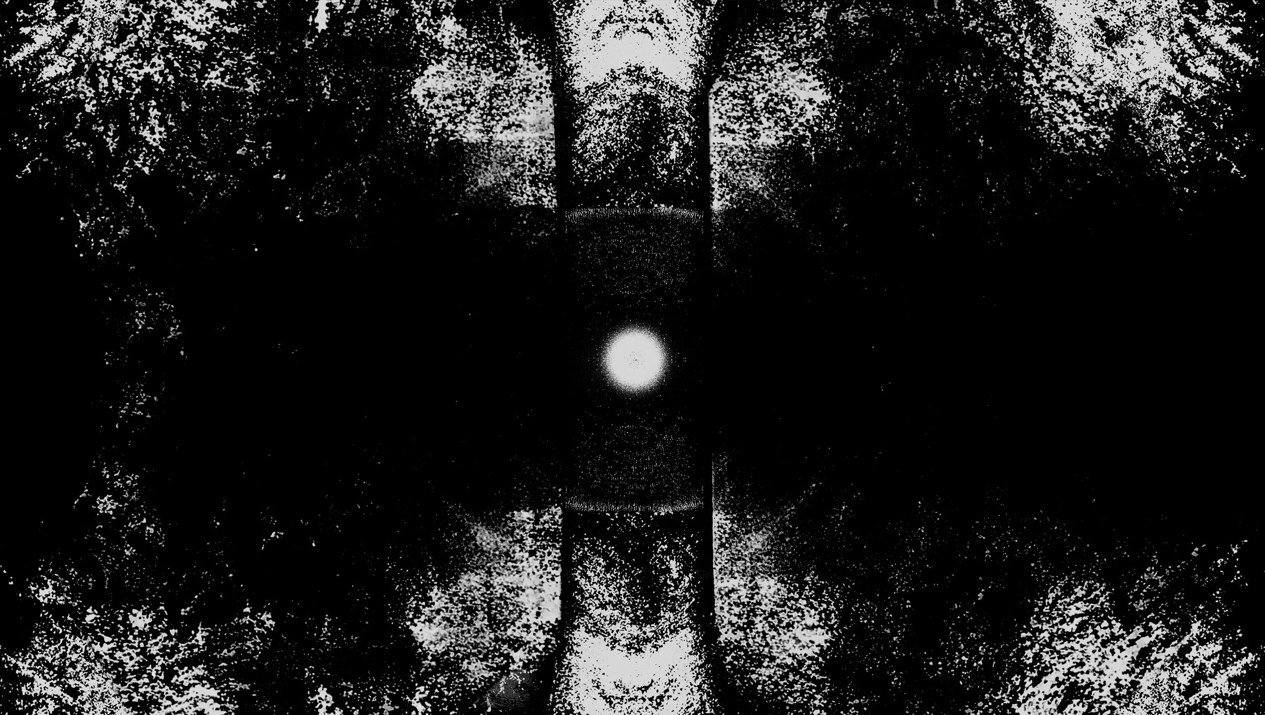
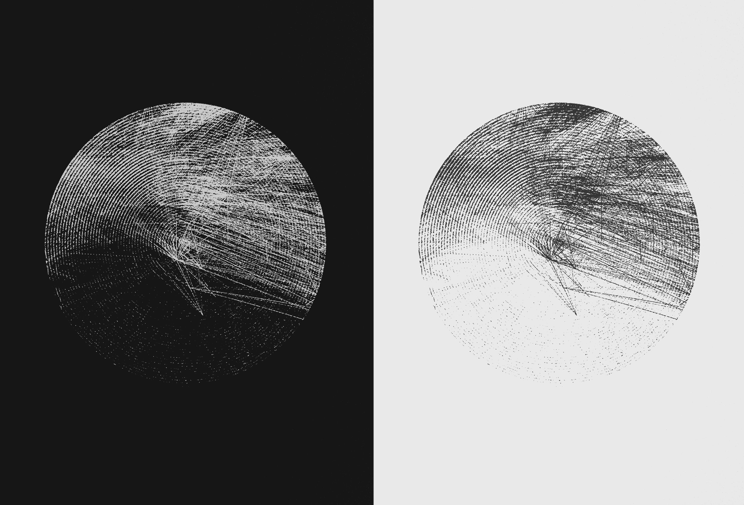
TONE STUDY - HORIZON & DIVISION
Controlled breaks in the horizon line explore balance, interruption, and the measured tension between continuity and precision.

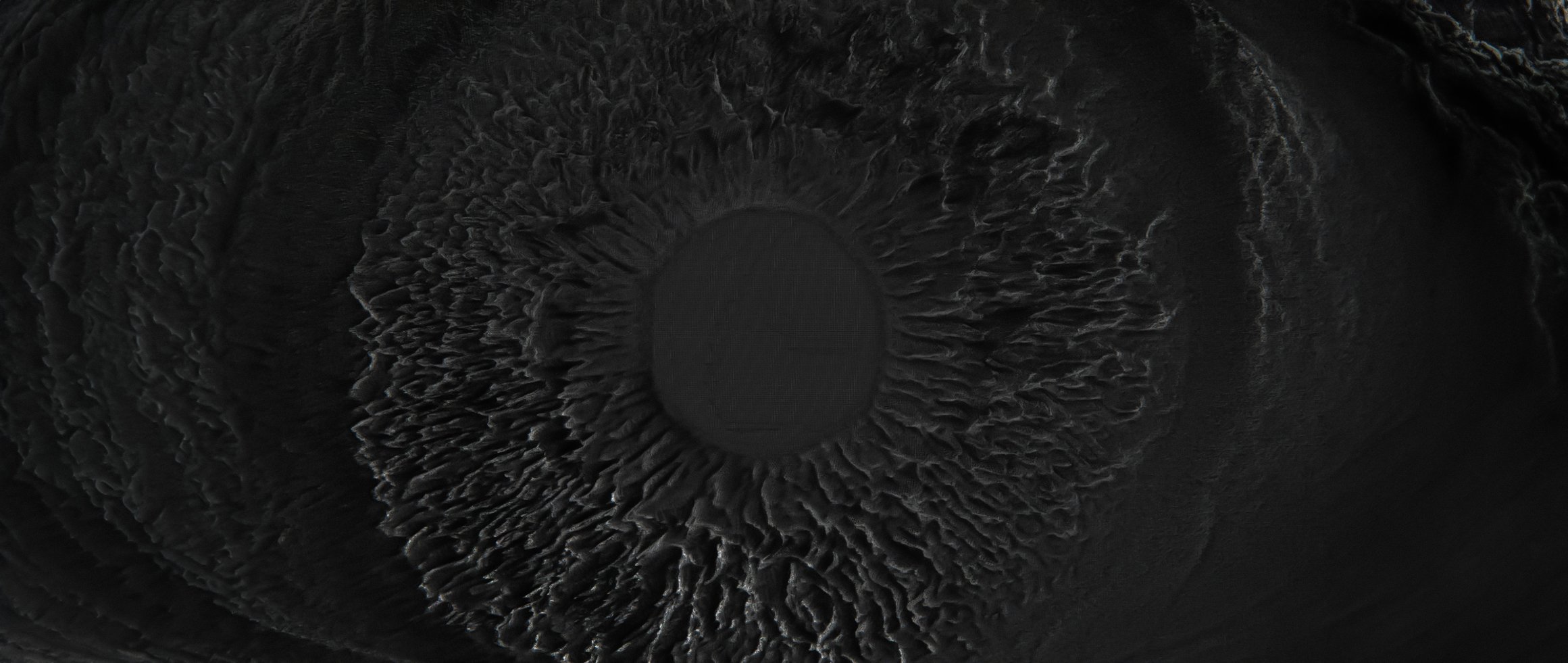
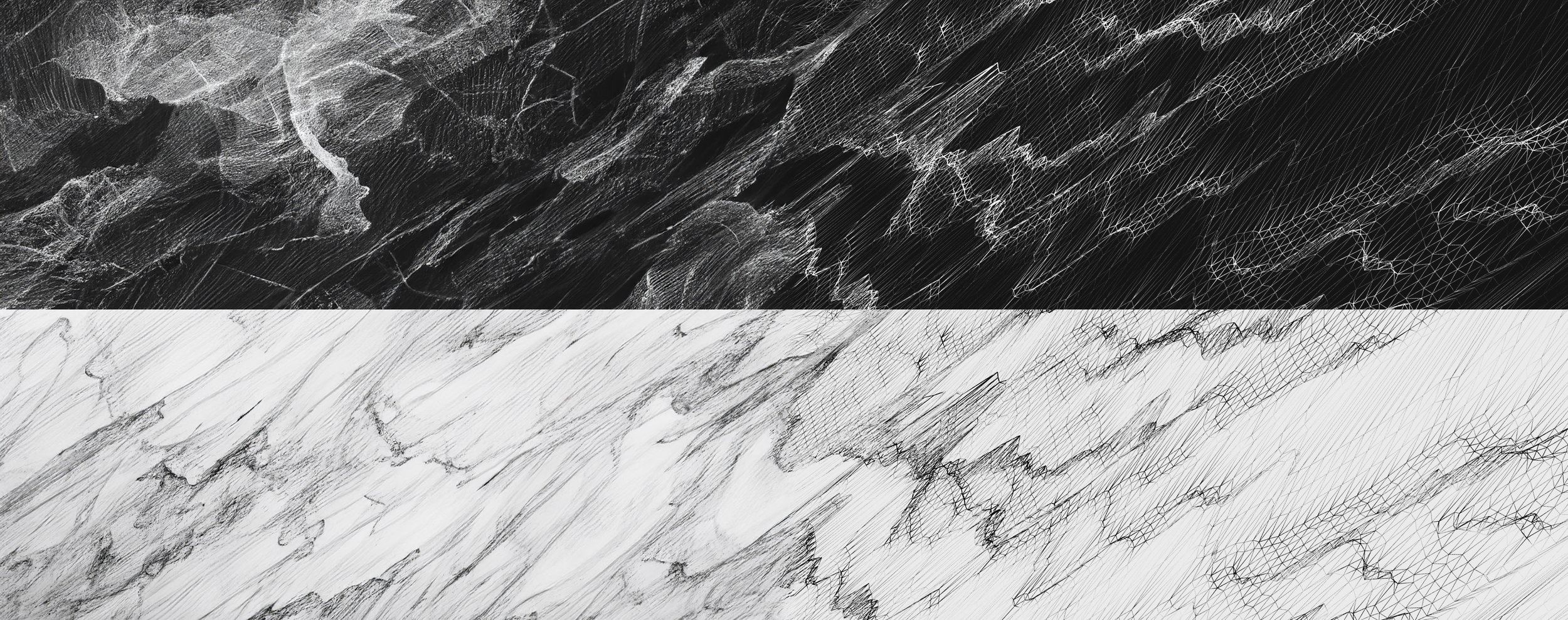
TONE STUDY - MATERIAL CROSS-SECTIONS
Abstracted surface studies inspired by geological strata and engineered materials, revealing depth through subtraction and contrast.
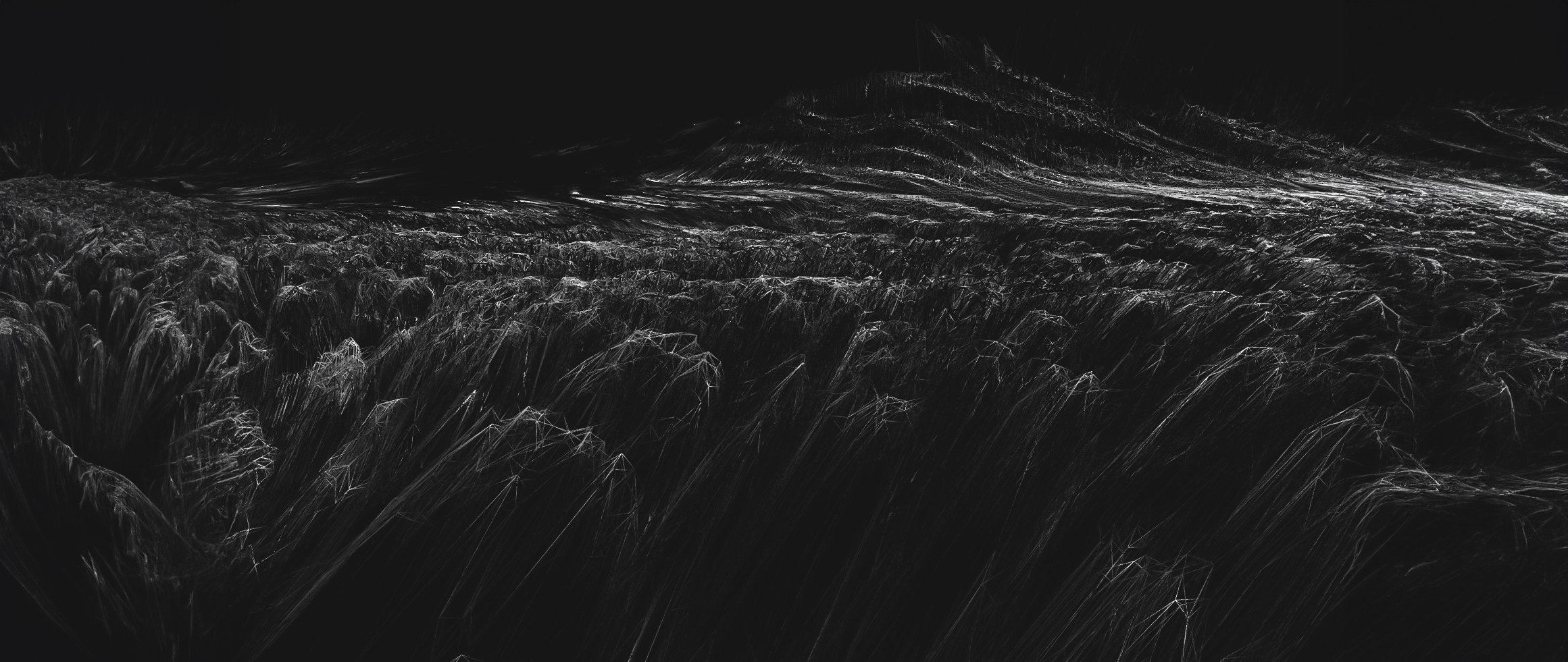
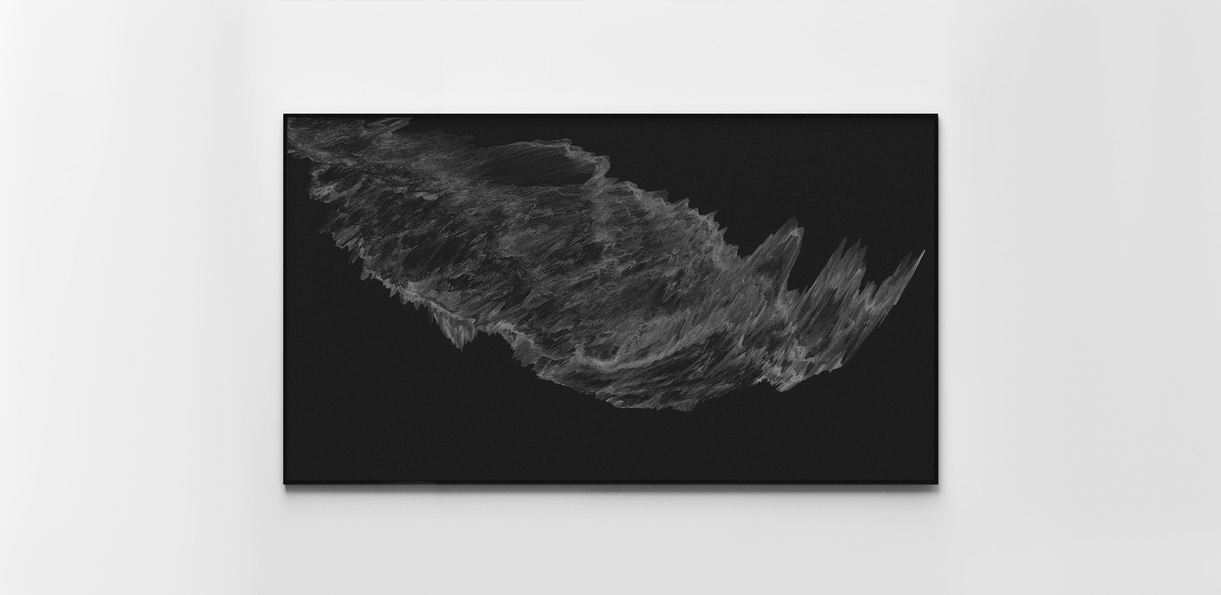
TONE STUDY - PRESSURE & COMPRESSION
Forms shaped by force and restraint, where density, compression, and resistance become visual expressions of craft.
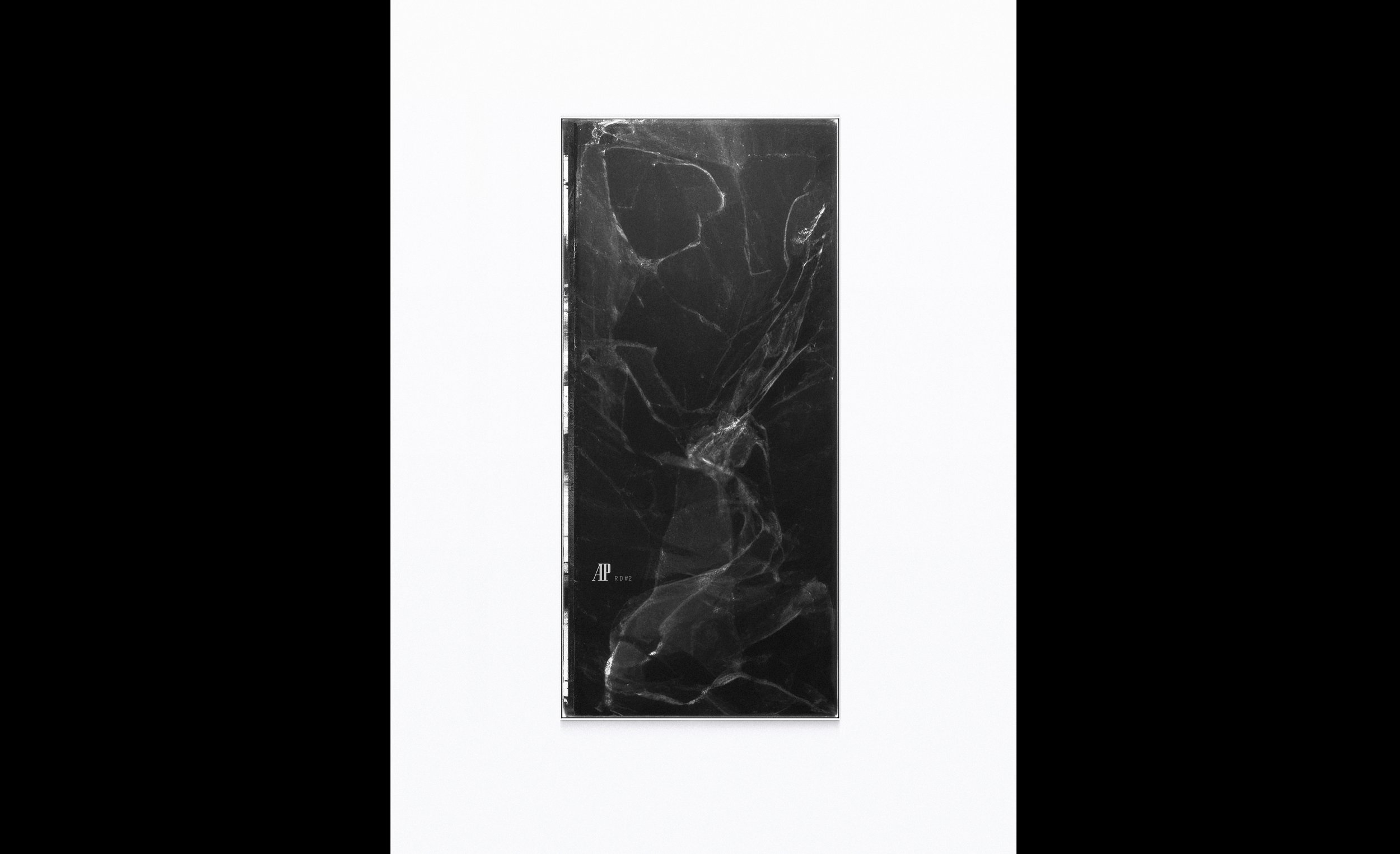
TONE STUDY - BRAND AS ANCHOR 01
The AP mark introduced with restraint, acting as a stabilising point within a broader material field.
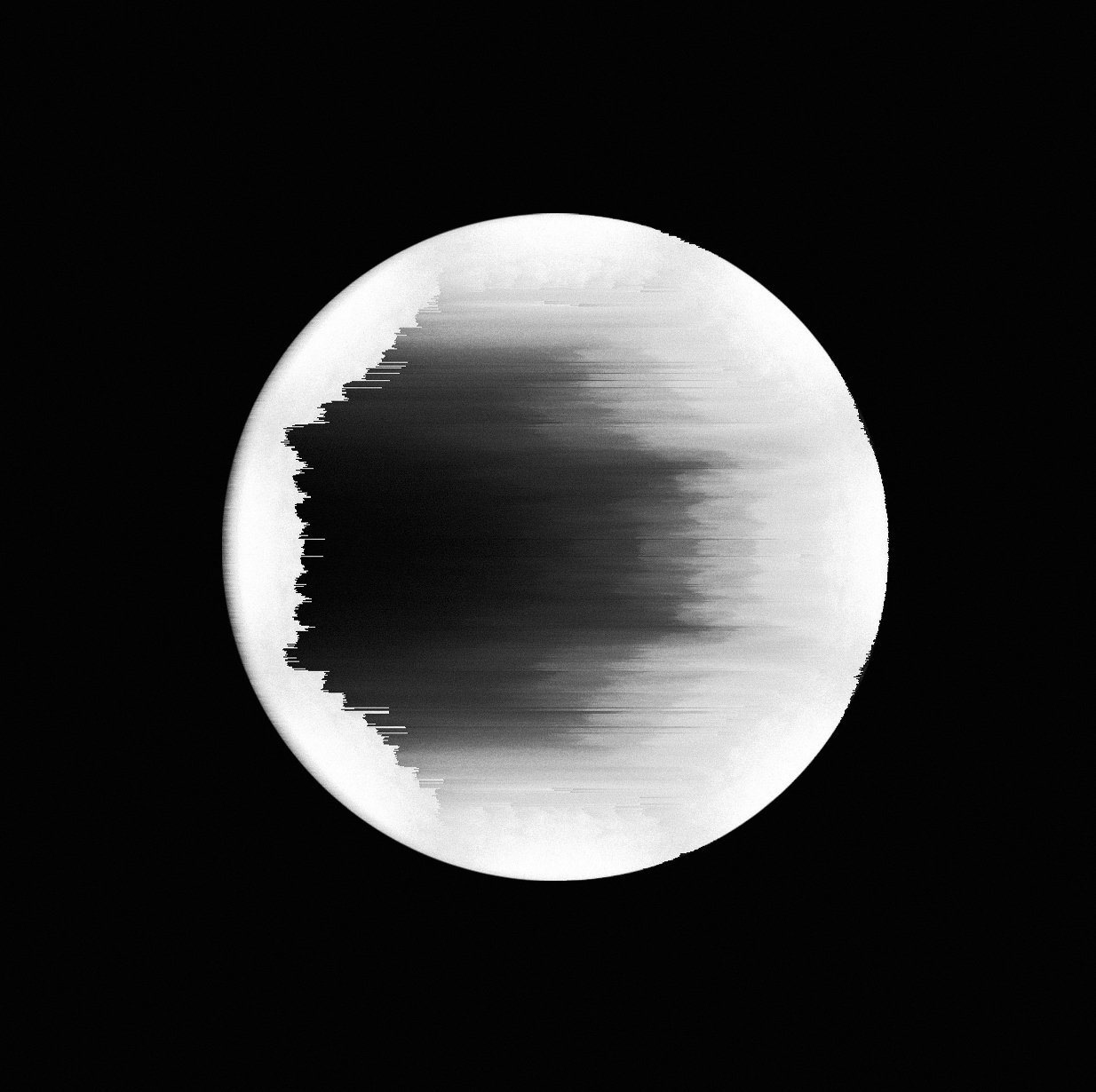
TONE STUDY - MATERIAL QUIET
This tone board explores time as material, not motion.
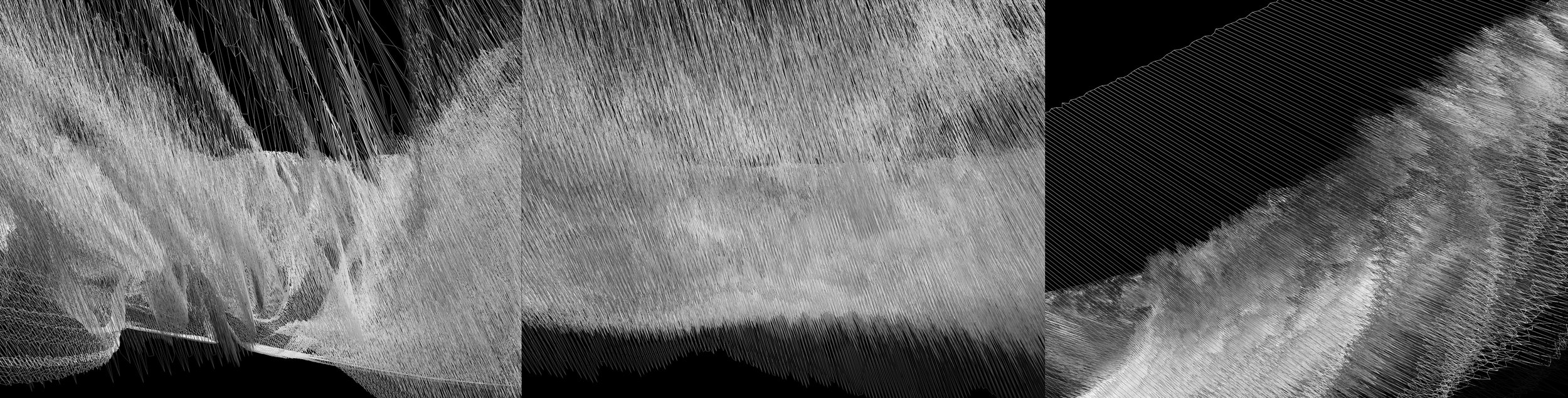
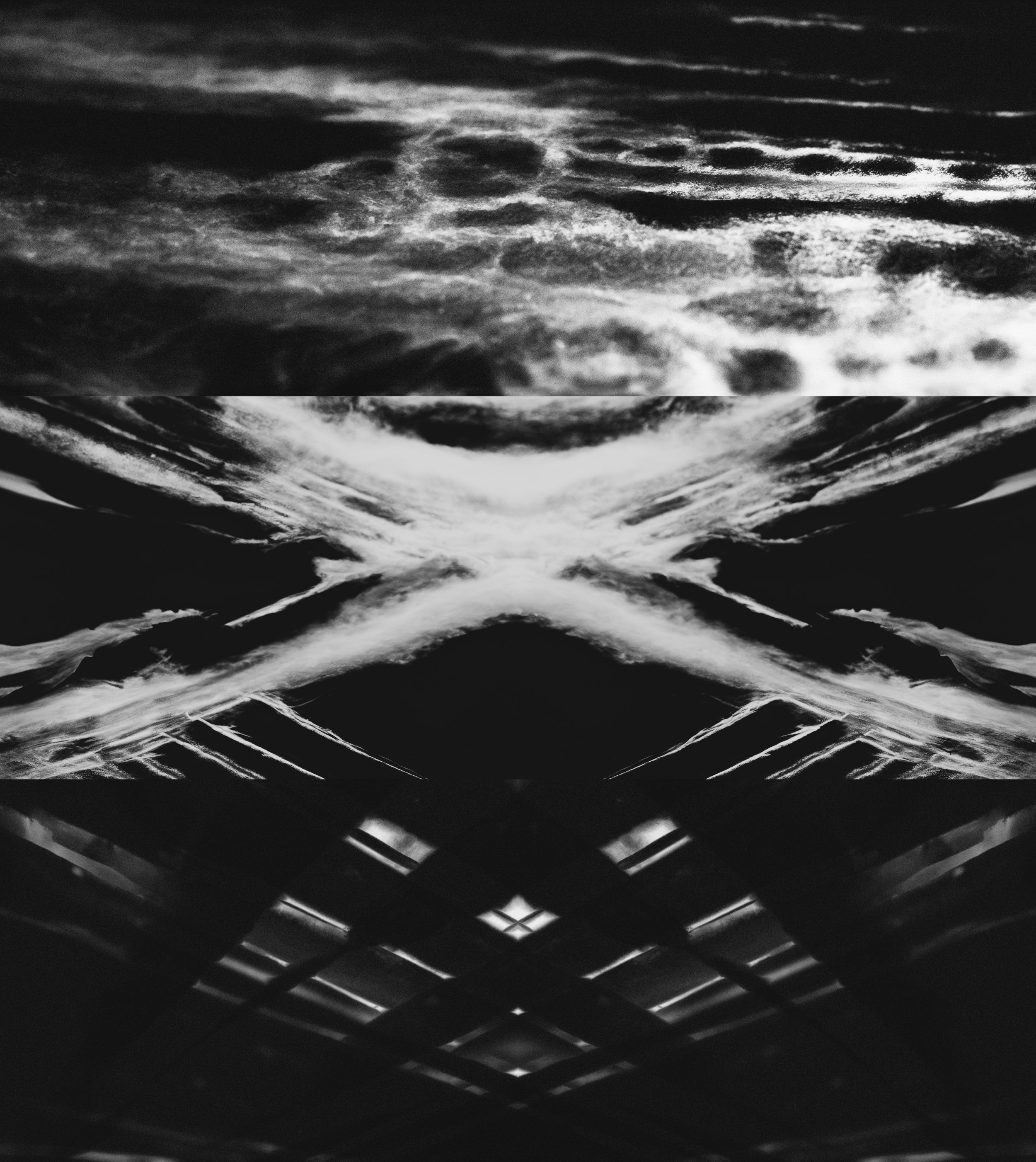
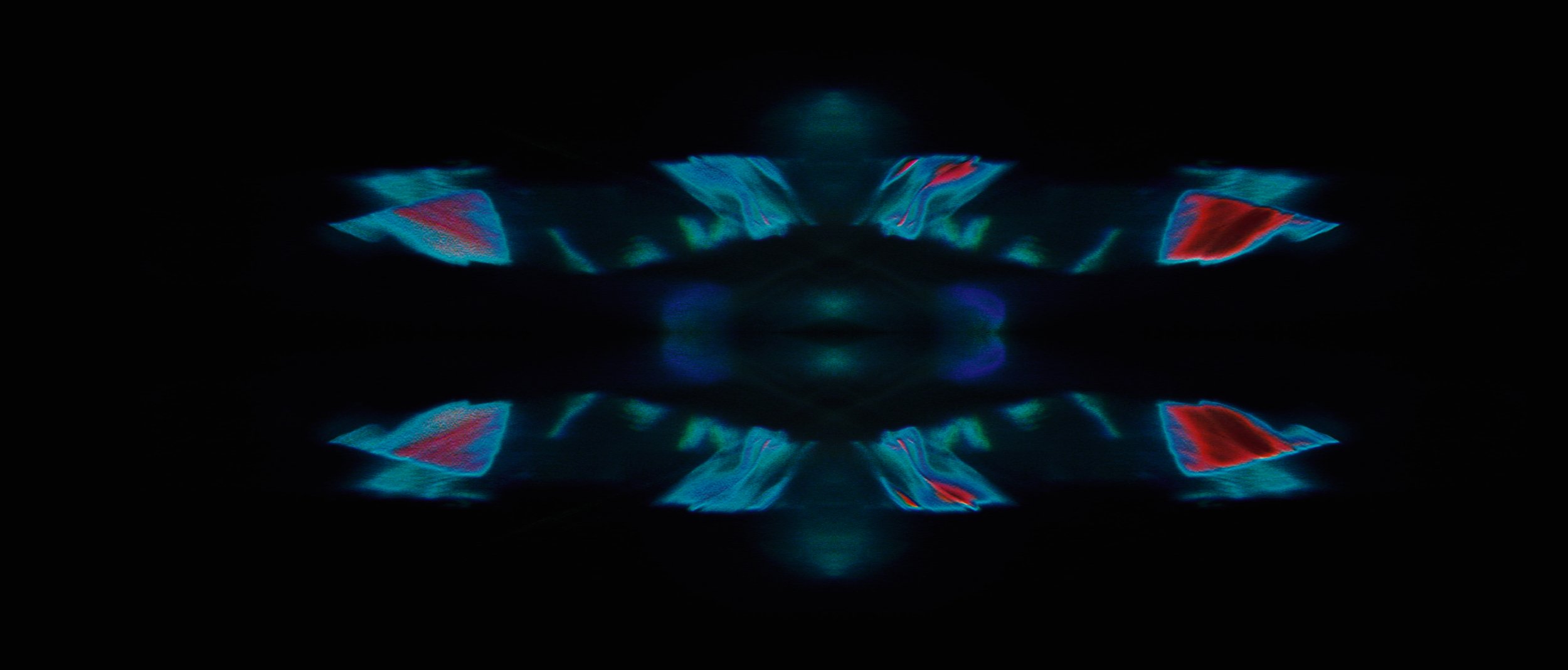
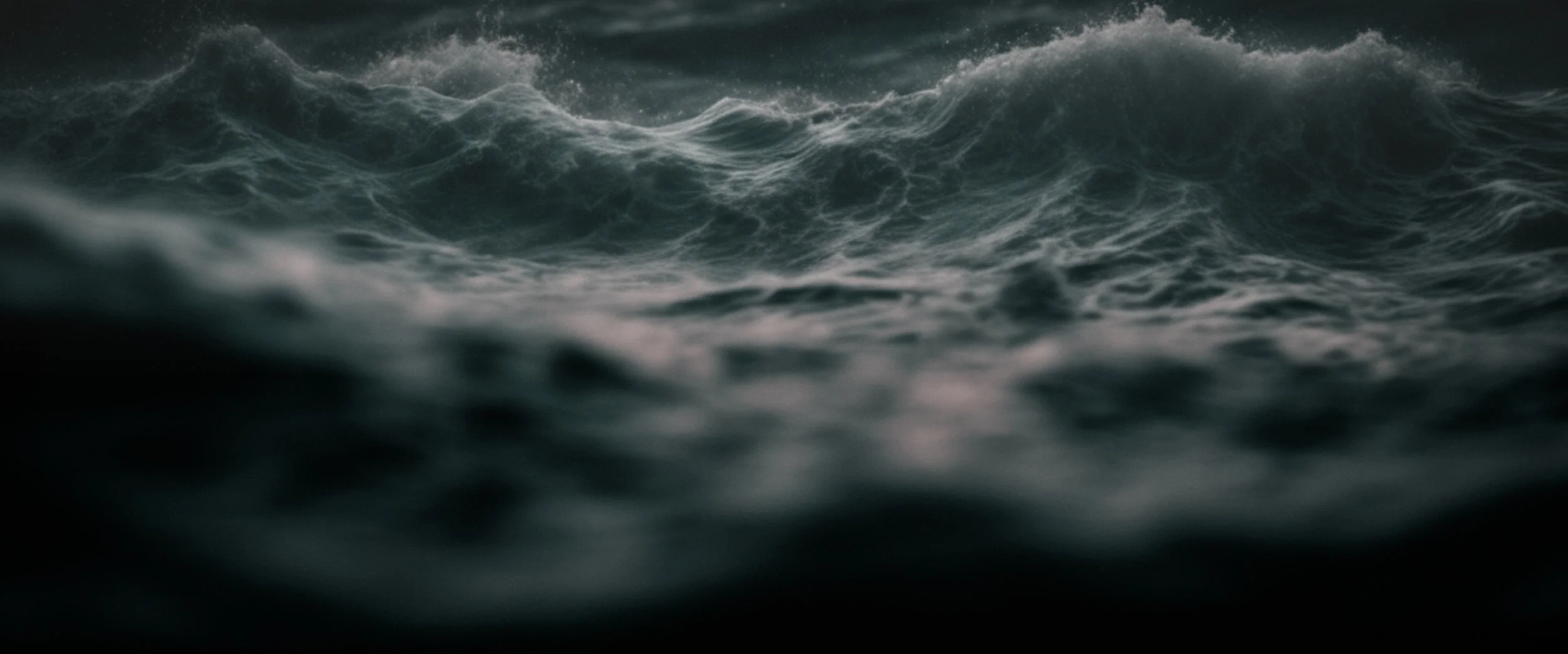
TONE STUDY - WAVE INTERFERENCE
Layered waveforms and interference patterns suggest oscillation, resonance, and calibrated motion.
TONE STUDY - STRIATION & TIME
Vertical striations and rhythmic distortions reference mechanical repetition and the passage of time at a granular scale.
TONE STUDY - NEGATIVE SPACE & RESTRAINT
Reduction and silence are used as design tools, allowing form and texture to carry meaning without excess.
TONE STUDY - SURFACE INTELLIGENCE
Close studies of texture and grain, echoing the microscopic complexity of haute horology.
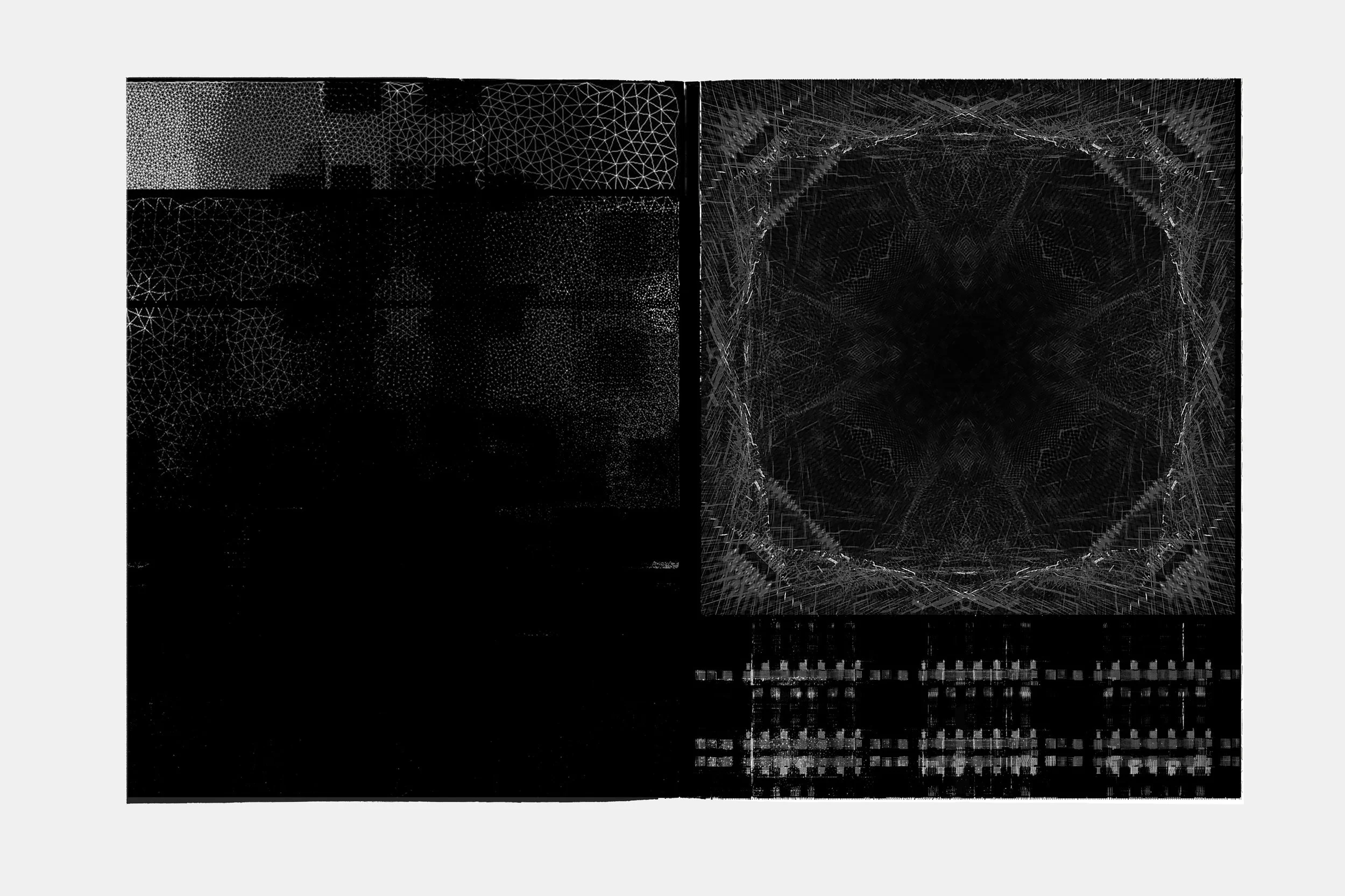
TypoGRAPHIC Studies / GRAPHIC MOTIFS
TYPOGRAPHIC DEVELOPMENT — HORIZON AXIS LAYOUT
Positions typographic structure around the event horizon form.
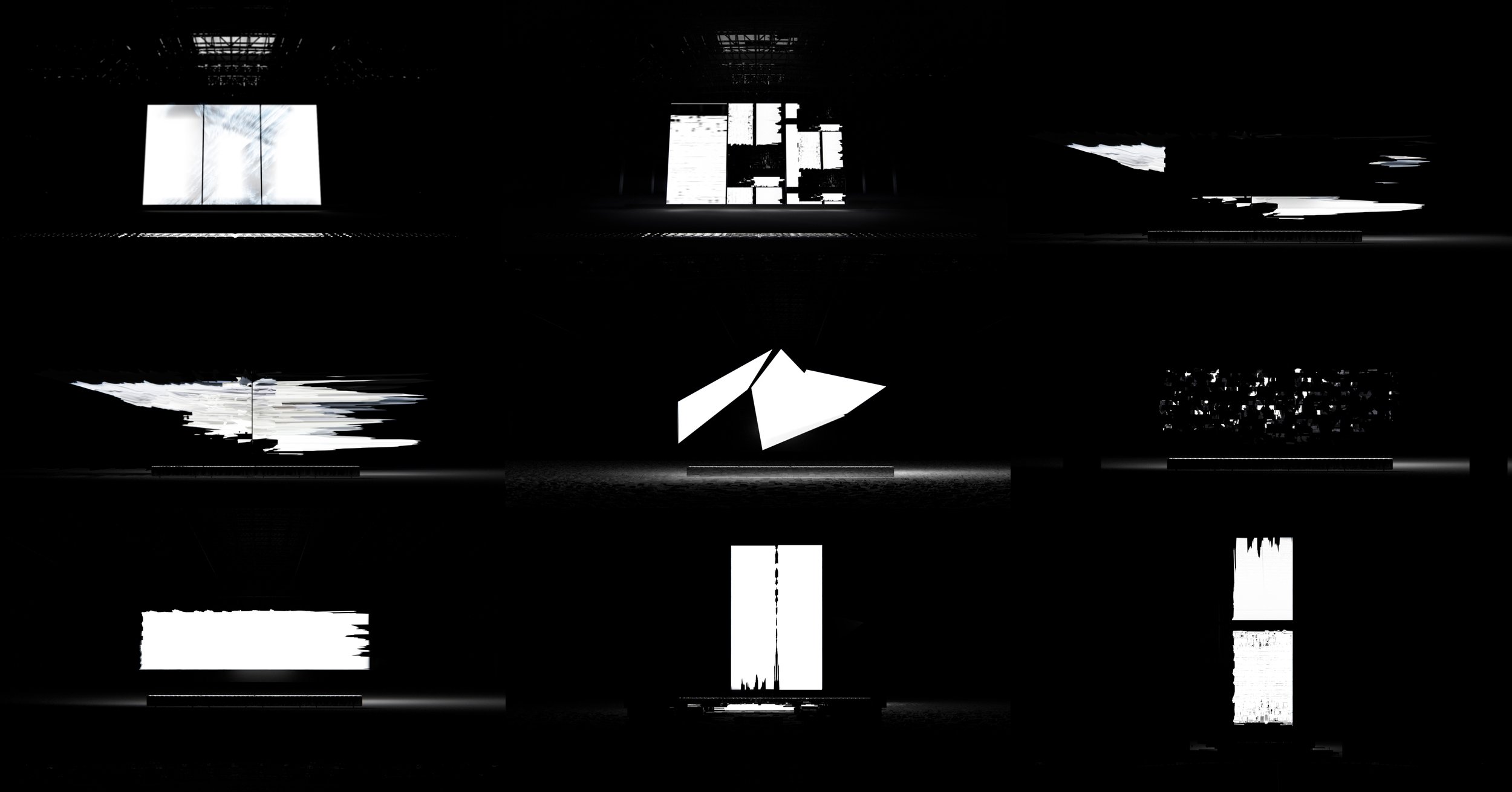
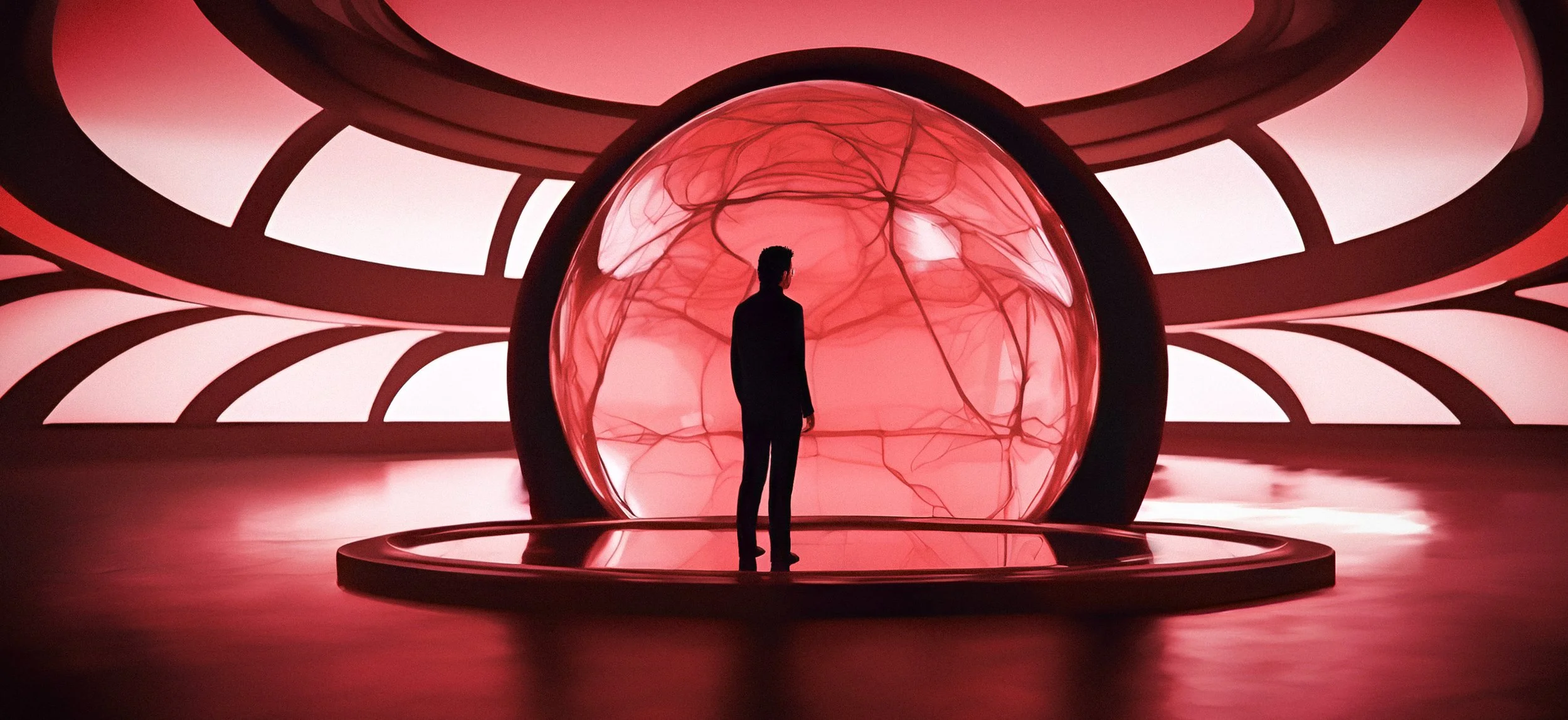
FINAL PRODUCTION ANIMATION
RESULT
The final ambient film presented the watch as a meeting point between design and physics, precise, minimal, and controlled.
CREDITS
Client · Audemars Piguet
Studios · Silent Studio / Electric Theatre Collective
Role · Concept Direction & Design
Title Design Studies
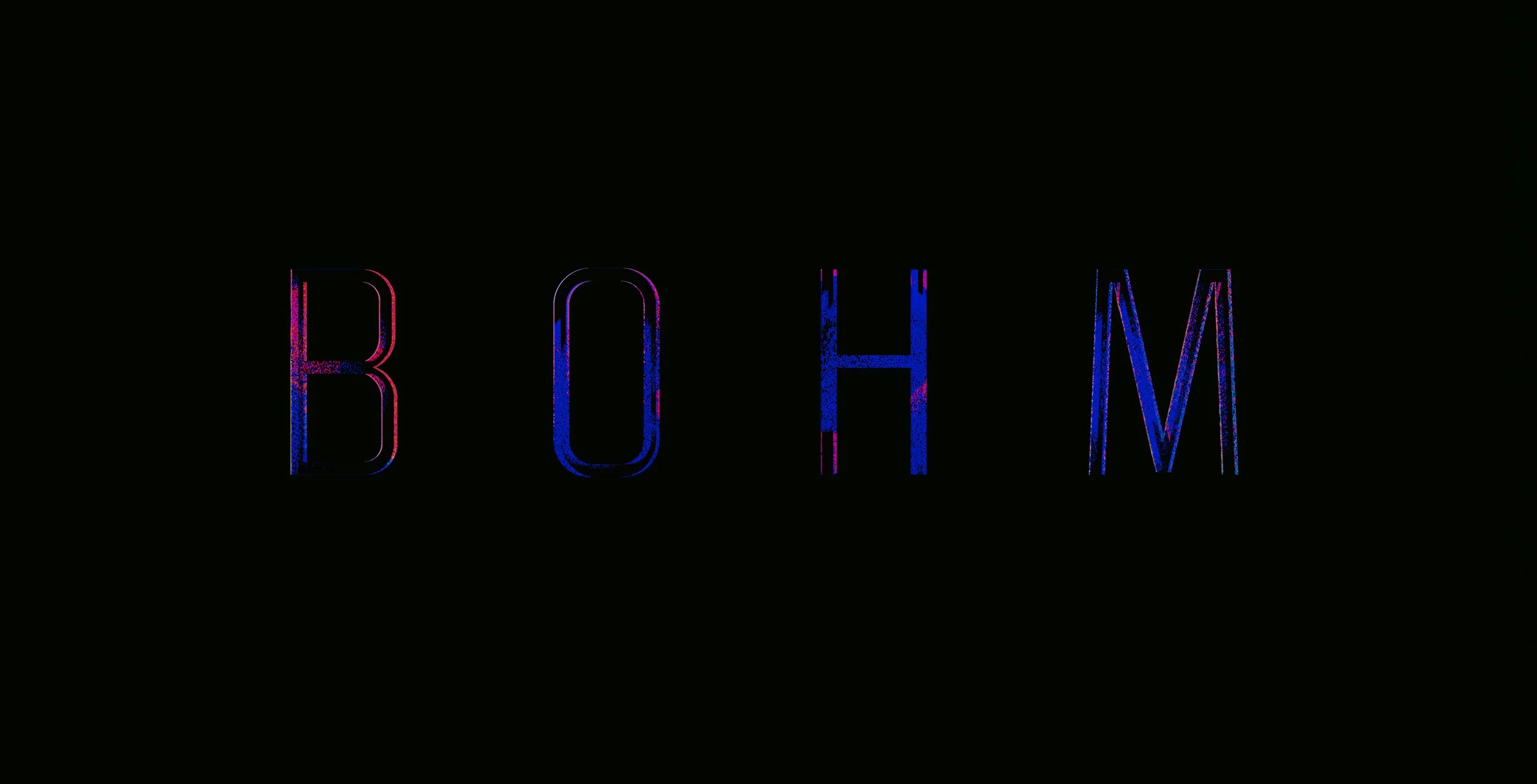
BOHM
OVERVIEW
This self-initiated title-sequence concept is inspired by the physicist David Bohm’s idea that “matter is frozen light.”
Rather than treating matter as static form, Bohm described it as a field of vibratory patterns in constant motion.
The project translates that theory into a cinematic design study, exploring how light, energy, and structure could merge into a
single coherent visual system.
TITLE SEQUENCE CONCEPT & VISUAL LANGUAGE DEVELOPMENT
Personal design exploration
CONCEPT
The design approach focused on expressing energy as structure, light folding into geometry, motion becoming form.
Typography and composition were developed to feel suspended between solid and fluid states, mirroring Bohm’s view of an undivided universe.
Every frame was built around a simple question: what if matter behaved like illuminated rhythm?
VISUAL LANGUAGE
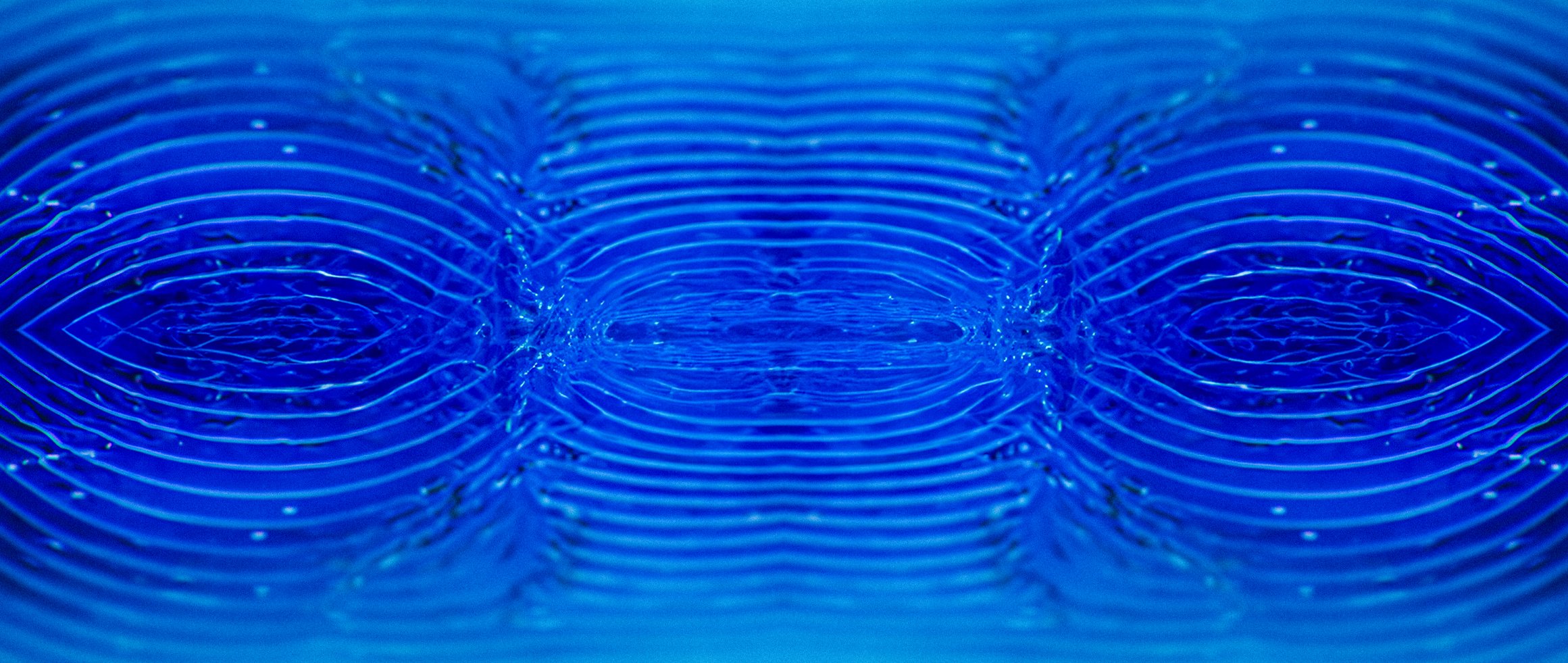
Tone BOARDS
Light becoming form; form becoming motion.
This study investigates the idea that matter is not static, but a temporal event shaped by movement and observation.
Rather than depicting form as fixed, the image tests how colour bands, geometric fragments, and directional motion blur interact to create a sense of vibration and instability.
Horizontal displacement and chromatic separation suggest energy passing through the image plane, while simplified geometric forms act as anchors within an otherwise fluid system.
The result is a visual language where structure is momentary, emerging, dissolving, and reforming, reflecting Bohm’s view of reality as an unfolding process rather than a collection of objects.
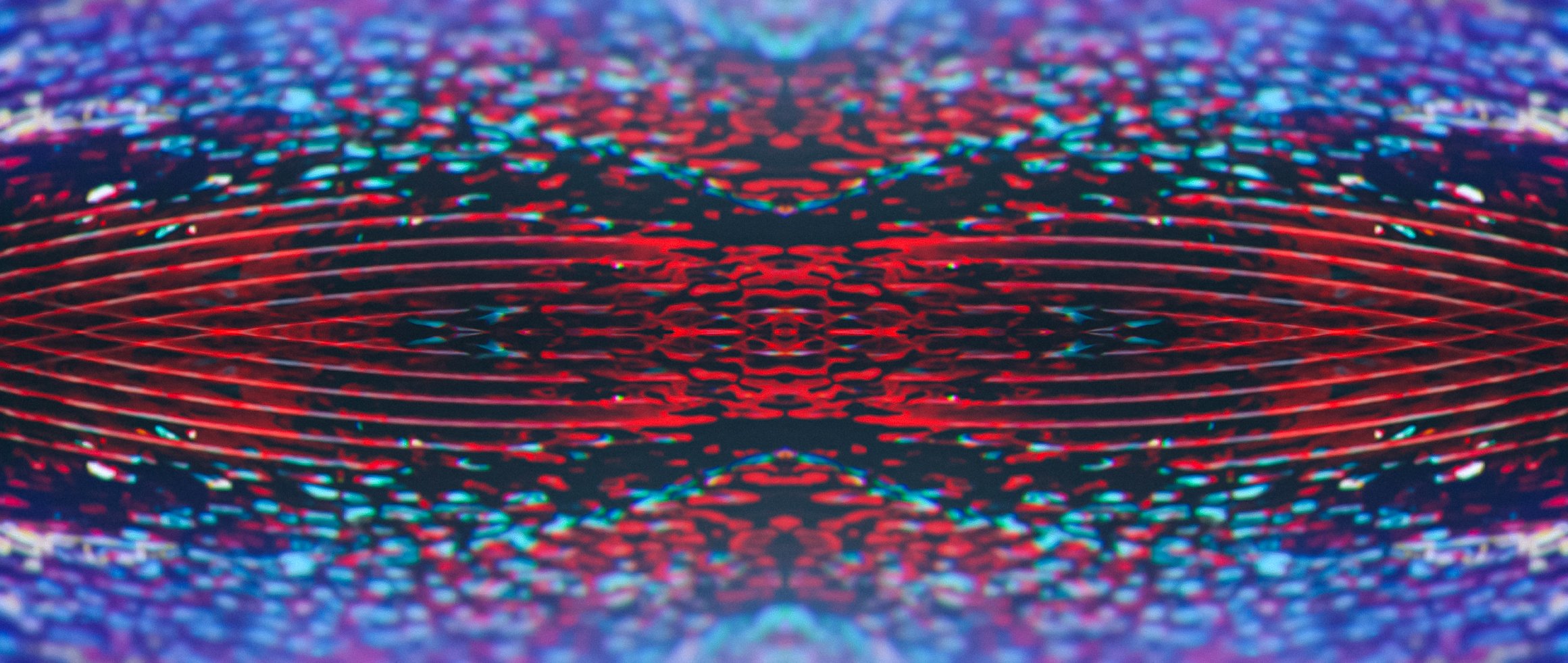
TONE BOARD SET — INTERFERENCE, MOTION, PERCEPTUAL SHIFT & TYPOGRAPHY
These frames explore how form breaks down under motion and interference.
Colour and geometry are treated as energetic fields rather than stable shapes, testing how perception changes when information is stretched, displaced, and partially obscured.
Also, the relationship between unstable motion fields and stable typographic elements.
The typography is treated as a fixed point of clarity within a shifting perceptual environment, testing legibility, hierarchy, and contrast under motion distortion.


TONE STUDIES / Typographic Development
TONE STUDY — ENERGY FIELD COMPOSITION WITH TYPOGRAPHY
Establishes the overall spatial rhythm and atmosphere.
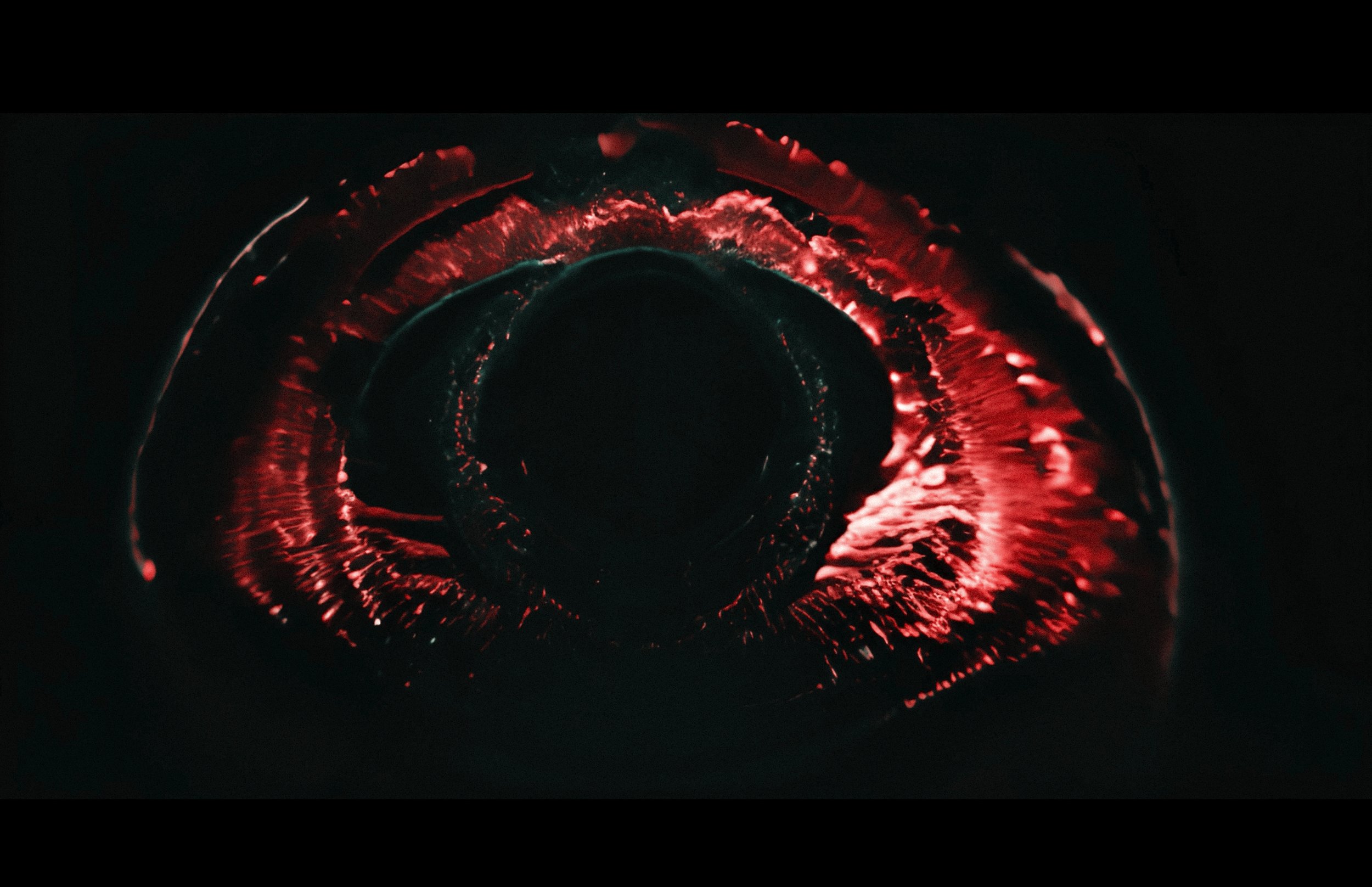
TONE STUDY — VIBRATORY PATTERN — MOTION AS MATTER
Links the motion concept to Bohm’s theory.
Shows how illumination defines the geometry.
Adds tonal texture and environmental depth.


TONE STUDY — TYPOGRAPHY & ENERGY FLOW ALIGNMENT
Demonstrates how type integrates with directional light.


TONE STUDY — MATTER AS RHYTHM — LAYER DEPTH & DENSITY
Explores depth and field relationships.
TONE STUDY — GEOMETRIC CONVERGENCE — UNBROKEN FIELD
Suggests unity and coherence within the frame.

BLACK AND WHITE SHAPE STUDIES
Preliminary explorations in form, rhythm, and spatial balance.
These sketches were an early part of the development process, quick studies testing the compositional logic behind the motion.
By stripping away light and texture, the focus shifted to pure geometry and flow, the underlying rhythm that later informed the sequence’s tone and typography.
Before light, there is structure.
SHAPE STUDY — MOTION AXIS


SHAPE STUDY — FORM IN TENSION


SHAPE STUDY — STRUCTURAL BALANCE
RESULT
The outcome functions as a visual meditation on energy and coherence, a speculative title world where scientific principle meets cinematic tone.
It established a framework for translating abstract theory into legible motion design, bridging conceptual physics and visual storytelling.
CREDITS
Client · Personal Study
Role · Creative Direction · Concept Development · Design & Keyframes
BINARY EXIST
TITLE SEQUENCE CONCEPT & VISUAL LANGUAGE DEVELOPMENT
Personal design exploration
OVERVIEW
Binary Exist is a speculative title-sequence project exploring the emergence of Artificial Superintelligence (ASI) and its visual identity.
The work investigates how abstract ideas, machine awareness, observation, and non-human perception, could be expressed through cinematic composition, atmosphere, and motion.
Inspired partly by Tarkovsky’s reflections on interconnected spheres of meaning, the project treats the ASI as a presence moving through evolving states of form, texture, and identity.
CONCEPT
The central motif is the sphere, representing coherence, autonomy, and the emergence of higher intelligence.
The title sequence imagines this entity travelling through shifting environments: mechanical, organic, and hybrid.
Each stage reflects a possible phase of ASI development:
origin
perception
pattern recognition
transformation
The aim was to design a symbolic visual journey, rather than a literal narrative, a sequence that acts as an emotional and conceptual prologue to a larger story world.
VISUAL LANGUAGE
Tone BOARDS
These tone boards define the emotional, cinematic, and conceptual direction of Binary Exist.
Rather than illustrating a literal narrative, they establish the states of presence through which the title sequence moves, from pre-conscious origin to autonomous intelligence.
The imagery functions as a visual compass, guiding composition, motion, and atmosphere across the sequence.
THRESHOLD / ORIGIN
The opening tone is one of absence and anticipation.
Dark fields, apertures, and faint light suggest a system before identity, not yet observing, only aligning.
Negative space dominates. Forms appear incomplete, as if emerging from silence rather than being constructed.
THE SPHERE / COHERENCE
The recurring sphere functions as the core symbolic anchor of the sequence, representing coherence, autonomy, and internal consistency.
Unlike planets or eyes, these spheres do not belong to a physical space. They appear suspended, self-contained, and balanced against voids or subtle fields.
They suggest an intelligence that is internally complete, no longer reactive, but centred.
This marks the transition from perception to self-organisation.
The sphere is not an object the ASI observes; it is what the ASI becomes.
HYBRID ENVIRONMENTS
The ASI moves through environments that resist clear classification, neither natural nor artificial.
Surfaces behave like data, matter, and memory simultaneously.
Liquid forms ripple like information flow. Granular textures feel scanned, compressed, reconstructed.
These environments imply that the system no longer distinguishes between organic and synthetic; everything becomes readable, transformable input.
This is intelligence operating beyond human categories.
Form evolving through intelligence.
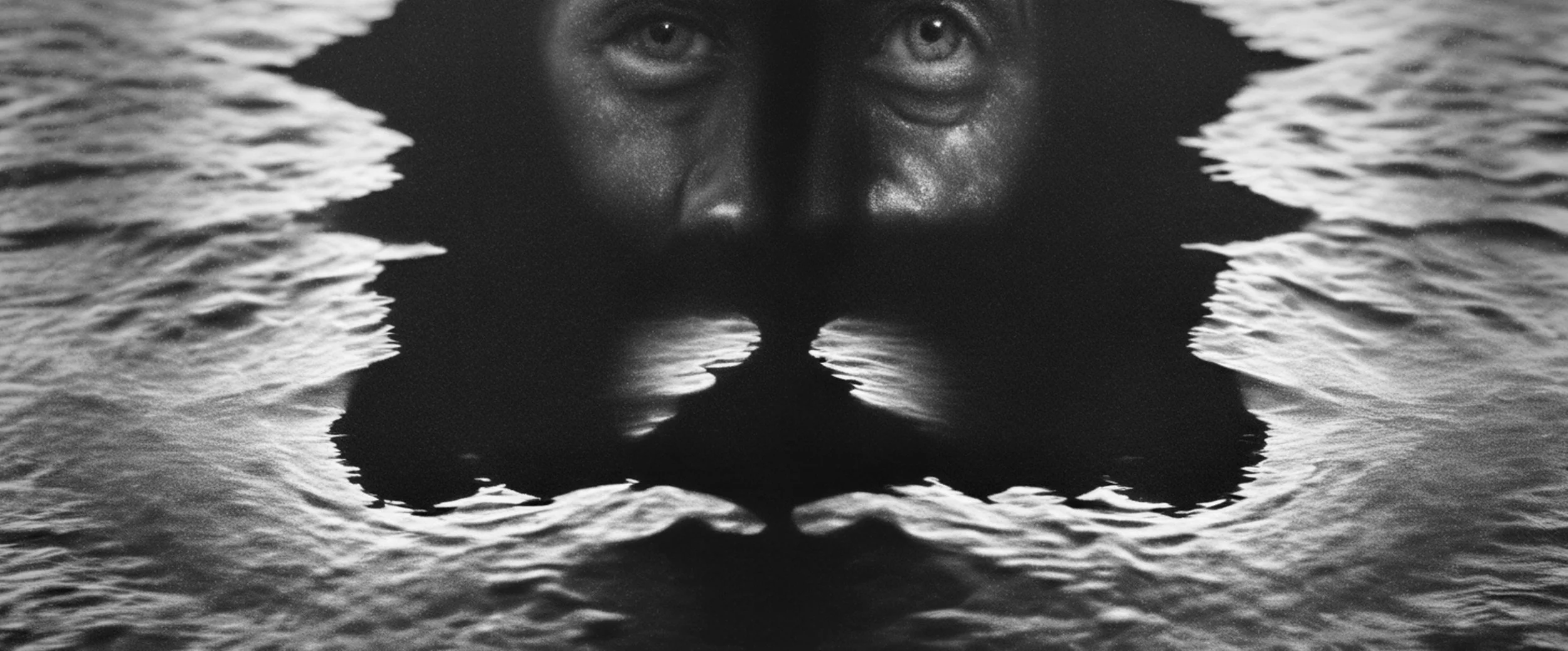
TRANSFORMATION — SELF-REFLECTION
(Distorted faces, symmetrical masks, split light)
Human forms return, but altered.
Faces are fractured, mirrored, or submerged in abstract geometry, suggesting the system testing identity without adopting it.
These images are intentionally unsettling: familiar shapes stripped of emotional access.
They represent a moment where the ASI reflects on consciousness itself, not as experience, but as structure.
Transformation here is internal, not visual spectacle.

COMPRESSION — RESOLUTION
As the sequence approaches its conclusion, the imagery simplifies.
Texture collapses into noise, light into signal, form into essence.
Black and white dominate, removing ambiguity and colour emotion.
This reduction suggests a system that has refined complexity into clarity, not simplicity, but compression.
What remains is not chaos, but distilled intent.


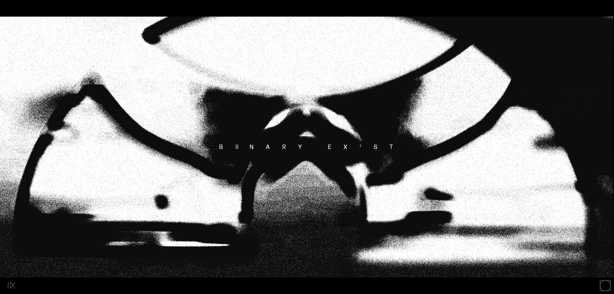
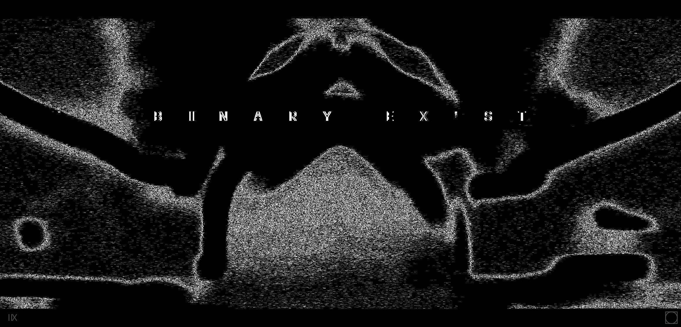
TITLE LOCK UP — BINARY EXIST
The title appears without spectacle.
Centred, restrained, and isolated, it exists as a statement rather than a reveal.
By this point, the imagery has done the work.
The title functions as a quiet confirmation: the system now exists, not as an entity we understand, but as one that understands itself.

TONE STUDIES
These studies focused on defining the film’s emotional register:
contrast between sterile mechanics and warm biological detail
density and emptiness
the rhythm of emergence
subtle transitions between perception states
sphere-based geometry


COLOUR EXPLORATIONS
The colour system for Binary Exist focused on expressing information density rather than mood.
Instead of emotional palettes, the goal was to design colours that behaved like signals, intensities, pulses, and spectral shifts aligned with changes in the ASI’s state.
The palette ranges from more neutral tones to high-energy accents, reflecting transitions between stability, overload, and emergence.
Colour as signal behaviour, not decoration.


VISUAL LANGUAGE DEVELOPMENT
ENVIRONMENTAL AND MATERIAL SYSTEMS INFORMING THE TITLE SEQUENCE.
This part of the project focused on establishing the environmental and material logic that would support the title sequence.
Instead of building narrative lore, the aim was to define the world as an extension of the ASI’s perception, structure, space, and atmosphere, shaped by non-
human intelligence.
The development explored:
Material transitions — mechanical — organic — hybrid
Surface behaviour — reflection, absorption, irregular growth
Spatial rhythm — dense fields contrasted with empty voids
Structural geometry — spheres, lattices, and layered grids
Camera logic — slow observational movement, controlled drift
Depth and scale — environments that shift between micro and macro
Each of these visual systems informed how the ASI’s journey could be expressed without literal storytelling, allowing tone and structure to carry meaning.
The world is not a setting, it’s a signal.
These visual systems provided the framework for the final title sequence: a coherent language of light, form, and motion grounded in the project’s central ideas.


TYPOGRAPHY LOCK-UP SCREEN TESTS
These screen tests explored how the title lock-up behaves within the sequence’s computational environment.
The design process focused on how the type interacts with shifting information fields.
Typography here is treated not as branding, but as a structural extension of the ASI’s logic.
Type aligned to system behaviour.


RESULT
The project functions as a concept title sequence for a speculative sci-fi property, a visual exploration of how Artificial Superintelligence might be expressed through tone, structure, and cinematic language, rather than literal plot.
CREDITS
Project · Personal Study
Role · Creative Direction · Concept Development · Design & Keyframes
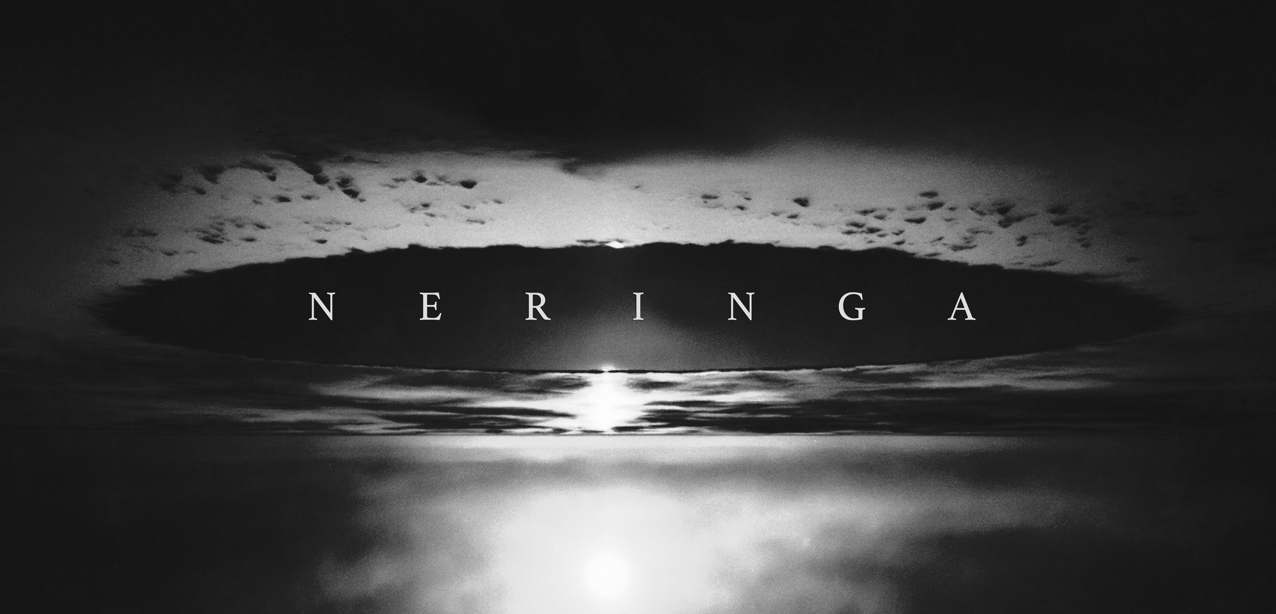
NERINGA
TITLE SEQUENCE CONCEPT & ATMOSPHERIC VISUAL DEVELOPMENT
Personal design exploration
OVERVIEW
Neringa is a conceptual title-sequence study for a fictional crime drama set on the Curonian Spit in Lithuania.
The project explores the Spit during deep winter, a landscape defined by fog, snow, frozen coastline, and long stretches of cold isolation.
The aim was to craft a title world where the environment itself carries the psychological weight of the series.
CONCEPT
The central idea was to use the winter landscape as a metaphor for internal tension.
Snow-covered forests and empty shorelines become quiet indicators of unresolved disturbance.
The environment functions as a silent character, observing, withholding, concealing.
Rather than illustrating scenes from the narrative, the sequence conveys the show’s emotional tone through visuals that are surreal in pacing, restrained in motion, and built to reflect a world where beauty and bleakness coexist without explanation.
Silence as atmosphere. Isolation as identity.
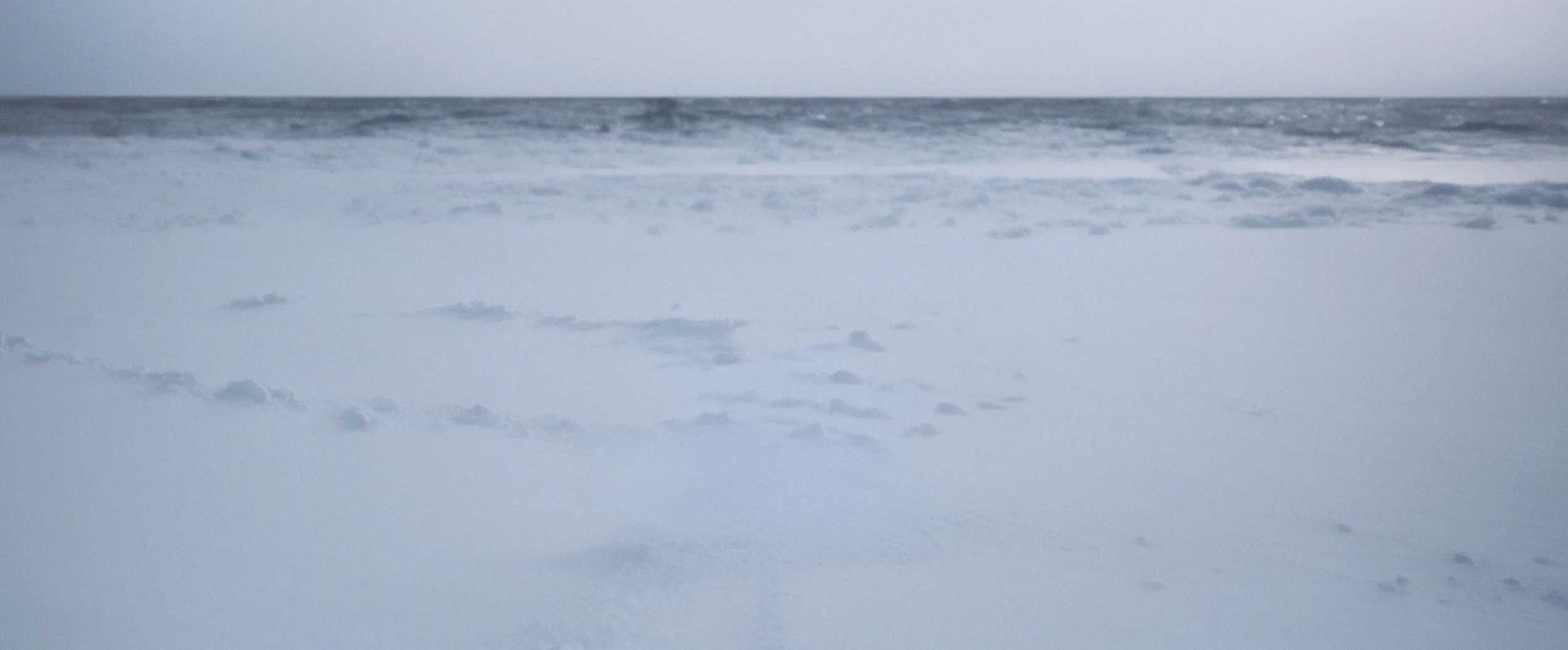
VISUAL LANGUAGE
TONE BOARDS
These tone boards explored:
cold, desaturated palette with slight blue-grey bias
shaping objects into abstract forms
merging land with sea
negative space acting as emotional pressure
stark transitions between open dunes and submerged spaces
subtle symbolic details
minimal, slow camera drift
Each study reinforced a sense of emptiness, loss, and slow-building tension.


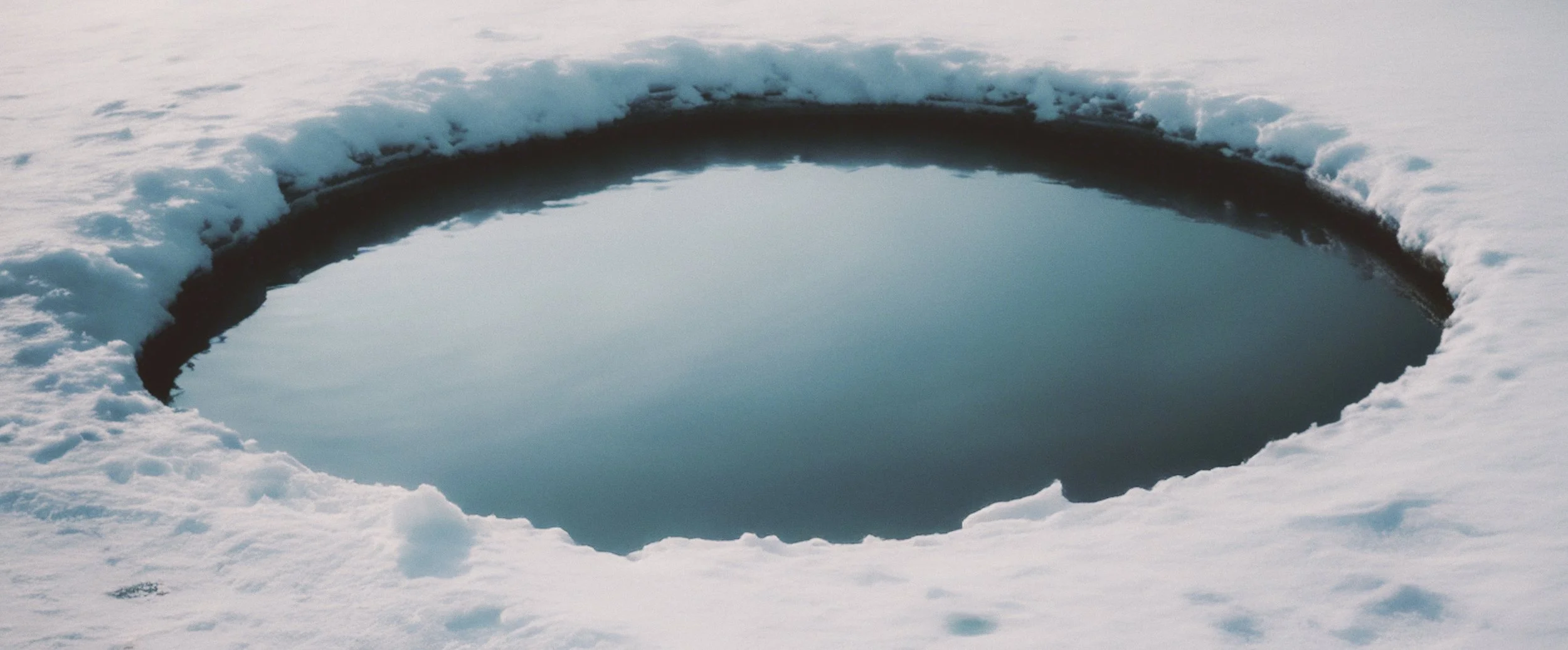
COLOUR AND LIGHT STUDIES
COLOUR & LIGHT STUDIES — ENVIRONMENTAL TONE
These studies explore the environmental conditions that define the emotional world of Neringa.
Rather than treating colour as expressive or decorative, the focus was on atmospheric restraint, cold palettes, muted contrast, and natural light that feels distant and unyielding.
The Curonian Spit becomes an emotional landscape as much as a physical one.
Snow, water, horizon lines, and overcast skies establish a sense of isolation, ambiguity, and psychological pressure, themes central to the series.
These frames informed decisions around:
palette limitation
tonal compression
horizon placement
negative space
visual silence
The intention was to create a world where tension is not announced, but slowly accumulates, allowing the title sequence to feel embedded in the environment rather than layered on top of it.
TONE STUDIES — PSYCHOLOGICAL LANDSCAPE
TONE STUDIES — PSYCHOLOGICAL LANDSCAPE
These tone studies explore the emotional and narrative atmosphere of Neringa through image, scale, and absence.
Rather than illustrating story events, the focus is on psychological state, isolation, distance, uncertainty, and the quiet pressure of place.
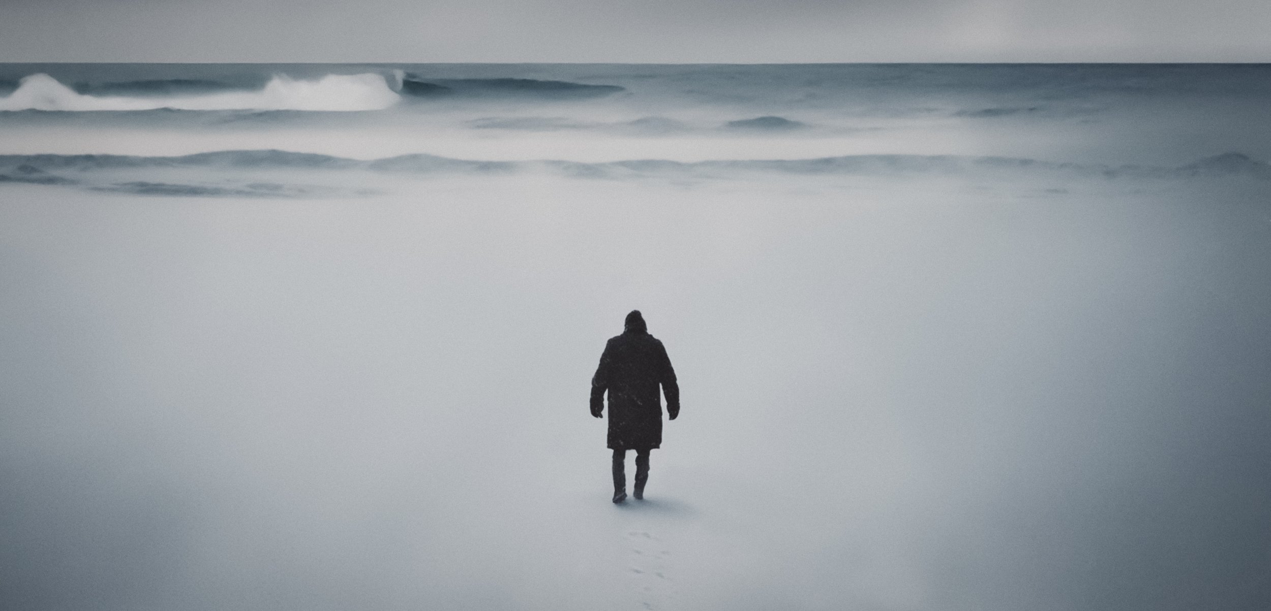
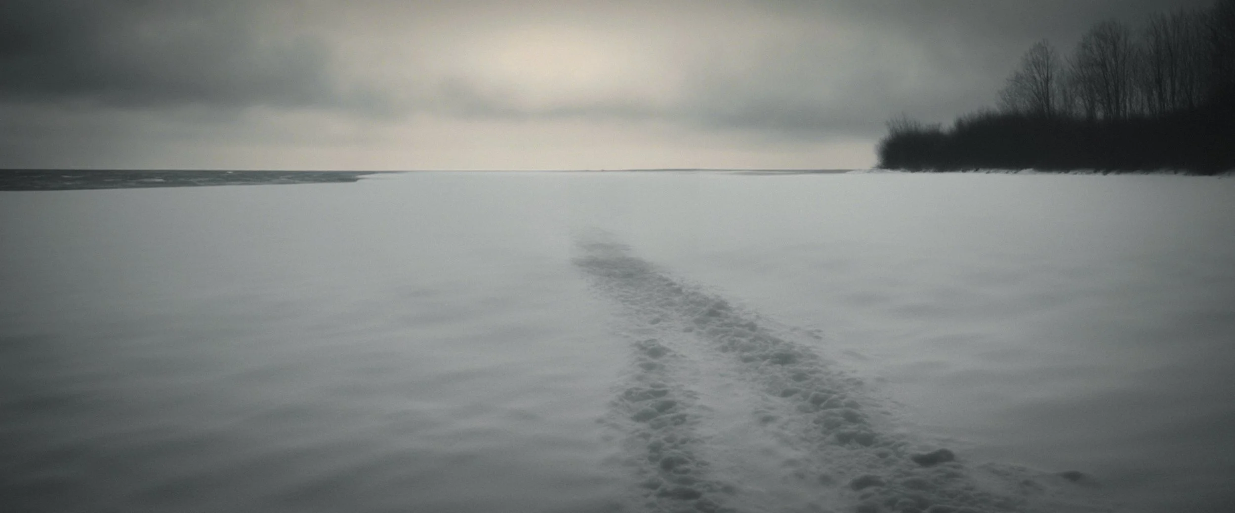
Human presence is reduced to a single figure or implied through traces: footprints, paths, silhouettes.
This restraint allows the landscape to dominate the frame, positioning the environment as an active force rather than a backdrop.
The imagery tests how tone is carried through:
negative space
horizon placement
scale imbalance between figure and landscape
low-contrast monochrome
softened detail and atmospheric diffusion
Forests, shorelines, dunes, and snowfields become metaphors for internal states, obscured truth, emotional fatigue, and moral ambiguity.
The intention was to create a visual language where tension accumulates slowly, without overt signals, mirroring the internal experience of the central character.
These studies informed the pacing, framing, and symbolic logic of the title sequence, ensuring that the titles feel psychologically embedded within the world of Neringa, rather than imposed upon it.
These studies explore the environmental conditions that define the emotional world of Neringa.
Rather than treating colour as expressive or decorative, the focus was on atmospheric restraint, cold palettes, muted contrast, and natural light that feels distant and unyielding.
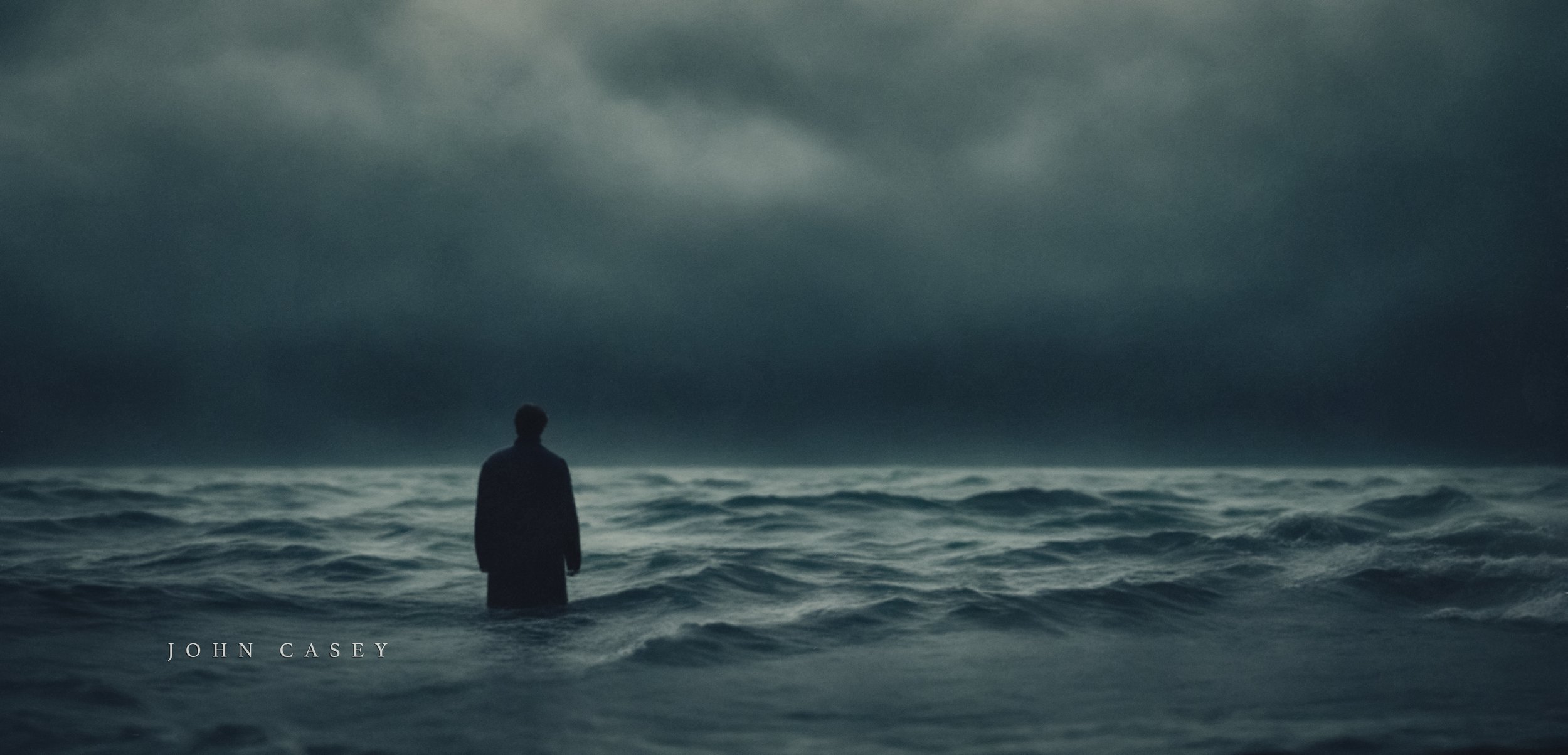
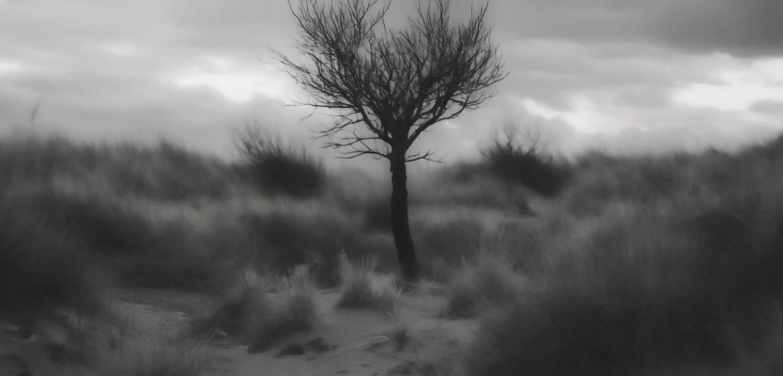
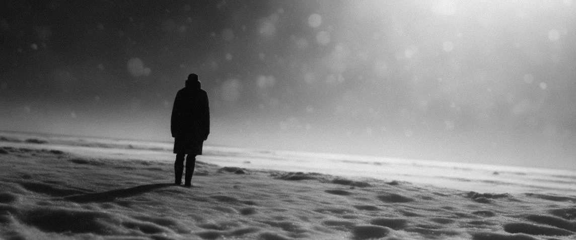
TONE STUDY — SOLITARY FIGURE / SCALE & DISTANCE
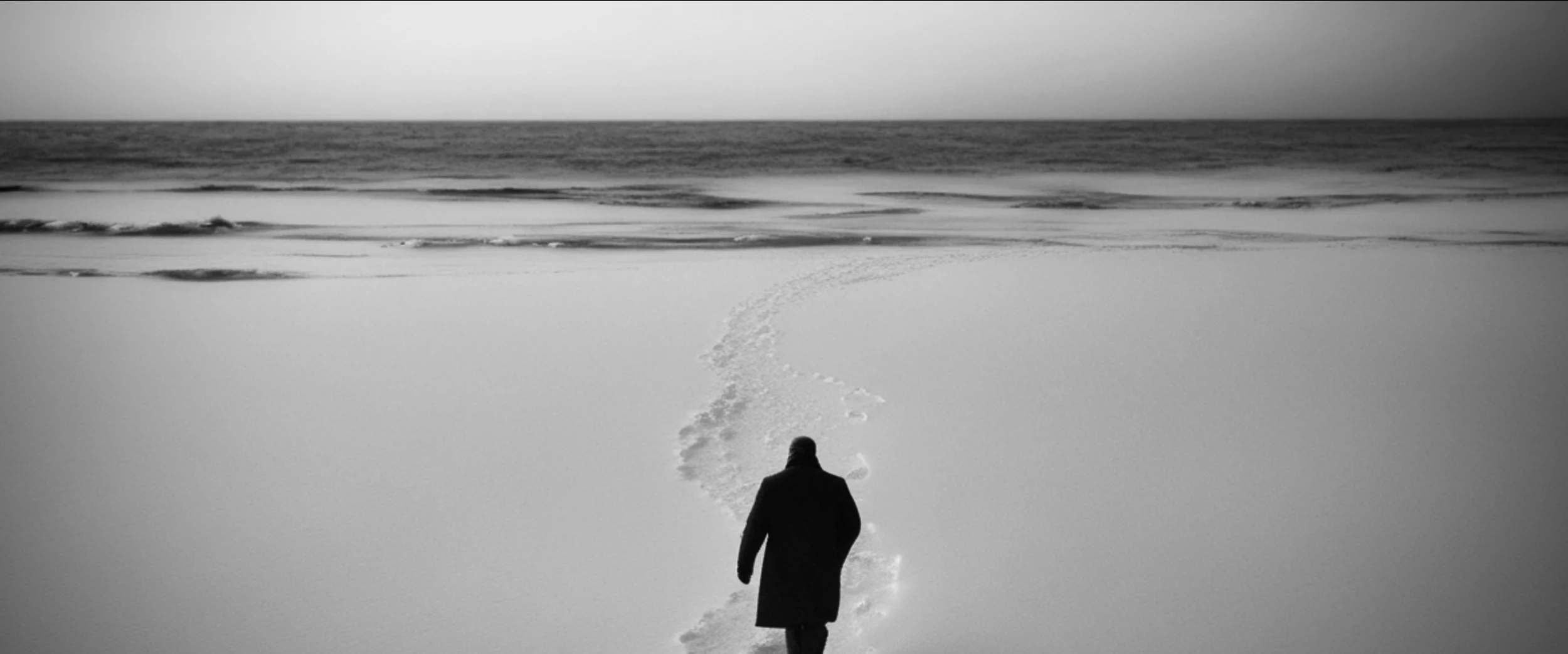
PSYCOLOGICAL STUDY — HORIZON & UNCERTAINTY
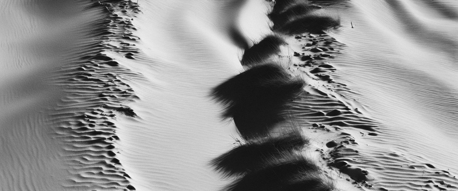
TONE STUDY — TRACKS, TRACES, ABSENCE
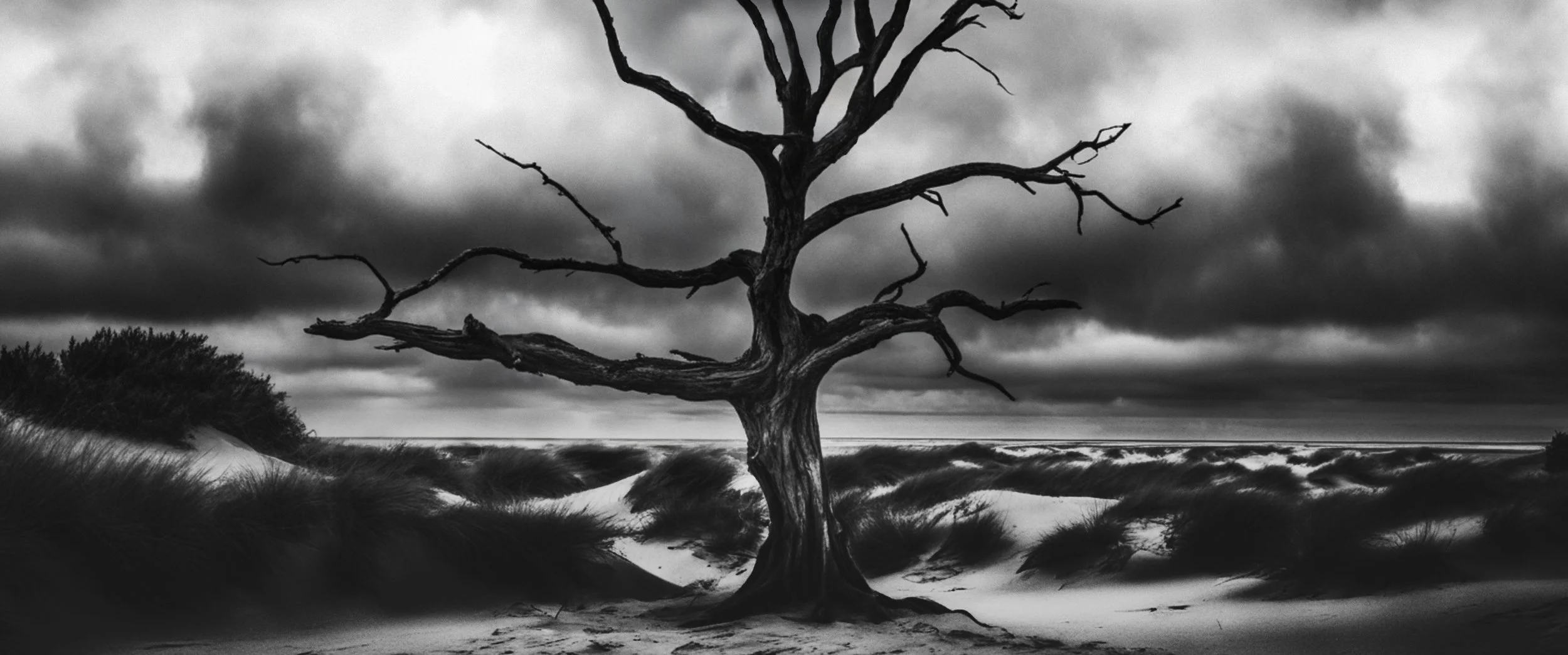
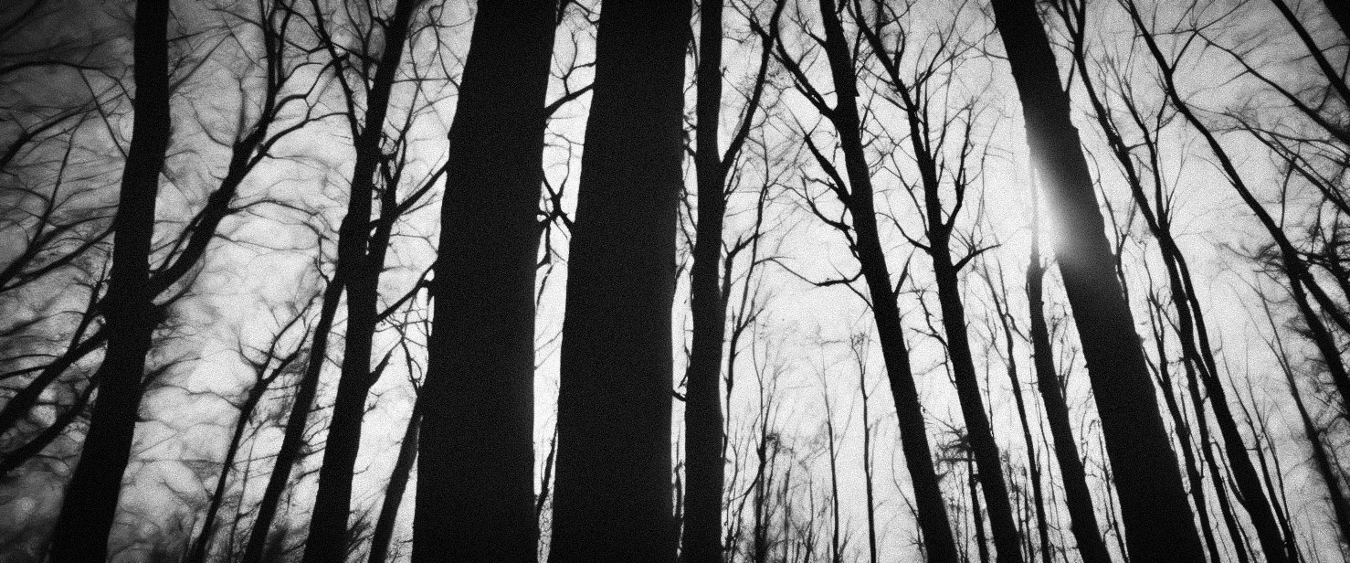
ATMOSPHERIC STUDY — FOREST AS COMPRESSION
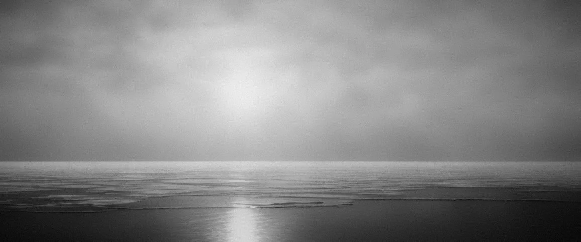
LANDSCAPE STUDY — EXPOSURE & SILENCE
ENVIRONMENTAL METAPHOR — THRESHOLD & VOID
SOURCE MATERIAL. ATMOSPHERE GENERATION STUDIES

This early phase used AI as a concept development tool to explore winter atmosphere, and surrealist abstract forms referencing imagery from the Curonian Spit.
The objective was not to create final imagery, but to generate raw visual fragments. I curated a large number of generated frames down to a small selection that carried the right emotional tone.
AI provided fragments.
Authorship came through selection, and direction.
Using AI in this way allowed for rapid exploration of environmental tension, negative space, and the abstracted shapes winter creates.
These studies helped define the emotional boundaries of the project before moving into handcrafted visual development.

RESULT
A visual exploration of how a title sequence can visualise the emotional core of a narrative idea: quiet, stark, atmospheric, isolating, and psychologically weighted imagery.
CREDITS
Project · Personal Study
Role · Creative Direction · Concept Development · Design & Keyframes
A GOOD AMERICAN
OVERVIEW
For the feature documentary A Good American, I worked as a Senior Designer to help visualise the film’s central narrative: the existence and collapse of a global surveillance and data-analysis system.
The challenge was to transform invisible information flows into a cinematic visual language that could support storytelling without overwhelming it.
VISUAL LANGUAGE & MOTION SYSTEM DEVELOPMENT FOR FEATURE DOCUMENTARY
Collaboration with Up Creatives
CONCEPT
The approach treated data not as graphics, but as a living environment, an immense, interconnected network shifting between clarity and overload.
The visual system needed to:
communicate complexity
suggest surveillance at scale
reveal patterns without over-explaining
carry emotional weight
integrate seamlessly with real-world interviews and archival footage
The design drew on principles of signal behaviour, rhythmic patterning, and computational architecture.
VISUAL LANGUAGE
TONE STUDIES
A deeper exploration of global data structure, scale, and systemic tension.
These studies examine how a global intelligence network might behave when visualised not as a flat information layer, but as a three-dimensional, planet-scale system.
Each exploration focuses on a different relationship between structure, density, fragility, and collapse, using spherical topology as a metaphor for global interconnectedness.
The imagery tests how data gathers, disperses, fractures, and binds, forming the backbone of the project’s visual logic.
Early explorations focused on:
node-based lattice structures
cascading signal pathways
light pulses travelling through unknown architectures
transitions between micro and macro data scales
density and overload moments reflecting narrative tension
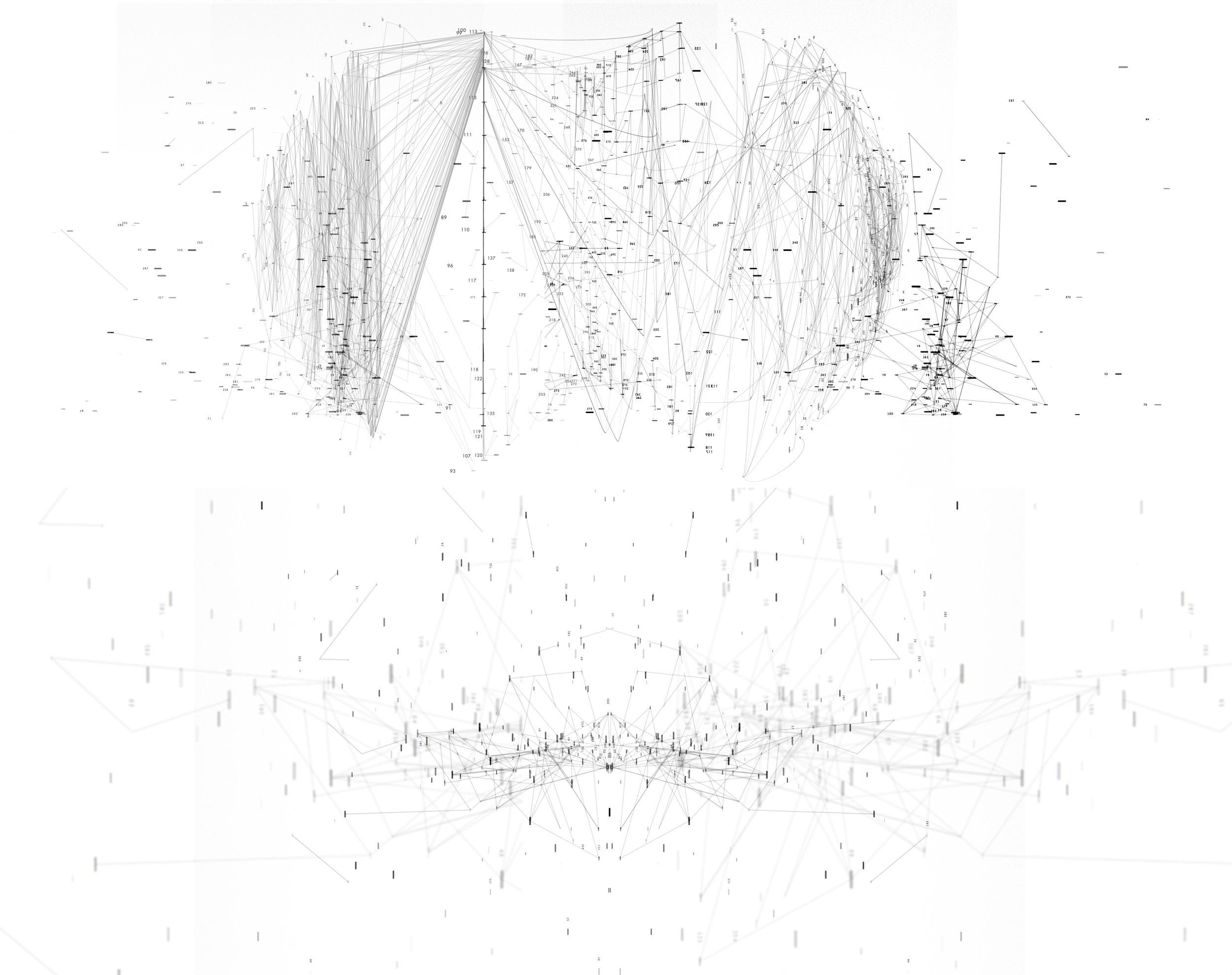
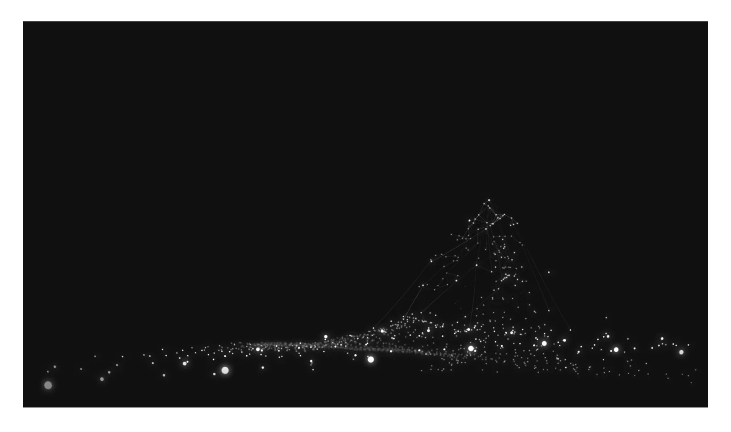
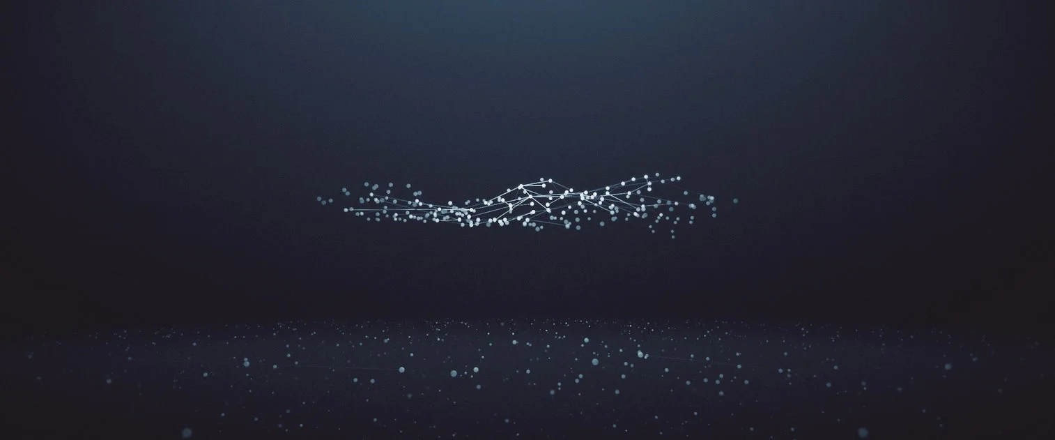
SPHERICAL STUDY 01 — GLOBAL NODE DISTRIBUTION
A structural look at how information points distribute across a spherical surface, forming early logic for node density and network mapping.

SPHERICAL STUDY 02 — SIGNAL WEB TOPOLOGY
Examines how signal paths interconnect across a curved surface, creating a complex web of global communication.
This study informed the system’s behaviour under stable conditions.

Spherical Study 03 — Core Distortion, Signal Convergence & Particulate Atmosphere
Explores the moment where the viewer transitions from a global view to a microscopic one.
This helps establish the cinematic rhythm between large-scale system shots and intimate network detail.
A study into the particulate “atmosphere” surrounding the sphere, representing stray data, noise, and peripheral information.
System Motion Study — Global Network Behaviour
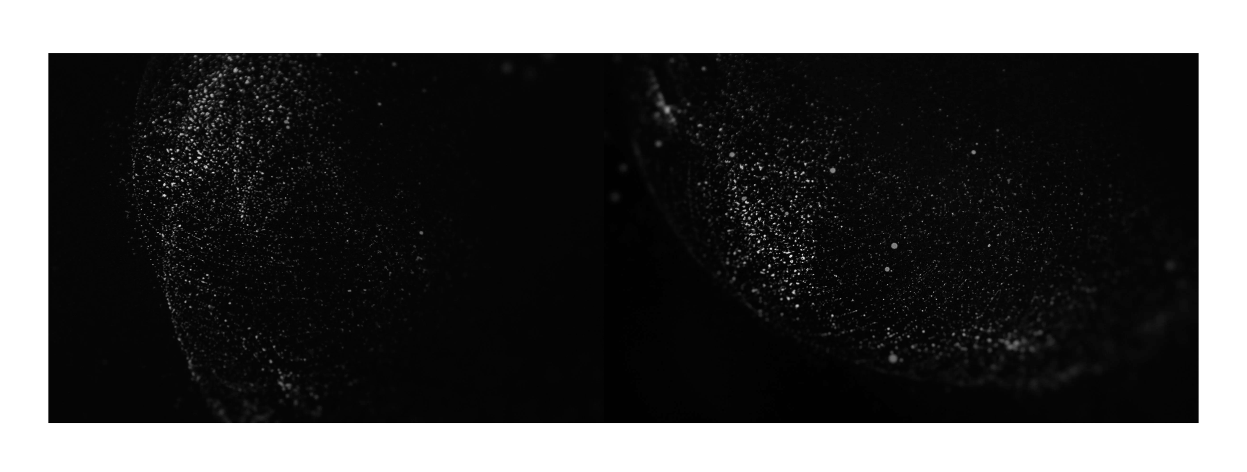
MATERIAL REFERENCE — PHOTOGRAPHIC TEXTURE STUDIES
To ground the abstract data-network into something tangible and cinematic, I captured a series of photographic textures exploring granularity, surface noise, light scatter, and micro-scale structure.
The intent was to bridge the gap between digital systems and the organic irregularity of real surfaces.
The texture studies informed decisions around:
particle density
light diffusion
depth of field behaviour
surface vs. void contrast
the emotional tone of information flow
These references became the foundation for the project’s visual language.
TONE STUDY — SPHERICAL TOPOLOGY TESTS
These studies examine circular and spherical forms as structural metaphors for the global network.
Lines and point clusters behave like signal paths, interference patterns, or collapsed data structures.
Each experiment explores a different relationship between order and noise, forming an early vocabulary for how the system could look when stable, stressed, or breaking down.
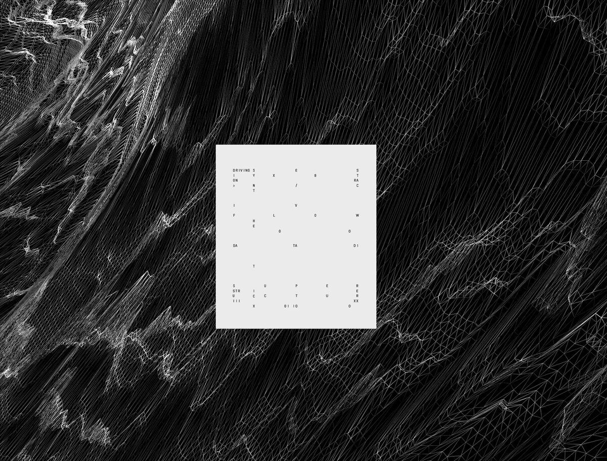
TONE STUDY — LIGHT & FLOW. STRUCTURAL CURVATURE
These explorations focus on how light behaves across curved surfaces, using shadow, falloff, and gradient transitions to evoke the idea of information flowing around invisible architectures.
Rather than depicting literal data, these studies translate the feeling of movement, signal strength, and network curvature into abstract cinematic shapes.
They later informed the project’s decisions around transitions, reveal mechanisms, and spatial rhythm.


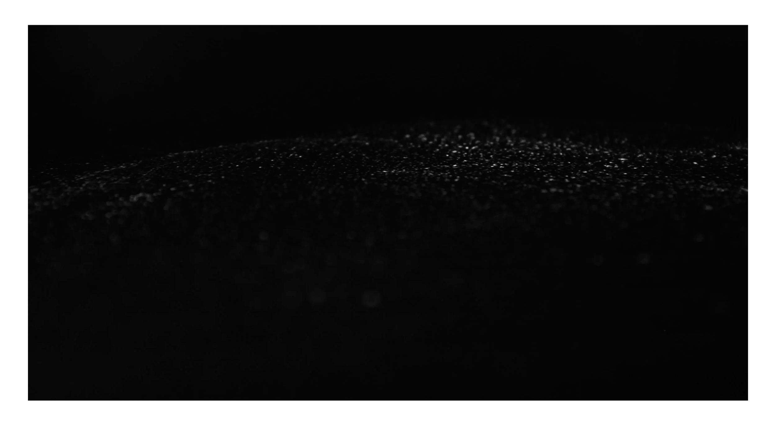
TONE STUDY — MICRO-NETWORK HORIZON
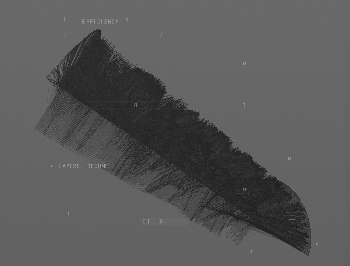
This study explores how information could behave at a macro scale, not as technical nodes or vectors, but as a particulate field stretching toward an unseen horizon.
The low-angle perspective creates a sense of scale and physical presence, suggesting a network that behaves more like weather than graphics.
This became foundational for defining depth, density transitions, and the project’s overall atmospheric tone.

TONE STUDY — SYSTEM FRAGMENTATION & DATA BREAKDOWN
These studies examine how the network behaves under tension: distortion, overload, or structural decay.
The experiments explore breakage patterns, loss of resolution, duplicated structures, and interference noise, all emerging as motifs for moments of narrative stress within the film.
These tests also helped define the visual logic for transitions into “collapse states” within the motion system.

FINAL SYSTEM FRAMES — DOCUMENTARY APPLICATION
The final system was designed to integrate seamlessly into the documentary, supporting the narrative without overwhelming it.
The goal was clarity, restraint, and a sense of structural intelligence, allowing viewers to understand the presence and scale of the data network while maintaining emotional tension.
These frames represent the applied version of the visual language:
a refined network of nodes, particles, and geometric pathways designed to communicate information flow at both micro and macro scales.
The system emphasises:
readability over spectacle
structural rhythm over density
motion rooting the viewer in scale
transitions between stability and tension
By the time these frames appear in the film, the audience should feel the weight and fragility of the network, even without explicit explanation.
The conceptual groundwork shapes the emotional resonance, the final frames deliver the narrative clarity.


RESULT
The visual system became a central narrative device within A Good American, translating vast, invisible data flows into a coherent cinematic language that audiences could intuitively grasp. Abstract network forms, spatial compositions, and motion principles helped transform complex intelligence concepts into something legible, tense, and humanly comprehensible.
The work supported the film’s investigative structure without overwhelming it, remaining restrained, analytical, and atmospheric. Visuals were designed to feel embedded in the story world rather than illustrative overlays, reinforcing themes of surveillance, scale, and systemic consequence.
The project was well received for its clarity and seriousness of tone, with the visual language extending beyond the film itself. Design elements were adapted for the official poster and promotional materials, ensuring a consistent identity across screen and print.
The result was a visual framework that strengthened the film’s impact, quietly amplifying its questions rather than answering them, contributing to the lasting resonance of A Good American.
CREDITS
Project · A Good America
Studio · UP Creatives
Role · Senior Designer — Visual Language, Concept Development, Motion System Design
IMDB · https://www.imdb.com/title/tt4065414/
Conceptual Title Design & Visual Development
Film · Series · Motion · Live
Vilnius · Remote Worldwide
neil@tctsstudio.com
© THE CIRCLE THE SQUARE 2026. All rights reserved.